Overview
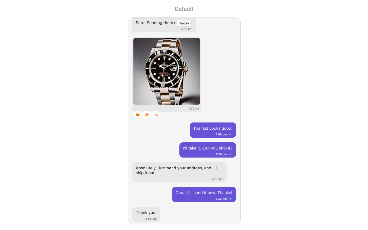
MessageList is a Composite Component that displays a list of messages and effectively manages real-time operations. It includes various types of messages such as Text Messages, Media Messages, Stickers, and more.
MessageList is primarily a list of the base component MessageBubble. The MessageBubble Component is utilized to create different types of chat bubbles depending on the message type.
Usage
Integration
The following code snippet illustrates how you can directly incorporate the MessageList component.- Swift
Actions
Actions dictate how a component functions. They are divided into two types: Predefined and User-defined. You can override either type, allowing you to tailor the behavior of the component to fit your specific needs.1. onThreadRepliesClick
onThreadRepliesClick is triggered when you click on the thread indicator of message bubble. The onThreadRepliesClick action doesn’t have a predefined behavior. You can override this action using the following code snippet.
- Swift
2. onReactionClick
onReactionClick is triggered when you click on a reaction on a message bubble.
- Swift
3. onReactionListItemClick
onReactionListItemClick is triggered when you click on the list item of CometChatReactionList on a message bubble.
- Swift
4. set(onError:)
This method proves helpful when a user needs to customize the action taken upon encountering an error in CometChatMessageList.- Swift
5. set(onEmpty:)
Thisset(onEmpty:) method is triggered when the message list is empty in CometChatMessageList.
- Swift
6. setOnLoad
This set(onLoad:) method is triggered when messages are successfully loaded in CometChatMessageList.- Swift
Filters
You can adjust theMessagesRequestBuilder in the MessageList Component to customize your message list. Numerous options are available to alter the builder to meet your specific needs. For additional details on MessagesRequestBuilder, please visit MessagesRequestBuilder.
In the example below, we are applying a filter to the messages based on a search substring and for a specific user. This means that only messages that contain the search term and are associated with the specified user will be displayed
- Swift
The following parameters in messageRequestBuilder will always be altered inside the message list
- UID
- GUID
- types
- categories
Events
Events are emitted by aComponent. By using event you can extend existing functionality. Being global events, they can be applied in Multiple Locations and are capable of being Added or Removed.
The MessageList Component does not emit any events of its own.
Customization
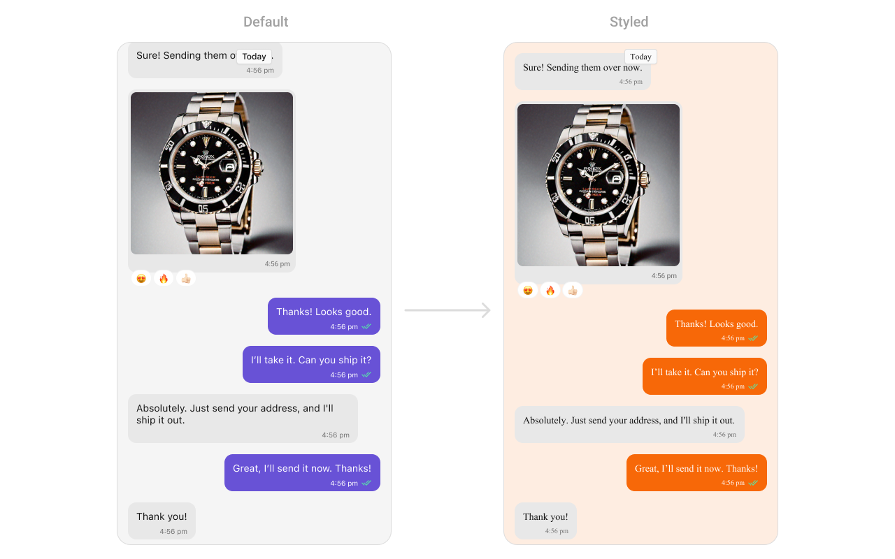
To fit your app’s design requirements, you can customize the appearance of the conversation component. We provide exposed methods that allow you to modify the experience and behavior according to your specific needs.Style
Using Style you can customize the look and feel of the component in your app, These parameters typically control elements such as the color, size, shape, and fonts used within the component.1. MessageList Style
To customize the appearance, you can assign aMessageListStyle object to the MessageList component
Global level styling
- Swift
- Swift
| Property | Description | Code |
|---|---|---|
| Background Color | Background color with dynamic support for light and dark mode. | CometChatMessageList.style.backgroundColor = UIColor.dynamicColor(lightModeColor: ..., darkModeColor: ...) |
| Border Width | Border width for the component. | CometChatMessageList.style.borderWidth = 0 |
| Border Color | Border color for the component. | CometChatMessageList.style.borderColor = .clear |
| Corner Radius | Corner radius for the component. | CometChatMessageList.style.cornerRadius = CometChatCornerStyle? |
| Shimmer Gradient Color 1 | First color of the shimmer gradient. | CometChatMessageList.style.shimmerGradientColor1 = CometChatTheme.backgroundColor04 |
| Shimmer Gradient Color 2 | Second color of the shimmer gradient. | CometChatMessageList.style.shimmerGradientColor2 = CometChatTheme.backgroundColor03 |
| Empty State Title Color | Text color for the title in the empty state. | CometChatMessageList.style.emptyStateTitleColor = CometChatTheme.textColorPrimary |
| Empty State Title Font | Font for the title in the empty state. | CometChatMessageList.style.emptyStateTitleFont = CometChatTypography.Heading3.bold |
| Empty State Subtitle Color | Text color for the subtitle in the empty state. | CometChatMessageList.style.emptyStateSubtitleColor = CometChatTheme.textColorSecondary |
| Empty State Subtitle Font | Font for the subtitle in the empty state. | CometChatMessageList.style.emptyStateSubtitleFont = CometChatTypography.Body.regular |
| Error State Title Color | Text color for the title in the error state. | CometChatMessageList.style.errorStateTitleColor = CometChatTheme.textColorPrimary |
| Error State Title Font | Font for the title in the error state. | CometChatMessageList.style.errorStateTitleFont = CometChatTypography.Heading3.bold |
| Error State Subtitle Color | Text color for the subtitle in the error state. | CometChatMessageList.style.errorStateSubtitleColor = CometChatTheme.textColorSecondary |
| Error State Subtitle Font | Font for the subtitle in the error state. | CometChatMessageList.style.errorStateSubtitleFont = CometChatTypography.Body.regular |
| Threaded Message Image | Icon image for threaded messages. | CometChatMessageList.style.threadedMessageImage = UIImage(systemName: "arrow.turn.down.right") |
| Error Image | Icon image for error state. | CometChatMessageList.style.errorImage = UIImage(named: "error-icon") |
| Empty Image | Icon image for empty state. | CometChatMessageList.style.emptyImage = UIImage(named: "empty-icon") |
| New Message Indicator Image | Icon image for new message indicator. | CometChatMessageList.style.newMessageIndicatorImage = UIImage? |
| New Message Indicator Text Color | Text color for unread messages indicator. | CometChatMessageList.style.newMessageIndicatorTextColor = UIColor? |
| New Message Indicator Text Font | Text font for unread messages indicator. | CometChatMessageList.style.newMessageIndicatorTextFont = UIFont? |
| New Message Indicator Background Color | Background color for unread messages indicator. | CometChatMessageList.style.newMessageIndicatorBackgroundColor = UIColor? |
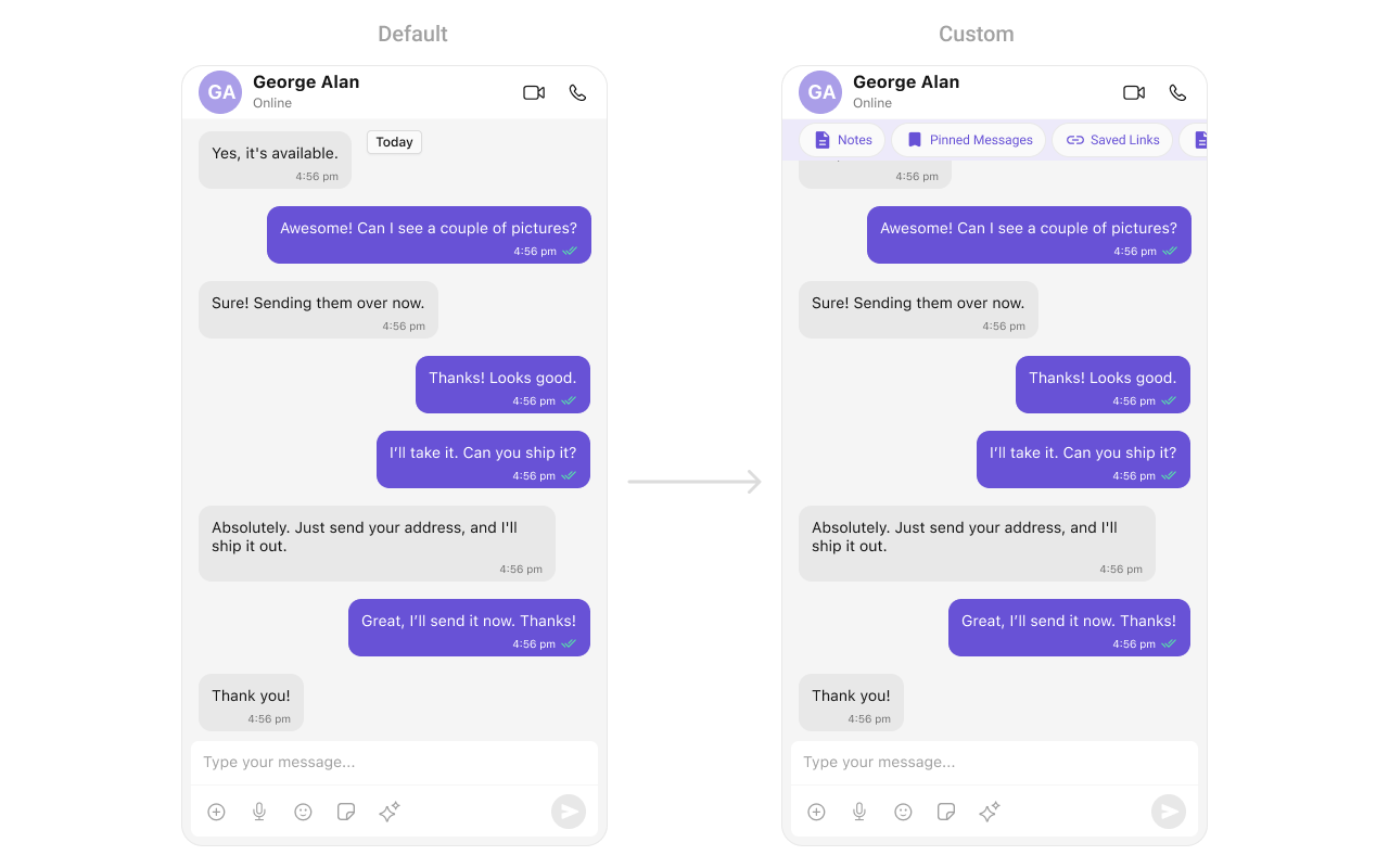
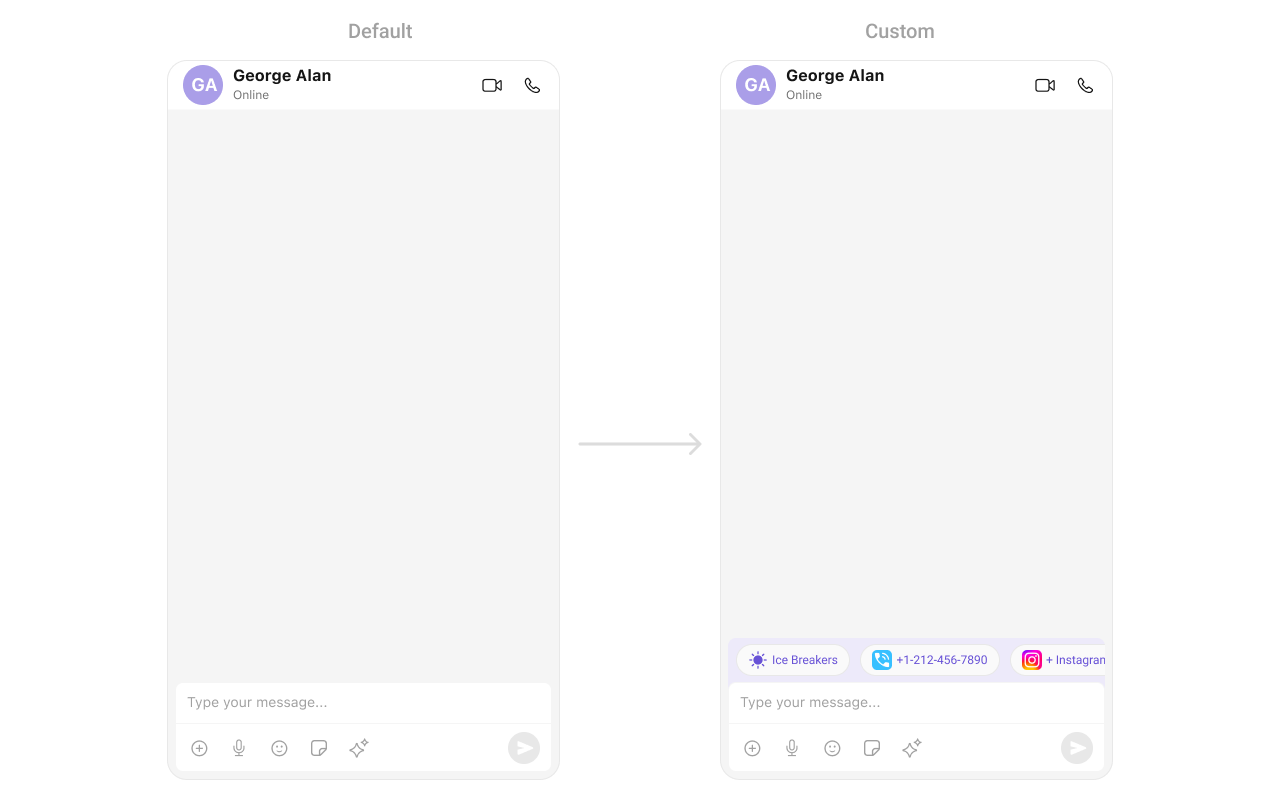
Functionality
These are a set of small functional customizations that allow you to fine-tune the overall experience of the component. With these, you can change text, set custom icons, and toggle the visibility of UI elements. Below is a list of customizations along with corresponding code snippets| Property | Description | Code |
|---|---|---|
| hideAvatar | Hides the avatar of the sender. | hideAvatar = true |
| hideGroupActionMessages | Hides group action messages (like join/leave notifications). | hideGroupActionMessages = true |
| hideReplyInThreadOption | Hides the reply in thread option. | hideReplyInThreadOption = true |
| hideTranslateMessageOption | Hides the message translation option. | hideTranslateMessageOption = true |
| hideEditMessageOption | Hides the edit message option. | hideEditMessageOption = true |
| hideDeleteMessageOption | Hides the delete message option. | hideDeleteMessageOption = true |
| hideReactionOption | Hides the reaction option on messages. | hideReactionOption = true |
| hideMessagePrivatelyOption | Hides the option to message privately. | hideMessagePrivatelyOption = true |
| hideCopyMessageOption | Hides the option to copy a message. | hideCopyMessageOption = true |
| hideMessageInfoOption | Hides the message info option. | hideMessageInfoOption = true |
| hideHeaderView | Hides the header view of the message list. | hideHeaderView = true |
| hideFooterView | Hides the footer view of the message list. | hideFooterView = true |
| hideDateSeparator | Hides the date separator between messages. | hideDateSeparator = true |
| scrollToBottomOnNewMessages | Scrolls to the bottom when new messages arrive. | scrollToBottomOnNewMessages = true |
| hideReceipts | Hides the message read receipts (ticks). | hideReceipts = true |
| disableSoundForMessages | Disables the sound when a new message arrives. | disableSoundForMessages = true |
| hideEmptyView | Hides the empty state view when no messages are available. | hideEmptyView = true |
| hideErrorView | Hides the error view when an error occurs. | hideErrorView = true |
| hideLoadingView | Hides the loading view when fetching messages. | hideLoadingView = true |
| hideNewMessageIndicator | Hides the “new message” indicator. | hideNewMessageIndicator = true |
| scrollToBottom(isAnimated:) | Scrolls to the bottom of the message list. | scrollToBottom(isAnimated: true) |
| set(messageAlignment:) | Sets the alignment of messages in the list. | set(messageAlignment: .left) |
| set(smartRepliesKeywords:) | Sets keywords for smart replies. | set(smartRepliesKeywords: ["Hi", "Bye"]) |
| set(smartRepliesDelayDuration:) | Sets the delay duration for smart replies. | set(smartRepliesDelayDuration: 2) |
| set(user:parentMessage:) | Sets the user and an optional parent message. | set(user: user, parentMessage: message) |
| set(group:parentMessage:) | Sets the group and an optional parent message. | set(group: group, parentMessage: message) |
| set(messagesRequestBuilder:) | Sets the message request builder. | set(messagesRequestBuilder: builder) |
| set(reactionsRequestBuilder:) | Sets the reactions request builder. | set(reactionsRequestBuilder: builder) |
| set(parentMessageId:) | Sets the parent message ID. | set(parentMessageId: 12345) |
| hideModerationView | Hides the moderation view in the AI assistant chat. | hideModerationView = true |
| hideThreadView | Hides the thread view in the AI assistant chat. | hideThreadView = true |
| set(suggestedMessages:) | List of predefined replies shown in the AI assistant. | suggestedMessages = ["Hello", "Hi"] |
| hideSuggestedMessages | Hides the suggested message replies. | hideSuggestedMessages = true |
| set(emptyChatGreetingView:) | Custom view displayed when the AI assistant chat is empty. | emptyChatGreetingView = { /* custom view */ } |
| set(streamingSpeed:) | Sets the speed of streaming for AI assistant messages. | streamingSpeed = 50 |
| goToMessage(withId:) | Scrolls the message list to a specific message, making it visible to the user based on the provided message ID | goToMessage(messageId: Int) |
| startFromUnreadMessages | Starts the message list from the first unread message.. | startFromUnreadMessages = true |
| showMarkAsUnreadOption | Sets the visibility of the “Mark as unread” option in the message actions menu. | showMarkAsUnreadOption = true |
Advance
For advanced-level customization, you can set custom views to the component. This lets you tailor each aspect of the component to fit your exact needs and application aesthetics. You can create and define your views, layouts, and UI elements and then incorporate those into the component.Date Time Formatter
The CometChatMessageList component supports full customization of how date and time are displayed using the CometChatDateTimeFormatter. This enables developers to localize, format, or personalize the date and time strings shown next to each message such as “Today”, “Yesterday”, “12:45 PM”, etc.- Component-Level (Global)
- Swift
- Instance-Level (Local)
- Swift
Available closures
| Property | Description | Code |
|---|---|---|
| time | Called to format a timestamp as a standard time (e.g., “12:30 PM”). | CometChatMessageList.dateTimeFormatter.time = { ... } |
| today | Called when rendering messages sent today. | CometChatMessageList.dateTimeFormatter.today = { ... } |
| yesterday | Called for yesterday’s messages. | CometChatMessageList.dateTimeFormatter.yesterday = { ... } |
| lastweek | Called for messages within the last week. | CometChatMessageList.dateTimeFormatter.lastweek = { ... } |
| otherDay | Called for dates older than last week. | CometChatMessageList.dateTimeFormatter.otherDay = { ... } |
| minute | Called when referring to “a minute ago”. | CometChatMessageList.dateTimeFormatter.minute = { ... } |
| minutes | Called for “x minutes ago”. | CometChatMessageList.dateTimeFormatter.minutes = { ... } |
| hour | Called for “an hour ago”. | CometChatMessageList.dateTimeFormatter.hour = { ... } |
| hours | Called for “x hours ago”. | CometChatMessageList.dateTimeFormatter.hours = { ... } |
SetHeaderView
You can set custom headerView to the Message List component using the following method.- Swift
SetFooterView
You can set custom footerView to the Message List component using the following method. Example- Swift
SetDateSeparatorPattern
You can modify the date pattern of the message list date separator to your requirement usingsetDateSeparatorPattern(). This method accepts a function with a return type String. Inside the function, you can create your own pattern and return it as a String.
Example
- Swift
Ensure to pass and present
cometChatMessages. If a navigation controller is already in use, utilize the pushViewController function instead of directly presenting the view controller.SetDatePattern
You can modify the date pattern to your requirement using .set(datePattern:). This method accepts a function with a return type String. Inside the function, you can create your own pattern and return it as a String. Example- Swift
SetTimePattern
You can modify the date pattern to your requirement using.set(timePattern:). This method accepts a function with a return type String. Inside the function, you can create your own pattern and return it as a String.
Example
- Swift
SetTextFormatters
This functionality dynamically assigns a list of text formatters. If a custom list is provided, it uses that list. Otherwise, it gracefully falls back to the default text formatters retrieved from the data source for seamless integration. Example This code customizes a CometChat text formatter to identify and style the word “sure”, with handling options for interactions like string search, scrolling, and item clicks. The custom formatter is then applied to CometChat messages.Swift
- MyCustomTextFormatter
SetTemplate and AddTemplate
CometChatMessageTemplate is a pre-defined structure for creating message views that can be used as a starting point or blueprint for creating message views often known as message bubbles. For more information, you can refer to CometChatMessageTemplate.SetLoadingView
You can set a custom loading view using .set(loadingView:). This method accepts a UIView to display while data is being fetched.- Swift
SetErrorView
You can customize the error view using .set(errorView:). This method accepts a UIView that appears when an error occurs.- Swift
SetEmptyView
You can customize the empty state view using .set(emptyView:). This method accepts a UIView that appears when no conversations are available.- Swift
SetNewMessageIndicatorView
Set a custom view for the unread message indicator.- Swift
To ensure that the
MessageList is properly configured, passing the controller is mandatory.- Swift
Ensure to pass and present
cometChatMessages. If a navigation controller is already in use, utilize the pushViewController function instead of directly presenting the view controller.