Groups
Overview
CometChatGroups functions as a standalone component designed to create a screen displaying a list of groups, with the added functionality of enabling users to search for specific groups. Acting as a container component, CometChatGroups encapsulates and formats the CometChatListBase without introducing any additional behavior of its own.
The Groups component is composed of the following BaseComponents:
| Components | Description |
|---|---|
| CometChatListBase | CometChatListBase serves as a container component equipped with a title (navigationBar), search functionality (search-bar), background settings, and a container for embedding a list view. |
| CometChatListItem | This component renders information extracted from a Group object onto a tile, featuring a title, subtitle, leading view, and trailing view. |
Usage
Integration
The following code snippet illustrates how you can can launch CometChatGroups.
- Swift
let groups = CometChatGroups()
let naviVC = UINavigationController(rootViewController: groups)
self.present(naviVC, animated: true)
If you are already using a navigation controller, you can use the pushViewController function instead of presenting the view controller.
Actions
Actions dictate how a component functions. They are divided into two types: Predefined and User-defined. You can override either type, allowing you to tailor the behavior of the component to fit your specific needs.
-
set(onItemClick:)
set(OnItemClick:) is triggered when you click on a ListItem of the groups component.
This set(OnItemClick:) method proves beneficial when a user intends to customize the on-click behavior in CometChatGroups.
- Swift
cometChatGroups.set(onItemClick: { group, indexPath in
    // Override on item click
})
-
set(OnItemLongClick:)
set(OnItemLongClick:) is triggered when you long press on a ListItem of the groups component.
This set(OnItemLongClick:) method proves beneficial when a user intends to additional functionality on long press on list item in CometChatGroups.
- Swift
cometChatGroups.set(onItemLongClick: { group, indexPath in
    // Override on item click
})
3. set(onBack:)
This set(onBack:) method becomes valuable when a user needs to override the action triggered upon pressing the back button in CometChatGroups.
- Swift
cometChatGroups.set(onBack: {
    // Override on back
})
4. set(onSelection:)
The set(onSelection:) only gets trigger when selection mode is set to multiple of single. And this gets trigger on every selection, and returns the list of selected groups.
- Swift
cometChatGroups.set(onSelection: { groups in
     //Handle action
})
5. set(onError:)
This method proves helpful when a user needs to customize the action taken upon encountering an error in CometChatGroups.
- Swift
cometChatGroups.set(onError: { error in
    // Override on error
})
6. set(onEmpty:)
This set(onEmpty:) method is triggered when the groups list is empty in CometChatGroups.
- Swift
cometChatGroups.set(onEmpty: {
    // Handle empty state
})
7. setOnLoad
This set(onLoad:) gets triggered when a group list is fully fetched and going to displayed on the screen, this return the list of groups to get displayed on the screen.
- Swift
cometChatGroups.set(onLoad: { groups in
    // Handle loaded groups
})
Filters
Filters allow you to customize the data displayed in a list within a Component. You can filter the list based on your specific criteria, allowing for a more customized. Filters can be applied using RequestBuilders of Chat SDK.
1. GroupsRequestBuilder
The GroupsRequestBuilder enables you to filter and customize the group list based on available parameters in GroupsRequestBuilder. This feature allows you to create more specific and targeted queries when fetching groups. The following are the parameters available in GroupsRequestBuilder
| Methods | Type | Description |
|---|---|---|
| setLimit | Int | Configure the maximum number of groups to fetch in a single request, optimizing pagination for smoother navigation. |
| setSearchKeyword | String | Employed to retrieve groups that match the provided string, facilitating precise searches. |
| joinedOnly | boolean | Exclusively fetches joined groups. |
| setTags | [String] | Utilized to fetch groups containing the specified tags. |
| withTags | boolean | Utilized to retrieve groups with specific tags. |
Example
In the example below, we are applying a filter to the Group List based on only joined groups.
- Swift
// You can create GroupRequestBuilder as per your requirement
let groupsRequestBuilder = GroupsRequest.GroupsRequestBuilder(limit: 20).set(joinedOnly: true)

let groups = CometChatGroups(groupsRequestBuilder: groupsRequestBuilder)
let naviVC = UINavigationController(rootViewController: groups)
self.present(naviVC, animated: true)
2. SearchRequestBuilder
The SearchRequestBuilder uses GroupsRequestBuilder enables you to filter and customize the search list based on available parameters in GroupsRequestBuilder. This feature allows you to keep uniformity between the displayed Groups List and searched Group List.
Example
- Swift
// You can create GroupRequestBuilder as per your requirement
let groupsRequestBuilder = GroupsRequest.GroupsRequestBuilder(limit: 2).set(searchKeyword: "")

let groups = CometChatGroups(groupsRequestBuilder: groupsRequestBuilder)
let naviVC = UINavigationController(rootViewController: groups)
self.present(naviVC, animated: true)
Events
Events are emitted by a Component. By using event you can extend existing functionality. Being global events, they can be applied in Multiple Locations and are capable of being Added or Removed.
The list of events emitted by the Groups component is as follows.
| Event | Description |
|---|---|
| onGroupCreate | This gets triggered when the logged in user creates a group. |
| onGroupDelete | This gets triggered when the logged in user deletes a group. |
| onGroupMemberLeave | This gets triggered when the logged in user leaves a group. |
| onGroupMemberChangeScope | This gets triggered when the logged in user changes the scope of another group member. |
| onGroupMemberBan | This gets triggered when the logged in user bans a group member from the group. |
| onGroupMemberKick | This gets triggered when the logged in user kicks another group member from the group. |
| onGroupMemberUnban | This gets triggered when the logged in user unbans a user banned from the group. |
| onGroupMemberJoin | This gets triggered when the logged in user joins a group. |
| onGroupMemberAdd | This gets triggered when the logged in user adds new members to the group. |
| onOwnershipChange | This gets triggered when the logged in user transfers the ownership of their group to some other member. |
Adding CometChatGroupsEvents Listener's
- Add Listener
// View controller from your project where you want to listen events.
public class ViewController: UIViewController {

   public override func viewDidLoad() {
        super.viewDidLoad()

       // Subscribing for the listener to listen events from user module
         CometChatGroupEvents.addListener("UNIQUE_ID", self as CometChatGroupEventListener)
    }

}

 // Listener events from groups module
extension  ViewController: CometChatGroupEventListener {

    public func onGroupMemberAdd(group: Group, members: [GroupMember], addedBy: User) {
        // Do Stuff
    }

    public func onCreateGroupClick() {
         // Do Stuff
    }

    public func onGroupCreate(group: Group) {
        // Do Stuff
    }

    public func onGroupDelete(group: Group) {
        // Do Stuff
    }

    public func onGroupMemberJoin(joinedUser: User, joinedGroup: Group) {
        // Do Stuff
    }

    public func onGroupMemberLeave(leftUser: User, leftGroup: Group) {
        // Do Stuff
    }

    public func onGroupMemberBan(bannedUser: User, bannedGroup: Group) {
         // Do Stuff
    }

    public func onGroupMemberUnban(unbannedUserUser: User, unbannedUserGroup: Group) {
         // Do Stuff
    }

    public func onGroupMemberKick(kickedUser: User, kickedGroup: Group) {
         // Do Stuff
    }

    public func onGroupMemberChangeScope(updatedBy: User, updatedUser: User, scopeChangedTo: CometChat.MemberScope, scopeChangedFrom: CometChat.MemberScope, group: Group) {
          // Do Stuff
    }

    public func onOwnershipChange(group: Group?, member: GroupMember?) {
        // Do Stuff
    }
}
///you need to pass the [Group] object of the group which is created
CometChatGroupEvents.emitOnGroupCreate(group: Group)

///you need to pass the [Group] object of the group which is deleted
CometChatGroupEvents.emitOnGroupDelete(group: Group)

///emit this when logged in user leaves the group.
CometChatGroupEvents.emitOnGroupMemberLeave(leftUser: User, leftGroup: Group)

///emit this when group member's scope is changed by logged in user.
CometChatGroupEvents.emitOnGroupMemberChangeScope(updatedBy: User , updatedUser: User , scopeChangedTo: CometChat.MemberScope , scopeChangedFrom: CometChat.MemberScope, group: Group)

///emit this when group member is banned from the group by logged in user.
CometChatGroupEvents.emitOnGroupMemberBan(bannedUser: User, bannedGroup: Group, bannedBy: User)

///emit this when group member is kicked from the group by logged in user.
CometChatGroupEvents.emitOnGroupMemberKick(kickedUser: User, kickedGroup: Group, kickedBy: User)

///emit this when a banned group member is unbanned from group by logged in user.
CometChatGroupEvents.emitOnGroupMemberUnban(unbannedUserUser: User, unbannedUserGroup: Group, unbannedBy: User)

///emit this when logged in user has joined a group successfully.
CometChatGroupEvents.emitOnGroupMemberJoin(joinedUser: User, joinedGroup: Group)

//emit this when members are added to a group by the logged in user.
CometChatGroupEvents.emitOnGroupMemberAdd(group: Group, members: [GroupMember], addedBy: User)

///emit this when ownership is changed by logged in user.
CometChatGroupEvents.emitOnGroupMemberChangeScope(updatedBy: User , updatedUser: User , scopeChangedTo: CometChat.MemberScope , scopeChangedFrom: CometChat.MemberScope, group: Group)
Removing CometChatGroupsEvents Listener's
- Remove Listener
public override func viewWillDisappear(_ animated: Bool) {
       // Uncubscribing for the listener to listen events
CometChatGroupEvents.removeListener("LISTENER_ID_USED_FOR_ADDING_THIS_LISTENER")
}
Customization
To fit your app's design requirements, you can customize the appearance of the groups component. We provide exposed methods that allow you to modify the experience and behavior according to your specific needs.
Style
Using Style you can customize the look and feel of the component in your app, These parameters typically control elements such as the color, size, shape, and fonts used within the component.
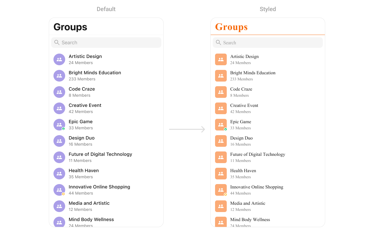
1. Groups Style
Enhance your Groups Component by setting the GroupsStyle to customize its appearance.
Group level styling
- Swift
let customAvatarStyle = AvatarStyle()
customAvatarStyle.backgroundColor = UIColor(hex: "#FBAA75")
customAvatarStyle.cornerRadius = CometChatCornerStyle(cornerRadius: 8)

CometChatGroups.style.titleColor = UIColor(hex: "#F76808")
CometChatGroups.style.titleFont = UIFont(name: "Times-New-Roman", size: 34)
CometChatGroups.avatarStyle = customAvatarStyle
Instance level styling
- Swift
let customAvatarStyle = AvatarStyle()
customAvatarStyle.backgroundColor = UIColor(hex: "#FBAA75")
customAvatarStyle.cornerRadius = CometChatCornerStyle(cornerRadius: 20)

let groupStyle = GroupsStyle()
groupStyle.titleColor = UIColor(hex: "#F76808")
groupStyle.titleFont = UIFont(name: "Times-New-Roman", size: 34)

let customGroup = CometChatGroups()
customGroup.style = groupStyle
customGroup.avatarStyle = customAvatarStyle
| Property | Description | Code |
|---|---|---|
| List Item Selected Image | Check box image when a list item is selected. | listItemSelectedImage |
| List Item Deselected Image | Check box image when a list item is deselected. | listItemDeSelectedImage |
| Search Icon Tint Color | Tint color for the search icon, defaults to the secondary icon color from CometChatTheme. | searchIconTintColor |
| Search Bar Style | Style of the search bar, defaulting to the standard style. | searchBarStyle |
| Search Tint Color | Tint color for the search bar, defaults to the primary color from CometChatTheme. | searchTintColor |
| Search Bar Tint Color | Background color of the search bar, defaulting to clear. | searchBarTintColor |
| Search Bar Placeholder Text Color | Placeholder text color for the search bar, defaults to the tertiary text color from CometChatTheme. | searchBarPlaceholderTextColor |
| Search Bar Placeholder Text Font | Font used for the placeholder text in the search bar, defaults to regular body font. | searchBarPlaceholderTextFont |
| Search Bar Text Color | Color of the text entered in the search bar, defaults to the primary text color from CometChatTheme. | searchBarTextColor |
| Search Bar Text Font | Font used for the text in the search bar, defaults to regular body font. | searchBarTextFont |
| Search Bar Background Color | Background color of the search bar, defaults to a specific background color from CometChatTheme. | searchBarBackgroundColor |
| Search Bar Cancel Icon Tint Color | Tint color for the cancel icon in the search bar, defaults to the primary color from CometChatTheme. | searchBarCancelIconTintColor |
| Search Bar Cross Icon Tint Color | Tint color for the cross icon in the search bar, defaults to the secondary icon color from CometChatTheme. | searchBarCrossIconTintColor |
| Background Color | Background color of the overall view, defaults to a specific background color from CometChatTheme. | backgroundColor |
| Border Width | Width of the border around the view, defaults to 0 (no border). | borderWidth |
| Border Color | Color of the border around the view, defaults to clear. | borderColor |
| Corner Radius | Corner radius settings for the view, defaults to no corner radius. | cornerRadius |
| Title Color | Color for the title text, defaults to the primary text color from CometChatTheme. | titleColor |
| Title Font | Font used for the title text, defaults to nil (not set). | titleFont |
| Large Title Color | Color for the large title text, defaults to the primary text color from CometChatTheme. | largeTitleColor |
| Large Title Font | Font used for the large title text, defaults to nil (not set). | largeTitleFont |
| Navigation Bar Tint Color | Background color of the navigation bar, defaults to a specific background color from CometChatTheme. | navigationBarTintColor |
| Navigation Bar Items Tint Color | Tint color for items in the navigation bar, defaults to the highlight color from CometChatTheme. | navigationBarItemsTintColor |
| Error Title Text Font | Font used for the error title text, defaults to a bold heading 3 font from CometChatTypography. | errorTitleTextFont |
| Error Title Text Color | Color of the error title text, defaults to the primary text color from CometChatTheme. | errorTitleTextColor |
| Error Subtitle Font | Font used for the error subtitle text, defaults to regular body font. | errorSubTitleFont |
| Error Subtitle Text Color | Color of the error subtitle text, defaults to the secondary text color from CometChatTheme. | errorSubTitleTextColor |
| Retry Button Text Color | Color for the retry button text, defaults to button text color from CometChatTheme. | retryButtonTextColor |
| Retry Button Text Font | Font used for the retry button text, defaults to medium button font from CometChatTypography. | retryButtonTextFont |
| Retry Button Background Color | Background color for the retry button, defaults to the primary color from CometChatTheme. | retryButtonBackgroundColor |
| Retry Button Border Color | Border color for the retry button, defaults to clear. | retryButtonBorderColor |
| Retry Button Border Width | Width of the border around the retry button, defaults to 0 (no border). | retryButtonBorderWidth |
| Retry Button Corner Radius | Corner radius settings for the retry button, defaults to a specific corner radius from CometChatSpacing. | retryButtonCornerRadius |
| Empty State Title Font | Font used for the empty state title text, defaults to a bold heading 3 font from CometChatTypography. | emptyTitleTextFont |
| Empty State Title Color | Color of the empty state title text, defaults to the primary text color from CometChatTheme. | emptyTitleTextColor |
| Empty State Subtitle Font | Font used for the empty state subtitle text, defaults to regular body font. | emptySubTitleFont |
| Empty State Subtitle Color | Color of the empty state subtitle text, defaults to the secondary text color from CometChatTheme. | emptySubTitleTextColor |
| Table View Separator | Color of the table view separator, defaults to clear. | tableViewSeparator |
| List Item Title Text Color | Color of the title text in list items, defaults to the primary text color from CometChatTheme. | listItemTitleTextColor |
| List Item Title Font | Font used for the title text in list items, defaults to medium heading 4 font from CometChatTypography. | listItemTitleFont |
| List Item Subtitle Text Color | Color of the subtitle text in list items, defaults to the secondary text color from CometChatTheme. | listItemSubTitleTextColor |
| List Item Subtitle Font | Font used for the subtitle text in list items, defaults to regular body font. | listItemSubTitleFont |
| List Item Background | Background color for list items, defaults to clear. | listItemBackground |
| List Item Selected Background | Background color for list items if selected, defaults to clear. | listItemSelectedBackground |
| List Item Border Width | Width of the border around list items, defaults to 0 (no border). | listItemBorderWidth |
| List Item Border Color | Color of the border around list items, defaults to the light border color from CometChatTheme. | listItemBorderColor |
| List Item Corner Radius | Corner radius settings for list items, defaults to no corner radius. | listItemCornerRadius |
| List Item Selection Image Tint | Tint color for the selection image in list items, defaults to the highlight color from CometChatTheme. | listItemSelectionImageTint |
| List Item Deselection Image Tint | Tint color for the deselected image in list items. | listItemDeSelectedImageTint |
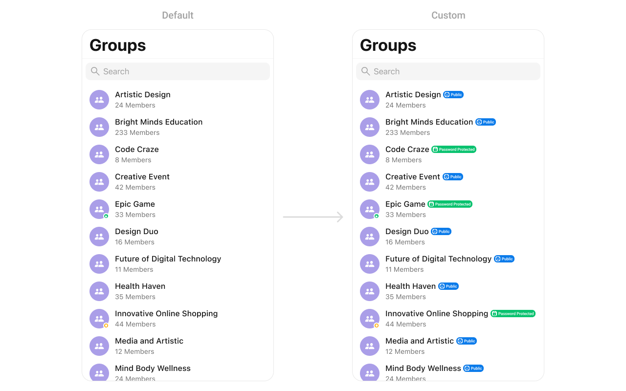
| Password Group Image Tint Color | Tint color for the password group image, defaults to the background color from CometChatTheme. | passwordGroupImageTintColor |
| Password Group Image Background Color | Background color for the password group image, defaults to the warning color from CometChatTheme. | passwordGroupImageBackgroundColor |
| Private Group Image Tint Color | Tint color for the private group image, defaults to the background color from CometChatTheme. | privateGroupImageTintColor |
| Private Group Image Background Color | Background color for the private group image, defaults to the success color from CometChatTheme. | privateGroupImageBackgroundColor |
| Private Group Icon | Image for a private group icon. | privateGroupIcon |
| Protected Group Icon | Image for a protected group icon. | protectedGroupIcon |
Functionality
These are a set of small functional customizations that allow you to fine-tune the overall experience of the component. With these, you can change text, set custom icons, and toggle the visibility of UI elements.
Below is a list of customizations along with corresponding code snippets
| Method | Description | Code |
|---|---|---|
| set(groupsRequestBuilder:) | Sets the request builder for fetching groups. | set(groupsRequestBuilder: requestBuilder) |
| set(searchRequestBuilder:) | Sets the request builder for searching groups. | set(searchRequestBuilder: searchRequestBuilder) |
| set(searchKeyword:) | Sets the search keyword to filter groups. | set(searchKeyword: "group_name") |
| hideErrorView | Hides the error state view. | hideErrorView = true |
| hideNavigationBar | Hides or shows the navigation bar. | hideNavigationBar = true |
| hideSearch | Hides the search bar. | hideSearch = true |
| hideBackButton | Hides the back button. | hideBackButton = true |
| hideLoadingState | Hides the loading state indicator. | hideLoadingState = true |
| hideReceipts | Hides message read/delivery receipts. | hideReceipts = true |
| hideDeleteConversationOption | Hides the option to delete a conversation. | hideDeleteConversationOption = true |
| hideUserStatus | Hides the online/offline status of users. | hideUserStatus = true |
| hideGroupType | Hides the group type (private/public). | hideGroupType = true |
Advanced
For advanced-level customization, you can set custom views to the component. This lets you tailor each aspect of the component to fit your exact needs and application aesthetics. You can create and define your views, layouts, and UI elements and then incorporate those into the component.
SetOptions
You can define custom options for each group using .set(options:). This method allows you to return an array of CometChatGroupOption based on the group object.
- Swift
cometChatGroups.set(options: { group in
    return [CometChatGroupOptions]
})
AddOptions
You can dynamically add options to groups using .add(options:). This method lets you return additional CometChatGroupOption elements.
- Swift
cometChatGroups.add(options: { group in
    return [ArchiveOption()]
})
SetListItemView
With this function, you can assign a custom ListItem to the groups Component.
- Swift
let cometChatGroups = CometChatGroups()
cometChatGroups.set(listItemView: { group in
    let view = GroupCellView()
    return view
})
Demonstration
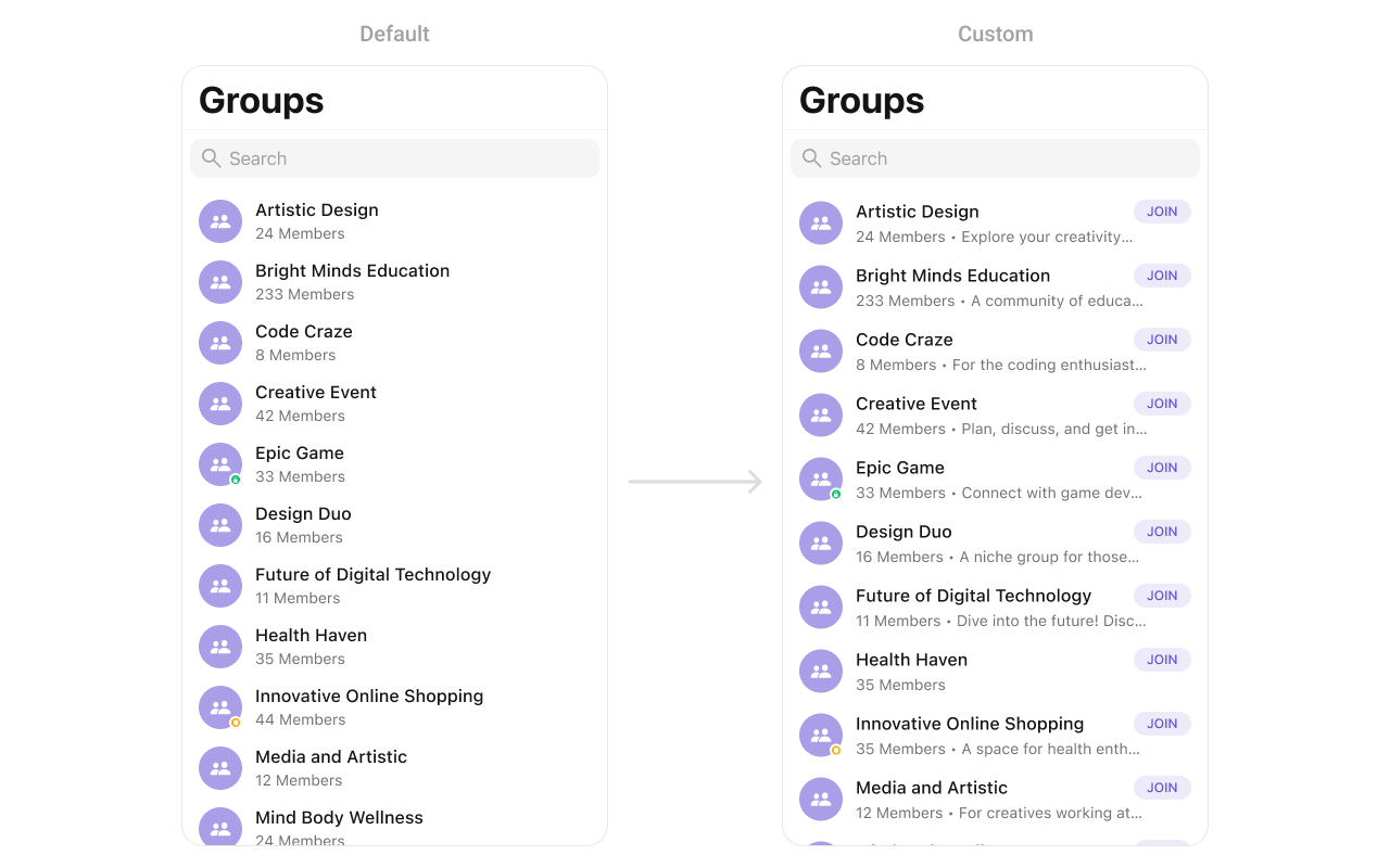
You can create a CustomListItemView as a custom UIView. Which we will inflate in setListItemView()
import UIKit
import CometChatSDK
import CometChatUIKitSwift

class GroupCellView: UIView {

    // MARK: - Properties

    private let avatarImageView: UIImageView = {
        let imageView = UIImageView()
        imageView.translatesAutoresizingMaskIntoConstraints = false
        imageView.contentMode = .scaleAspectFit
        imageView.layer.cornerRadius = 20 // Circular avatar
        imageView.clipsToBounds = true
        return imageView
    }()

    private let titleLabel: UILabel = {
        let label = UILabel()
        label.translatesAutoresizingMaskIntoConstraints = false
        label.font = UIFont.systemFont(ofSize: 16, weight: .bold)
        label.textColor = .black
        label.numberOfLines = 1
        return label
    }()

    private let subtitleLabel: UILabel = {
        let label = UILabel()
        label.translatesAutoresizingMaskIntoConstraints = false
        label.font = UIFont.systemFont(ofSize: 14, weight: .regular)
        label.textColor = .darkGray
        label.numberOfLines = 1
        return label
    }()

    private let joinButton: UIButton = {
        let button = UIButton(type: .system)
        button.translatesAutoresizingMaskIntoConstraints = false
        button.setTitle("JOIN", for: .normal)
        button.setTitleColor(.systemBlue, for: .normal)
        button.titleLabel?.font = UIFont.systemFont(ofSize: 14, weight: .bold)
        button.layer.cornerRadius = 12
        button.layer.borderWidth = 1
        button.layer.borderColor = UIColor.systemBlue.cgColor
        button.clipsToBounds = true
        return button
    }()

    // MARK: - Initializers

    override init(frame: CGRect) {
        super.init(frame: frame)
        setupView()
    }

    required init?(coder: NSCoder) {
        super.init(coder: coder)
        setupView()
    }

    // MARK: - Setup

    private func setupView() {
        // Add subviews
        addSubview(avatarImageView)
        addSubview(titleLabel)
        addSubview(subtitleLabel)
        addSubview(joinButton)

        // Constraints for avatarImageView
        NSLayoutConstraint.activate([
            avatarImageView.leadingAnchor.constraint(equalTo: leadingAnchor, constant: 16),
            avatarImageView.centerYAnchor.constraint(equalTo: centerYAnchor),
            avatarImageView.widthAnchor.constraint(equalToConstant: 40),
            avatarImageView.heightAnchor.constraint(equalToConstant: 40)
        ])

        // Constraints for titleLabel
        NSLayoutConstraint.activate([
            titleLabel.leadingAnchor.constraint(equalTo: avatarImageView.trailingAnchor, constant: 12),
            titleLabel.topAnchor.constraint(equalTo: topAnchor, constant: 8),
            titleLabel.trailingAnchor.constraint(lessThanOrEqualTo: joinButton.leadingAnchor, constant: -8)
        ])

        // Constraints for subtitleLabel
        NSLayoutConstraint.activate([
            subtitleLabel.leadingAnchor.constraint(equalTo: avatarImageView.trailingAnchor, constant: 12),
            subtitleLabel.topAnchor.constraint(equalTo: titleLabel.bottomAnchor, constant: 4),
            subtitleLabel.trailingAnchor.constraint(lessThanOrEqualTo: joinButton.leadingAnchor, constant: -8),
            subtitleLabel.bottomAnchor.constraint(equalTo: bottomAnchor, constant: -8)
        ])

        // Constraints for joinButton
        NSLayoutConstraint.activate([
            joinButton.trailingAnchor.constraint(equalTo: trailingAnchor, constant: -16),
            joinButton.centerYAnchor.constraint(equalTo: centerYAnchor),
            joinButton.widthAnchor.constraint(equalToConstant: 60),
            joinButton.heightAnchor.constraint(equalToConstant: 24)
        ])
    }

    // MARK: - Configuration

    func configure(avatar: UIImage?, title: String, subtitle: String, isJoined: Bool) {
        avatarImageView.image = avatar
        titleLabel.text = title
        subtitleLabel.text = subtitle
        joinButton.setTitle(isJoined ? "JOINED" : "JOIN", for: .normal)
        joinButton.setTitleColor(isJoined ? .gray : .systemBlue, for: .normal)
        joinButton.layer.borderColor = isJoined ? UIColor.gray.cgColor : UIColor.systemBlue.cgColor
    }
}
SetLeadingView
You can modify the leading view of a group cell using .set(leadingView:).
- Swift
cometChatGroups.set(leadingView: { group in
    let view = CustomLeadingView()
    return view
})
Demonstration
You can create a CustomLeadingView as a custom UIView. Which we will inflate in setLeadingView()
- Swift
import UIKit

class CustomLeadingView: UIView {

    private let iconImageView: UIImageView = {
        let imageView = UIImageView(image: UIImage(systemName: "person.2.fill"))
        imageView.tintColor = .white
        imageView.contentMode = .scaleAspectFit
        return imageView
    }()

    private let joinButton: UIButton = {
        let button = UIButton()
        button.setTitle("Join", for: .normal)
        button.setTitleColor(.white, for: .normal)
        button.titleLabel?.font = UIFont.systemFont(ofSize: 14, weight: .bold)
        button.backgroundColor = .orange
        button.layer.cornerRadius = 8
        return button
    }()

    override init(frame: CGRect) {
        super.init(frame: frame)
        setupView()
    }

    required init?(coder: NSCoder) {
        fatalError("init(coder:) has not been implemented")
    }

    private func setupView() {
        backgroundColor = .purple
        layer.cornerRadius = 12

        addSubview(iconImageView)
        addSubview(joinButton)

        iconImageView.translatesAutoresizingMaskIntoConstraints = false
        joinButton.translatesAutoresizingMask
    }
}
SetTitleView
You can customize the title view of a group cell using .set(titleView:).
- Swift
cometChatGroups.set(titleView: { group in
    let view = CustomTitleView()
    return view
})
Demonstration
You can create a CustomTitleView as a custom UIView. Which we will inflate in setTitleView()
- Swift
 class CustomTitleView: UIView {

    private let titleLabel: UILabel = {
        let label = UILabel()
        label.text = "Artistic Design"
        label.font = UIFont.systemFont(ofSize: 16, weight: .medium)
        label.textColor = .black
        return label
    }()

    private let publicBadge: UIView = {
        let view = UIView()
        view.backgroundColor = .blue
        view.layer.cornerRadius = 10

        let icon = UIImageView(image: UIImage(systemName: "person.3.fill"))
        icon.tintColor = .white
        icon.contentMode = .scaleAspectFit

        let label = UILabel()
        label.text = "Public"
        label.font = UIFont.systemFont(ofSize: 12, weight: .bold)
        label.textColor = .white

        let stackView = UIStackView(arrangedSubviews: [icon, label])
        stackView.spacing = 4
        stackView.alignment = .center
        stackView.translatesAutoresizingMaskIntoConstraints = false

        view.addSubview(stackView)

        NSLayoutConstraint.activate([
            stackView.centerXAnchor.constraint(equalTo: view.centerXAnchor),
            stackView.centerYAnchor.constraint(equalTo: view.centerYAnchor),
            view.widthAnchor.constraint(equalToConstant: 60),
            view.heightAnchor.constraint(equalToConstant: 20)
        ])

        return view
    }()

    override init(frame: CGRect) {
        super.init(frame: frame)
        setupView()
    }

    required init?(coder: NSCoder) {
        fatalError("init(coder:) has not been implemented")
    }

    private func setupView() {
        addSubview(titleLabel)
        addSubview(publicBadge)

        titleLabel.translatesAutoresizingMaskIntoConstraints = false
        publicBadge.translatesAutoresizingMaskIntoConstraints = false

        NSLayoutConstraint.activate([
            titleLabel.leadingAnchor.constraint(equalTo: leadingAnchor),
            titleLabel.centerYAnchor.constraint(equalTo: centerYAnchor),

            publicBadge.leadingAnchor.constraint(equalTo: titleLabel.trailingAnchor, constant: 6),
            publicBadge.centerYAnchor.constraint(equalTo: centerYAnchor)
        ])
    }
}
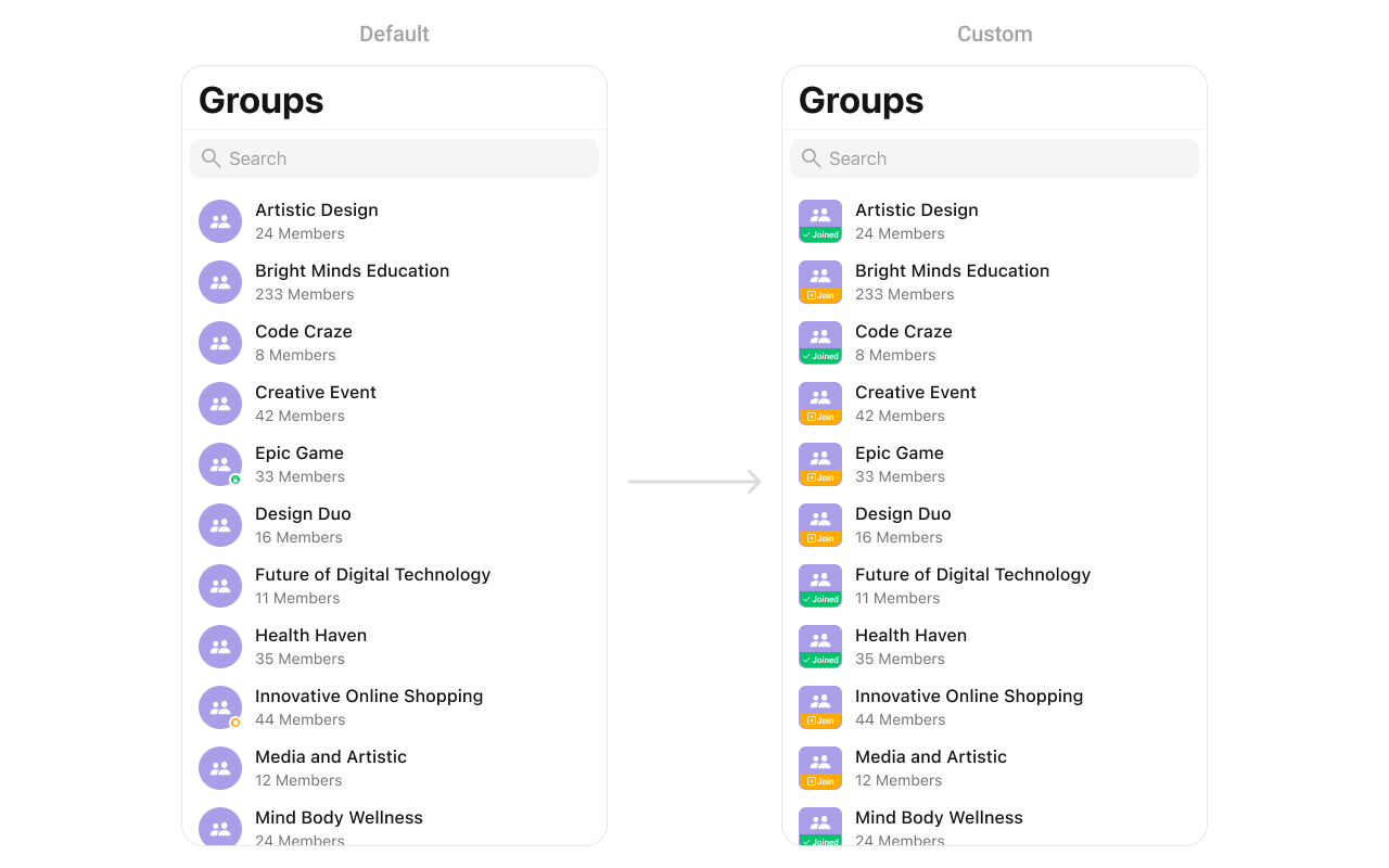
SetTrailView
You can modify the trailing view of a group cell using .set(trailView:).
- Swift
cometChatGroups.set(trailView: { group in
    let view = CustomTrailView()
    return view
})
Demonstration
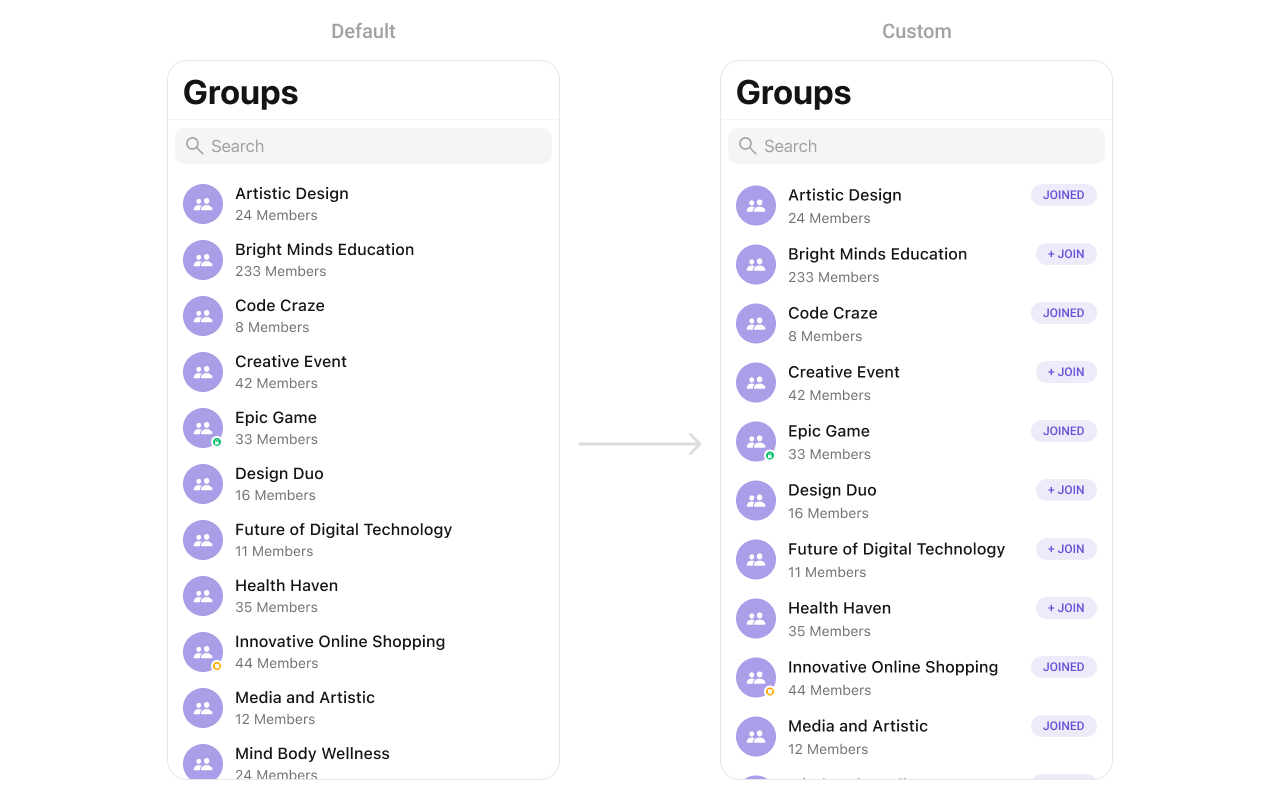
You can create a CustomTrailView as a custom UIView. Which we will inflate in setTrailView()
- Swift
 import UIKit

class CustomTrailView: UIView {

    private let joinedLabel: UILabel = {
        let label = UILabel()
        label.text = "JOINED"
        label.font = UIFont.systemFont(ofSize: 14, weight: .bold)
        label.textColor = UIColor.purple
        return label
    }()

    override init(frame: CGRect) {
        super.init(frame: frame)
        setupView()
    }

    required init?(coder: NSCoder) {
        fatalError("init(coder:) has not been implemented")
    }

    private func setupView() {
        backgroundColor = UIColor.purple.withAlphaComponent(0.1)
        layer.cornerRadius = 16

        addSubview(joinedLabel)
        joinedLabel.translatesAutoresizingMaskIntoConstraints = false

        NSLayoutConstraint.activate([
            joinedLabel.centerXAnchor.constraint(equalTo: centerXAnchor),
            joinedLabel.centerYAnchor.constraint(equalTo: centerYAnchor),
            widthAnchor.constraint(equalToConstant: 80),
            heightAnchor.constraint(equalToConstant: 32)
        ])
    }
}
SetSubTitleView
You can customize the subtitle view for each group item to meet your requirements
- Swift
cometChatGroup.set(subtitleView: { group in
   let view = CustomSubtitleView()
   return view
})
Example
Demonstration
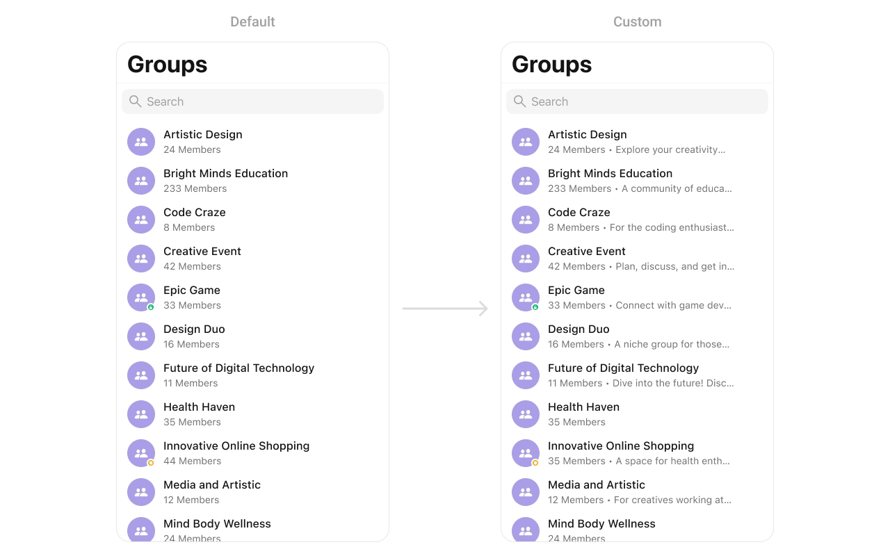
You can seamlessly integrate this CustomSubtitleView UIView file into the .set(subtitleView:) method within CometChatGroups.
- Swift
import UIKit

class CustomSubtitleView: UILabel {

    init(membersCount: Int) {
        super.init(frame: .zero)
        self.text = "\(membersCount) members • \("group_description")"
        self.textColor = UIColor.gray
        self.font = UIFont.systemFont(ofSize: 14)
        self.numberOfLines = 1
    }

    required init?(coder: NSCoder) {
        fatalError("init(coder:) has not been implemented")
    }
}
SetLoadingView
You can set a custom loading view using .set(loadingView:). This method accepts a UIView to display while data is being fetched.
- Swift
let loadingIndicator = UIActivityIndicatorView(style: .medium)
loadingIndicator.startAnimating()
cometChatGroups.set(loadingView: loadingIndicator)
SetErrorView
You can customize the error view using .set(errorView:). This method accepts a UIView that appears when an error occurs.
- Swift
let errorLabel = UILabel()
errorLabel.text = "Something went wrong!"
errorLabel.textColor = .red
cometChatGroups.set(errorView: errorLabel)
SetEmptyView
You can customize the empty state view using .set(emptyView:). This method accepts a UIView that appears when no groups are available.
- Swift
let emptyLabel = UILabel()
emptyLabel.text = "No groups found"
emptyLabel.textColor = .gray
emptyLabel.textAlignment = .center
cometChatGroups.set(emptyView: emptyLabel)