Overview
MessageHeader is a Component that showcases the User or Group details in the toolbar. Furthermore, it also presents a typing indicator and a back navigation button for ease of use.

MessageHeader is comprised of the following components:
| Components | Description |
|---|---|
| ListItem Component | This component’s view consists of avatar, status indicator , title, and subtitle. The fields are then mapped with the SDK’s user, group class. |
| Back Button | BackButton that allows users to navigate back from the current activity or screen to the previous one |
Usage
Integration
You can addMessageHeader component directly by setting the user.
Swift
Actions
Actions dictate how a component functions. They are divided into two types: Predefined and User-defined. You can override either type, allowing you to tailor the behavior of the component to fit your specific needs. TheMessageHeader component does not have any exposed actions.
1. set(onBack:)
Thisset(onBack:) method becomes valuable when a user needs to override the action triggered upon pressing the back button in CometChatMessageHeader.
- Swift
2. set(onError:)
This method proves helpful when a user needs to customize the action taken upon encountering an error in CometChatMessageHeader.- Swift
Filters
Filters allow you to customize the data displayed in a list within aComponent. You can filter the list based on your specific criteria, allowing for a more customized. Filters can be applied using RequestBuilders of Chat SDK.
The MessageHeader component does not have any exposed filters.
Events
Events are emitted by aComponent. By using event you can extend existing functionality. Being global events, they can be applied in Multiple Locations and are capable of being Added or Removed.
The MessageHeader component does not produce any events.
Customization
To fit your app’s design requirements, you can customize the appearance of the conversation component. We provide exposed methods that allow you to modify the experience and behavior according to your specific needs.Style
Using Style you can customize the look and feel of the component in your app, These parameters typically control elements such as the color, size, shape, and fonts used within the component.1. MessageHeader Style
To customize the appearance, you can assign aMessageHeaderStyle object to the MessageHeader component.
Global level styling
- Swift
- Swift
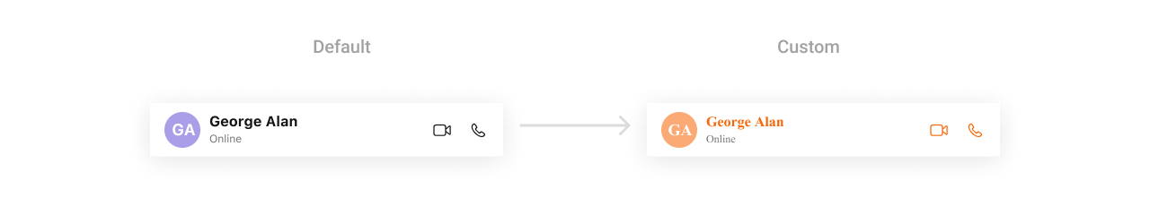
MessageHeaderStyle are as follows:
| Property | Description | Code |
|---|---|---|
| Title Text Color | Used to set the text color of the header title. | CometChatMessageHeader.style.titleTextColor = UIColor.black |
| Title Text Font | Used to set the font style of the header title. | CometChatMessageHeader.style.titleTextFont = UIFont.boldSystemFont(ofSize: 18) |
| Subtitle Text Color | Used to set the text color of the subtitle in the header. | CometChatMessageHeader.style.subtitleTextColor = UIColor.gray |
| Subtitle Text Font | Used to set the font style of the subtitle in the header. | CometChatMessageHeader.style.subtitleTextFont = UIFont.systemFont(ofSize: 14) |
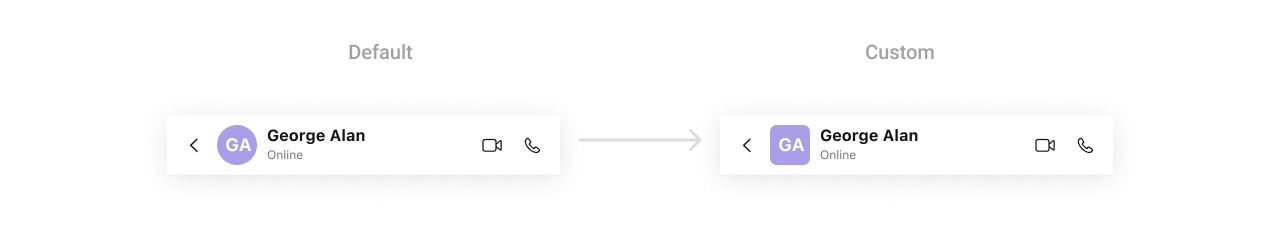
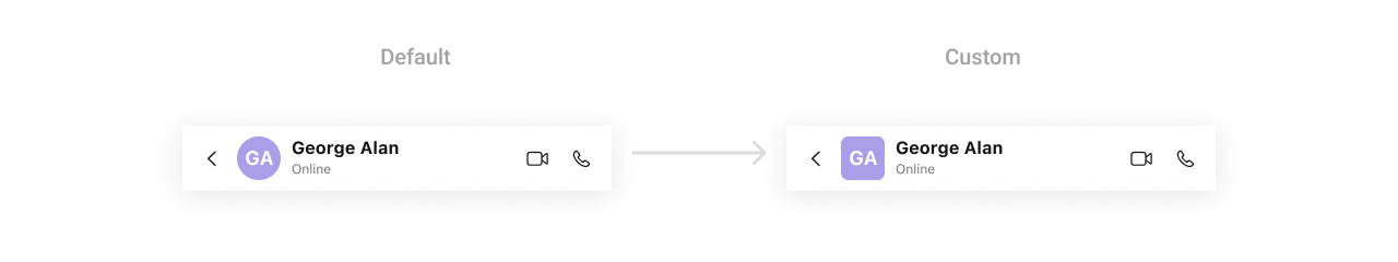
| Back Button Image Tint Color | Used to set the tint color of the back button image in the header. | CometChatMessageHeader.style.backButtonImageTintColor = UIColor.blue |
| Private Group Badge Tint Color | Used to set the tint color of the private group badge in the header. | CometChatMessageHeader.style.privateGroupBadgeImageTintColor = UIColor.green |
| Password-Protected Badge Tint Color | Used to set the tint color of the password-protected group badge in the header. | CometChatMessageHeader.style.passwordProtectedGroupBadgeImageTintColor = UIColor.orange |
| Private Group Background Color | Used to set the background color of the private group badge. | CometChatMessageHeader.style.privateGroupImageBackgroundColor = UIColor.lightGray |
| Password-Protected Background Color | Used to set the background color of the password-protected group badge. | CometChatMessageHeader.style.passwordGroupImageBackgroundColor = UIColor.red |
| Group Image Background Color | Used to set the background color for group icons in the header. | CometChatMessageHeader.style.groupImageBackgroundColor = UIColor.clear |
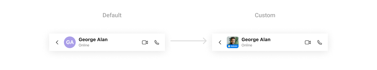
| Avatar Style | Used to customize the appearance of the avatar in the header. | CometChatMessageHeader.style.avatarStyle = customAvatarStyle |
| Background Color | Used to set the background color of the header. | CometChatMessageHeader.style.backgroundColor = UIColor.white |
| Corner Radius | Used to set the corner radius of the header. | CometChatMessageHeader.style.cornerRadius = CometChatCornerStyle(cornerRadius: 8) |
| Border Width | Used to set the border width of the header. | CometChatMessageHeader.style.borderWidth = 2 |
| Border Color | Used to set the border color of the header. | CometChatMessageHeader.style.borderColor = UIColor.gray |
| Back Button Icon | Used to set a custom icon for the back button. | CometChatMessageHeader.style.backButtonIcon = UIImage(named: "customBackIcon") |
| Private Group Icon | Used to set a custom icon for private groups. | CometChatMessageHeader.style.privateGroupIcon = UIImage(named: "privateIcon") |
| Protected Group Icon | Used to set a custom icon for password-protected groups. | CometChatMessageHeader.style.protectedGroupIcon = UIImage(named: "protectedIcon") |
| Background Image | Used to set a background image for the header. | CometChatMessageHeader.style.backgroundImage = UIImage(named: "headerBackground") |
| New Chat Icon | Sets a custom icon for the new chat button for AI agent. | CometChatAIAssistantChatHistory.newChatIcon = UIImage(named: "iconName") |
| Chat History Icon | Sets a custom icon for the chat history button for AI agent. | CometChatAIAssistantChatHistory.chatHistoryIcon = UIImage(named: "iconName") |
2. Avatar Style
If you want to apply customized styles to theAvatar component within the MessageHeader Component, you can use the following code snippet. For more information you can refer Avatar Styles.
Global level styling
- Swift
- Swift
Functionality
These are a set of small functional customizations that allow you to fine-tune the overall experience of the component. With these, you can change text, set custom icons, and toggle the visibility of UI elements. Below is a list of customizations along with corresponding code snippets| Method | Description | Code |
|---|---|---|
| set(user:User) | Sets message header for CometChat user. | .set(user:User) |
| set(group:Group) | Sets message header for CometChat group. | .set(group:Group) |
| hideBackButton | Hides the back button of message header. | hideBackButton = true |
| hideUserStatus | Hides or shows the user status of user(online/offline/last active at). | hideUserStatus = true |
| hideVideoCallButton | Hides the video call button. | hideVideoCallButton = true |
| hideVoiceCallButton | Hides the voice call button. | hideVoiceCallButton = true |
| hideChatHistoryButton | Hides the chat history button in the component. | CometChatAIAssistantChatHistory.hideChatHistoryButton = true |
| hideNewChatButton | Hides the new chat button in the component for AI agent. | CometChatAIAssistantChatHistory.hideNewChatButton = true |
| onNewChatButtonClicked | Used to handle actions when the “New Chat” button is clicked. | CometChatAIAssistantChatHistory.set(onNewChatButtonClicked: { user in }) |
| onMessageClicked | Used to handle actions when a message is clicked. | CometChatAIAssistantChatHistory.set(onMessageClicked: { message in }) |
Advanced
For advanced-level customization, you can set custom views to the component. This lets you tailor each aspect of the component to fit your exact needs and application aesthetics. You can create and define your views, layouts, and UI elements and then incorporate those into the component.Date Time Formatter
The CometChatMessageHeader component supports full customization of how date and time are displayed using the CometChatDateTimeFormatter. This enables developers to localize, format, or personalize the date and time strings shown next to the message header such as “Today”, “Yesterday”, “12:45 PM”, etc.- Component-Level (Global)
- Swift
- Instance-Level (Local)
- Swift
Available closures
| Property | Description | Code |
|---|---|---|
| time | Called to format a timestamp as a standard time (e.g., “12:30 PM”). | CometChatMessageHeader.dateTimeFormatter.time = { ... } |
| today | Called when rendering messages sent today. | CometChatMessageHeader.dateTimeFormatter.today = { ... } |
| yesterday | Called for yesterday’s messages. | CometChatMessageHeader.dateTimeFormatter.yesterday = { ... } |
| lastweek | Called for messages within the last week. | CometChatMessageHeader.dateTimeFormatter.lastweek = { ... } |
| otherDay | Called for dates older than last week. | CometChatMessageHeader.dateTimeFormatter.otherDay = { ... } |
| minute | Called when referring to “a minute ago”. | CometChatMessageHeader.dateTimeFormatter.minute = { ... } |
| minutes | Called for “x minutes ago”. | CometChatMessageHeader.dateTimeFormatter.minutes = { ... } |
| hour | Called for “an hour ago”. | CometChatMessageHeader.dateTimeFormatter.hour = { ... } |
| hours | Called for “x hours ago”. | CometChatMessageHeader.dateTimeFormatter.hours = { ... } |
SetListItemView
With this function, you can assign a custom ListItem to the message header Component.- Swift
CustomListItemView as a custom UIView. Which we will inflate in setListItemView()
swift
SetLeadingView
You can modify the leading view of a group cell using .set(leadingView:).- Swift
CustomLeadingView as a custom UIView. Which we will inflate in setLeadingView()
- Swift
SetTitleView
You can customize the title view of a group cell using .set(titleView:).- Swift
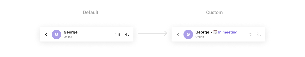
CustomTitleView as a custom UIView. Which we will inflate in setTitleView()
- Swift
SetTrailView
You can modify the trailing view of a message header using .set(trailView:).- Swift
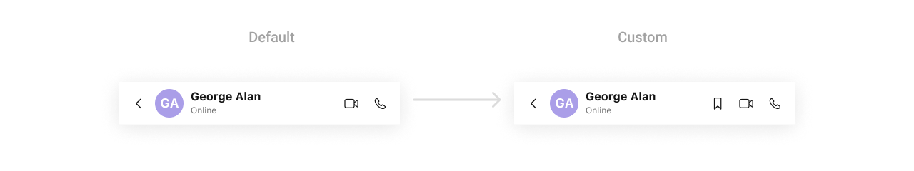
CustomTrailView as a custom UIView. Which we will inflate in setTrailView()
- Swift
SetSubTitleView
You can customize the subtitle view for each group item to meet your requirements- Swift
CustomSubtitleView UIView file into the .set(subtitleView:) method within CometChatMessageHeader.
- Swift
To ensure that the
MessageHeader is properly configured, passing the controller is mandatory.- Swift