Reactions
Overview
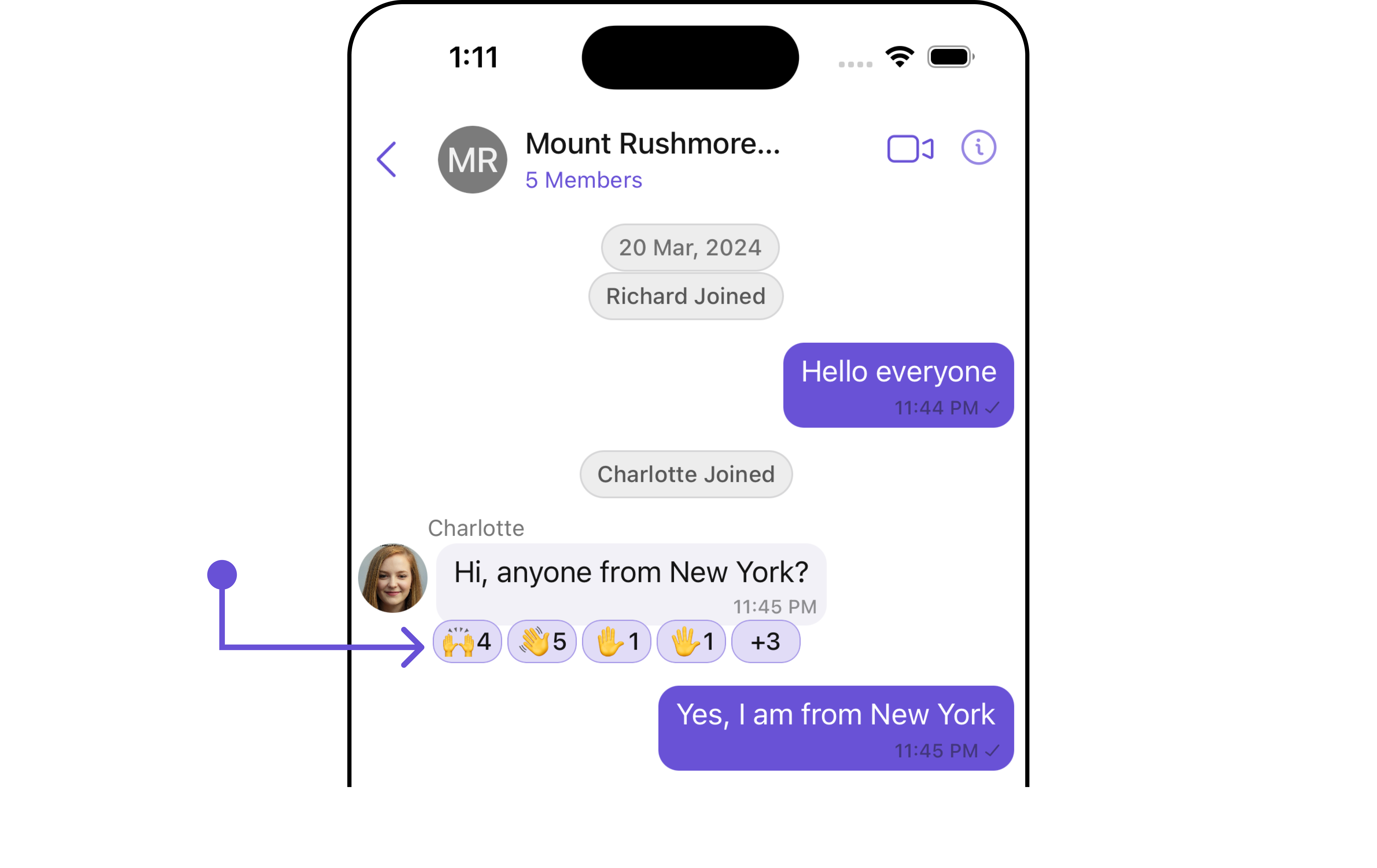
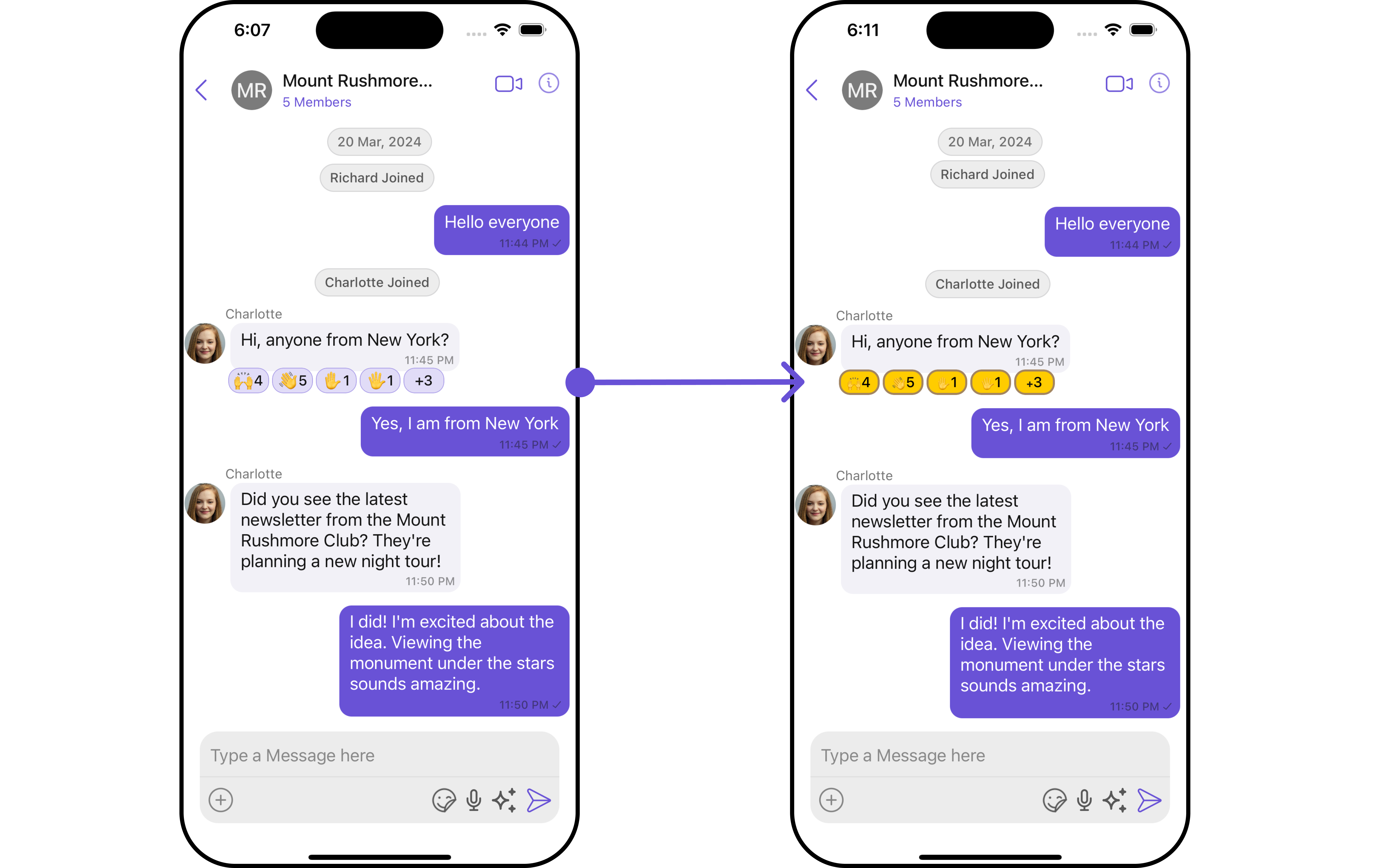
The CometChatReactions component is designed to visually represent the reactions received by a message. Each reaction appears in a horizontal alignment beneath the message to indicate which emojis users have used to react.
The number of visible reactions depends on the width of the view. For example, if a message has 5 reactions but the CometChatReactions view can only accommodate 4 reactions within its width, the first three reactions will be displayed visibly. Additionally, an element will be added at the end of the row to indicate the number of other unique reactions that are not immediately visible. This element informs users of the total count of different reactions beyond those initially shown.
Usage
Integration
The CometChatReactions component is a standard UIView that displays a list of reactions as its children. In the provided UI example, it is utilized within the footer view of the CometChatMessageBubble. However, it is versatile and can be incorporated anywhere a UIView can be placed. The minimum requirement for this component to function is to provide the reactions to display, which can be passed using the baseMessage property.
let cometChatReaction = CometChatReactions()
    .set(message: forMessage)
    .build()

self.addSubViews(cometChatReaction)
Actions
Actions dictate how a component functions. They are divided into two types: Predefined and User-defined. You can override either type, allowing you to tailor the behavior of the component to fit your specific needs.
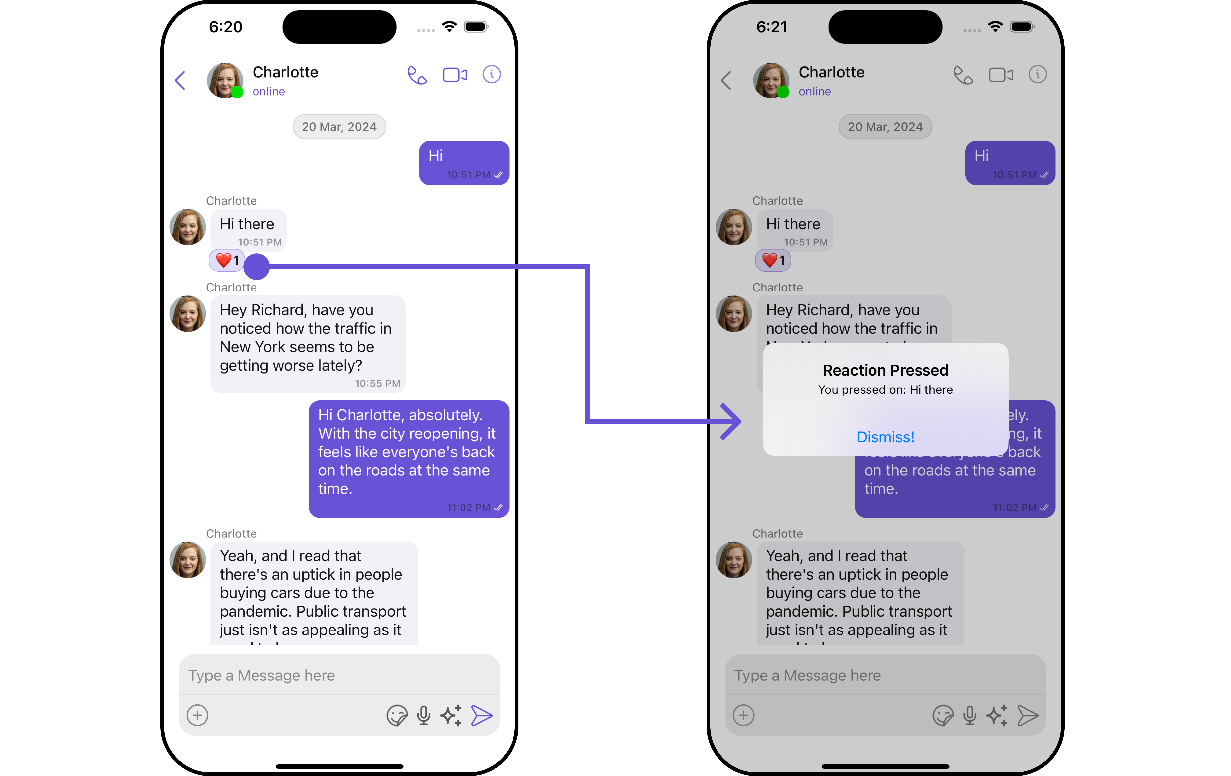
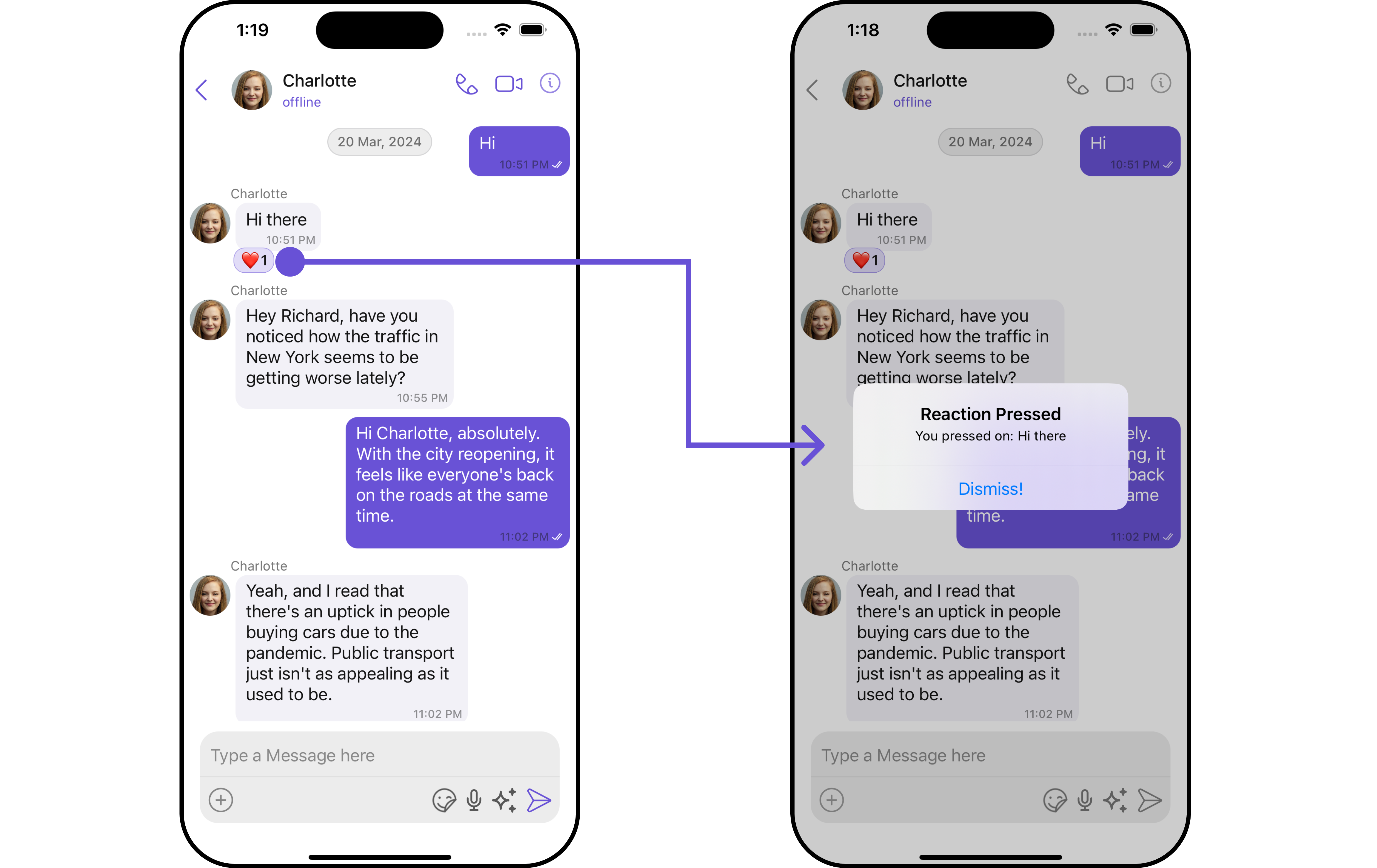
1. onReactionsPressed
The onReactionsPressed event is triggered when a user interacts with a reaction by pressing it, typically to indicate a response or provide feedback.
- Swift
let reactionsConfiguration = ReactionsConfiguration()
.set(onReactionsPressed: { reaction, baseMessage in

})
Example
In this example, we are using the onReactionsPressed action.
let reactionsConfiguration = ReactionsConfiguration()
    .set(onReactionsPressed: { reaction, baseMessage in

let messageText = (baseMessage as? TextMessage)?.text ?? "a message"
let alertController = UIAlertController(title: "Reaction Pressed",
                                        message: "You pressed on: \(messageText)",
                                        preferredStyle: .alert)
alertController.addAction(UIAlertAction(title: "Dismiss!", style: .default, handler: nil))
UIApplication.shared.keyWindow?.rootViewController?.present(alertController, animated: true)
})

let messageListConfiguration = MessageListConfiguration()
    .set(reactionsConfiguration: reactionsConfiguration)

let messagesConfiguration = MessagesConfiguration()
    .set(messageListConfiguration: messageListConfiguration)

let cometChatConversationsWithMessages = CometChatConversationsWithMessages()
            .set(messagesConfiguration: messagesConfiguration)
Filters
Filters empower you to customize the displayed data within a component's list by applying specific criteria. This capability allows for a more tailored and personalized view of the content. Filters are implemented using RequestBuilders of Chat SDK.
The Reactions component does not provide any exposed filtering options.
Events
Events are triggered by a component, enabling you to enhance its functionality. These events are global in scope, making them applicable across multiple areas of your application, and they can be added or removed as required.
The Reactions component does not provide any available events.
Customization
For customization aligned with your app's design, you can adjust the appearance of the Reaction component using our accessible methods. These methods enable you to tailor the experience and behavior to suit your specific needs.
Style
Through Style, you can customize the visual presentation of the component in your app. This includes controlling elements such as color, size, shape, and fonts to achieve the desired look and feel.
1. Reactions Style
The ReactionsStyle class encapsulates properties that facilitate customization of the CometChatReactions component's visual appearance.
- Swift
let reactionsStyle = ReactionsStyle()
    .set(countFont: CometChatTheme.typography.text2)
    .set(reactionBorderWidth: 3)
    .set(background: .black)
Example
Here, we are applying the reactionsStyle to customize the appearance.
let reactionsStyle = ReactionsStyle()
    .set(countColor: .black)
    .set(emojiFont: .monospacedDigitSystemFont(ofSize: 10, weight: .bold))
    .set(reactionBorderWidth: 20)
    .set(activeReactionBackgroundColor: .systemYellow)
    .set(activeReactionBorderColor: .systemBrown)
    .set(activeReactionBorderWidth: 2)

let reactionsConfiguration = ReactionsConfiguration()
    .set(style: reactionsStyle)

let messageListConfiguration = MessageListConfiguration()
    .set(reactionsConfiguration: reactionsConfiguration)

let messagesConfiguration = MessagesConfiguration()
    .set(messageListConfiguration: messageListConfiguration)

let cometChatConversationsWithMessages = CometChatConversationsWithMessages()
    .set(messagesConfiguration: messagesConfiguration)
The following properties are exposed by MessageInformationStyle:
Functionality
These functional customizations provide ways to enhance the component's overall experience. They allow for text modification, custom icon setting, and UI element visibility toggling.
- Swift
let reactionsConfiguration = ReactionsConfiguration()
    .set(style: reactionsStyle)
    .set(reactionAlignment: .right)

let messageListConfiguration = MessageListConfiguration()
    .set(reactionsConfiguration: reactionsConfiguration)

let messagesConfiguration = MessagesConfiguration()
.set(messageListConfiguration: messageListConfiguration)

let cometChatConversationsWithMessages = CometChatConversationsWithMessages()
.set(messagesConfiguration: messagesConfiguration)
Below is a customizations list along with corresponding code snippets
| Property | Description | Code |
|---|---|---|
| onReactionsLongPressed | This callback is triggered when a user long-presses a reaction. | (( reaction: ReactionCount, baseMessage: BaseMessage?) -> ())? |
| onReactionsPressed | This call back get trigger when a add reaction button is clicked. | (( reaction: ReactionCount, baseMessage: BaseMessage?) -> ())? |
| configuration | Used to customize configuration for CometChatReactions.. | ReactionsConfiguration |
Configuration
Configurations offer the ability to customize the properties of each component within a Composite Component.
On Reactions Pressed
If you want to customize the properties of the Reaction onReactionsPressed Component inside Reactions Component, you need use the ReactionsConfiguration object.
- Swift
let reactionsConfiguration = ReactionsConfiguration()
     .set(onReactionsPressed: { reaction, baseMessage in

})
Example
let reactionsConfiguration = ReactionsConfiguration()
    .set(onReactionsPressed: { reaction, baseMessage in

let messageText = (baseMessage as? TextMessage)?.text ?? "a message"
let alertController = UIAlertController(title: "Reaction Pressed",
                                        message: "You pressed on: \(messageText)",
                                        preferredStyle: .alert)
alertController.addAction(UIAlertAction(title: "Dismiss!", style: .default, handler: nil))
UIApplication.shared.keyWindow?.rootViewController?.present(alertController, animated: true)
})

let messageListConfiguration = MessageListConfiguration()
    .set(reactionsConfiguration: reactionsConfiguration)

let messagesConfiguration = MessagesConfiguration()
    .set(messageListConfiguration: messageListConfiguration)

let cometChatConversationsWithMessages = CometChatConversationsWithMessages()
            .set(messagesConfiguration: messagesConfiguration)
In the example above, we are customizing specific properties of the Reactions component using ReactionsConfigurations.
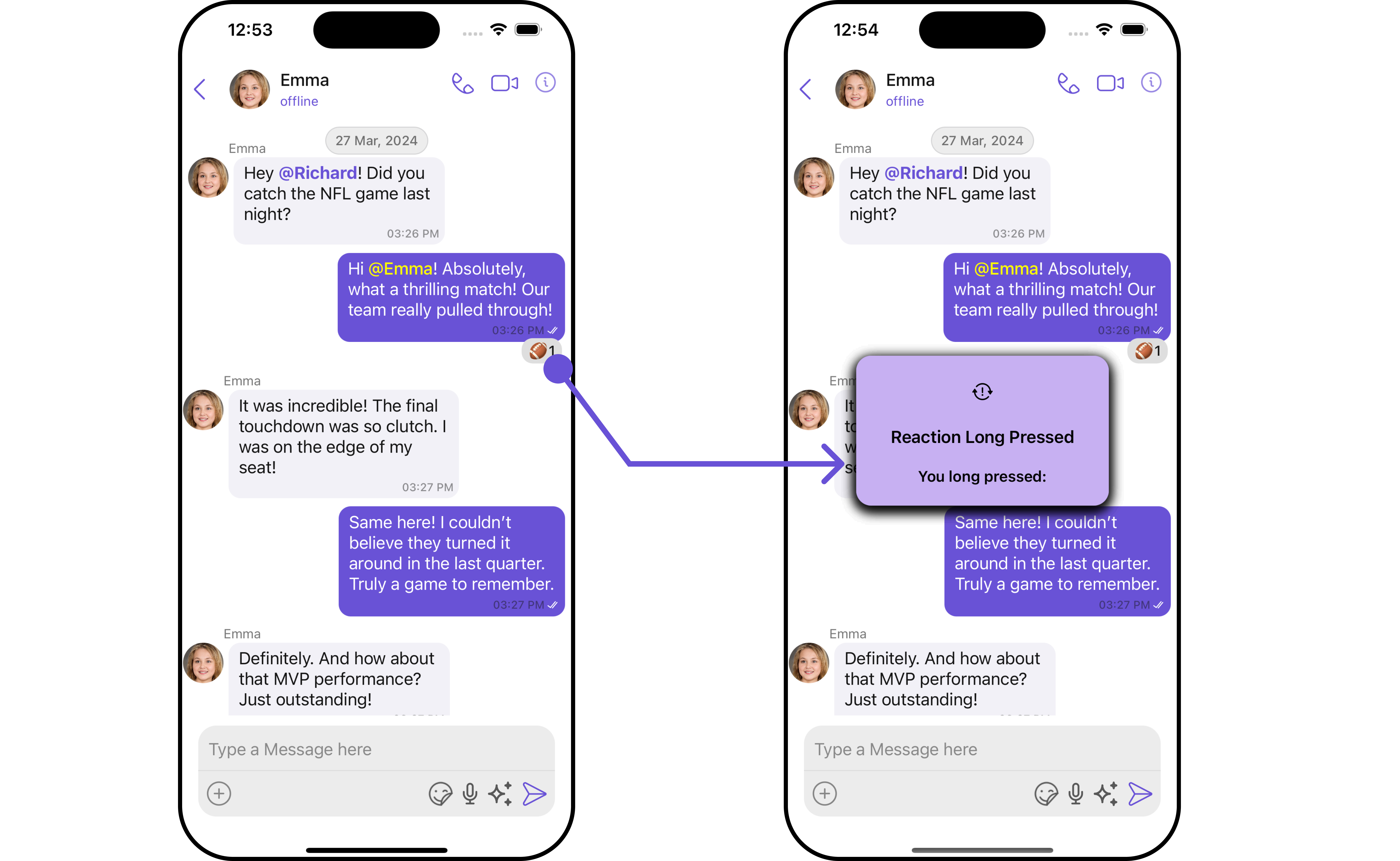
On Reactions LongPressed
If you want to customize the properties of the Reaction onReactionsLongPressed Component inside Reactions Component, you need use the ReactionsConfiguration object.
- Swift
let reactionsConfiguration = ReactionsConfiguration()
    .set (onReactionsLongPressed:{ reaction, baseMessage in

 })
Example
- Swift
import UIKit

class CustomAlertView: UIView {
    let titleLabel: UILabel = {
    let label = UILabel()
        label.textAlignment = .center
        label.font = UIFont.boldSystemFont(ofSize: 17)
        label.textColor = .black
        return label
}()

    let messageLabel: UILabel = {
        let label = UILabel()
        label.textAlignment = .center
        label.font = UIFont.boldSystemFont(ofSize: 15)
        label.textColor = .black
        return label
}()

    let iconImageView: UIImageView = {
    let imageView = UIImageView(image: UIImage(systemName: "exclamationmark.arrow.triangle.2.circlepath"))
        imageView.tintColor = .black
        imageView.contentMode = .scaleAspectFit
        return imageView
 }()

    var timer: Timer?

    init(title: String, message: String, icon: UIImage? = nil) {
            super.init(frame: .zero)
            titleLabel.text = title
            messageLabel.text = message
            if let icon = icon {
                iconImageView.image = icon
            }
        setupView()
}

    required init?(coder: NSCoder) {
        fatalError("init(coder:) has not been implemented")
    }

    func setupView() {
        backgroundColor = .init(red: 0.78, green: 0.69, blue: 0.95, alpha: 1.00)
        layer.cornerRadius = 15
        layer.shadowColor = UIColor.black.cgColor
        layer.shadowOpacity = 0.5
        layer.shadowOffset = CGSize(width: 0, height: 4)
        layer.shadowRadius = 6

        addSubview(iconImageView)
        addSubview(titleLabel)
        addSubview(messageLabel)

        iconImageView.translatesAutoresizingMaskIntoConstraints = false
        titleLabel.translatesAutoresizingMaskIntoConstraints = false
        messageLabel.translatesAutoresizingMaskIntoConstraints = false

        NSLayoutConstraint.activate([
            iconImageView.topAnchor.constraint(equalTo: topAnchor, constant: 20),
            iconImageView.centerXAnchor.constraint(equalTo: centerXAnchor),
            iconImageView.heightAnchor.constraint(equalToConstant: 30),

            titleLabel.topAnchor.constraint(equalTo: iconImageView.bottomAnchor, constant: 20),
            titleLabel.leadingAnchor.constraint(equalTo: leadingAnchor, constant: 20),
            titleLabel.trailingAnchor.constraint(equalTo: trailingAnchor, constant: -20),

            messageLabel.topAnchor.constraint(equalTo: titleLabel.bottomAnchor, constant: 20),
            messageLabel.leadingAnchor.constraint(equalTo: leadingAnchor, constant: 20),
            messageLabel.trailingAnchor.constraint(equalTo: trailingAnchor, constant: -20),

            messageLabel.bottomAnchor.constraint(equalTo: bottomAnchor, constant: -20)
        ])
 }

    func showAlert(in view: UIView) {
        view.addSubview(self)
        translatesAutoresizingMaskIntoConstraints = false
        centerYAnchor.constraint(equalTo: view.centerYAnchor).isActive = true
        centerXAnchor.constraint(equalTo: view.centerXAnchor).isActive = true
        widthAnchor.constraint(equalToConstant: 250).isActive = true
        alpha = 0

        UIView.animate(withDuration: 0.1) { self.alpha = 1 }

        timer?.invalidate()
        timer = Timer.scheduledTimer(withTimeInterval: 2.0, repeats: false) { _ in
          UIView.animate(withDuration: 0.2) {
                self.alpha = 0
            } completion: { _ in
                self.removeFromSuperview()
            }
        }
    }
}
Make sure to pass the CustomAlertView file to ReactionsConfigurations
let reactionsConfiguration = ReactionsConfiguration()
    .set(onReactionsLongPressed: { reaction, baseMessage in
let title = "Reaction Long Pressed"
let message = "You long pressed:"
let alertView = CustomAlertView(title: title, message: message)
    alertView.showAlert(in: UIApplication.shared.keyWindow!)
})

let messageListConfiguration = MessageListConfiguration()
    .set(reactionsConfiguration: reactionsConfiguration)

let messagesConfiguration = MessagesConfiguration()
    .set(messageListConfiguration: messageListConfiguration)

let cometChatConversationsWithMessages = CometChatConversationsWithMessages()
    .set(messagesConfiguration: messagesConfiguration)
In the example above, we are customizing specific properties of the Reactions component using ReactionsConfigurations.