Theme
Overview
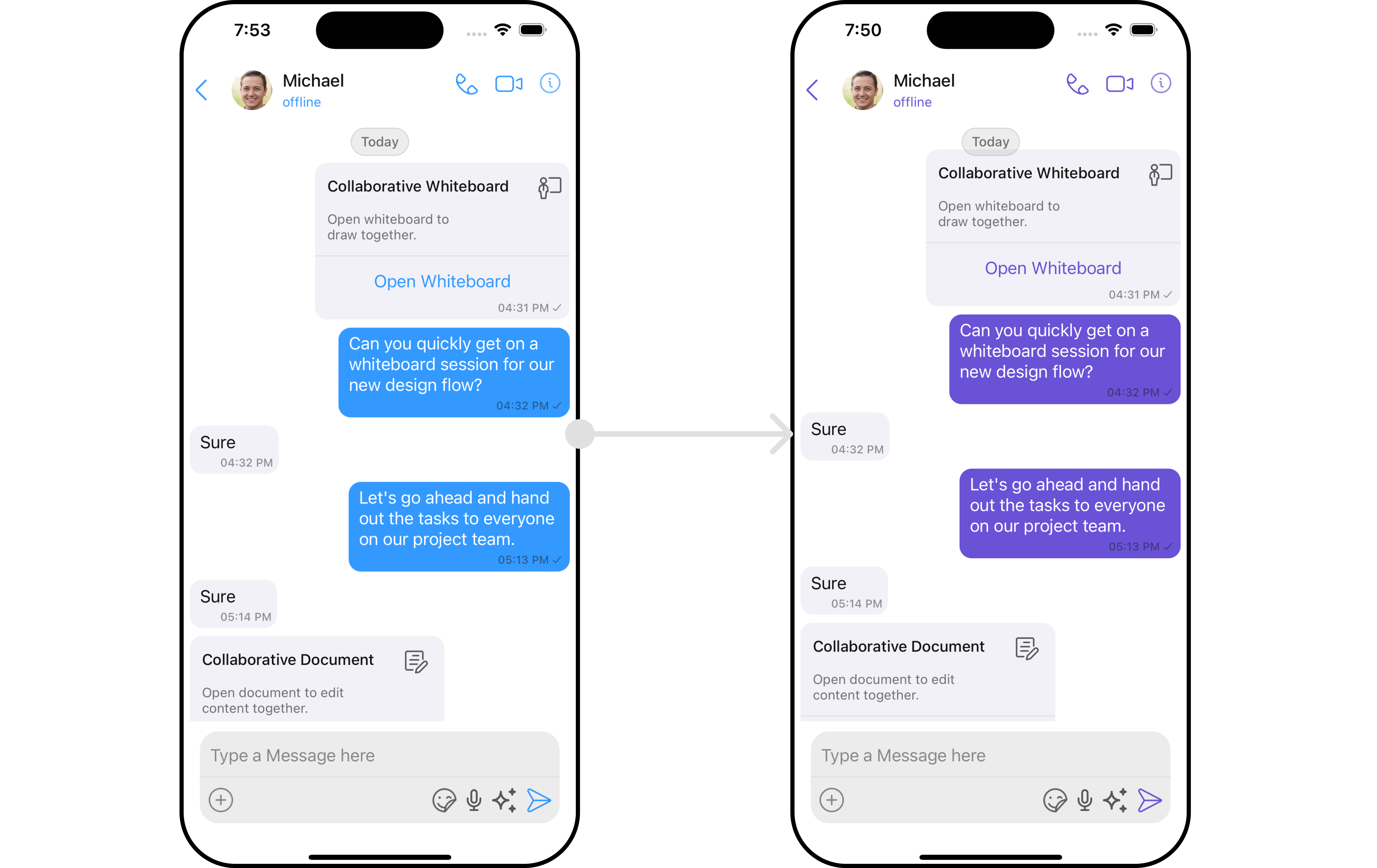
The Theme is a style applied to every component of CometChat. When a style is applied as a theme, every view in the activity or every component in the UiKit will apply each property of the theme that it supports.
CometChat theme comprises two key components: Palette and Typography.
Palette: The Palette is a class that possesses all the color variables with their default values. It can be used to customize the color scheme of the CometChat theme, including background color, primary and secondary colors, error color, and various levels of accent colors.
Typography: Typography, which is also a singleton class, encompasses all the default Text Style's values. It allows you to customize the text appearances throughout the CometChat theme, such as heading, name, titles, subtitles, text, and captions.
Usage
Palette
The CometChat UI kit provides an easy way to customize the visual appearance of your chat application via the Palette class. This class contains several methods that allow you to modify the default color scheme of your app, imparting a unique look and feel that aligns with your branding or design guidelines.
Here's an overview of the different color's available in the Palette class:
| Color | Description |
|---|---|
| background | This color is used for the back drop in each component across UI Kit |
| primary | This color is used for the primary components/actions in components across UI Kit |
| error | This color is used for the destructive components/actions in components across UI Kit |
| accent | This color is used for the secondary components/actions in components across UI Kit |
| accent50 to accent900 | This color is used for the secondary components/actions with a shades of same color manages by the alpha varient(opacity of the color) in components across UI Kit |
Here's an overview of the different methods available in the Palette class:
| Method | Description |
|---|---|
| set(primary: UIColor) | This method will override the color used for primary color set |
| set(background: UIColor) | This method will override the color used for background color set |
| set(error: UIColor) | This method will override the color used for error color set |
| set(accent: UIColor) | This method will override the color used for accent color set |
Example

To modify the palette user has to firstly create an instance of palette.
- swift
var palette = Palette()
After creating a instance user can update the values of colors as shown below:
 palette.set(primary: .white)
 palette.set(background: .darkGray)
 palette.set(accent: .white)
 palette.set(error: .red)

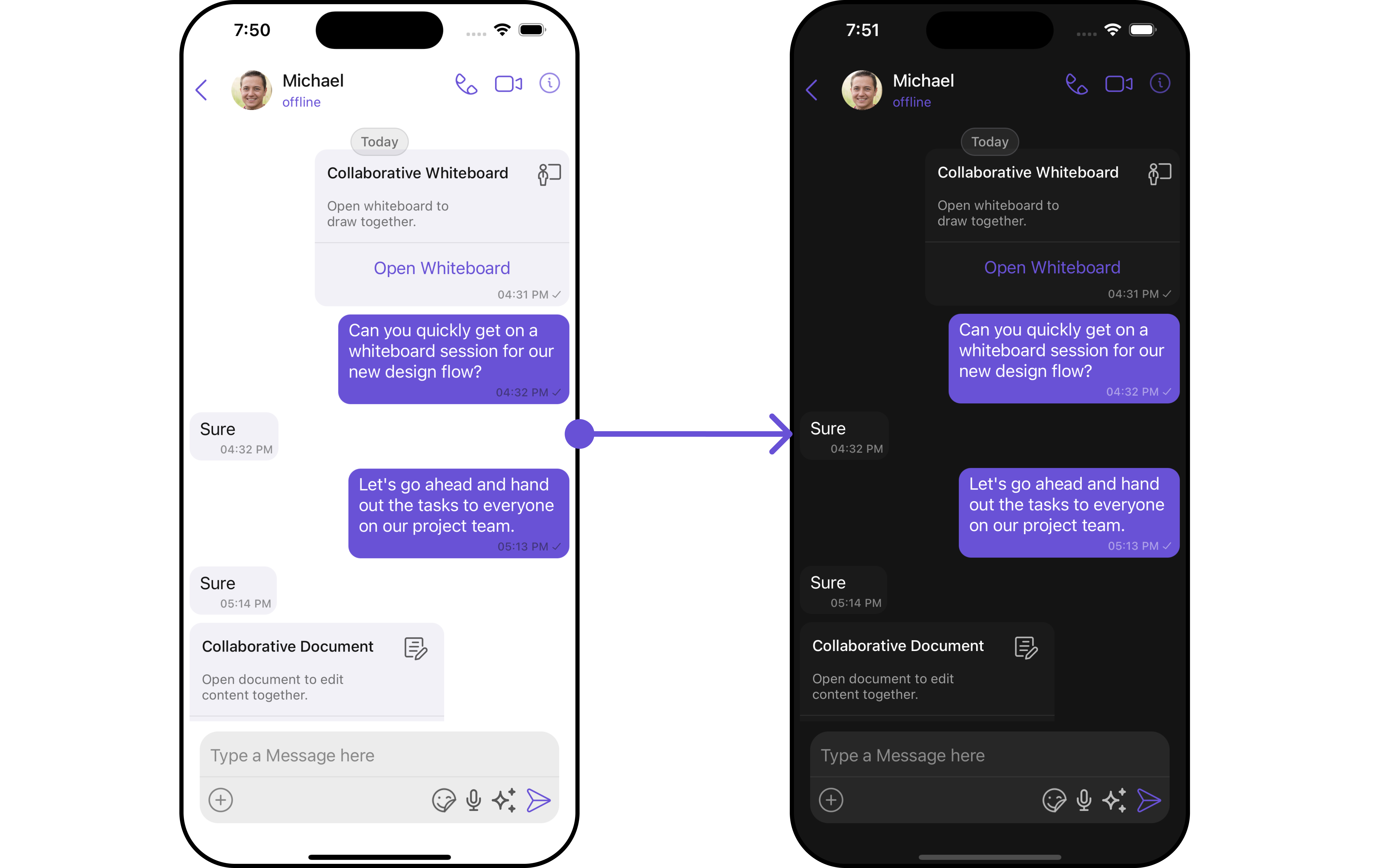
Switching between Light and Dark modes in CometChat is quite simple by manipulating the mode property of the Palette class.
CometChatTheme.set(mode: .dark, for: window)
By default, UI Kit will be support in both light and dark mode. > > If you wish to set the whole app always in the dark mode then you can set it in the application class such as AppDelegate or SceneDelegate using below code snippet.> > window?.overrideUserInterfaceStyle = .dark
Typography
The Typography class provides methods that allow you to change the default text styles in the CometChat theme as per your requirements.
User can set custom font as well using Typography class.
| Font | Description |
|---|---|
| LargeHeading | This font takes the size of 34 with a bold weight |
| LargeHeading2 | This font takes the size of 22 with a bold weight |
| Heading | This font takes the size of 17 with a semibold weight |
| Name | This font takes the size of 20 with a medium weight |
| Title1 | This font takes the size of 22 with a regular weight |
| Title2 | This font takes the size of 17 with a semibold weight |
| Subtitle1 | This font takes the size of 15 with a regular weight |
| Subtitle2 | This font takes the size of 13 with a regular weight |
| Text1 | This font takes the size of 17 with a regular weight |
| Text2 | This font takes the size of 15 with a medium weight |
| Text3 | This font takes the size of 13 with a semibold weight |
| Caption1 | This font takes the size of 13 with a medium weight |
| Caption2 | This font takes the size of 11 with a medium weight |
Here are some of the methods provided by the Typography class:
| Method | Description |
|---|---|
setFont(largeHeading: UIFont) | This method will override the font for largeHeading |
setFont(largeHeading2: UIFont) | This method will override the font for largeHeading2 |
| setFont(heading: UIFont) | This method will override the font for heading |
| setFont(name: UIFont) | This method will override the font for name |
| setFont(name2: UIFont) | This method will override the font for name2 |
| setFont(title1: UIFont) | This method will override the font for title1 |
| setFont(title2: UIFont) | This method will override the font for title2 |
| setFont(subtitle1: UIFont) | This method will override the font for subtitle1 |
| setFont(subtitle2: UIFont) | This method will override the font for subtitle2 |
| setFont(text1: UIFont) | This method will override the font for text1 |
| setFont(text2: UIFont) | This method will override the font for text2 |
| setFont(text3: UIFont) | This method will override the font for text3 |
| setFont(caption1: UIFont) | This method will override the font for caption1 |
| setFont(caption2: UIFont) | This method will override the font for caption2 |
| overrideFont(family: CometChatFontFamily) | This method can override the system font with the other font family. |
To change Name TextStyle of the UiKit Theme Please refer to the code below :
- To modify the palette user has to firstly create an instance of Typography.
var typography = Typography()
- After creating a instance user can update the values of fonts as shown below:
typography.setFont(heading: UIFont("Your font here", size: 40))
typography.setFont(name1: UIFont("Your font here", size: 22))
typography.setFont(caption1: UIFont("Your font here", size: 15))
- User can also update the font family using below snippet.
let family = CometChatFontFamily(regular: "Your font here with regular size", medium: "Your font here with medium size", bold: "Your font here with bold size")

typography.overrideFont(family: family)
After creation of both Palette and typography class, user can initialize the theme class.
CometChatTheme.init(typography: typography, palatte: palette)
If user wish to set the default appearance then you can use below method.
CometChatTheme.defaultAppearance()
At the end your application class will look like this:
func application(_ application: UIApplication, didFinishLaunchingWithOptions launchOptions:      [UIApplication.LaunchOptionsKey: Any]?) -> Bool {

     // Creating Palette
     var palette = Palette()
     palette.set(primary: .white)
     palette.set(background: .purple)
     palette.set(accent: .white)

   // Creating Typography
    var typography = Typography()
    typography.setFont(heading: UIFont("CourierNewPSMT", size: 40))
    typography.setFont(name1: UIFont("CourierNewPSMT", size: 22))
    typography.setFont(caption1: UIFont("CourierNewPSMT", size: 15))

   // If the user wants to override the whole font family
    let fontFamily = CometChatFontFamily(regular: "CourierNewPSMT", medium: "CourierNewPS-BoldMT", bold:    "CourierNewPS-BoldMT")
   typography.overrideFont(family: family)

   // Initializing Theme
   CometChatTheme.init(typography: typography, palatte: palette)

    }

similarly to change other Text Style of Theme you can refer to the above mentioned method.