AI Integration Quick Reference
AI Integration Quick Reference
Where It Fits
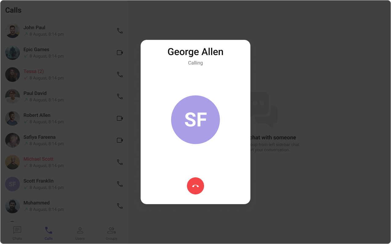
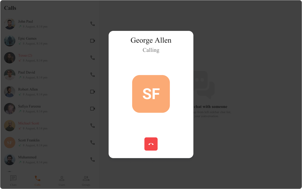
CometChatOutgoingCall is an overlay component that displays the outgoing call screen with the recipient’s name, avatar, and a cancel button. It plays a ringtone while the call is pending. Typically rendered at the app root level after initiating a call via CometChat.initiateCall().
Minimal Render
.cometchat-outgoing-call
Actions and Events
Callback Props
onCallCanceled
Fires when the cancel button is clicked. Pauses the ringtone internally before invoking the callback.onError
Fires on internal errors.Global UI Events
CometChatCallEvents emits call lifecycle events subscribable from anywhere. Subscribe in a useEffect and unsubscribe on cleanup.
| Event | Fires when | Payload |
|---|---|---|
ccOutgoingCall | A call is initiated | CometChat.Call |
ccCallAccepted | The recipient accepts the call | CometChat.Call |
ccCallRejected | The recipient rejects the call | CometChat.Call |
ccCallEnded | The call session ends | CometChat.Call |
SDK Events (Real-Time, Automatic)
The component internally manages call sound playback. It plays the outgoing call ringtone on mount (unlessdisableSoundForCalls={true}) and pauses it on unmount or cancel. No SDK call listeners are attached by the component itself — call status updates are handled by the parent application.
Custom View Slots
All view slots onCometChatOutgoingCall are JSX.Element (not functions). They do not receive parameters — pass call data via closure if needed.
| Slot | Type | Replaces |
|---|---|---|
titleView | JSX.Element | Recipient name |
subtitleView | JSX.Element | ”Calling…” text |
avatarView | JSX.Element | Recipient avatar |
cancelButtonView | JSX.Element | Cancel call button |
titleView
Replace the recipient name.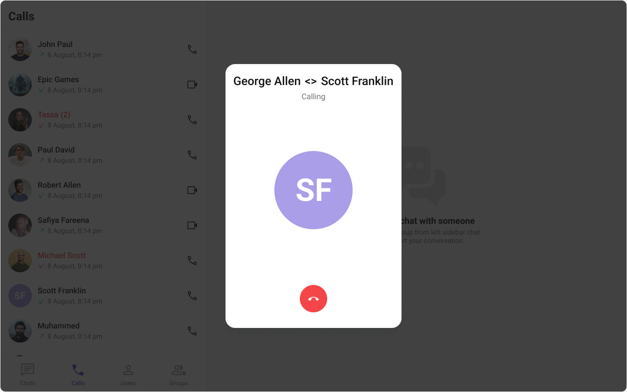
- TypeScript
- CSS
subtitleView
Replace the “Calling…” text.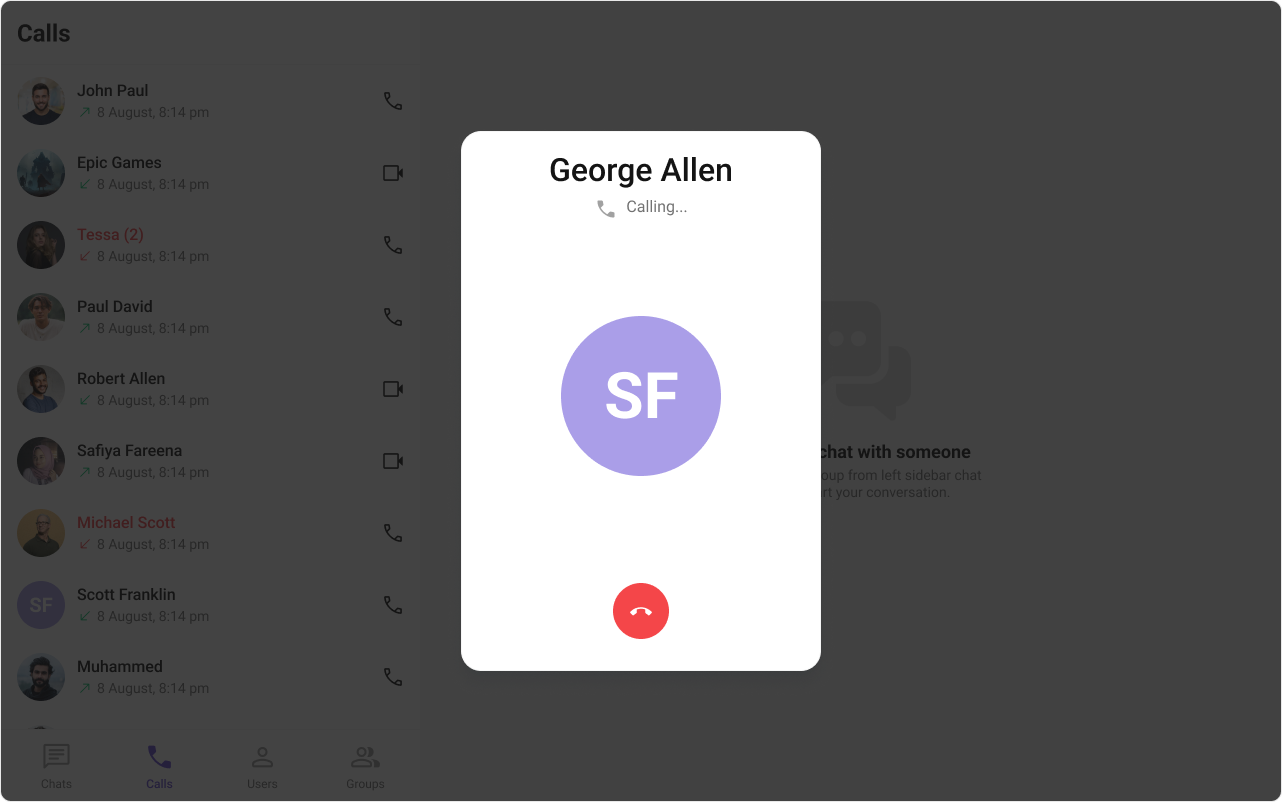
- TypeScript
- CSS
avatarView
Replace the recipient avatar.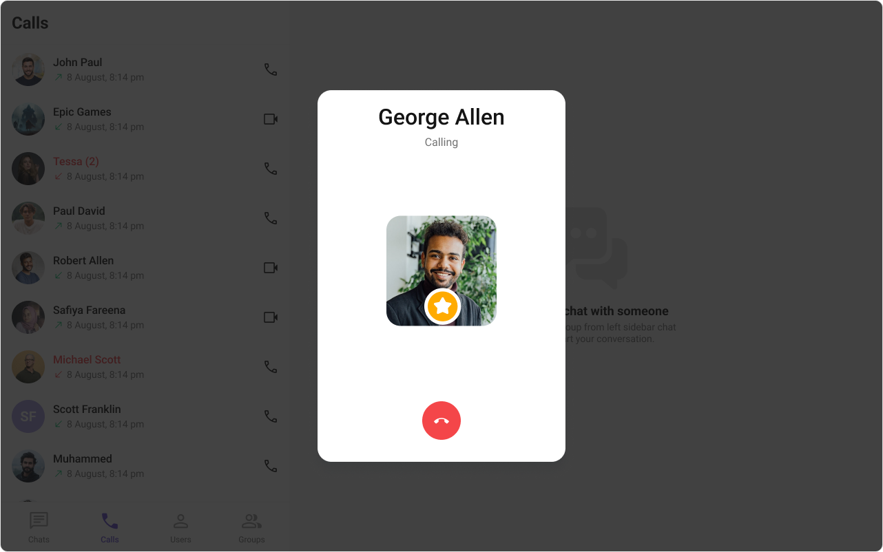
- TypeScript
- CSS
cancelButtonView
Replace the cancel call button.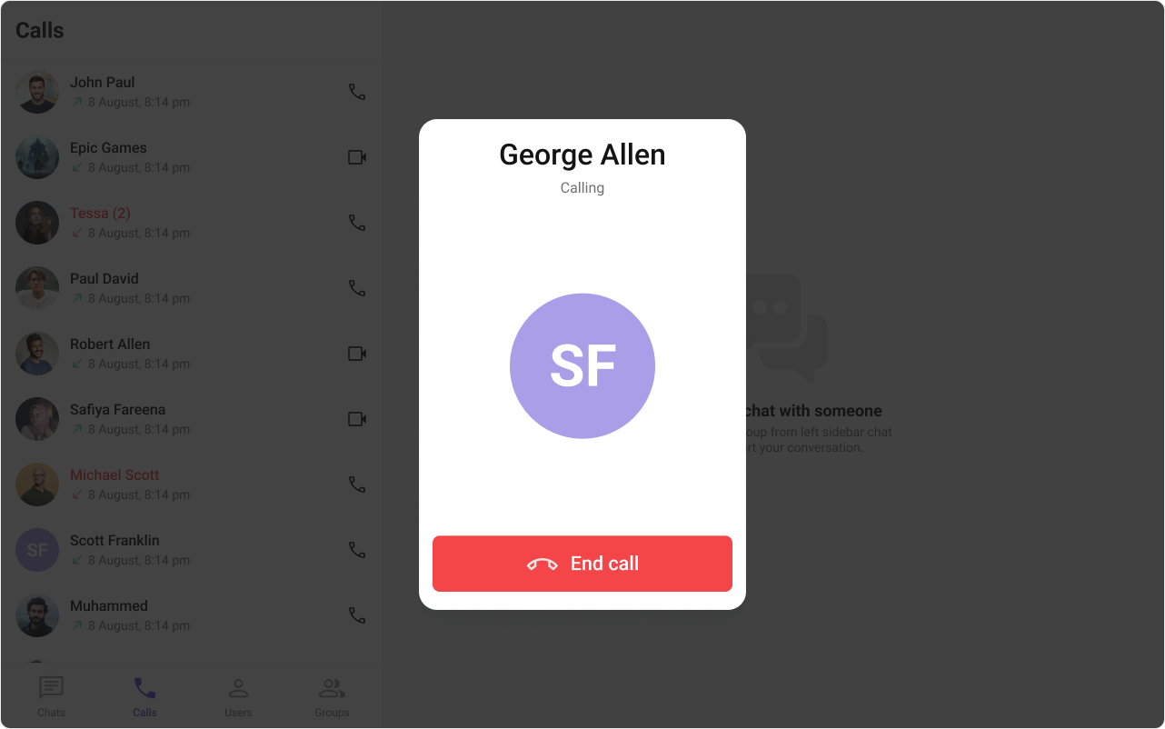
- TypeScript
- CSS
Common Patterns
Cancel and end the call session
Custom ringtone
Silent outgoing call (no ringtone)
CSS Architecture
The component uses CSS custom properties (design tokens) defined in@cometchat/chat-uikit-react/css-variables.css. The cascade:
- Global tokens (e.g.,
--cometchat-primary-color,--cometchat-error-color) set on the.cometchatroot wrapper. - Component CSS (
.cometchat-outgoing-call) consumes these tokens viavar()with fallback values. - Overrides target
.cometchat-outgoing-calldescendant selectors in a global stylesheet.
Key Selectors
| Target | Selector |
|---|---|
| Root | .cometchat-outgoing-call |
| Title container | .cometchat-outgoing-call__title-container |
| Title text | .cometchat-outgoing-call__title |
| Subtitle text | .cometchat-outgoing-call__subtitle |
| Avatar container | .cometchat-outgoing-call__avatar |
| Avatar image | .cometchat-outgoing-call__avatar .cometchat-avatar |
| Avatar text | .cometchat-outgoing-call__avatar .cometchat-avatar__text |
| Cancel button wrapper | .cometchat-outgoing-call__button |
| Cancel button | .cometchat-outgoing-call__button .cometchat-button |
| Cancel button icon | .cometchat-outgoing-call__button .cometchat-button .cometchat-button__icon |
Example: Themed outgoing call
Customization Matrix
| What to change | Where | Property/API | Example |
|---|---|---|---|
| Handle cancel action | Component props | onCallCanceled | onCallCanceled={() => endCall()} |
| Disable ringtone | Component props | disableSoundForCalls | disableSoundForCalls={true} |
| Custom ringtone | Component props | customSoundForCalls | customSoundForCalls="/sounds/ring.mp3" |
| Replace UI sections | Component props | View slot props | titleView={<div>Custom</div>} |
| Change colors, fonts, spacing | Global CSS | Target .cometchat-outgoing-call class | .cometchat-outgoing-call__title { color: red; } |
Props
All props are optional unless noted. Sorted alphabetically.avatarView
Custom JSX replacing the recipient avatar.| Type | JSX.Element |
| Default | Built-in avatar |
call
The outgoing call object fromCometChat.initiateCall().
| Type | CometChat.Call |
| Default | undefined |
call is not provided.
cancelButtonView
Custom JSX replacing the cancel call button.| Type | JSX.Element |
| Default | Built-in cancel button |
customSoundForCalls
URL to a custom audio file for the outgoing call ringtone.| Type | string |
| Default | Built-in ringtone |
disableSoundForCalls
Disables the outgoing call ringtone.| Type | boolean |
| Default | false |
onCallCanceled
Callback fired when the cancel button is clicked.| Type | Function |
| Default | undefined |
onError
Callback fired when the component encounters an error.| Type | ((error: CometChat.CometChatException) => void) | null |
| Default | undefined |
subtitleView
Custom JSX replacing the “Calling…” subtitle text.| Type | JSX.Element |
| Default | Built-in subtitle |
titleView
Custom JSX replacing the recipient name.| Type | JSX.Element |
| Default | Built-in title |
Events
| Event | Payload | Fires when |
|---|---|---|
CometChatCallEvents.ccOutgoingCall | CometChat.Call | Call initiated |
CometChatCallEvents.ccCallAccepted | CometChat.Call | Recipient accepts |
CometChatCallEvents.ccCallRejected | CometChat.Call | Recipient rejects |
CometChatCallEvents.ccCallEnded | CometChat.Call | Call session ends |
Subject<CometChat.Call> from RxJS. Subscribe with .subscribe(), unsubscribe with the returned subscription’s .unsubscribe().
CSS Selectors
| Target | Selector |
|---|---|
| Root | .cometchat-outgoing-call |
| Title container | .cometchat-outgoing-call__title-container |
| Title text | .cometchat-outgoing-call__title |
| Subtitle text | .cometchat-outgoing-call__subtitle |
| Avatar container | .cometchat-outgoing-call__avatar |
| Avatar image | .cometchat-outgoing-call__avatar .cometchat-avatar |
| Avatar text | .cometchat-outgoing-call__avatar .cometchat-avatar__text |
| Cancel button wrapper | .cometchat-outgoing-call__button |
| Cancel button | .cometchat-outgoing-call__button .cometchat-button |
| Cancel button icon | .cometchat-outgoing-call__button .cometchat-button .cometchat-button__icon |