AI Integration Quick Reference
{ "component" : "CometChatCallLogs" , "package" : "@cometchat/chat-uikit-react" , "import" : "import { CometChatCallLogs } from \" @cometchat/chat-uikit-react \" ;" , "cssImport" : "import \" @cometchat/chat-uikit-react/css-variables.css \" ;" , "description" : "Scrollable list of call history entries with filtering, call-back actions, and custom views." , "cssRootClass" : ".cometchat-call-logs" , "primaryOutput" : { "prop" : "onItemClick" , "type" : "(call: any) => void" }, "props" : { "data" : { "callLogRequestBuilder" : { "type" : "any (CallLogRequestBuilder)" , "default" : "SDK default (30 per page)" }, "activeCall" : { "type" : "any" , "default" : "undefined" }, "callInitiatedDateTimeFormat" : { "type" : "CalendarObject" , "default" : "DD MMM, hh:mm A" } }, "callbacks" : { "onItemClick" : "(call: any) => void" , "onCallButtonClicked" : "(call: any) => void" , "onError" : "((error: CometChat.CometChatException) => void) | null" }, "visibility" : { "showScrollbar" : { "type" : "boolean" , "default" : false } }, "viewSlots" : { "itemView" : "(call: any) => JSX.Element" , "leadingView" : "(call: any) => JSX.Element" , "titleView" : "(call: any) => JSX.Element" , "subtitleView" : "(call: any) => JSX.Element" , "trailingView" : "(call: any) => JSX.Element" , "loadingView" : "JSX.Element" , "emptyView" : "JSX.Element" , "errorView" : "JSX.Element" } }, "events" : [ { "name" : "CometChatMessageEvents.ccMessageSent" , "payload" : "IMessages" , "description" : "Call message sent" } ], "types" : { "CalendarObject" : { "today" : "string | undefined" , "yesterday" : "string | undefined" , "lastWeek" : "string | undefined" , "otherDays" : "string | undefined" } } }
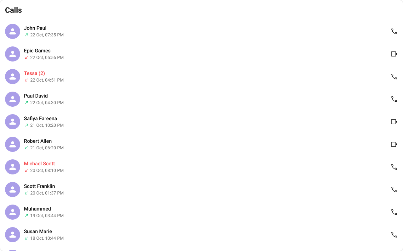
Where It Fits CometChatCallLogs is a standalone list component that renders call history entries. Each entry shows the caller/callee, call type (audio/video), direction (incoming/outgoing/missed), and timestamp. The onItemClick callback emits the selected call log, and onCallButtonClicked fires when the call-back button is tapped.import { CometChatCallLogs } from "@cometchat/chat-uikit-react" ; import "@cometchat/chat-uikit-react/css-variables.css" ; function CallLogPanel () { return ( < div style = { { width: 480 , height: "100vh" } } > < CometChatCallLogs onItemClick = { ( callLog : any ) => { console . log ( "Call log selected:" , callLog ); } } onCallButtonClicked = { ( callLog : any ) => { console . log ( "Call back:" , callLog ); } } /> </ div > ); }
Minimal Render import { CometChatCallLogs } from "@cometchat/chat-uikit-react" ; import "@cometchat/chat-uikit-react/css-variables.css" ; function CallLogsDemo () { return ( < div style = { { width: "100%" , height: "100%" } } > < CometChatCallLogs /> </ div > ); } export default CallLogsDemo ;
Root CSS class: .cometchat-call-logs
Filtering Call Logs Pass a CallLogRequestBuilder from @cometchat/calls-sdk-javascript to callLogRequestBuilder.
import { CallLogRequestBuilder } from "@cometchat/calls-sdk-javascript" ; import { CometChatCallLogs } from "@cometchat/chat-uikit-react" ; function FilteredCallLogs () { return ( < CometChatCallLogs callLogRequestBuilder = { new CallLogRequestBuilder () . setAuthToken ( "AUTH_TOKEN" ) . setLimit ( 10 ) . setCallStatus ( "cancelled" ) } /> ); }
Filter Recipes Recipe Code Limit to 5 per page new CallLogRequestBuilder().setAuthToken(token).setLimit(5)Cancelled calls only new CallLogRequestBuilder().setAuthToken(token).setCallStatus("cancelled")Video calls only new CallLogRequestBuilder().setAuthToken(token).setCallType("video")Calls with recordings new CallLogRequestBuilder().setAuthToken(token).setHasRecording(true)Calls for a specific user new CallLogRequestBuilder().setAuthToken(token).setUid("user_uid")Calls for a specific group new CallLogRequestBuilder().setAuthToken(token).setGuid("group_guid")
Refer to CallLogRequestBuilder for the full builder API.
Actions and Events Callback Props onItemClick Fires when a call log entry is tapped.
import { CometChatCallLogs } from "@cometchat/chat-uikit-react" ; function CallLogsWithClick () { return ( < CometChatCallLogs onItemClick = { ( callLog : any ) => { console . log ( "Selected call log:" , callLog ); } } /> ); }
Fires when the call-back button in the trailing view is tapped.
import { CometChatCallLogs } from "@cometchat/chat-uikit-react" ; function CallLogsWithCallback () { return ( < CometChatCallLogs onCallButtonClicked = { ( callLog : any ) => { console . log ( "Call back:" , callLog ); } } /> ); }
onError Fires on internal errors (network failure, auth issue, SDK exception).
import { CometChatCallLogs } from "@cometchat/chat-uikit-react" ; import { CometChat } from "@cometchat/chat-sdk-javascript" ; function CallLogsWithError () { return ( < CometChatCallLogs onError = { ( error : CometChat . CometChatException ) => { console . error ( "CometChatCallLogs error:" , error ); } } /> ); }
Global UI Events The component subscribes to CometChatMessageEvents.ccMessageSent to detect when a call message is sent and refresh the list.
SDK Events (Real-Time, Automatic) The component listens to SDK call events internally for real-time updates. No manual attachment needed.
In React 18 StrictMode, useEffect runs twice on mount in development. The component handles listener cleanup internally.
Custom View Slots Each slot replaces a section of the default UI. Slots that accept a call log parameter receive the call log object for that row.
Slot Signature Replaces itemView(call: any) => JSX.ElementEntire list item row leadingView(call: any) => JSX.ElementAvatar / left section titleView(call: any) => JSX.ElementName / title text subtitleView(call: any) => JSX.ElementCall type, direction, timestamp trailingView(call: any) => JSX.ElementCall-back button area loadingViewJSX.ElementLoading spinner emptyViewJSX.ElementEmpty state errorViewJSX.ElementError state
itemView Replace the entire call log list item.
import { CometChatCallLogs } from "@cometchat/chat-uikit-react" ; function CustomItemViewCallLogs () { const getItemView = ( callLog : any ) => { return ( < div className = "custom-call-log-item" > < div className = "custom-call-log-item__name" > { callLog ?. getInitiator ()?. getName () } </ div > < div className = "custom-call-log-item__status" > { callLog ?. getStatus () } </ div > </ div > ); }; return < CometChatCallLogs itemView = { getItemView } /> ; }
.custom-call-log-item { display : flex ; align-items : center ; justify-content : space-between ; padding : 8 px 16 px ; border-bottom : 1 px solid var ( --cometchat-border-color-light ); } .custom-call-log-item__name { font : var ( --cometchat-font-heading4-medium ); color : var ( --cometchat-text-color-primary ); } .custom-call-log-item__status { font : var ( --cometchat-font-body-regular ); color : var ( --cometchat-text-color-secondary ); }
subtitleView Replace the subtitle text (call type, duration).
import { CometChatCallLogs } from "@cometchat/chat-uikit-react" ; function SubtitleCallLogs () { const getSubtitleView = ( callLog : any ) => { return ( < div className = "custom-call-log-subtitle" > { callLog ?. getStatus () } • { callLog ?. getType () } </ div > ); }; return < CometChatCallLogs subtitleView = { getSubtitleView } /> ; }
.custom-call-log-subtitle { font : var ( --cometchat-font-body-regular ); color : var ( --cometchat-text-color-secondary ); }
trailingView Replace the right section (call-back button area).
import { CometChatCallLogs } from "@cometchat/chat-uikit-react" ; function TrailingViewCallLogs () { const getTrailingView = ( callLog : any ) => { return ( < div className = "custom-call-log-trailing" > < button onClick = { () => console . log ( "Call back" , callLog ) } > Call Back </ button > </ div > ); }; return < CometChatCallLogs trailingView = { getTrailingView } /> ; }
.custom-call-log-trailing button { background : var ( --cometchat-primary-color ); color : var ( --cometchat-static-white ); border : none ; border-radius : var ( --cometchat-radius-2 ); padding : 4 px 12 px ; cursor : pointer ; }
Customize the call initiated timestamp format using a CalendarObject.
import { CometChatCallLogs , CalendarObject , } from "@cometchat/chat-uikit-react" ; function CustomDateCallLogs () { const dateFormat = new CalendarObject ({ today: "hh:mm A" , yesterday: "[yesterday]" , otherDays: "DD MM YYYY" , }); return < CometChatCallLogs callInitiatedDateTimeFormat = { dateFormat } /> ; }
Common Patterns Custom empty state import { CometChatCallLogs } from "@cometchat/chat-uikit-react" ; function EmptyStateCallLogs () { return ( < CometChatCallLogs emptyView = { < div style = { { textAlign: "center" , padding: 40 } } > < p > No call history </ p > </ div > } /> ); }
Filtered to video calls only import { CallLogRequestBuilder } from "@cometchat/calls-sdk-javascript" ; import { CometChatCallLogs } from "@cometchat/chat-uikit-react" ; function VideoCallLogs ({ authToken } : { authToken : string }) { return ( < CometChatCallLogs callLogRequestBuilder = { new CallLogRequestBuilder () . setAuthToken ( authToken ) . setCallType ( "video" ) } /> ); }
CSS Architecture The component uses CSS custom properties (design tokens) defined in @cometchat/chat-uikit-react/css-variables.css. The cascade:
Global tokens are set on the .cometchat root wrapper.
Component CSS (.cometchat-call-logs) consumes these tokens via var() with fallback values.
Overrides target .cometchat-call-logs descendant selectors in a global stylesheet.
Key Selectors Target Selector Root .cometchat-call-logsList item .cometchat-call-logs .cometchat-list-itemActive item .cometchat-call-logs__list-item-active .cometchat-list-itemTrailing view (video) .cometchat-call-logs__list-item-trailing-view-videoTrailing view (audio) .cometchat-call-logs__list-item-trailing-view-audioSubtitle .cometchat-call-logs__list-item-subtitleSubtitle date .cometchat-call-logs__list-item-subtitle .cometchat-dateMissed call icon .cometchat-call-logs__list-item-subtitle-icon-missed-callOutgoing call icon .cometchat-call-logs__list-item-subtitle-icon-outgoing-callIncoming call icon .cometchat-call-logs__list-item-subtitle-icon-incoming-callEmpty state .cometchat-call-logs__empty-state-viewError state .cometchat-call-logs__error-state-viewShimmer loading .cometchat-call-logs__shimmerOutgoing call overlay .cometchat-call-logs__outgoing-call
Customization Matrix What to change Where Property/API Example Override behavior on user interaction Component props on<Event> callbacksonItemClick={(c) => showDetails(c)}Filter which call logs appear Component props callLogRequestBuildercallLogRequestBuilder={new CallLogRequestBuilder().setLimit(5)}Replace a section of the list item Component props <slot>View render propssubtitleView={(c) => <div>{c.getStatus()}</div>}Change colors, fonts, spacing Global CSS Target .cometchat-call-logs class .cometchat-call-logs .cometchat-list-item { background: #f9f8fd; }
Props All props are optional.
activeCall Highlights the currently active/selected call log entry.
Format for displaying the call initiated timestamp.
Type CalendarObjectDefault Component default (DD MMM, hh:mm A)
Falls back to global calendar configuration if not set.
callLogRequestBuilder Controls which call logs load and in what order.
Type any (CallLogRequestBuilder from @cometchat/calls-sdk-javascript)Default SDK default (30 per page)
emptyView Custom component displayed when there are no call logs.
Type JSX.ElementDefault Built-in empty state
errorView Custom component displayed when an error occurs.
Type JSX.ElementDefault Built-in error state
itemView Custom renderer for the entire call log list item.
Type (call: any) => JSX.ElementDefault Built-in list item
leadingView Custom renderer for the avatar / left section.
Type (call: any) => JSX.ElementDefault Built-in avatar
loadingView Custom component displayed during the loading state.
Type JSX.ElementDefault Built-in shimmer
Callback fired when the call-back button is clicked.
Type (call: any) => voidDefault undefined
onError Callback fired when the component encounters an error.
Type ((error: CometChat.CometChatException) => void) | nullDefault undefined
onItemClick Callback fired when a call log entry is clicked.
Type (call: any) => voidDefault undefined
Shows the scrollbar in the call log list.
subtitleView Custom renderer for the subtitle text.
Type (call: any) => JSX.ElementDefault Built-in subtitle
titleView Custom renderer for the name / title text.
Type (call: any) => JSX.ElementDefault Built-in title
trailingView Custom renderer for the right section.
Type (call: any) => JSX.ElementDefault Built-in trailing view
Events Event Payload Fires when CometChatMessageEvents.ccMessageSentIMessagesCall message sent
CSS Selectors Target Selector Root .cometchat-call-logsList item .cometchat-call-logs .cometchat-list-itemActive item .cometchat-call-logs__list-item-active .cometchat-list-itemTrailing view (video) .cometchat-call-logs__list-item-trailing-view-videoTrailing view (audio) .cometchat-call-logs__list-item-trailing-view-audioSubtitle .cometchat-call-logs__list-item-subtitleSubtitle date .cometchat-call-logs__list-item-subtitle .cometchat-dateMissed call icon .cometchat-call-logs__list-item-subtitle-icon-missed-callOutgoing call icon .cometchat-call-logs__list-item-subtitle-icon-outgoing-callIncoming call icon .cometchat-call-logs__list-item-subtitle-icon-incoming-callEmpty state .cometchat-call-logs__empty-state-viewError state .cometchat-call-logs__error-state-viewShimmer loading .cometchat-call-logs__shimmerOutgoing call overlay .cometchat-call-logs__outgoing-call