Message Header
Overview
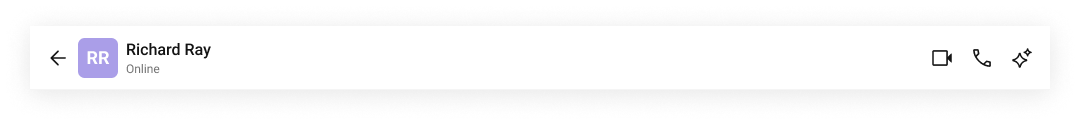
MessageHeader is a Component that showcases the User or Group details in the toolbar. Furthermore, it also presents a typing indicator and a back navigation button for ease of use.

The MessageHeader is comprised of the following components:
| Component | Description |
|---|---|
| CometChatListItem | This component’s view consists of avatar, status indicator , title, and subtitle. The fields are then mapped with the SDK’s user, group class. |
| Back Button | BackButton that allows users to navigate back from the current activity or screen to the previous one. |
Usage
Integration
- MessageHeaderDemo.tsx
- App.tsx
import React from "react";
import { CometChat } from "@cometchat/chat-sdk-javascript";
import { CometChatMessageHeader } from "@cometchat/chat-uikit-react";

export function MessageHeaderDemo() {
  const [chatUser, setChatUser] = React.useState<CometChat.User>();
  React.useEffect(() => {
    CometChat.getUser("uid").then((user) => {
      setChatUser(user);
    });
  }, []);

  return chatUser ? (
    <div>{chatUser && <CometChatMessageHeader user={chatUser} />}</div>
  ) : null;
}
import { MessageHeaderDemo } from "./MessageHeaderDemo";

export default function App() {
  return (
    <div className="App">
      <div>
        <MessageHeaderDemo />
      </div>
    </div>
  );
}
Actions
Actions dictate how a component functions. They are divided into two types: Predefined and User-defined. You can override either type, allowing you to tailor the behavior of the component to fit your specific needs.
1. OnBack
OnBack is triggered when you click on the back button of the Message Header component. You can override this action using the following code snippet.
Example
In this example, we are employing the onBack action.
- MessageHeaderDemo.tsx
- MessageHeaderDemo.jsx
import React from "react";
import { CometChat } from "@cometchat/chat-sdk-javascript";
import { CometChatMessageHeader } from "@cometchat/chat-uikit-react";

export function MessageHeaderDemo() {
  const [chatUser, setChatUser] = React.useState<CometChat.User>();
  React.useEffect(() => {
    CometChat.getUser("uid").then((user) => {
      setChatUser(user);
    });
  }, []);

  function handleOnBack() {
    console.log("your custom on back action");
  }

  return chatUser ? (
    <div>
      {chatUser && (
        <CometChatMessageHeader user={chatUser} onBack={handleOnBack} />
      )}
    </div>
  ) : null;
}
import React, { useState, useEffect } from "react";
import { CometChat } from "@cometchat/chat-sdk-javascript";
import { CometChatMessageHeader } from "@cometchat/chat-uikit-react";

function MessageHeaderDemo() {
  const [chatUser, setChatUser] = useState(null);

  useEffect(() => {
    CometChat.getUser("uid").then((user) => {
      setChatUser(user);
    });
  }, []);

  function handleOnBack() {
    console.log("your custom on back action");
  }

  return chatUser ? (
    <div>
      <CometChatMessageHeader user={chatUser} onBack={handleOnBack} />
    </div>
  ) : null;
}

export default MessageHeaderDemo;
2. OnError
This action doesn't change the behavior of the component but rather listens for any errors that occur in the Message Header component.
Example
In this example, we are employing the onError action.
- MessageHeaderDemo.tsx
- MessageHeaderDemo.jsx
import React from "react";
import { CometChat } from "@cometchat/chat-sdk-javascript";
import { CometChatMessageHeader } from "@cometchat/chat-uikit-react";

export function MessageHeaderDemo() {
  const [chatUser, setChatUser] = React.useState<CometChat.User>();
  React.useEffect(() => {
    CometChat.getUser("uid").then((user) => {
      setChatUser(user);
    });
  }, []);

  function handleError(error: CometChat.CometChatException) {
    throw new Error("your custom error action");
  }
  return chatUser ? (
    <div>
      {chatUser && (
        <CometChatMessageHeader user={chatUser} onError={handleError} />
      )}
    </div>
  ) : null;
}
import React, { useState, useEffect } from "react";
import { CometChat } from "@cometchat/chat-sdk-javascript";
import { CometChatMessageHeader } from "@cometchat/chat-uikit-react";

export function MessageHeaderDemo() {
  const [chatUser, setChatUser] = useState(null);

  useEffect(() => {
    CometChat.getUser("uid").then((user) => {
      setChatUser(user);
    });
  }, []);

  function handleError(error) {
    throw new Error("your custom error action");
  }
  return chatUser ? (
    <div>
      {chatUser && (
        <CometChatMessageHeader user={chatUser} onError={handleError} />
      )}
    </div>
  ) : null;
}
Filters
Filters allow you to customize the data displayed in a list within a Component. You can filter the list based on your specific criteria, allowing for a more customized. Filters can be applied using RequestBuilders of Chat SDK.
The MessageHeader component does not have any exposed filters.
Events
Events are emitted by a Component. By using event you can extend existing functionality. Being global events, they can be applied in Multiple Locations and are capable of being Added or Removed.
The MessageHeader component does not produce any events.
Customization
To fit your app's design requirements, you can customize the appearance of the Message Header component. We provide exposed methods that allow you to modify the experience and behavior according to your specific needs.
Style
To customize the appearance, you can customise css of CometChatMessageHeader
Example

- TypeScript
- CSS
import React from "react";
import { CometChat } from "@cometchat/chat-sdk-javascript";
import { CometChatMessageHeader } from "@cometchat/chat-uikit-react";

// Assuming groupObj is defined elsewhere in your code
<CometChatMessageHeader group={groupObj} />;
.cometchat-message-header .cometchat-list-item .cometchat-avatar {
  background: #f0999b;
  border-radius: 8px;
}
.cometchat-message-header .cometchat-avatar__text {
  font-family: "SF Pro";
}
Functionality
These are a set of small functional customizations that allow you to fine-tune the overall experience of the component. With these, you can change text, set custom icons, and toggle the visibility of UI elements.
Here is a code snippet demonstrating how you can customize the functionality of the Message Header component.
- TypeScript
import { CometChatMessageHeader } from "@cometchat/chat-uikit-react";

<CometChatMessageHeader user={chatUser} hideBackButton={true} />;
Following is a list of customizations along with their corresponding code snippets:
| Property | Description | Code |
|---|---|---|
| Hide Back Button | Hides the back button in the header in mobile view. | hideBackButton={true} |
| Hide Video Call Button | Hides the video call button. | hideVideoCallButton={true} |
| Hide Voice Call Button | Hides the voice call button. | hideVoiceCallButton={true} |
| Show Conversation Summary Button | Hides the conversation summary button. | showConversationSummaryButton={true} |
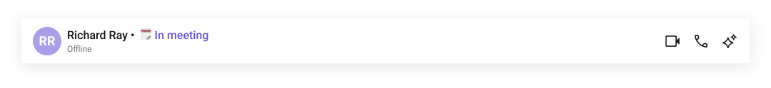
| Hide User Status | Hides the user's online/offline status indicator. | hideUserStatus={true} |
| User | A CometChat.User object representing the user whose information (e.g., status) is displayed. | user={chatUser} |
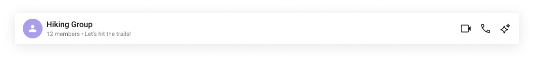
| Group | A CometChat.Group object representing the group whose details (e.g., member count) are displayed. | group={chatGroup} |
| Summary Generation Message Count | Number of messages for which the summary should be shown. | summaryGenerationMessageCount={1000} |
| Disable Auto Summary Generation | Disables the auto generation of conversation summary. | disableAutoSummaryGeneration={true} |
Advanced
For advanced-level customization, you can set custom views to the component. This lets you tailor each aspect of the component to fit your exact needs and application aesthetics. You can create and define your views, layouts, and UI elements and then incorporate those into the component.
ItemView
The customized chat interface is displayed below.
Use the following code to achieve the customization shown above.
- TypeScript
- CSS
import React from "react";
import { CometChat } from "@cometchat/chat-sdk-javascript";
import {
  CometChatMessageHeader,
  CometChatListItem,
} from "@cometchat/chat-uikit-react";

// Custom list item view definition
const CustomItemView = (
  <>
    <CometChatListItem
      avatarName={chatUser?.getName()}
      avatarURL={chatUser?.getAvatar()}
      title={chatUser?.getName()}
      subtitleView={chatUser?.getStatus()}
    />
  </>
);

<CometChatMessageHeader
  user={chatUser}
  itemView={CustomItemView}
  hideBackButton={false}
/>;
.cometchat-message-header .cometchat-list-item .cometchat-avatar {
  border-radius: 8px;
}
TitleView
The customized chat interface is displayed below.
Use the following code to achieve the customization shown above.
- TypeScript
- CSS
import React from "react";
import { CometChat } from "@cometchat/chat-sdk-javascript";
import { CometChatMessageHeader } from "@cometchat/chat-uikit-react";

// Custom title view component
function CustomTitleView() {
  return  <div className="message-header__title-view">
<span className="message-header__title-view-name">{userObj.getName() + " • "}</span>
<span className="message-header__title-view-status">{userObj.getStatusMessage()}</span>
   </div>;
}

<CometChatMessageHeader user={userObj} titleView={CustomTitleView()} />;
.cometchat-message-header .message-header__title-view{
    display: flex;
    gap: 4px;
    width: 100%;
}

.cometchat-message-header .message-header__title-view .message-header__title-view-name{
    color: #141414;
    font: 500 16px/19.2px Roboto;
    text-align: left;
}
.cometchat-message-header .message-header__title-view .message-header__title-view-status{
    color: #6852D6;
    font: 400 16px/19.2px Roboto;
    text-align: left;
}
SubtitleView
The customized chat interface is displayed below.
Use the following code to achieve the customization shown above.
- TypeScript
import React from "react";
import { CometChat } from "@cometchat/chat-sdk-javascript";
import { CometChatMessageHeader } from "@cometchat/chat-uikit-react";

// Custom subtitle view component
function CustomSubtitleView() {
  return <>{group?.getMembersCount() + " • " + group?.getDescription()}</>;
}

<CometChatMessageHeader group={groupObj} subtitleView={CustomSubtitleView()} />;
LeadingView
The customized chat interface is displayed below.

Use the following code to achieve the customization shown above.
- TypeScript
- CSS
import React from "react";
import { CometChat } from "@cometchat/chat-sdk-javascript";
import { CometChatMessageHeader,CometChatAvatar } from "@cometchat/chat-uikit-react";

// Custom title view component
function CustomLeadingView() {
  return  <div className="message-header__leading-view">
        <CometChatAvatar
            image={userObj?.getAvatar()}
            name={userObj?.getName()}
        />
        <span className="message-header__leading-view-role">⭐ {userObj?.getRole()}</span>


    </div>;
}

<CometChatMessageHeader user={userObj} leadingView={CustomLeadingView()} />;
.cometchat-message-header .cometchat-list-item .message-header__leading-view .cometchat-avatar__image, .cometchat-message-header .cometchat-list-item .message-header__leading-view .cometchat-avatar{
  border-radius: 8px;
  height: 48px ;
  width: 48px ;
}

.message-header__leading-view-role{
  display: flex;
  width: 48px;
  height: 15px;
  padding: 1px 3px;
  justify-content: center;
  align-items: center;
  color:#FFF;
  font:600 8px/9.6px Roboto;
  background:#0B7BEA;
  position:absolute;
  bottom:-2px;
}
.message-header__leading-view{
  position: relative;
}
TrailingView
The customized chat interface is displayed below.

Use the following code to achieve the customization shown above.
- TypeScript
- CSS
import React from "react";
import { CometChat } from "@cometchat/chat-sdk-javascript";
import {
  CometChatMessageHeader,
  CometChatButton,
} from "@cometchat/chat-uikit-react";

// Custom trailing view component
function CustomTrailingButtonView() {
  return (
    <>
      <CometChatButton
        onClick={() => {
          // Your logic here
        }}
        iconURL={icon} // Ensure `icon` is defined or passed as a prop
      />
    </>
  );
}

<CometChatMessageHeader user={userObj} trailingView={CustomTrailingButtonView()} />;
.cometchat-message-header .cometchat-list-item__trailing-view .cometchat-button {
  background: transparent;
  height: 24px;
  width: 24px;
  padding: 0;
}

.cometchat-message-header
  .cometchat-list-item__trailing-view
  .cometchat-button__icon {
  background: black;
}
AuxiliaryButtonView
The customized chat interface is displayed below.

Use the following code to achieve the customization shown above.
- TypeScript
- CSS
import React from "react";
import { CometChat } from "@cometchat/chat-sdk-javascript";
import {
  CometChatMessageHeader,
  CometChatButton,
} from "@cometchat/chat-uikit-react";

// Custom auxiliary view component
function CustomAuxiliaryButtonView() {
  return (
    <>
      <CometChatButton
        onClick={() => {
          // Your logic here
        }}
        iconURL={icon} // Ensure `icon` is defined or passed as a prop
      />
    </>
  );
}

<CometChatMessageHeader group={groupObj} auxiliaryButtonView={CustomAuxiliaryButtonView()} />;
.cometchat-message-header .cometchat-message-header__auxiliary-view .cometchat-button {
  background: transparent;
  height: 24px;
  width: 24px;
  padding: 0;
}

.cometchat-message-header
  .cometchat-message-header__auxiliary-view
  .cometchat-button__icon {
  background: black;
}
LastActiveAt Date Time Format
The lastActiveAtDateTimeFormat property allows you to customize the last active timestamp displayed in the message header.
Default Date Time Format:
new CalendarObject({
    today: `[Last seen DD MMM at] hh:mm A`, // Example: "today at 10:30 AM"
    yesterday: `[Last seen DD MMM at] hh:mm A`, // Example: "yesterday at 08:15 PM"
    otherDays: `[Last seen DD MMM at] hh:mm A`, // Example: "25, Jan 05:45 PM"
    relativeTime: {
        hour: `Last seen  %d hour ago`, // Example: "1 hour ago"
        minute: `Last seen  %d minute ago`, // Example: "1 minute ago"
        minutes: `Last seen  %d minutes ago`, // Example: "5 minutes ago"
    },
});
The following example demonstrates how to modify the last active timestamp format using a custom CalendarObject.
- TypeScript
import {
  CometChatMessageHeader,
  CalendarObject
} from "@cometchat/chat-uikit-react";

// Define a custom date format pattern
function getDateFormat() {
  const dateFormat = new CalendarObject({
    today: `hh:mm A`,   // Example: "10:30 AM"
    yesterday: `[yesterday]`, // Example: "yesterday"
    otherDays: `DD MM YYYY`,  // Example: "25 01 2025"
  });
  return dateFormat;
}

// Apply the custom format to the CometChatMessageHeader component
<CometChatMessageHeader group={groupObj} lastActiveAtDateTimeFormat={getDateFormat()} />;
Fallback Mechanism
- If you do not pass any property in the CalendarObject, the component will first check the global configuration. If the property is also missing in the global configuration, it will fallback to the component's default formatting.