Documentation Index
Fetch the complete documentation index at: https://www.cometchat.com/docs/llms.txt
Use this file to discover all available pages before exploring further.
AI Integration Quick Reference
AI Integration Quick Reference
Where It Fits
CometChatConversations is a sidebar list component. It renders recent conversations and emits the selected CometChat.Conversation via onItemClick. Wire it to CometChatMessageHeader, CometChatMessageList, and CometChatMessageComposer to build a standard two-panel chat layout.
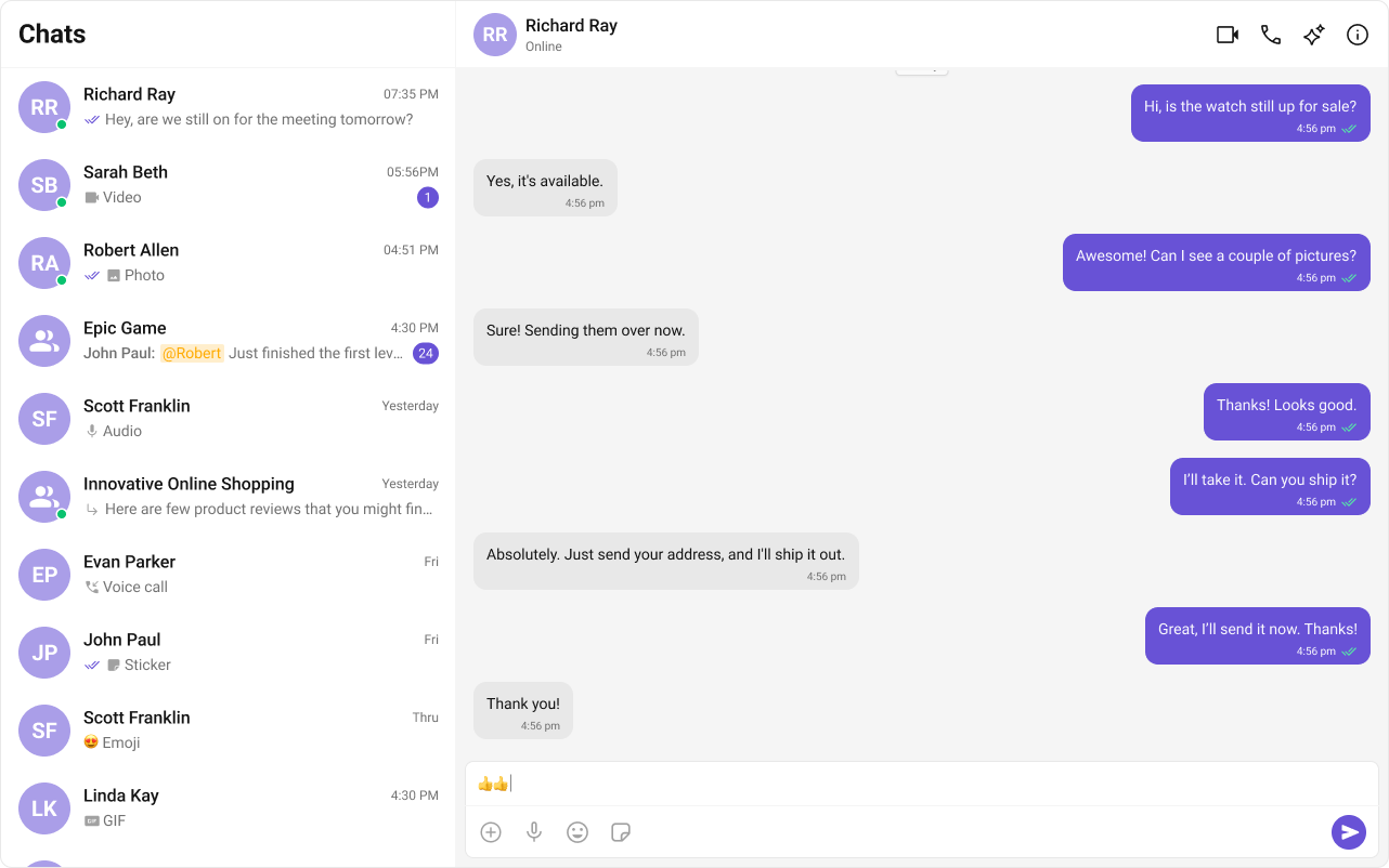
Minimal Render

.cometchat-conversations
Filtering Conversations
Pass aCometChat.ConversationsRequestBuilder to conversationsRequestBuilder. Pass the builder instance — not the result of .build().
Filter Recipes
| Recipe | Code |
|---|---|
| Only user conversations | new CometChat.ConversationsRequestBuilder().setConversationType("user") |
| Only group conversations | new CometChat.ConversationsRequestBuilder().setConversationType("group") |
| Limit to 10 per page | new CometChat.ConversationsRequestBuilder().setLimit(10) |
| With specific tags | new CometChat.ConversationsRequestBuilder().setTags(["vip"]) |
| Filter by user tags | new CometChat.ConversationsRequestBuilder().withUserAndGroupTags(true).setUserTags(["premium"]) |
| Filter by group tags | new CometChat.ConversationsRequestBuilder().withUserAndGroupTags(true).setGroupTags(["support"]) |
Actions and Events
Callback Props
onItemClick
Fires when a conversation row is tapped. Primary navigation hook — set the active conversation and render the message view.onSelect
Fires when a conversation is checked/unchecked in multi-select mode. RequiresselectionMode to be set.
onError
Fires on internal errors (network failure, auth issue, SDK exception).onSearchBarClicked
Fires when the search bar is clicked. RequiresshowSearchBar={true}.
Global UI Events
CometChatConversationEvents emits events subscribable from anywhere in the application. Subscribe in a useEffect and unsubscribe on cleanup.
| Event | Fires when | Payload |
|---|---|---|
ccConversationDeleted | A conversation is deleted from the list | CometChat.Conversation |
ccUpdateConversation | A conversation is updated (last message change, metadata update) | CometChat.Conversation |
ccMarkConversationAsRead | A conversation is marked as read | CometChat.Conversation |
ccMarkConversationAsRead fires, or remove a conversation from a custom sidebar when ccConversationDeleted fires.
SDK Events (Real-Time, Automatic)
The component listens to these SDK events internally. No manual attachment needed unless additional side effects are required.| SDK Listener | Internal behavior |
|---|---|
onTextMessageReceived / onMediaMessageReceived / onCustomMessageReceived | Moves conversation to top, updates last message preview and unread count |
onTypingStarted / onTypingEnded | Shows/hides typing indicator in the subtitle |
onMessagesDelivered / onMessagesRead / onMessagesDeliveredToAll / onMessagesReadByAll | Updates receipt ticks (unless hideReceipts={true}) |
onUserOnline / onUserOffline | Updates online/offline status dot (unless hideUserStatus={true}) |
onGroupMemberJoined / onGroupMemberLeft / onGroupMemberKicked / onGroupMemberBanned / onMemberAddedToGroup | Updates group conversation metadata |
CometChatConversationEvents.ccConversationDeleted for the UI to update.
In React 18 StrictMode,
useEffect runs twice on mount in development. The component handles listener cleanup internally, but any additional listeners added alongside the component need cleanup in the useEffect return function to avoid duplicate event handling.Custom View Slots
Each slot replaces a section of the default UI. Slots that accept a conversation parameter receive theCometChat.Conversation object for that row.
| Slot | Signature | Replaces |
|---|---|---|
itemView | (conversation: CometChat.Conversation) => JSX.Element | Entire list item row |
leadingView | (conversation: CometChat.Conversation) => JSX.Element | Avatar / left section |
titleView | (conversation: CometChat.Conversation) => JSX.Element | Name / title text |
subtitleView | (conversation: CometChat.Conversation) => JSX.Element | Last message preview |
trailingView | (conversation: CometChat.Conversation) => JSX.Element | Timestamp / badge / right section |
headerView | JSX.Element | Entire header bar |
searchView | JSX.Element | Search bar |
loadingView | JSX.Element | Loading spinner |
emptyView | JSX.Element | Empty state |
errorView | JSX.Element | Error state |
options | (conversation: CometChat.Conversation) => CometChatOption[] | Context menu / hover actions |
itemView
Replace the entire list item row. Default: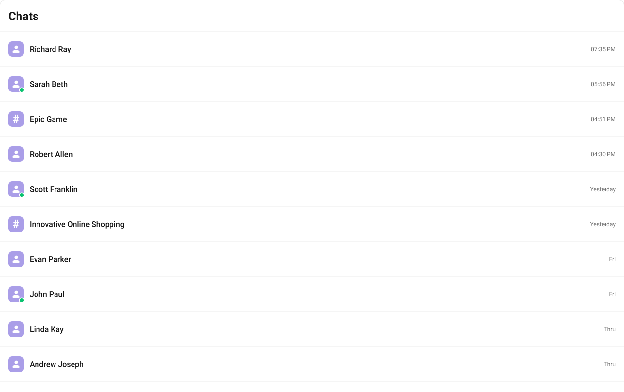
- TypeScript
- CSS
leadingView
Replace the avatar / left section. Typing-aware avatar example.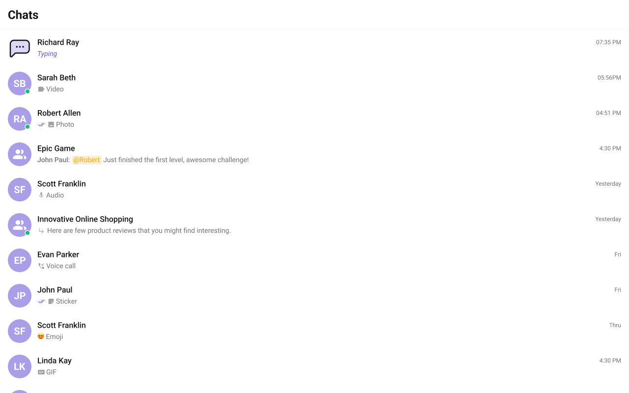
trailingView
Replace the timestamp / badge / right section. Relative time badge example.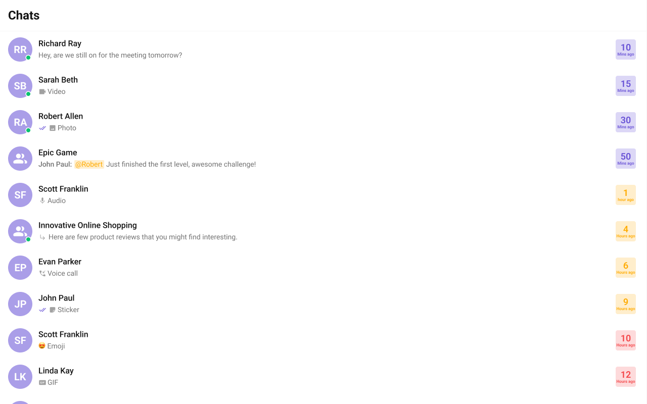
- TypeScript
- CSS
titleView
Replace the name / title text. Inline user status example.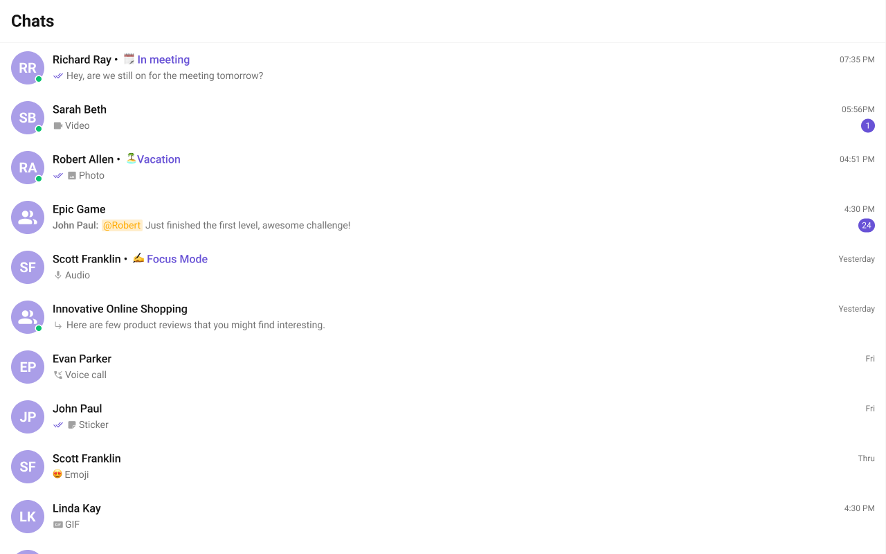
- TypeScript
- CSS
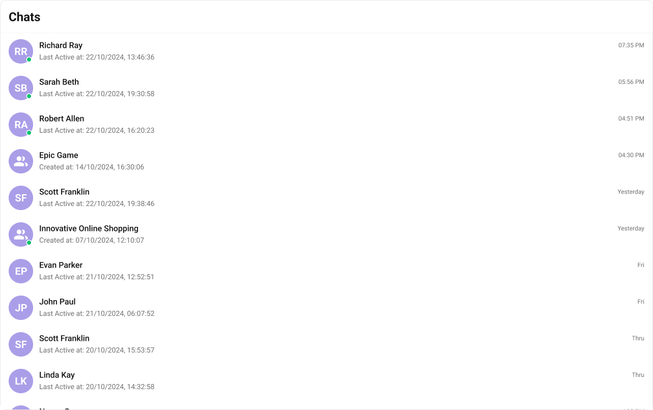
subtitleView
Replace the last message preview text. Default:
- TypeScript
- CSS
headerView
Replace the entire header bar.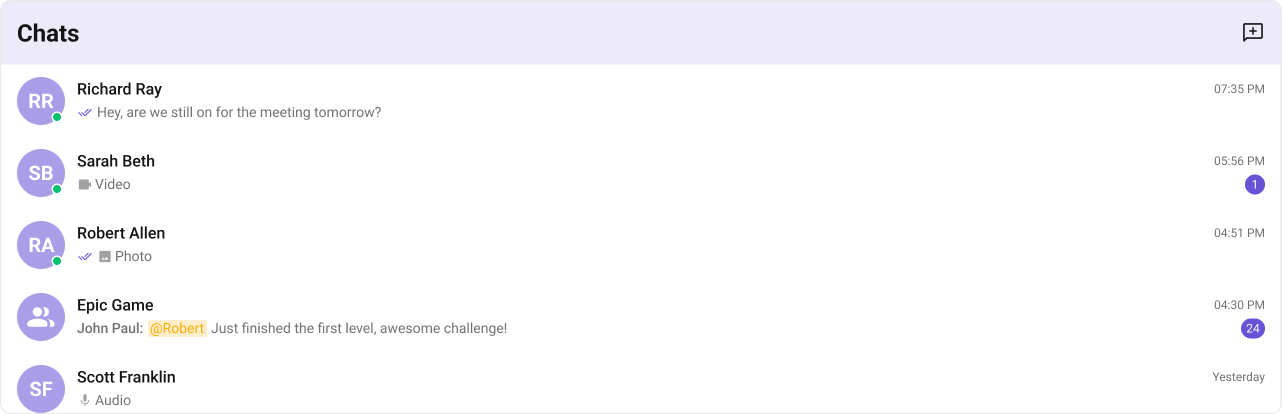
- TypeScript
- CSS
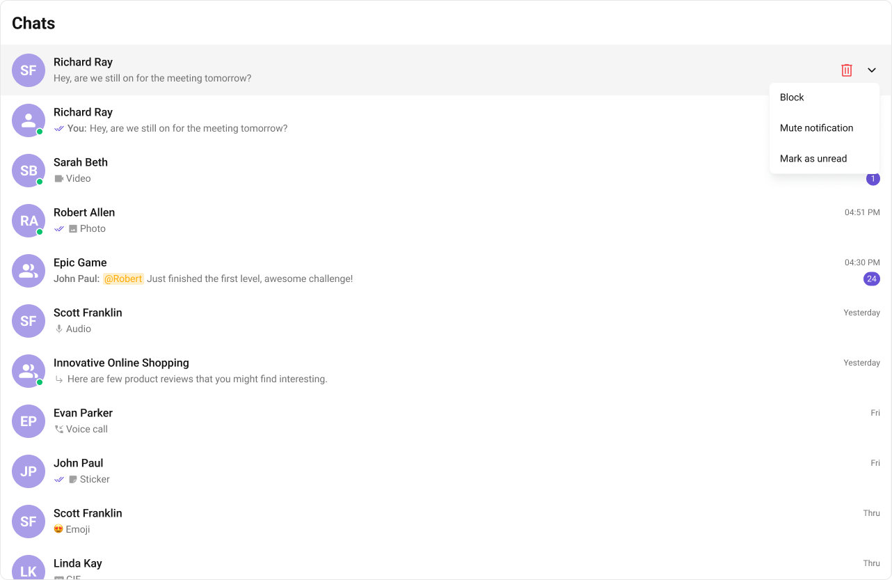
options
Replace the context menu / hover actions on each conversation item. Default: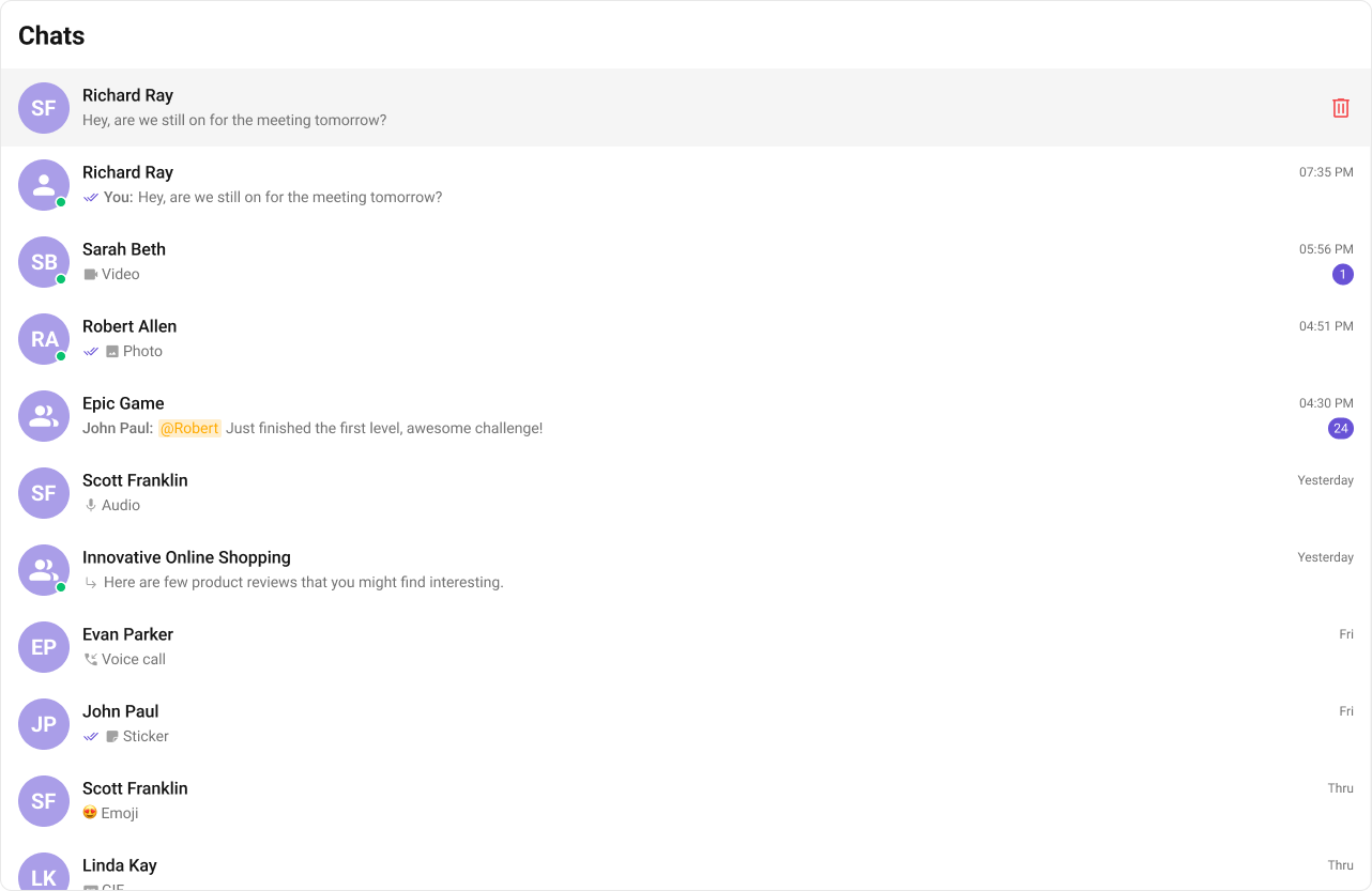
- TypeScript
- CSS
textFormatters
Custom text formatters for the conversation subtitle. Array ofCometChatTextFormatter instances. If not provided, default formatters from the data source are used.
lastMessageDateTimeFormat
Customize the last message timestamp format using aCalendarObject.
If no property is passed in the CalendarObject, the component checks the global configuration first. If also missing there, the component’s default formatting applies.
Common Patterns
Custom empty state with CTA
Hide all chrome — minimal list
Conversations with search
CSS Architecture
The component uses CSS custom properties (design tokens) defined in@cometchat/chat-uikit-react/css-variables.css. The cascade:
- Global tokens (e.g.,
--cometchat-primary-color,--cometchat-background-color-01) are set on the.cometchatroot wrapper. - Component CSS (
.cometchat-conversations) consumes these tokens viavar()with fallback values. - Overrides target
.cometchat-conversationsdescendant selectors in a global stylesheet.
CometChatConversations exist on the same page, wrap the component in a container and scope selectors:
Key Selectors
| Target | Selector |
|---|---|
| Root | .cometchat-conversations |
| Header title | .cometchat-conversations .cometchat-list__header-title |
| List item | .cometchat-conversations .cometchat-list-item |
| Body title | .cometchat-conversations .cometchat-list-item__body-title |
| Avatar | .cometchat-conversations .cometchat-avatar |
| Avatar text | .cometchat-conversations .cometchat-avatar__text |
| Unread badge | .cometchat-conversations .cometchat-badge |
| Subtitle text | .cometchat-conversations .cometchat-conversations__subtitle-text |
| Status indicator | .cometchat-conversations .cometchat-status-indicator |
| Read receipts | .cometchat-conversations .cometchat-receipts-read |
| Active item | .cometchat-conversations__list-item-active .cometchat-list-item |
| Typing indicator | .cometchat-conversations__subtitle-typing |
| Trailing view | .cometchat-conversations__trailing-view |
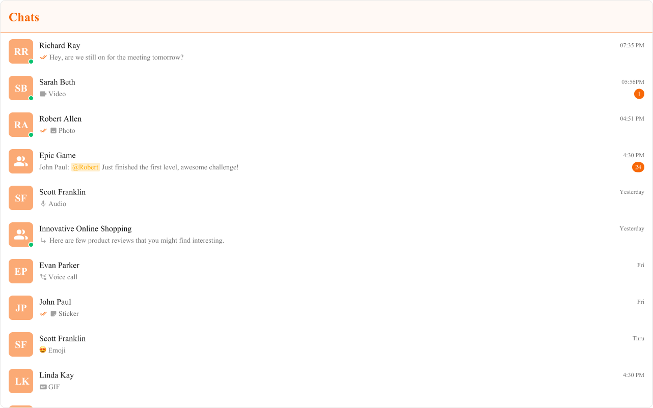
Example: Brand-themed conversations
Customization Matrix
| What to change | Where | Property/API | Example |
|---|---|---|---|
| Override behavior on user interaction | Component props | on<Event> callbacks | onItemClick={(c) => setActive(c)} |
| Filter which conversations appear | Component props | conversationsRequestBuilder | conversationsRequestBuilder={new CometChat.ConversationsRequestBuilder().setLimit(10)} |
| Toggle visibility of UI elements | Component props | hide<Feature> boolean props | hideReceipts={true} |
| Replace a section of the list item | Component props | <slot>View render props | itemView={(conversation) => <div>...</div>} |
| Change colors, fonts, spacing | Global CSS | Target .cometchat-conversations class | .cometchat-conversations .cometchat-badge { background: #e5484d; } |
Props
All props are optional. Sorted alphabetically.activeConversation
Highlights the specified conversation in the list.| Type | CometChat.Conversation |
| Default | undefined |
conversationsRequestBuilder
Controls which conversations load and in what order.| Type | CometChat.ConversationsRequestBuilder |
| Default | SDK default (30 per page) |
.build().
customSoundForMessages
URL to a custom audio file for incoming message notifications.| Type | string |
| Default | Built-in sound |
disableSoundForMessages
Disables the notification sound for incoming messages.| Type | boolean |
| Default | false |
emptyView
Custom component displayed when there are no conversations.| Type | JSX.Element |
| Default | Built-in empty state |
errorView
Custom component displayed when an error occurs.| Type | JSX.Element |
| Default | Built-in error state |
hideError={true}.
headerView
Custom component rendered as the entire header bar.| Type | JSX.Element |
| Default | Built-in header with title |
hideDeleteConversation
Hides the delete option in the context menu.| Type | boolean |
| Default | false |
hideError
Hides the default and custom error views.| Type | boolean |
| Default | false |
errorView if set.
hideGroupType
Hides the group type icon (public/private/password).| Type | boolean |
| Default | false |
hideReceipts
Hides message read/delivery receipt indicators.| Type | boolean |
| Default | false |
hideUserStatus
Hides the online/offline status indicator.| Type | boolean |
| Default | false |
itemView
Custom renderer for the entire list item row.| Type | (conversation: CometChat.Conversation) => JSX.Element |
| Default | Built-in list item |
lastMessageDateTimeFormat
Format for displaying the timestamp of the last message.| Type | CalendarObject |
| Default | Component default (hh:mm A today, [yesterday], DD/MM/YYYY other days) |
leadingView
Custom renderer for the avatar / left section.| Type | (conversation: CometChat.Conversation) => JSX.Element |
| Default | Built-in avatar |
loadingView
Custom component displayed during the loading state.| Type | JSX.Element |
| Default | Built-in shimmer |
onError
Callback fired when the component encounters an error.| Type | ((error: CometChat.CometChatException) => void) | null |
| Default | undefined |
onItemClick
Callback fired when a conversation row is clicked.| Type | (conversation: CometChat.Conversation) => void |
| Default | undefined |
onSearchBarClicked
Callback fired when the search bar is clicked. RequiresshowSearchBar={true}.
| Type | () => void |
| Default | undefined |
onSelect
Callback fired when a conversation is selected/deselected. RequiresselectionMode to be set.
| Type | (conversation: CometChat.Conversation, selected: boolean) => void |
| Default | undefined |
options
Custom context menu / hover actions for each conversation item.| Type | ((conversation: CometChat.Conversation) => CometChatOption[]) | null |
| Default | Built-in delete option |
searchView
Custom search bar component in the header.| Type | JSX.Element |
| Default | Built-in search bar |
selectionMode
Enables single or multi-select checkboxes on list items.| Type | SelectionMode |
| Default | SelectionMode.none |
onSelect to capture selections.
showScrollbar
Shows the scrollbar in the conversation list.| Type | boolean |
| Default | false |
showSearchBar
Shows a search bar at the top of the list.| Type | boolean |
| Default | false |
subtitleView
Custom renderer for the last message preview text.| Type | (conversation: CometChat.Conversation) => JSX.Element |
| Default | Built-in subtitle |
textFormatters
Custom text formatters for the conversation subtitle.| Type | CometChatTextFormatter[] |
| Default | Default formatters from data source |
titleView
Custom renderer for the name / title text.| Type | (conversation: CometChat.Conversation) => JSX.Element |
| Default | Built-in title |
trailingView
Custom renderer for the timestamp / badge / right section.| Type | (conversation: CometChat.Conversation) => JSX.Element |
| Default | Built-in trailing view |
Events
| Event | Payload | Fires when |
|---|---|---|
CometChatConversationEvents.ccConversationDeleted | CometChat.Conversation | Conversation deleted from list |
CometChatConversationEvents.ccUpdateConversation | CometChat.Conversation | Conversation updated |
CometChatConversationEvents.ccMarkConversationAsRead | CometChat.Conversation | Conversation marked as read |
Subject<CometChat.Conversation> from RxJS. Subscribe with .subscribe(), unsubscribe with the returned subscription’s .unsubscribe().
CSS Selectors
| Target | Selector |
|---|---|
| Root | .cometchat-conversations |
| Header title | .cometchat-conversations .cometchat-list__header-title |
| List item | .cometchat-conversations .cometchat-list-item |
| Body title | .cometchat-conversations .cometchat-list-item__body-title |
| Avatar | .cometchat-conversations .cometchat-avatar |
| Avatar text | .cometchat-conversations .cometchat-avatar__text |
| Unread badge | .cometchat-conversations .cometchat-badge |
| Subtitle text | .cometchat-conversations .cometchat-conversations__subtitle-text |
| Subtitle sender | .cometchat-conversations__subtitle-text-sender |
| Status indicator (online) | .cometchat-conversations__list-item-online .cometchat-list-item__status |
| Group type (password) | .cometchat-conversations__list-item-password .cometchat-list-item__status |
| Group type (private) | .cometchat-conversations__list-item-private .cometchat-list-item__status |
| Read receipts | .cometchat-conversations__subtitle-receipts-read |
| Delivered receipts | .cometchat-conversations__subtitle-receipts-delivered |
| Sent receipts | .cometchat-conversations__subtitle-receipts-sent |
| Error receipts | .cometchat-conversations__subtitle-receipts-error |
| Active item | .cometchat-conversations__list-item-active .cometchat-list-item |
| Typing indicator | .cometchat-conversations__subtitle-typing |
| Trailing view | .cometchat-conversations__trailing-view |
| Badge count | .cometchat-conversations__trailing-view-badge-count |
| Empty state | .cometchat-conversations__empty-state-view |
| Error state | .cometchat-conversations__error-state-view |
| Shimmer loading | .cometchat-conversations__shimmer |
| Context menu | .cometchat-conversations__trailing-view-options |
| Mentions highlight | .cometchat-conversations__subtitle-text .cometchat-mentions |
| @you mentions | .cometchat-conversations__subtitle-text .cometchat-mentions-you |