AI Integration Quick Reference
AI Integration Quick Reference
Where It Fits
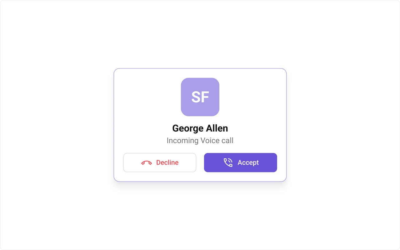
CometChatIncomingCall is an overlay component that auto-detects incoming calls and renders a notification with accept/decline buttons. Place it at the app root level so it appears above all other content.
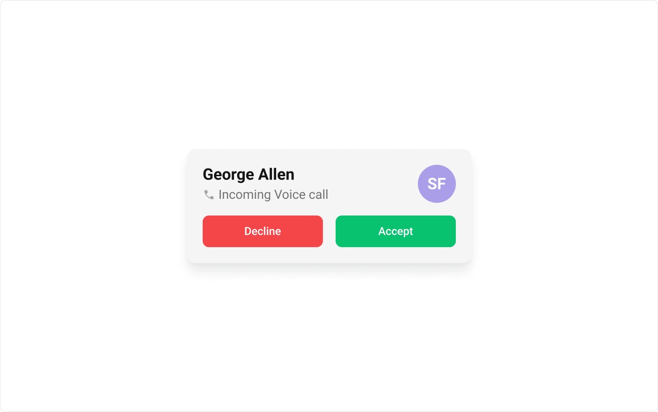
Minimal Render
.cometchat-incoming-call
Actions and Events
Callback Props
onAccept
Fires when the accept button is clicked.onDecline
Fires when the decline button is clicked.onError
Fires on internal errors.Global UI Events
CometChatCallEvents emits events subscribable from anywhere in the application.
| Event | Fires when | Payload |
|---|---|---|
ccCallRejected | Incoming call is rejected | CometChat.Call |
ccCallAccepted | Incoming call is accepted | CometChat.Call |
ccCallEnded | Call ends | CometChat.Call |
SDK Events (Real-Time, Automatic)
The component listens to SDK call events internally for real-time incoming call detection. No manual attachment needed.Custom View Slots
View slots forCometChatIncomingCall are functions that receive the CometChat.Call object.
| Slot | Signature | Replaces |
|---|---|---|
itemView | (call: CometChat.Call) => JSX.Element | Entire list item |
leadingView | (call: CometChat.Call) => JSX.Element | Avatar / left section |
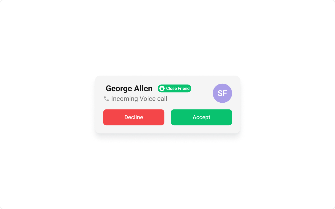
titleView | (call: CometChat.Call) => JSX.Element | Name / title text |
subtitleView | (call: CometChat.Call) => JSX.Element | Subtitle text |
trailingView | (call: CometChat.Call) => JSX.Element | Right section |
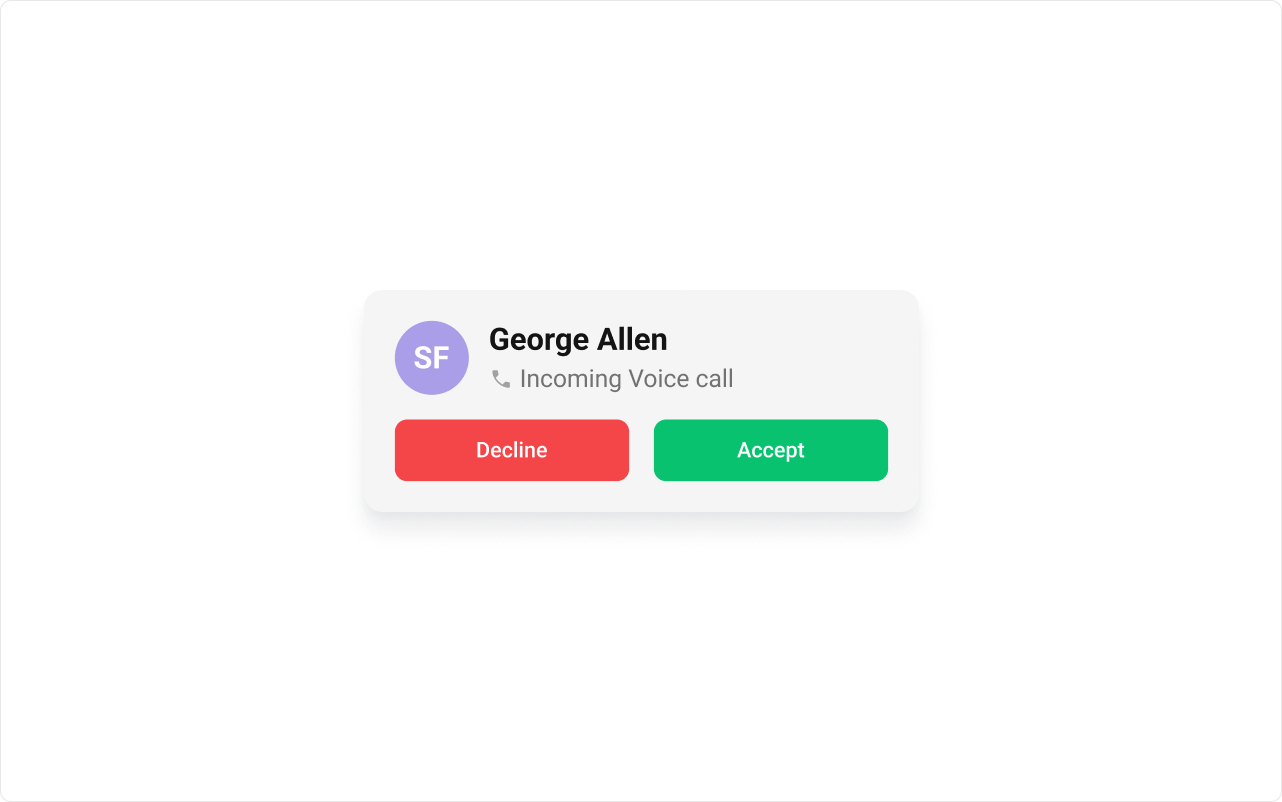
leadingView
titleView
itemView
Common Patterns
Disable ringtone
Custom ringtone
CSS Architecture
Key Selectors
| Target | Selector |
|---|---|
| Root | .cometchat-incoming-call |
| List item | .cometchat-incoming-call .cometchat-list-item |
| Body title | .cometchat-incoming-call .cometchat-list-item__body-title |
| Button group | .cometchat-incoming-call__button-group |
| Decline button | .cometchat-incoming-call__button-decline |
| Accept button | .cometchat-incoming-call__button-accept |
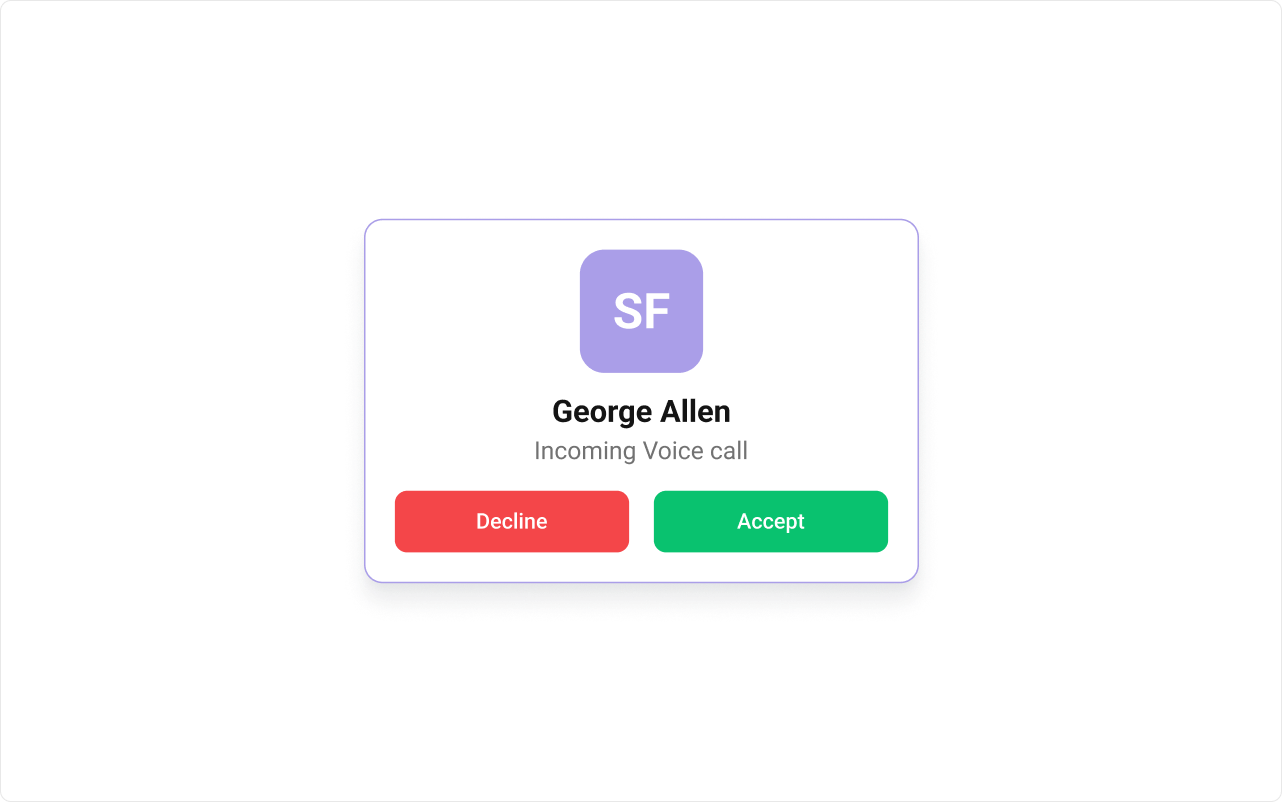
Example: Brand-themed incoming call
Props
All props are optional.call
Sets a specific call object for the incoming call display.| Type | any |
| Default | Auto-detected |
callSettingsBuilder
Custom call settings builder for the call session.| Type | (call: CometChat.Call) => typeof CometChatUIKitCalls.CallSettingsBuilder |
| Default | undefined |
customSoundForCalls
Custom sound file URL for incoming calls.| Type | string |
| Default | undefined |
disableSoundForCalls
Disables the incoming call ringtone.| Type | boolean |
| Default | false |
itemView
Custom renderer for the entire list item.| Type | (call: CometChat.Call) => JSX.Element |
| Default | undefined |
leadingView
Custom renderer for the avatar / left section.| Type | (call: CometChat.Call) => JSX.Element |
| Default | undefined |
onAccept
Callback fired when the accept button is clicked.| Type | (call: CometChat.Call) => void |
| Default | undefined |
onDecline
Callback fired when the decline button is clicked.| Type | (call: CometChat.Call) => void |
| Default | undefined |
onError
Callback fired when the component encounters an error.| Type | ((error: CometChat.CometChatException) => void) | null |
| Default | undefined |
subtitleView
Custom renderer for the subtitle text.| Type | (call: CometChat.Call) => JSX.Element |
| Default | undefined |
titleView
Custom renderer for the name / title text.| Type | (call: CometChat.Call) => JSX.Element |
| Default | undefined |
trailingView
Custom renderer for the right section.| Type | (call: CometChat.Call) => JSX.Element |
| Default | undefined |
Events
| Event | Payload | Fires when |
|---|---|---|
CometChatCallEvents.ccCallRejected | CometChat.Call | Call rejected |
CometChatCallEvents.ccCallAccepted | CometChat.Call | Call accepted |
CometChatCallEvents.ccCallEnded | CometChat.Call | Call ended |
CSS Selectors
| Target | Selector |
|---|---|
| Root | .cometchat-incoming-call |
| List item | .cometchat-incoming-call .cometchat-list-item |
| Body title | .cometchat-incoming-call .cometchat-list-item__body-title |
| Title container | .cometchat-incoming-call .cometchat-list-item__title-container |
| Trailing view | .cometchat-incoming-call .cometchat-list-item__trailing-view |
| Button group | .cometchat-incoming-call__button-group |
| Decline button | .cometchat-incoming-call__button-decline |
| Accept button | .cometchat-incoming-call__button-accept |