AI Integration Quick Reference
AI Integration Quick Reference
Where It Fits
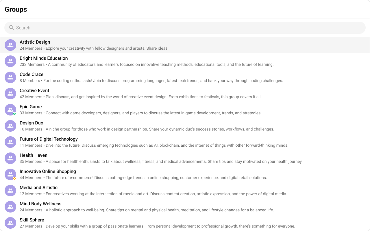
CometChatGroups is a directory list component. It renders available groups and emits the selected CometChat.Group via onItemClick. Wire it to CometChatMessageHeader, CometChatMessageList, and CometChatMessageComposer to build a group chat layout.

Minimal Render
.cometchat-groups
Filtering Groups
Pass aCometChat.GroupsRequestBuilder to groupsRequestBuilder. Pass the builder instance — not the result of .build().
Filter Recipes
| Recipe | Code |
|---|---|
| Joined groups only | new CometChat.GroupsRequestBuilder().joinedOnly(true) |
| Limit to 10 per page | new CometChat.GroupsRequestBuilder().setLimit(10) |
| Search by keyword | new CometChat.GroupsRequestBuilder().setSearchKeyword("design") |
| Filter by tags | new CometChat.GroupsRequestBuilder().setTags(["vip"]) |
| With tags data | new CometChat.GroupsRequestBuilder().withTags(true) |
searchRequestBuilder prop accepts a separate GroupsRequestBuilder for filtering when the search bar is active.
Actions and Events
Callback Props
onItemClick
Fires when a group row is tapped. Primary navigation hook — set the active group and render the message view.onSelect
Fires when a group is checked/unchecked in multi-select mode. RequiresselectionMode to be set.
onError
Fires on internal errors (network failure, auth issue, SDK exception).Global UI Events
CometChatGroupEvents emits events subscribable from anywhere in the application. Subscribe in a useEffect and unsubscribe on cleanup.
| Event | Fires when | Payload |
|---|---|---|
ccGroupCreated | A new group is created | CometChat.Group |
ccGroupDeleted | A group is deleted | CometChat.Group |
ccGroupMemberJoined | A user joins a group | IGroupMemberJoined |
ccGroupLeft | A user leaves a group | IGroupLeft |
ccGroupMemberAdded | Members are added to a group | IGroupMemberAdded |
ccGroupMemberScopeChanged | A member’s scope changes | IGroupMemberScopeChanged |
ccGroupMemberKicked | A member is kicked | IGroupMemberKickedBanned |
ccGroupMemberBanned | A member is banned | IGroupMemberKickedBanned |
ccGroupMemberUnbanned | A member is unbanned | IGroupMemberUnBanned |
ccOwnershipChanged | Group ownership is transferred | IOwnershipChanged |
SDK Events (Real-Time, Automatic)
The component listens to these SDK events internally. No manual attachment needed unless additional side effects are required.| SDK Listener | Internal behavior |
|---|---|
onGroupMemberJoined | Updates member count, sets hasJoined if current user joined |
onGroupMemberLeft | Updates member count, sets hasJoined(false) if current user left |
onMemberAddedToGroup | Updates member count, adds group to list if current user was added |
onGroupMemberKicked | Updates member count, sets hasJoined(false) if current user was kicked |
onGroupMemberBanned | Removes group if current user was banned, otherwise updates member count |
onGroupMemberScopeChanged | Updates scope if current user’s scope changed, updates member count |
In React 18 StrictMode,
useEffect runs twice on mount in development. The component handles listener cleanup internally, but any additional listeners added alongside the component need cleanup in the useEffect return function to avoid duplicate event handling.Custom View Slots
Each slot replaces a section of the default UI. Slots that accept a group parameter receive theCometChat.Group object for that row.
| Slot | Signature | Replaces |
|---|---|---|
itemView | (group: CometChat.Group) => JSX.Element | Entire list item row |
leadingView | (group: CometChat.Group) => JSX.Element | Avatar / left section |
titleView | (group: CometChat.Group) => JSX.Element | Name / title text |
subtitleView | (group: CometChat.Group) => JSX.Element | Member count subtitle |
trailingView | (group: CometChat.Group) => JSX.Element | Right section |
headerView | JSX.Element | Entire header bar |
loadingView | JSX.Element | Loading spinner |
emptyView | JSX.Element | Empty state |
errorView | JSX.Element | Error state |
options | (group: CometChat.Group) => CometChatOption[] | Context menu / hover actions |
itemView
Replace the entire list item row. Default: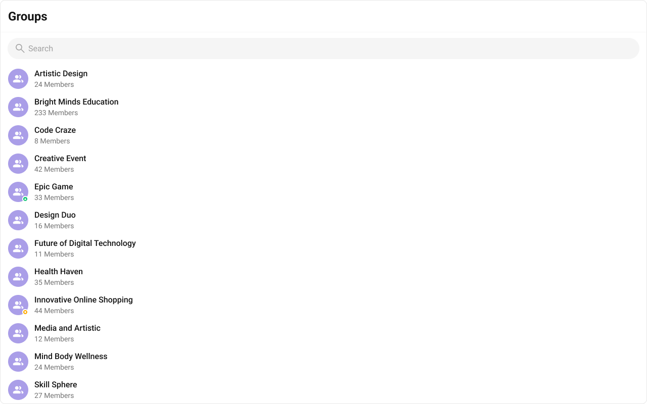
- TypeScript
- CSS
titleView
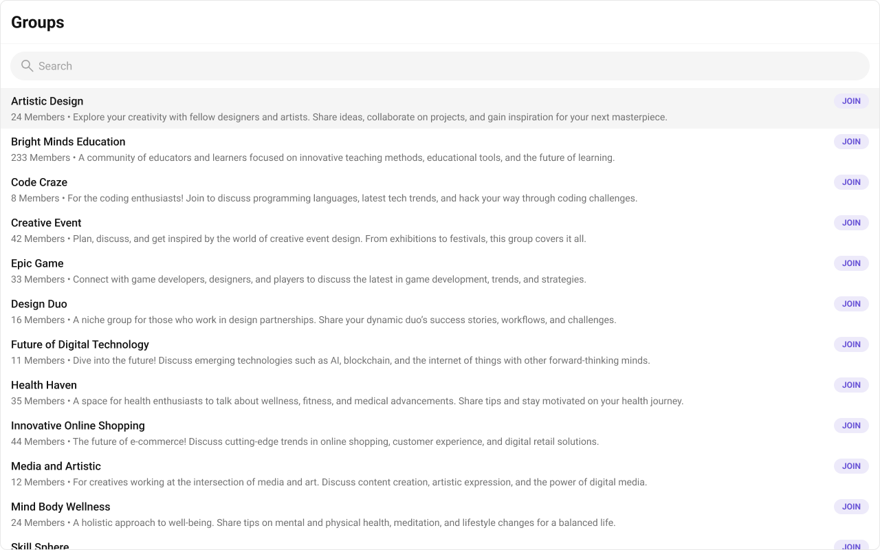
Replace the name / title text. Group type badge inline example.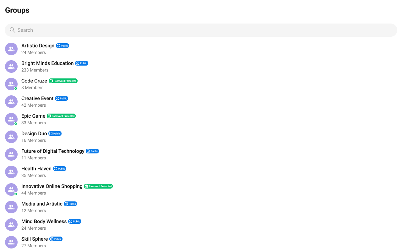
- TypeScript
- CSS
subtitleView
Replace the member count subtitle text. Default:
- TypeScript
- CSS
leadingView
Replace the avatar / left section. Joined status badge example.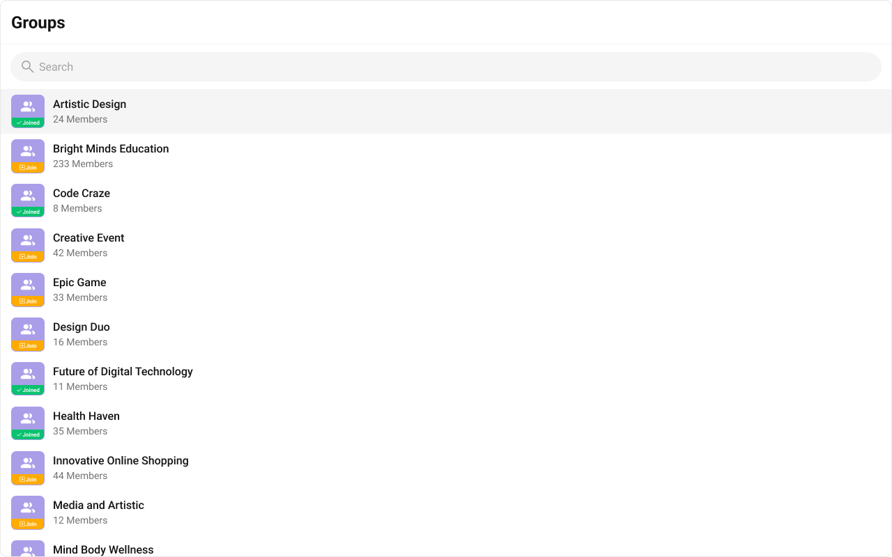
- TypeScript
- CSS
trailingView
Replace the right section. Join status button example.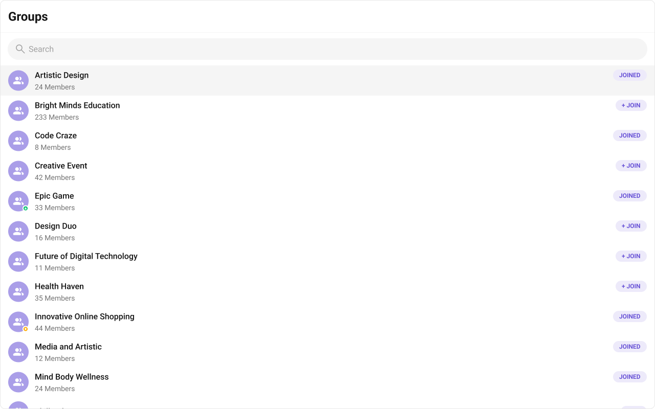
- TypeScript
- CSS
headerView
Replace the entire header bar.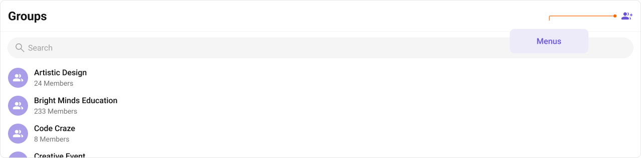
- TypeScript
- CSS
options
Replace the context menu / hover actions on each group item.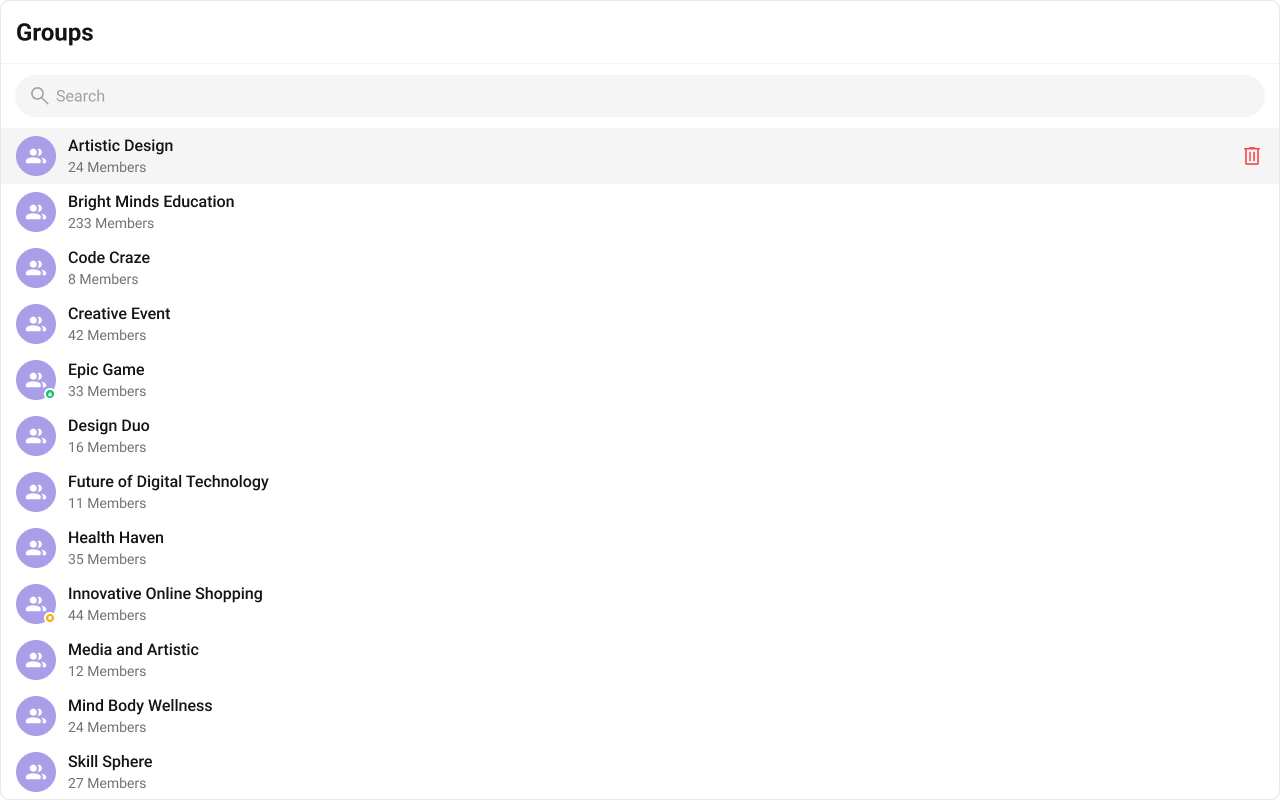
- TypeScript
- CSS
Common Patterns
Custom empty state with CTA
Hide all chrome — minimal list
Joined groups only
CSS Architecture
The component uses CSS custom properties (design tokens) defined in@cometchat/chat-uikit-react/css-variables.css. The cascade:
- Global tokens (e.g.,
--cometchat-primary-color,--cometchat-background-color-01) are set on the.cometchatroot wrapper. - Component CSS (
.cometchat-groups) consumes these tokens viavar()with fallback values. - Overrides target
.cometchat-groupsdescendant selectors in a global stylesheet.
CometChatGroups exist on the same page, wrap the component in a container and scope selectors:
Key Selectors
| Target | Selector |
|---|---|
| Root | .cometchat-groups |
| Header title | .cometchat-groups .cometchat-list__header-title |
| Search bar input | .cometchat-groups .cometchat-search-bar__input |
| List item | .cometchat-groups .cometchat-list-item |
| Body title | .cometchat-groups .cometchat-list-item__body-title |
| Avatar | .cometchat-groups__list-item .cometchat-avatar |
| Subtitle | .cometchat-groups__subtitle |
| Active item | .cometchat-groups__list-item-active .cometchat-list-item |
| Password group icon | .cometchat-groups__list-item-password .cometchat-list-item__status |
| Private group icon | .cometchat-groups__list-item-private .cometchat-list-item__status |
| Empty state | .cometchat-groups__empty-state-view |
| Error state | .cometchat-groups__error-state-view |
| Shimmer loading | .cometchat-groups__shimmer |
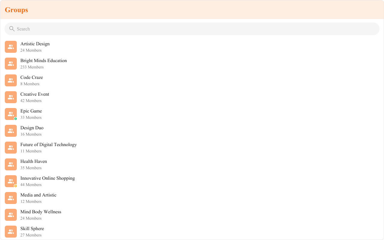
Example: Brand-themed groups
Customization Matrix
| What to change | Where | Property/API | Example |
|---|---|---|---|
| Override behavior on user interaction | Component props | on<Event> callbacks | onItemClick={(g) => setActive(g)} |
| Filter which groups appear | Component props | groupsRequestBuilder | groupsRequestBuilder={new CometChat.GroupsRequestBuilder().joinedOnly(true)} |
| Toggle visibility of UI elements | Component props | hide<Feature> boolean props | hideGroupType={true} |
| Replace a section of the list item | Component props | <slot>View render props | itemView={(group) => <div>...</div>} |
| Change colors, fonts, spacing | Global CSS | Target .cometchat-groups class | .cometchat-groups .cometchat-avatar { border-radius: 8px; } |
Props
All props are optional unless noted otherwise.activeGroup
Highlights the specified group in the list.| Type | CometChat.Group |
| Default | undefined |
emptyView
Custom component displayed when there are no groups.| Type | JSX.Element |
| Default | Built-in empty state |
errorView
Custom component displayed when an error occurs.| Type | JSX.Element |
| Default | Built-in error state |
hideError={true}.
groupsRequestBuilder
Controls which groups load and in what order.| Type | CometChat.GroupsRequestBuilder |
| Default | SDK default (30 per page) |
.build().
headerView
Custom component rendered as the entire header bar.| Type | JSX.Element |
| Default | Built-in header with title |
hideError
Hides the default and custom error views.| Type | boolean |
| Default | false |
errorView if set.
hideGroupType
Hides the group type icon (public/private/password).| Type | boolean |
| Default | false |
hideSearch
Hides the default search bar.| Type | boolean |
| Default | false |
itemView
Custom renderer for the entire list item row.| Type | (group: CometChat.Group) => JSX.Element |
| Default | Built-in list item |
leadingView
Custom renderer for the avatar / left section.| Type | (group: CometChat.Group) => JSX.Element |
| Default | Built-in avatar |
loadingView
Custom component displayed during the loading state.| Type | JSX.Element |
| Default | Built-in shimmer |
onError
Callback fired when the component encounters an error.| Type | ((error: CometChat.CometChatException) => void) | null |
| Default | undefined |
onItemClick
Callback fired when a group row is clicked.| Type | (group: CometChat.Group) => void |
| Default | undefined |
onSelect
Callback fired when a group is selected/deselected. RequiresselectionMode to be set.
| Type | (group: CometChat.Group, selected: boolean) => void |
| Default | undefined |
options
Custom context menu / hover actions for each group item.| Type | (group: CometChat.Group) => CometChatOption[] |
| Default | undefined |
searchRequestBuilder
Controls filtering when the search bar is active.| Type | CometChat.GroupsRequestBuilder |
| Default | undefined |
selectionMode
Enables single or multi-select checkboxes on list items.| Type | SelectionMode |
| Default | SelectionMode.none |
onSelect to capture selections.
showScrollbar
Shows the scrollbar in the group list.| Type | boolean |
| Default | false |
subtitleView
Custom renderer for the member count subtitle text.| Type | (group: CometChat.Group) => JSX.Element |
| Default | Built-in subtitle |
titleView
Custom renderer for the name / title text.| Type | (group: CometChat.Group) => JSX.Element |
| Default | Built-in title |
trailingView
Custom renderer for the right section.| Type | (group: CometChat.Group) => JSX.Element |
| Default | Built-in trailing view |
Events
| Event | Payload | Fires when |
|---|---|---|
CometChatGroupEvents.ccGroupCreated | CometChat.Group | New group created |
CometChatGroupEvents.ccGroupDeleted | CometChat.Group | Group deleted |
CometChatGroupEvents.ccGroupMemberJoined | IGroupMemberJoined | User joins a group |
CometChatGroupEvents.ccGroupLeft | IGroupLeft | User leaves a group |
CometChatGroupEvents.ccGroupMemberAdded | IGroupMemberAdded | Members added to a group |
CometChatGroupEvents.ccGroupMemberScopeChanged | IGroupMemberScopeChanged | Member scope changed |
CometChatGroupEvents.ccGroupMemberKicked | IGroupMemberKickedBanned | Member kicked |
CometChatGroupEvents.ccGroupMemberBanned | IGroupMemberKickedBanned | Member banned |
CometChatGroupEvents.ccGroupMemberUnbanned | IGroupMemberUnBanned | Member unbanned |
CometChatGroupEvents.ccOwnershipChanged | IOwnershipChanged | Ownership transferred |
Subject instances. Subscribe with .subscribe(), unsubscribe with the returned subscription’s .unsubscribe().
CSS Selectors
| Target | Selector |
|---|---|
| Root | .cometchat-groups |
| Header title | .cometchat-groups .cometchat-list__header-title |
| Search bar input | .cometchat-groups .cometchat-search-bar__input |
| List item | .cometchat-groups .cometchat-list-item |
| Body title | .cometchat-groups .cometchat-list-item__body-title |
| Avatar | .cometchat-groups__list-item .cometchat-avatar |
| Leading view | .cometchat-groups__list-item .cometchat-list-item__leading-view |
| Subtitle | .cometchat-groups__subtitle |
| Active item | .cometchat-groups__list-item-active .cometchat-list-item |
| Password group icon | .cometchat-groups__list-item-password .cometchat-list-item__status |
| Password group status icon | .cometchat-groups__list-item-password .cometchat-list-item__status-icon |
| Private group icon | .cometchat-groups__list-item-private .cometchat-list-item__status |
| Private group status icon | .cometchat-groups__list-item-private .cometchat-list-item__status-icon |
| Empty state | .cometchat-groups__empty-state-view |
| Empty state title | .cometchat-groups__empty-state-view-body-title |
| Empty state description | .cometchat-groups__empty-state-view-body-description |
| Error state | .cometchat-groups__error-state-view |
| Error state title | .cometchat-groups__error-state-view-body-title |
| Error state description | .cometchat-groups__error-state-view-body-description |
| Shimmer loading | .cometchat-groups__shimmer |
| Shimmer item | .cometchat-groups__shimmer-item |
| Shimmer avatar | .cometchat-groups__shimmer-item-avatar |
| Shimmer title | .cometchat-groups__shimmer-item-body-title |
| Shimmer subtitle | .cometchat-groups__shimmer-item-body-subtitle |