AI Integration Quick Reference
AI Integration Quick Reference
Where It Fits
CometChatMessageList renders a scrollable, real-time message feed for a user or group conversation. Wire it alongside CometChatMessageHeader and CometChatMessageComposer to build a standard chat view.
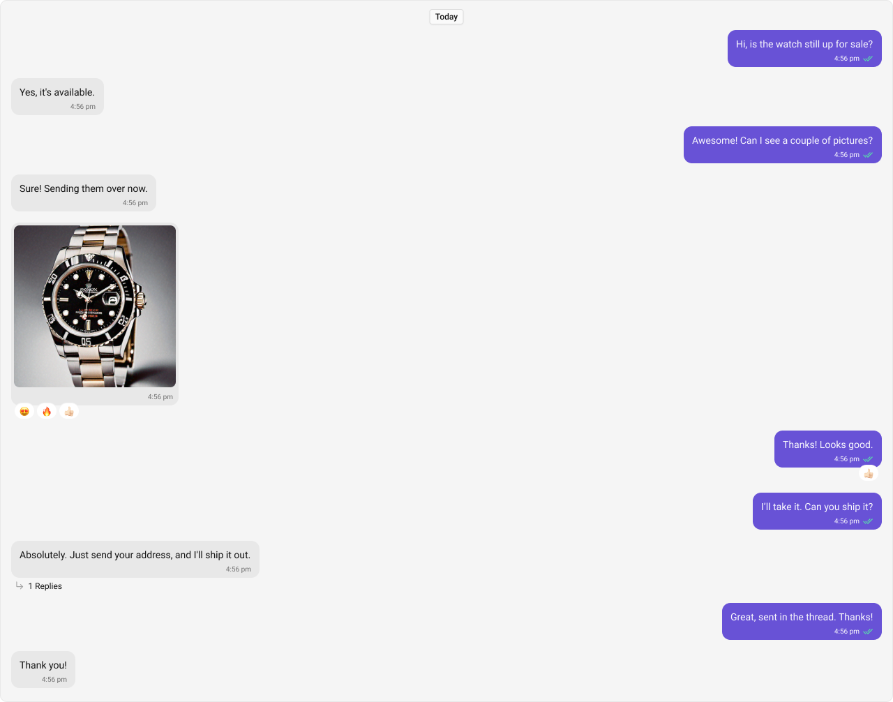
Minimal Render
.cometchat-message-list
Filtering Messages
Pass aCometChat.MessagesRequestBuilder to messagesRequestBuilder. The UID/GUID parameters are always overridden internally based on the user/group prop.
Reactions Request Builder
Actions and Events
Callback Props
onThreadRepliesClick
Fires when a threaded message reply count is clicked.onReactionClick
Fires when a reaction on a message bubble is clicked.onReactionListItemClick
Fires when a specific reaction in the reaction detail view is clicked.onError
Fires on internal errors.Global UI Events
| Event | Fires when | Payload |
|---|---|---|
CometChatMessageEvents.ccMessageEdited | A message is edited | IMessages |
CometChatMessageEvents.ccMessageDeleted | A message is deleted | CometChat.BaseMessage |
CometChatMessageEvents.ccMessageRead | A message is read | CometChat.BaseMessage |
CometChatMessageEvents.ccReplyToMessage | User replies to a message | IMessages |
CometChatUIEvents.ccOpenChat | User opens a chat | IOpenChat |
CometChatUIEvents.ccActiveChatChanged | Active chat changes | IActiveChatChanged |
SDK Events (Real-Time, Automatic)
The component listens to these SDK events internally:| SDK Listener | Internal behavior |
|---|---|
onTextMessageReceived / onMediaMessageReceived / onCustomMessageReceived | Appends new message to list |
onMessageEdited / onMessageDeleted | Updates/removes message in list |
onTypingStarted / onTypingEnded | Shows/hides typing indicator |
onMessagesDelivered / onMessagesRead / onMessagesDeliveredToAll / onMessagesReadByAll | Updates receipt ticks |
onMessageModerated | Updates moderated message state |
Custom View Slots
| Slot | Type | Replaces |
|---|---|---|
headerView | JSX.Element | Area above the message list |
footerView | JSX.Element | Area below the message list |
loadingView | JSX.Element | Loading state |
emptyView | JSX.Element | Empty state |
errorView | JSX.Element | Error state |
templates | CometChatMessageTemplate[] | Message bubble rendering |
textFormatters | CometChatTextFormatter[] | Text formatting in messages |
headerView
Custom view above the message list.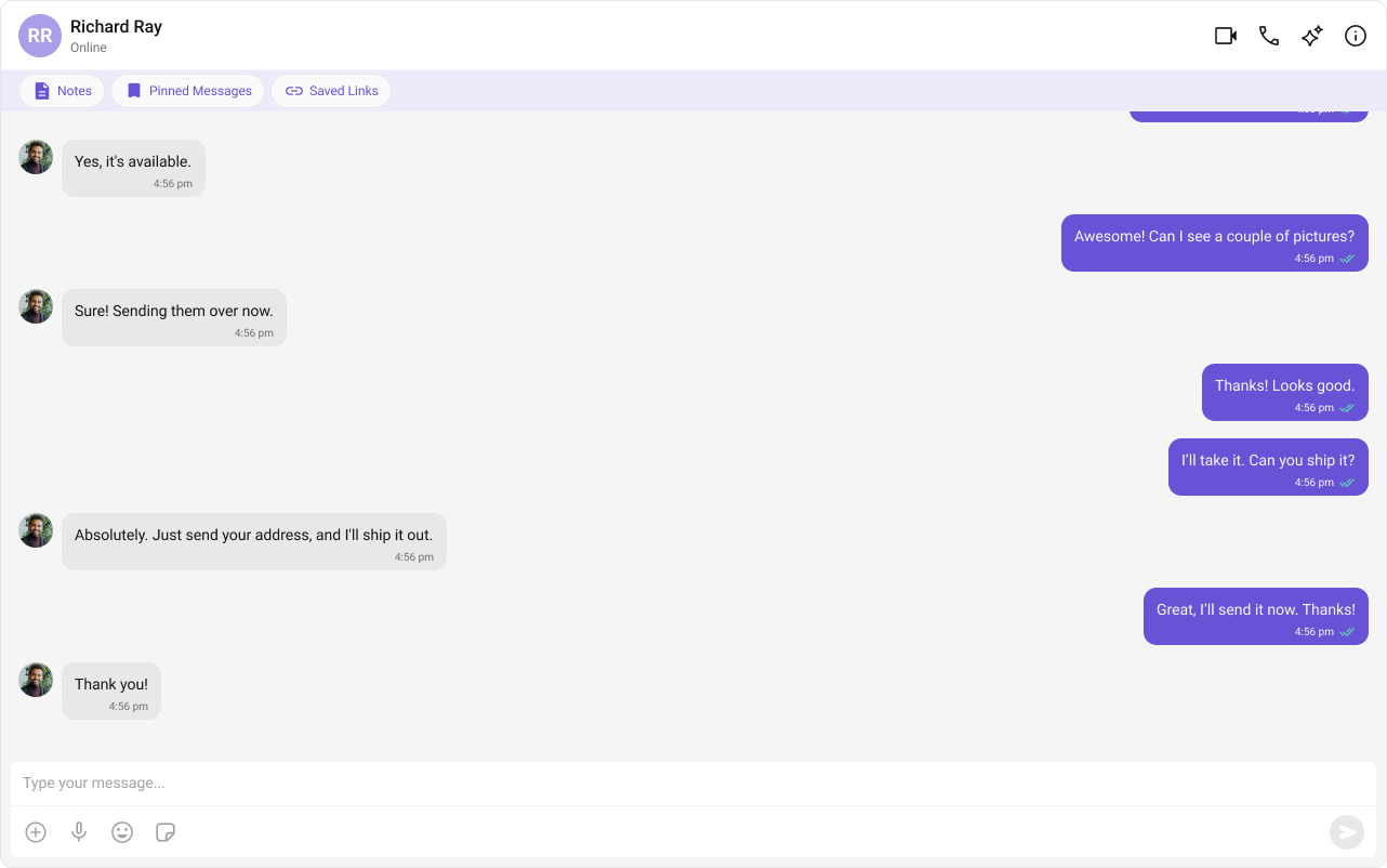
- TypeScript
- CSS
footerView
Custom view below the message list.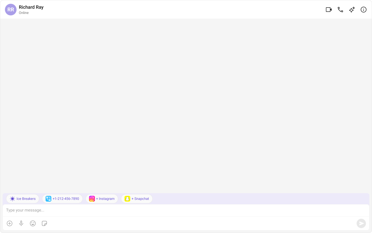
- TypeScript
- CSS
templates
Custom message bubble templates via CometChatMessageTemplate.Date Time Formatting
Customize timestamps usingCalendarObject:
Common Patterns
Threaded message list
Hide all chrome — minimal list
Left-aligned messages
AI conversation starters and smart replies
CSS Architecture
The component uses CSS custom properties (design tokens) defined in@cometchat/chat-uikit-react/css-variables.css. The cascade:
- Global tokens set on the
.cometchatroot wrapper. - Component CSS (
.cometchat-message-list) consumes these tokens viavar(). - Overrides target
.cometchat-message-listdescendant selectors.
Key Selectors
| Target | Selector |
|---|---|
| Root | .cometchat-message-list |
| Error state | .cometchat-message-list__error-state-view |
| Footer smart replies | .cometchat-message-list__footer-smart-replies |
| Footer conversation starters | .cometchat-message-list__footer-conversation-starter |
| Outgoing message bubble | .cometchat-message-bubble-outgoing |
| Incoming message bubble | .cometchat-message-bubble-incoming |
| Message bubble status info | .cometchat-message-bubble__status-info-view |
| Thread view replies | .cometchat-message-bubble__thread-view-replies |
| Text bubble | .cometchat-message-bubble .cometchat-text-bubble |
| Date separator | .cometchat-message-bubble__status-info-view .cometchat-date |
Customization Matrix
| What to change | Where | Property/API | Example |
|---|---|---|---|
| Handle thread clicks | Component props | onThreadRepliesClick | onThreadRepliesClick={(msg) => openThread(msg)} |
| Filter messages | Component props | messagesRequestBuilder | messagesRequestBuilder={builder} |
| Toggle visibility | Component props | hide<Feature> boolean props | hideReceipts={true} |
| Custom message bubbles | Component props | templates | templates={customTemplates} |
| Add header/footer | Component props | headerView / footerView | headerView={<div>...</div>} |
| Change colors, fonts, spacing | Global CSS | Target .cometchat-message-list class | .cometchat-message-bubble-outgoing { background: blue; } |
Props
All props are optional. Sorted alphabetically.customSoundForMessages
URL to a custom audio file for incoming message notifications.| Type | string |
| Default | undefined |
disableSoundForMessages
Disables the notification sound for incoming messages.| Type | boolean |
| Default | true |
emptyView
Custom component displayed when there are no messages.| Type | JSX.Element |
| Default | Built-in empty state |
errorView
Custom component displayed when an error occurs.| Type | JSX.Element |
| Default | Built-in error state |
footerView
Custom component displayed below the message list.| Type | JSX.Element |
| Default | undefined |
goToMessageId
Scrolls to the specified message on initial load.| Type | string |
| Default | undefined |
group
The group for group conversation messages.| Type | CometChat.Group |
| Default | undefined |
headerView
Custom component displayed above the message list.| Type | JSX.Element |
| Default | undefined |
hideAvatar
Hides avatars on messages.| Type | boolean |
| Default | false |
hideCopyMessageOption
Hides the copy message option.| Type | boolean |
| Default | false |
hideDateSeparator
Hides date separators between message groups.| Type | boolean |
| Default | false |
hideDeleteMessageOption
Hides the delete message option.| Type | boolean |
| Default | false |
hideEditMessageOption
Hides the edit message option.| Type | boolean |
| Default | false |
hideError
Hides the default and custom error views.| Type | boolean |
| Default | false |
hideFlagMessageOption
Hides the “Report Message” option.| Type | boolean |
| Default | false |
hideFlagRemarkField
Hides the remark text area in the flag message dialog.| Type | boolean |
| Default | false |
hideGroupActionMessages
Hides group action messages (join, leave, kick, etc.).| Type | boolean |
| Default | false |
hideMessageInfoOption
Hides the message info option.| Type | boolean |
| Default | false |
hideMessagePrivatelyOption
Hides the “Message Privately” option.| Type | boolean |
| Default | false |
hideModerationView
Hides the moderation view below moderated messages.| Type | boolean |
| Default | false |
hideReactionOption
Hides the reaction option.| Type | boolean |
| Default | false |
hideReceipts
Hides read/delivery receipt indicators.| Type | boolean |
| Default | false |
hideReplyInThreadOption
Hides the “Reply in Thread” option.| Type | boolean |
| Default | false |
hideReplyOption
Hides the reply option.| Type | boolean |
| Default | false |
hideStickyDate
Hides the sticky date header.| Type | boolean |
| Default | false |
hideTranslateMessageOption
Hides the translate message option.| Type | boolean |
| Default | false |
isAgentChat
Toggles AI Agent functionality for the message list.| Type | boolean |
| Default | false |
loadingView
Custom component displayed during the loading state.| Type | JSX.Element |
| Default | Built-in shimmer |
loadLastAgentConversation
Loads the most recent existing agent conversation on mount.| Type | boolean |
| Default | false |
messageAlignment
Controls message alignment.| Type | MessageListAlignment |
| Default | MessageListAlignment.standard |
messageInfoDateTimeFormat
Format for message info timestamps.| Type | CalendarObject |
| Default | Component default |
messageSentAtDateTimeFormat
Format for message sent-at timestamps.| Type | CalendarObject |
| Default | Component default |
messagesRequestBuilder
Controls which messages load and in what order.| Type | CometChat.MessagesRequestBuilder |
| Default | SDK default |
onError
Callback fired when the component encounters an error.| Type | ((error: CometChat.CometChatException) => void) | null |
| Default | undefined |
onReactionClick
Callback fired when a reaction on a message is clicked.| Type | (reaction: CometChat.ReactionCount, message: CometChat.BaseMessage) => void |
| Default | undefined |
onReactionListItemClick
Callback fired when a reaction list item is clicked.| Type | (reaction: CometChat.Reaction, message: CometChat.BaseMessage) => void |
| Default | undefined |
onThreadRepliesClick
Callback fired when a threaded message reply count is clicked.| Type | (message: CometChat.BaseMessage) => void |
| Default | undefined |
parentMessageId
Displays threaded conversation for the specified parent message.| Type | number |
| Default | undefined |
quickOptionsCount
Number of message options visible in the main menu before overflow.| Type | number |
| Default | 3 |
reactionsRequestBuilder
Controls how reactions are fetched for messages.| Type | CometChat.ReactionsRequestBuilder |
| Default | undefined |
scrollToBottomOnNewMessages
Auto-scrolls to bottom when new messages arrive.| Type | boolean |
| Default | false |
separatorDateTimeFormat
Format for date separator timestamps.| Type | CalendarObject |
| Default | Component default |
showConversationStarters
Shows AI conversation starters.| Type | boolean |
| Default | false |
showMarkAsUnreadOption
Shows “Mark Unread” option in message actions.| Type | boolean |
| Default | false |
showScrollbar
Shows the scrollbar in the message list.| Type | boolean |
| Default | false |
showSmartReplies
Shows AI smart replies.| Type | boolean |
| Default | false |
smartRepliesDelayDuration
Delay in milliseconds before smart replies appear.| Type | number |
| Default | 10000 |
smartRepliesKeywords
Keywords that trigger smart replies.| Type | string[] |
| Default | ["what", "when", "why", "who", "where", "how", "?"] |
startFromUnreadMessages
Loads from the first unread message if available.| Type | boolean |
| Default | false |
stickyDateTimeFormat
Format for sticky date header timestamps.| Type | CalendarObject |
| Default | Component default |
templates
Custom message bubble templates.| Type | CometChatMessageTemplate[] |
| Default | SDK defaults |
textFormatters
Custom text formatters for message content.| Type | CometChatTextFormatter[] |
| Default | Default formatters from data source |
user
The user for 1-on-1 conversation messages.| Type | CometChat.User |
| Default | undefined |
Events
| Event | Payload | Fires when |
|---|---|---|
CometChatMessageEvents.ccMessageEdited | IMessages | Message edited |
CometChatMessageEvents.ccMessageDeleted | CometChat.BaseMessage | Message deleted |
CometChatMessageEvents.ccMessageRead | CometChat.BaseMessage | Message read |
CometChatMessageEvents.ccReplyToMessage | IMessages | User replies to message |
CometChatUIEvents.ccOpenChat | IOpenChat | Chat opened |
CometChatUIEvents.ccActiveChatChanged | IActiveChatChanged | Active chat changes |
CSS Selectors
| Target | Selector |
|---|---|
| Root | .cometchat-message-list |
| Error state | .cometchat-message-list__error-state-view |
| Footer smart replies | .cometchat-message-list__footer-smart-replies |
| Footer conversation starters | .cometchat-message-list__footer-conversation-starter |
| Outgoing bubble | .cometchat-message-bubble-outgoing |
| Incoming bubble | .cometchat-message-bubble-incoming |
| Status info view | .cometchat-message-bubble__status-info-view |
| Thread view replies | .cometchat-message-bubble__thread-view-replies |
| Text bubble | .cometchat-message-bubble .cometchat-text-bubble |
| Delete bubble | .cometchat-message-bubble .cometchat-delete-bubble |