AI Integration Quick Reference
AI Integration Quick Reference
Where It Fits
CometChatOutgoingCall is a Component that provides a visual representation of a user-initiated call, whether it’s a voice or video call. It serves as an interface for managing outgoing calls, providing users with essential options to control the call experience.
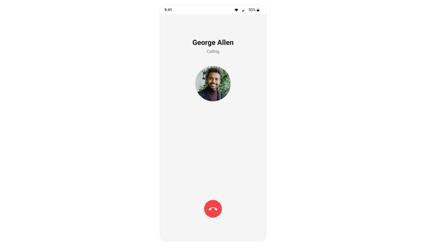
Minimal Render
Actions and Events
Callback Props
onEndCallButtonPressed
Fires when the end call button is pressed.onError
Fires on internal errors (network failure, auth issue, SDK exception).Global UI Events
CometChatUIEventHandler emits events subscribable from anywhere in the application. Add listeners and remove them on cleanup.
| Event | Fires when | Payload |
|---|---|---|
ccCallEnded | Initiated call successfully ends | { call } |
ccCallFailled | Error occurs during the initiated call | { call } |
Custom View Slots
Each slot replaces a section of the default UI. Slots that accept a call parameter receive the call object for customization.| Slot | Signature | Replaces |
|---|---|---|
TitleView | (call) => JSX.Element | Caller name / title text |
SubtitleView | (call) => JSX.Element | Call status text |
AvatarView | (call) => JSX.Element | Avatar / profile picture |
EndCallView | (call) => JSX.Element | End call button |
TitleView
Custom view for the caller name / title text.SubtitleView
Custom view for the call status text.AvatarView
Custom view for the avatar / profile picture.EndCallView
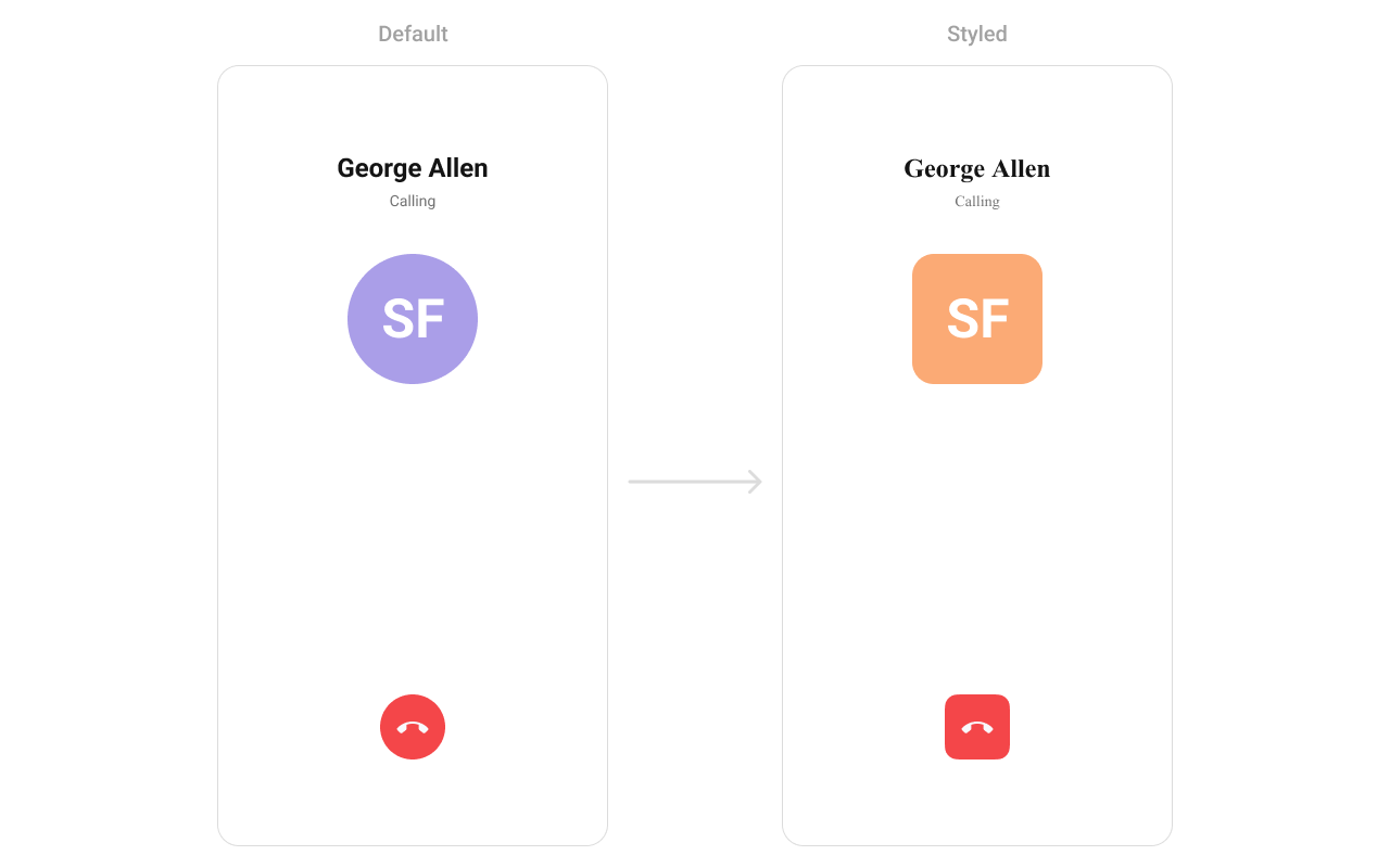
Custom view for the end call button.Styling
Using Style you can customize the look and feel of the component in your app. Pass a styling object as a prop to theCometChatOutgoingCall component.
Visibility Props
| Property | Description | Code |
|---|---|---|
disableSoundForCalls | Disable/enable the sound of outgoing calls | disableSoundForCalls?: boolean |
customSoundForCalls | Set custom sound for outgoing calls | customSoundForCalls?: string |
Next Steps
Incoming Call
Display and handle incoming calls
Call Buttons
Add voice and video call buttons to your UI
Call Features
Overview of all calling features
Component Styling
Customize the appearance of UI Kit components