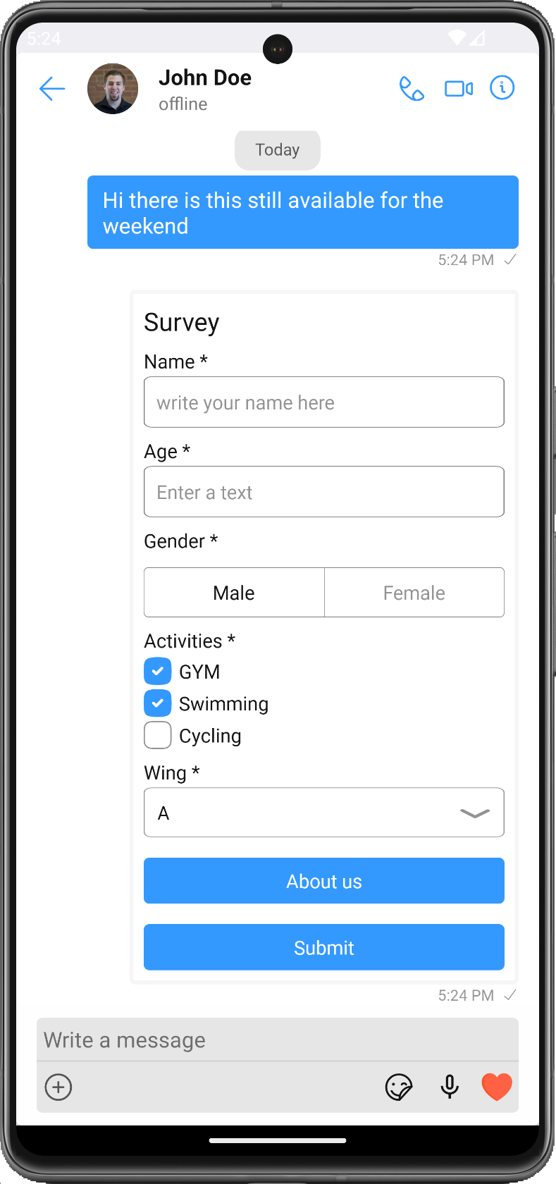
Form Bubble
The CometChatFormBubble component is used to render a form within a chat bubble. The form fields are dynamically built based on the data passed in the message prop. The form fields can include text inputs, checkboxes, radio buttons, dropdown, labels, single selects, buttons. Once the form is filled out and submitted, the data will be sent to the provided URL or handled by a custom function.

Properities
| Methods | Parameters | Description |
|---|---|---|
| message | Form Message | An instance of the FormMessage class which holds information about the form fields. |
| style? | FormBubbleStyleInterface | An object of styles for customizing the UI of the form bubble. |
| onSubmitClick? | (formData: any) => void | A function that will be called when the form is submitted. This function receives the form data as an argument. |
FormBubbleStyle
FormBubbleStyle is a class containing attributes to customize the appearance of the CometChatFormBubble component.
| Methods | Type | Description |
|---|---|---|
| backgroundColor | string | Used to set the background color of the form bubble. |
| border | BorderStyle | Used to set the border of the form bubble. The object should include borderWidth and borderColor. |
| borderRadius | number | Used to set the border radius of the form bubble. |
| titleFont | FontStyle | Used to set the font style of the title. The object should include fontFamily, fontSize, and fontWeight. |
| titleColor | string | Used to set the color of the title. |
| wrapperBackground | string | Used to set the background color of the message bubble. |
| wrapperBorderRadius | number | Used to set the border radius of the message bubble. |
| wrapperPadding | number | Used to set the padding of the message bubble. |
| goalCompletionTextFont | FontStyle | Used to set the font style of the goal completion text. The object should include fontFamily, fontSize, and fontWeight. |
| goalCompletionTextColor | string | Used to set the color of the goal completion text. |
| textInputStyle | TextInputStyleInterface | Used to customize the style of text input fields. |
| quickViewStyle | QuickViewStyleInterface | Used to customize the style of the quick view. |
| radioButtonStyle | RadioButtonStyleInterface | Used to customize the style of radio buttons. |
| checkboxStyle | CheckBoxStyleInterface | Used to customize the style of checkboxes. |
| dropdownStyle | DropDownStyleInterface | Used to customize the style of dropdowns. |
| labelStyle | LabelStyleInterface | Used to customize the style of labels. |
| buttonStyle | ButtonStyleInterface | Used to customize the style of buttons. |
| singleSelectStyle | SingleSelectStyleInterface | Used to customize the style of single select fields. |
Usage
- Typescript
<CometChatFormBubble
  message={message} //message: FormMessage
  onSubmitClick={onSubmitClick} //onSubmitClick?: (data: any) => void
  style={style} //style?: FormBubbleStyle
/>