Documentation Index
Fetch the complete documentation index at: https://www.cometchat.com/docs/llms.txt
Use this file to discover all available pages before exploring further.
AI Integration Quick Reference
AI Integration Quick Reference
Where It Fits
CometChatUsers is a contact list component. It renders all available users and emits the selected CometChat.User via onItemPress. Wire it to CometChatMessageHeader, CometChatMessageList, and CometChatMessageComposer to build a standard two-panel chat layout.
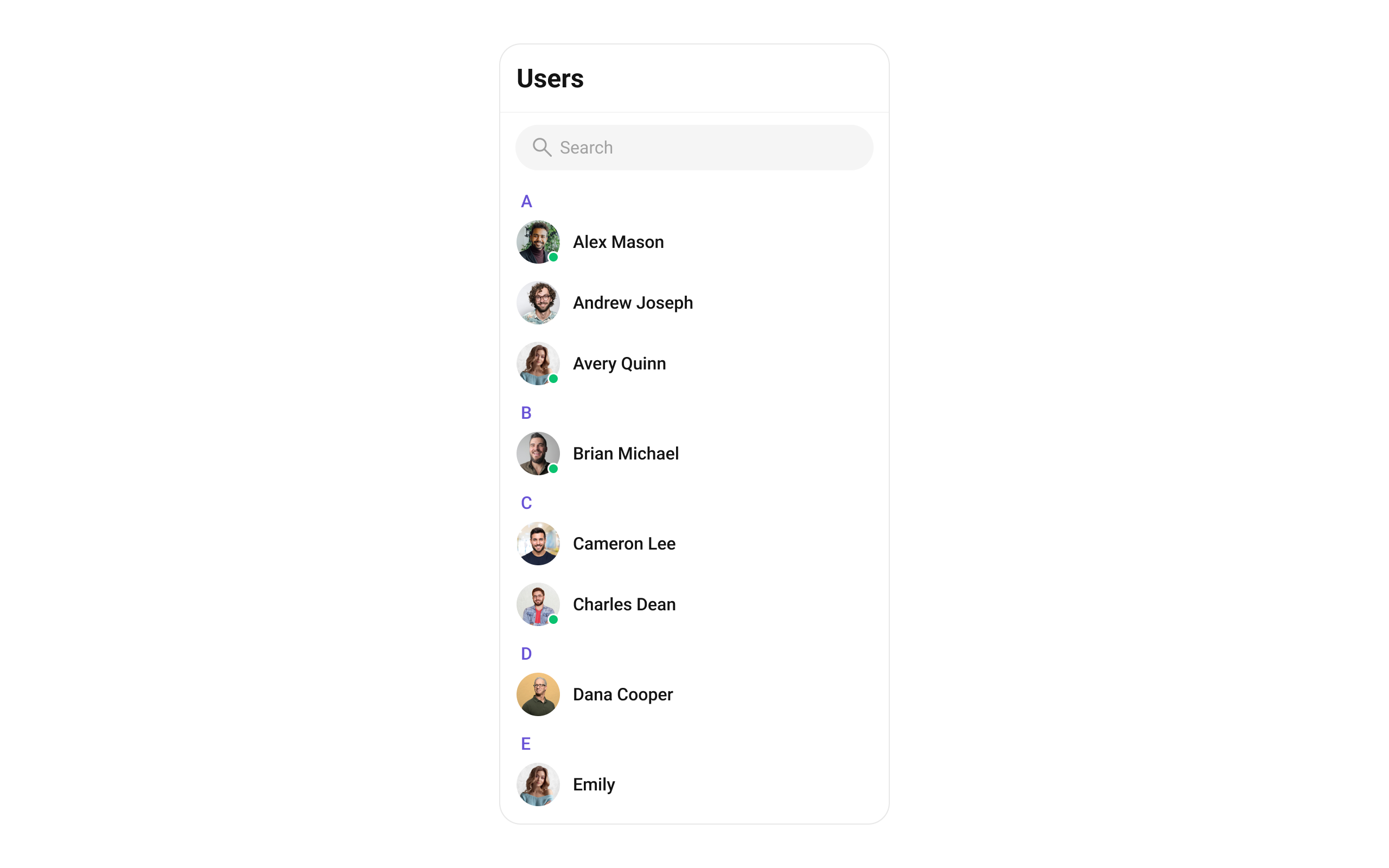
Minimal Render
Filtering Users
Pass aCometChat.UsersRequestBuilder to usersRequestBuilder. Pass the builder instance — not the result of .build().
Filter Recipes
| Recipe | Code |
|---|---|
| Friends only | new CometChat.UsersRequestBuilder().friendsOnly(true) |
| Online users only | new CometChat.UsersRequestBuilder().setStatus("online") |
| Limit to 15 per page | new CometChat.UsersRequestBuilder().setLimit(15) |
| Search by keyword | new CometChat.UsersRequestBuilder().setSearchKeyword("alice") |
| Hide blocked users | new CometChat.UsersRequestBuilder().hideBlockedUsers(true) |
| Filter by roles | new CometChat.UsersRequestBuilder().setRoles(["admin", "moderator"]) |
| Filter by tags | new CometChat.UsersRequestBuilder().setTags(["vip"]) |
| Specific UIDs | new CometChat.UsersRequestBuilder().setUIDs(["uid1", "uid2"]) |
searchRequestBuilder can be passed to filter the search list independently from the main list.
Refer to UsersRequestBuilder for the full builder API.
Actions and Events
Callback Props
onItemPress
Fires when a user row is tapped. Primary navigation hook — set the active user and render the message view.onItemLongPress
Fires when a user item is long-pressed, allowing additional actions like block or report.onSelection
Fires when users are selected/deselected in selection mode. RequiresselectionMode to be set.
onEmpty
Fires when the user list fetch returns zero results.onError
Fires on internal errors (network failure, auth issue, SDK exception).onLoad
Fires when the list is successfully fetched and loaded.Global UI Events
CometChatUIEventHandler emits events subscribable from anywhere in the application. Subscribe in a useEffect and unsubscribe on cleanup.
| Event | Fires when | Payload |
|---|---|---|
ccUserBlocked | The logged-in user blocks another user | CometChat.User |
ccUserUnblocked | The logged-in user unblocks another user | CometChat.User |
SDK Events (Real-Time, Automatic)
The component listens to these SDK events internally. No manual attachment needed unless additional side effects are required.| SDK Listener | Internal behavior |
|---|---|
onUserOnline | Updates the user’s status dot to online |
onUserOffline | Updates the user’s status dot to offline |
Custom View Slots
Each slot replaces a section of the default UI. Slots that accept a user parameter receive theCometChat.User object for that row.
| Slot | Signature | Replaces |
|---|---|---|
ItemView | (user: CometChat.User) => JSX.Element | Entire list item row |
LeadingView | (user: CometChat.User) => JSX.Element | Avatar / left section |
TitleView | (user: CometChat.User) => JSX.Element | Name / title text |
SubtitleView | (user: CometChat.User) => JSX.Element | Subtitle text |
TrailingView | (user: CometChat.User) => JSX.Element | Right section |
LoadingView | () => JSX.Element | Loading spinner |
EmptyView | () => JSX.Element | Empty state |
ErrorView | () => JSX.Element | Error state |
AppBarOptions | () => JSX.Element | Header bar options |
ItemView
Replace the entire list item row.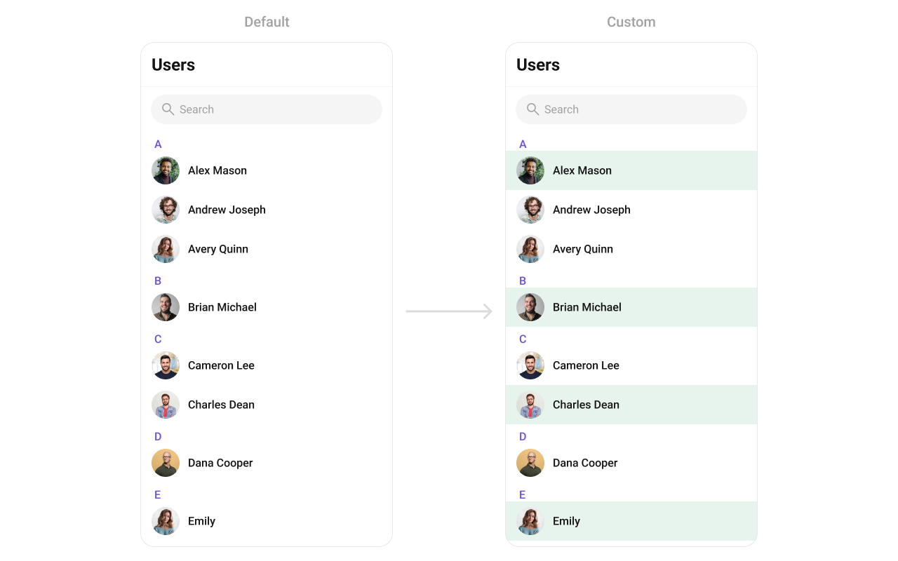
LeadingView
Replace the avatar / left section.SubtitleView
Replace the subtitle text.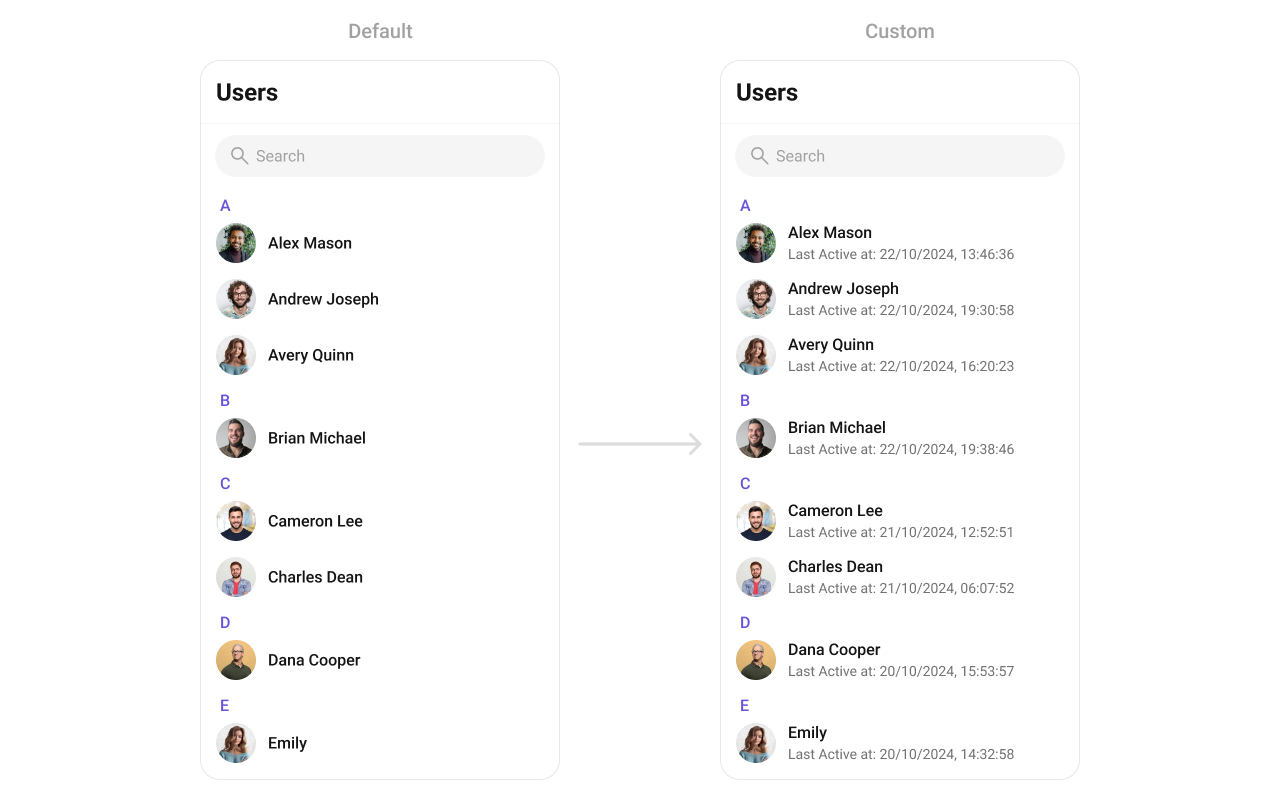
TrailingView
Replace the right section.AppBarOptions
Custom view for the header bar options.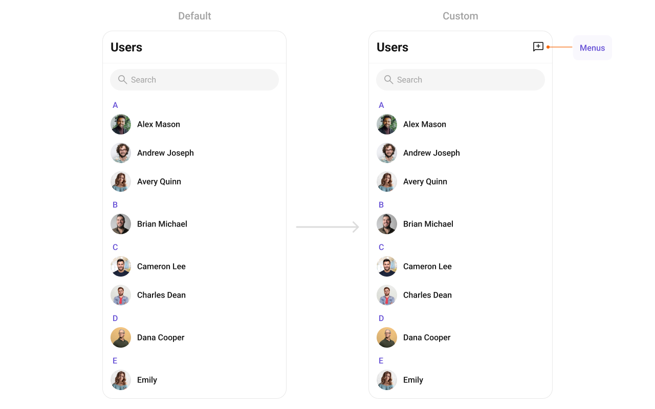
options
Custom context menu actions for each user item.Common Patterns
Custom empty state with CTA
Friends-only list
Multi-select with submit
Hide all chrome — minimal list
Styling
The component uses the theme system fromCometChatThemeProvider. Pass a style prop to customize the appearance.
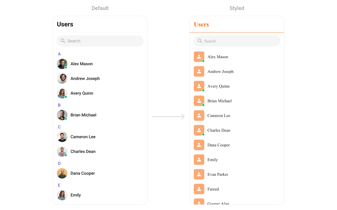
Style Properties
| Property | Type | Description |
|---|---|---|
containerStyle | ViewStyle | Style for the root container |
headerStyle | ViewStyle | Style for the header section |
titleStyle | TextStyle | Style for the header title |
titleSeparatorStyle | ViewStyle | Style for section header separators |
itemStyle | object | Style for list items (includes avatarStyle, titleStyle, subtitleStyle) |
searchStyle | object | Style for the search bar |
Props
All props are optional unless noted.EmptyView
Custom component displayed when there are no users.| Type | () => JSX.Element |
| Default | Built-in empty state |
ErrorView
Custom component displayed when an error occurs.| Type | () => JSX.Element |
| Default | Built-in error state |
hideError
Hides the error state view.| Type | boolean |
| Default | false |
hideHeader
Hides the entire header bar.| Type | boolean |
| Default | false |
hideLoadingState
Hides the loading state while fetching users.| Type | boolean |
| Default | false |
hideSearch
Hides the search bar.| Type | boolean |
| Default | false |
hideSubmitButton
Hides the submit button when selection mode is enabled.| Type | boolean |
| Default | true |
ItemView
Custom renderer for the entire list item row.| Type | (user: CometChat.User) => JSX.Element |
| Default | Built-in list item |
LeadingView
Custom renderer for the avatar / left section.| Type | (user: CometChat.User) => JSX.Element |
| Default | Built-in avatar |
LoadingView
Custom component displayed during the loading state.| Type | () => JSX.Element |
| Default | Built-in loading indicator |
onBack
Callback fired when the back button is pressed.| Type | () => void |
| Default | undefined |
onEmpty
Callback fired when the user list is empty.| Type | () => void |
| Default | undefined |
onError
Callback fired when the component encounters an error.| Type | (error: CometChat.CometChatException) => void |
| Default | undefined |
onItemLongPress
Callback fired when a user row is long-pressed.| Type | (user: CometChat.User) => void |
| Default | undefined |
onItemPress
Callback fired when a user row is tapped.| Type | (user: CometChat.User) => void |
| Default | undefined |
onLoad
Callback fired when users are loaded.| Type | (list: CometChat.User[]) => void |
| Default | undefined |
onSelection
Callback fired when users are selected/deselected. RequiresselectionMode to be set.
| Type | (list: CometChat.User[]) => void |
| Default | undefined |
onSubmit
Callback fired when the submit button is pressed. RequiresselectionMode to be set.
| Type | (list: Array<CometChat.User>) => void |
| Default | undefined |
searchKeyword
Pre-fills the search and filters the user list.| Type | string |
| Default | "" |
searchRequestBuilder
Request builder with search parameters to fetch users.| Type | CometChat.UsersRequestBuilder |
| Default | undefined |
selectionMode
Enables single or multi-select mode on list items.| Type | "single" | "multiple" | "none" |
| Default | "none" |
showBackButton
Shows the back button in the header.| Type | boolean |
| Default | false |
stickyHeaderVisibility
Shows/hides alphabetical section headers (A, B, C…).| Type | boolean |
| Default | true |
SubtitleView
Custom renderer for the subtitle text.| Type | (user: CometChat.User) => JSX.Element |
| Default | undefined |
TitleView
Custom renderer for the name / title text.| Type | (user: CometChat.User) => JSX.Element |
| Default | Built-in title |
TrailingView
Custom renderer for the right section.| Type | (user: CometChat.User) => JSX.Element |
| Default | Built-in trailing view |
usersRequestBuilder
Controls which users load and in what order.| Type | CometChat.UsersRequestBuilder |
| Default | SDK default (30 per page) |
.build().
usersStatusVisibility
Shows/hides the online/offline status indicator.| Type | boolean |
| Default | true |
title
Custom title for the header.| Type | string |
| Default | "Users" |
AppBarOptions
Custom component for the header bar options.| Type | () => JSX.Element |
| Default | undefined |
addOptions
Function to append additional menu items to the default context menu.| Type | (user: CometChat.User) => MenuItemInterface[] |
| Default | undefined |
options
Function to replace the default context menu items entirely.| Type | (user: CometChat.User) => MenuItemInterface[] |
| Default | undefined |
searchPlaceholderText
Placeholder text for the search input.| Type | string |
| Default | "Search" |
Next Steps
Conversations
Display and manage the list of recent chats
Groups
Display and manage group conversations
Message List
Display the full chat interface after selecting a user
Component Styling
Customize the appearance of UI Kit components