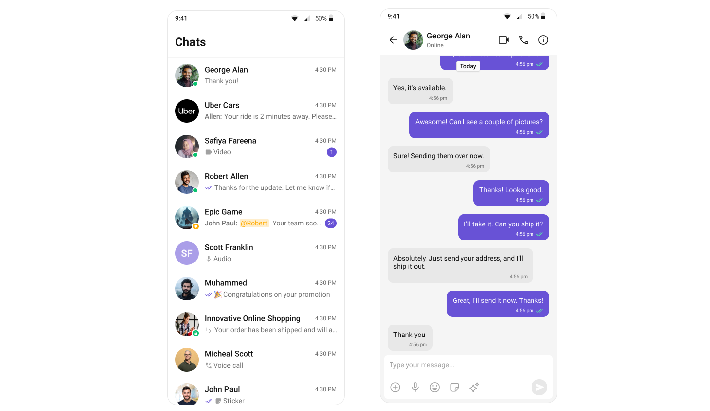
Overview
Theming in CometChat for React Native allows you to create visually consistent and customizable user interfaces that align with your application’s branding. The CometChatThemeProvider acts as a global theme provider, enabling seamless integration of light and dark modes while giving you the flexibility to define custom colors, typography, and component-specific styles. At the core of theming is the CometChatTheme interface, which defines the structure of the theme supplied to the provider. This interface lets you specify various theme attributes such as colors, fonts, and component-level customizations. By wrapping your application with CometChatThemeProvider and supplying a CometChatTheme, you can maintain a consistent look and feel across all CometChat components while having full control over customizations to match your app’s aesthetic.Using Theming in Your Project
By default, the theme is automatically selected based on the system settings, ensuring that your app aligns with the user’s preferred light or dark mode unless you choose to override it with a custom theme. The CometChatThemeProvider is used to apply a custom theme to your components. By setting the theme prop with a specific mode, such as{ mode: 'dark' }, you can override the default system theme and ensure that the UI is displayed in the desired light or dark mode. This allows you to provide a consistent visual experience based on the selected theme mode.
Here’s an example of how to explicitly set the theme mode to light:
- TypeScript

Customization
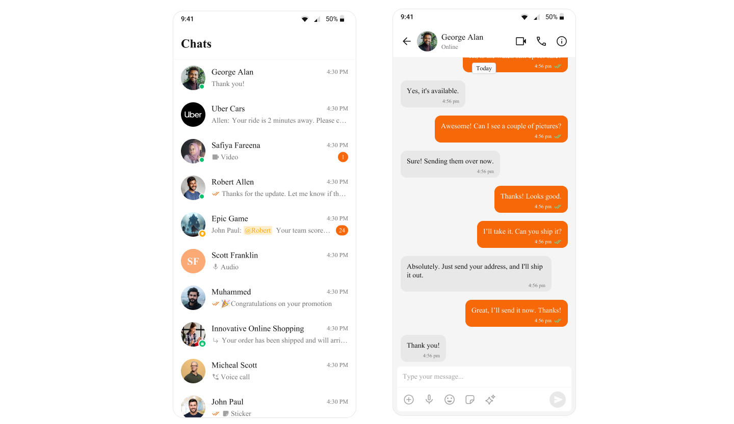
To customize the primary color in your app, you can override the primary color attribute in the theme. Here’s how to override the primary color for light theme:- TypeScript

Overriding the Theme for Specific Components by Customizing Style Properties
Following is an example of how the light theme for the CometChatConversations component is overridden directly by setting custom theme properties within the CometChatThemeProvider. This ensures that the CometChatConversations component uses a specific light theme, independent of the global theme applied to the rest of the app. The light theme is customized further by defining specific styles, such as the background color for the conversation container. This approach allows you to customize the theme for specific components while keeping the global theme intact.- App.tsx
Supplying Custom Theme to Specific Components by wrapping them in a separate CometChatThemeProvider
Following is an example of how the theme for the CometChatConversations component is specifically overridden by wrapping it in a separate CometChatThemeProvider. This allows the CometChatConversations component to use a dark mode theme, independent of the global theme applied to the rest of the app. Additionally, the dark theme is further customized for the component by defining specific styles, such as the background color for the conversation container. This approach enables you to tailor the theme for specific components while maintaining the overall consistency of the global theme.- App.tsx
When customizing theme properties, whether by overriding specific properties or supplying a completely custom theme, the provided values will be deeply merged with the default theme. This means that only the specified properties will be overridden, while all other properties will retain their default values. Additionally, if a style is passed through props, it will take priority over the style provided via the theme. The deep merge will occur in the following order of priority:
- The style prop (highest priority)
- The custom theme
- The default theme (lowest priority)