{
"component": "CometChatMessageList",
"package": "@cometchat/chat-uikit-react-native",
"import": "import { CometChatMessageList } from \"@cometchat/chat-uikit-react-native\";",
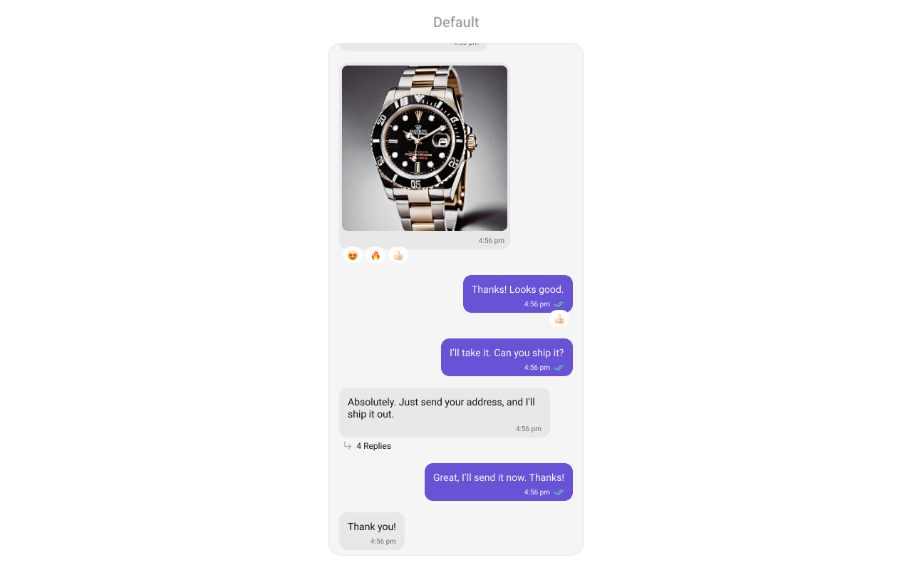
"description": "Scrollable list of sent and received messages with text, media, reactions, read receipts, threaded replies, and AI features.",
"primaryOutput": {
"prop": "onThreadRepliesPress",
"type": "(messageObject: CometChat.BaseMessage, messageBubbleView: () => JSX.Element | null) => void"
},
"props": {
"data": {
"user": { "type": "CometChat.User", "default": "undefined", "note": "User object for 1-on-1 conversation" },
"group": { "type": "CometChat.Group", "default": "undefined", "note": "Group object for group conversation" },
"messageRequestBuilder": { "type": "CometChat.MessagesRequestBuilder", "default": "SDK default", "note": "UID/GUID/types/categories are always overridden internally" },
"templates": { "type": "CometChatMessageTemplate[]", "default": "SDK defaults", "note": "Custom message bubble templates" },
"addTemplates": { "type": "CometChatMessageTemplate[]", "default": "[]", "note": "Additional message templates to append to defaults" },
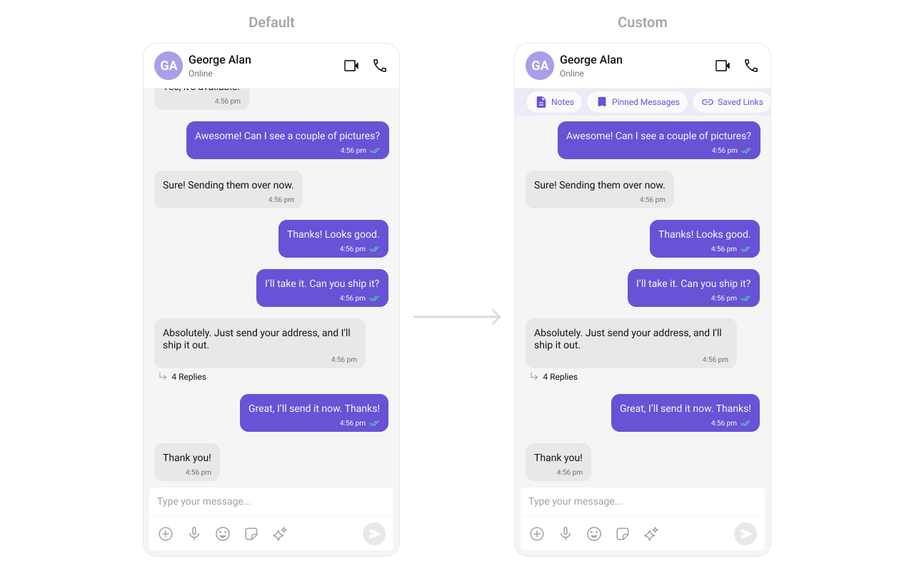
"parentMessageId": { "type": "number", "default": "undefined", "note": "For threaded message view" },
"goToMessageId": { "type": "string", "default": "undefined", "note": "Message ID to navigate to and highlight" },
"searchKeyword": { "type": "string", "default": "undefined", "note": "Keyword to highlight in message text" }
},
"callbacks": {
"onThreadRepliesPress": "(messageObject: CometChat.BaseMessage, messageBubbleView: () => JSX.Element | null) => void",
"onError": "(error: CometChat.CometChatException) => void",
"onReactionPress": "(reaction: CometChat.ReactionCount, messageObject: CometChat.BaseMessage) => void",
"onReactionLongPress": "(reaction: CometChat.ReactionCount, messageObject: CometChat.BaseMessage) => void",
"onReactionListItemPress": "(reaction: CometChat.Reaction, messageObject: CometChat.BaseMessage) => void",
"onAddReactionPress": "() => void",
"onSuggestedMessageClick": "(suggestion: string) => void",
"onLoad": "(messageList: CometChat.BaseMessage[]) => void",
"onEmpty": "() => void"
},
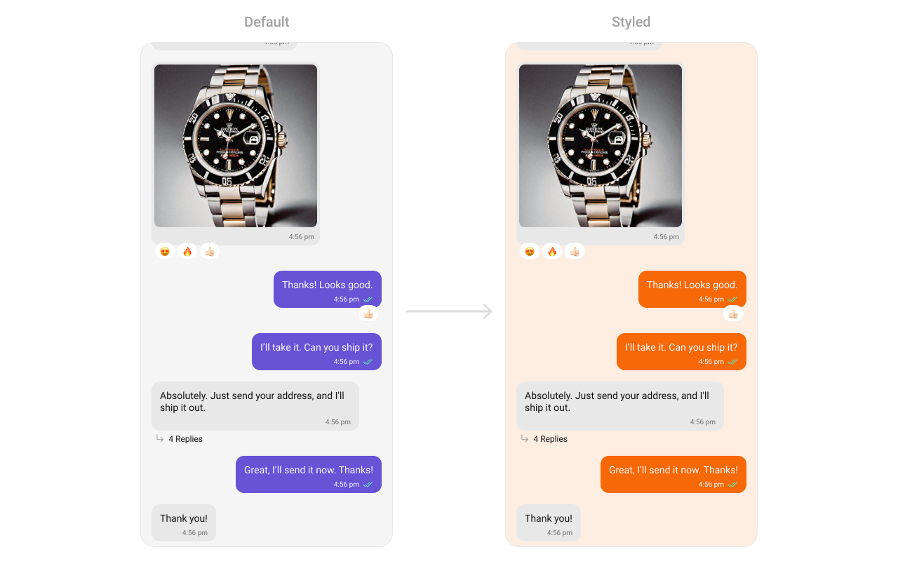
"visibility": {
"receiptsVisibility": { "type": "boolean", "default": true },
"avatarVisibility": { "type": "boolean", "default": true },
"hideError": { "type": "boolean", "default": false },
"hideTimestamp": { "type": "boolean", "default": false },
"hideReplyOption": { "type": "boolean", "default": false },
"hideReplyInThreadOption": { "type": "boolean", "default": false },
"hideShareMessageOption": { "type": "boolean", "default": false },
"hideEditMessageOption": { "type": "boolean", "default": false },
"hideDeleteMessageOption": { "type": "boolean", "default": false },
"hideTranslateMessageOption": { "type": "boolean", "default": false },
"hideReactionOption": { "type": "boolean", "default": false },
"hideMessagePrivatelyOption": { "type": "boolean", "default": false },
"hideCopyMessageOption": { "type": "boolean", "default": false },
"hideMessageInfoOption": { "type": "boolean", "default": false },
"hideGroupActionMessages": { "type": "boolean", "default": false },
"hideModerationStatus": { "type": "boolean", "default": false },
"hideSuggestedMessages": { "type": "boolean", "default": false },
"showMarkAsUnreadOption": { "type": "boolean", "default": false },
"hideFlagMessageOption": { "type": "boolean", "default": false },
"hideFlagRemarkField": { "type": "boolean", "default": false }
},
"behavior": {
"alignment": { "type": "MessageListAlignmentType", "values": ["leftAligned", "standard"], "default": "standard" },
"scrollToBottomOnNewMessage": { "type": "boolean", "default": false },
"startFromUnreadMessages": { "type": "boolean", "default": false },
"streamingSpeed": { "type": "number", "default": "undefined", "note": "AI response streaming speed in ms" }
},
"sound": {
"disableSoundForMessages": { "type": "boolean", "default": false },
"customSoundForMessages": { "type": "audio source", "default": "built-in" }
},
"ai": {
"suggestedMessages": { "type": "string[]", "note": "Predefined prompts for AI assistant chats" },
"aiAssistantTools": { "type": "CometChatAIAssistantTools", "note": "Tool actions for AI assistant" },
"quickReactionList": { "type": "string[]", "default": "predefined reactions" },
"streamingSpeed": { "type": "number", "default": "undefined", "note": "AI response streaming speed in ms" }
},
"viewSlots": {
"HeaderView": "({ user, group, id }) => JSX.Element",
"FooterView": "({ user, group, id }) => JSX.Element",
"LoadingView": "() => JSX.Element",
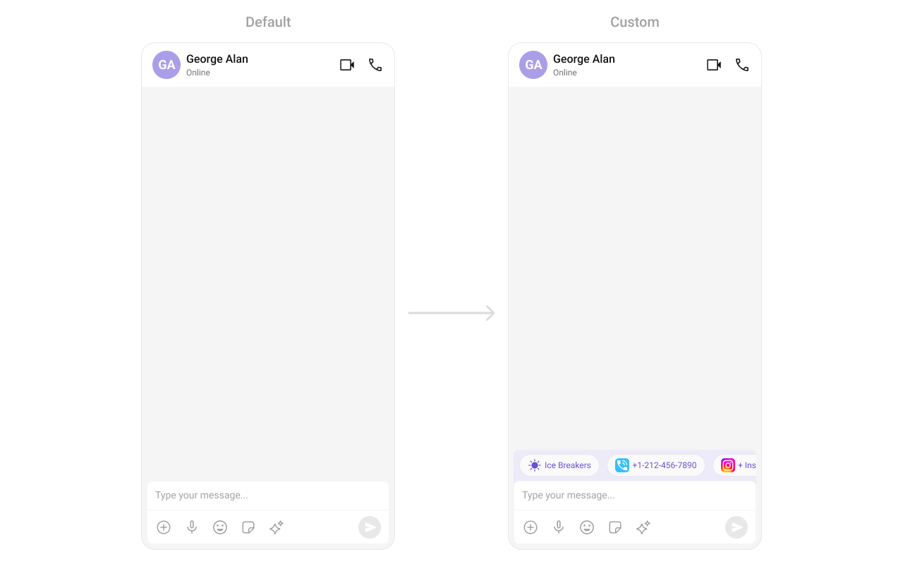
"EmptyView": "() => JSX.Element",
"ErrorView": "() => JSX.Element",
"NewMessageIndicatorView": "() => JSX.Element",
"emptyChatGreetingView": "JSX.Element",
"emptyChatIntroMessageView": "JSX.Element",
"emptyChatImageView": "JSX.Element"
},
"newMessageIndicator": {
"newMessageIndicatorStyle": { "type": "NewMessageIndicatorStyle", "default": "built-in" },
"newMessageIndicatorText": { "type": "string", "default": "built-in" }
},
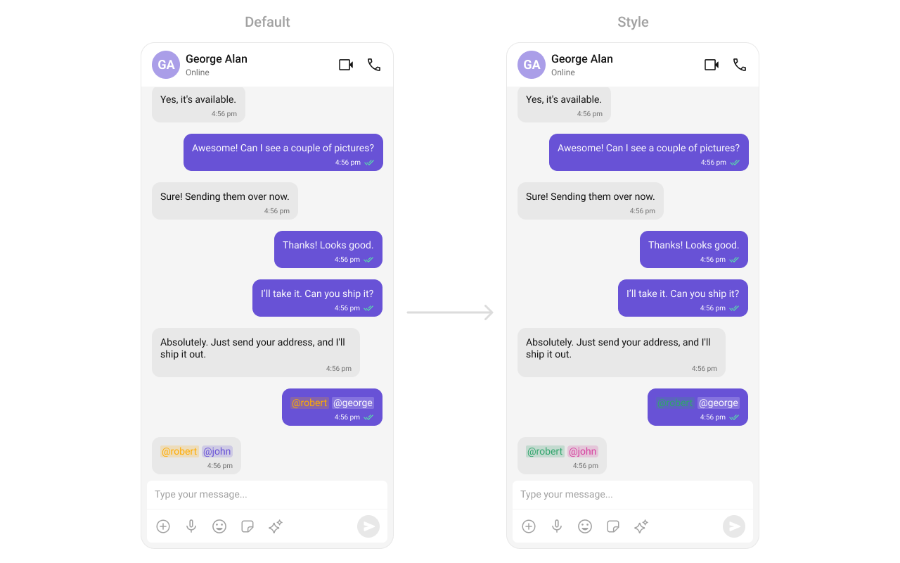
"formatting": {
"textFormatters": { "type": "CometChatTextFormatter[]", "default": "default formatters from data source" },
"datePattern": "(message: CometChat.BaseMessage) => string",
"dateSeperatorPattern": "(date: number) => string"
}
},
"events": [
{ "name": "openChat", "payload": "{ user, group }", "description": "User opens a chat" },
{ "name": "ccMessageEdited", "payload": "{ message }", "description": "Message edited by logged-in user" },
{ "name": "ccMessageDeleted", "payload": "{ message }", "description": "Message deleted by logged-in user" },
{ "name": "ccActiveChatChanged", "payload": "chat details", "description": "User navigates to a different chat" },
{ "name": "ccMessageRead", "payload": "{ message }", "description": "Message read by logged-in user" },
{ "name": "ccMessageDelivered", "payload": "{ message }", "description": "Messages marked as delivered" }
],
"sdkListeners": [
"onTextMessageReceived", "onMediaMessageReceived", "onCustomMessageReceived",
"onMessageEdited", "onMessageDeleted", "onTypingStarted", "onTypingEnded",
"onMessagesDelivered", "onMessagesRead"
],
"compositionExample": {
"description": "Message list wired with header and composer for complete chat view",
"components": ["CometChatMessageHeader", "CometChatMessageList", "CometChatMessageComposer"],
"flow": "Pass user or group prop to all three components for a complete messaging interface"
},
"types": {
"MessageListAlignmentType": { "leftAligned": "All messages aligned to left", "standard": "Sent messages right, received messages left" }
}
}