Documentation Index Fetch the complete documentation index at: https://www.cometchat.com/docs/llms.txt
Use this file to discover all available pages before exploring further.
AI Integration Quick Reference
{ "component" : "CometChatMessageHeader" , "package" : "@cometchat/chat-uikit-react-native" , "import" : "import { CometChatMessageHeader } from \" @cometchat/chat-uikit-react-native \" ;" , "description" : "Displays user or group details in the chat toolbar with typing indicators and navigation controls." , "props" : { "data" : { "user" : { "type" : "CometChat.User" , "note" : "User object for one-on-one chat header" }, "group" : { "type" : "CometChat.Group" , "note" : "Group object for group chat header" } }, "callbacks" : { "onBack" : "() => void" , "onError" : "(error: CometChat.CometChatException) => void" , "onNewChatButtonClick" : "() => void" , "onChatHistoryButtonClick" : "() => void" }, "visibility" : { "showBackButton" : { "type" : "boolean" , "default" : true }, "hideVoiceCallButton" : { "type" : "boolean" , "default" : false }, "hideVideoCallButton" : { "type" : "boolean" , "default" : false }, "usersStatusVisibility" : { "type" : "boolean" , "default" : true }, "hideNewChatButton" : { "type" : "boolean" , "default" : true }, "hideChatHistoryButton" : { "type" : "boolean" , "default" : true } }, "viewSlots" : { "ItemView" : "({ user, group }) => JSX.Element" , "LeadingView" : "({ user, group }) => JSX.Element" , "TitleView" : "({ user, group }) => JSX.Element" , "SubtitleView" : "({ user, group }) => JSX.Element" , "TrailingView" : "({ user, group }) => JSX.Element" , "AuxiliaryButtonView" : "({ user, group }) => JSX.Element" }, "options" : { "options" : "({ user, group }) => MenuItemInterface[]" } }, "compositionExample" : { "description" : "Header component for message view" , "components" : [ "CometChatMessageHeader" , "CometChatMessageList" , "CometChatMessageComposer" ], "flow" : "Displays user/group info at top of chat, handles back navigation and call buttons" } }
Where It Fits CometChatMessageHeader is a Component that showcases the User or Group details in the toolbar. It presents a typing indicator and a back navigation button for ease of use.Minimal Render import { CometChatMessageHeader } from "@cometchat/chat-uikit-react-native" ; function MessageHeaderDemo () { return < CometChatMessageHeader group = { group } /> ; }
Actions and Events Callback Props onError Fires on internal errors (network failure, auth issue, SDK exception).
onError ?: ( error : CometChat . CometChatException ) => void
import { CometChatMessageHeader } from "@cometchat/chat-uikit-react-native" ; import { CometChat } from "@cometchat/chat-sdk-react-native" ; function MessageHeaderWithError () { return ( < CometChatMessageHeader group = { group } onError = { ( error : CometChat . CometChatException ) => { console . error ( "MessageHeader error:" , error ); } } /> ); }
onBack Fires when the back button in the app bar is pressed. Requires showBackButton={true}.
import { CometChatMessageHeader } from "@cometchat/chat-uikit-react-native" ; function MessageHeaderWithBack () { return ( < CometChatMessageHeader group = { group } showBackButton = { true } onBack = { () => { console . log ( "Back pressed" ); } } /> ); }
Fires when the new chat button is pressed (only applies to AI Assistant users). Allows handling starting a new conversation with the AI assistant.
import { CometChatMessageHeader } from "@cometchat/chat-uikit-react-native" ; function MessageHeaderWithNewChat () { return ( < CometChatMessageHeader user = { user } onNewChatButtonClick = { () => { console . log ( "Starting new AI chat" ); } } /> ); }
onChatHistoryButtonClick Fires when the chat history button is pressed (only applies to AI Assistant users). Allows handling opening the AI assistant chat history.
import { CometChatMessageHeader } from "@cometchat/chat-uikit-react-native" ; function MessageHeaderWithHistory () { return ( < CometChatMessageHeader user = { user } onChatHistoryButtonClick = { () => { console . log ( "Opening AI chat history" ); } } /> ); }
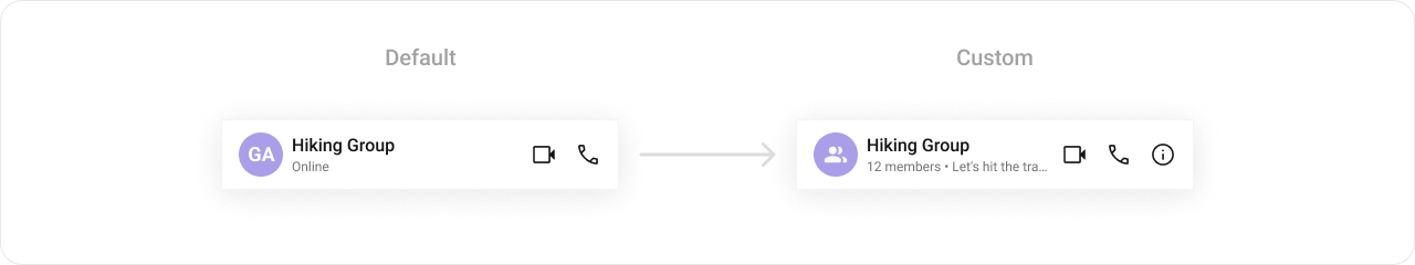
Custom View Slots Each slot replaces a section of the default UI. Slots that accept parameters receive the user or group object for customization.
Slot Signature Replaces ItemView({ user, group }) => JSX.ElementEntire header layout LeadingView({ user, group }) => JSX.ElementAvatar / left section TitleView({ user, group }) => JSX.ElementName / title text SubtitleView({ user, group }) => JSX.ElementStatus / subtitle text TrailingView({ user, group }) => JSX.ElementRight section next to call buttons AuxiliaryButtonView({ user, group }) => JSX.ElementReplaces default call buttons
TitleView Custom view for the name / title text.
TitleView ?: ({ user , group }) => JSX . Element
import { CometChatMessageHeader } from "@cometchat/chat-uikit-react-native" ; import { CometChat } from "@cometchat/chat-sdk-react-native" ; import { Text } from "react-native" ; function TitleViewDemo () { const getTitleView = ({ user , group , } : { user ?: CometChat . User ; group ?: CometChat . Group ; }) => { const name = user ? user . getName () : group ?. getName (); return ( < Text style = { { fontWeight: 'bold' , fontSize: 18 } } > { name } </ Text > ); }; return < CometChatMessageHeader group = { group } TitleView = { getTitleView } /> ; }
Custom buttons that replace the default call buttons.
AuxiliaryButtonView ?: ({ user , group }) => JSX . Element
import { CometChatMessageHeader } from "@cometchat/chat-uikit-react-native" ; import { CometChat } from "@cometchat/chat-sdk-react-native" ; import { TouchableOpacity , Text } from "react-native" ; function AuxiliaryButtonDemo () { const getAuxiliaryView = ({ user , group , } : { user ?: CometChat . User ; group ?: CometChat . Group ; }) => { return ( < TouchableOpacity onPress = { () => console . log ( "Custom action" ) } > < Text > Custom Button </ Text > </ TouchableOpacity > ); }; return ( < CometChatMessageHeader group = { group } AuxiliaryButtonView = { getAuxiliaryView } /> ); }
ItemView Custom view for the entire header layout.
ItemView ?: ({ user , group }) => JSX . Element
import { CometChatMessageHeader } from "@cometchat/chat-uikit-react-native" ; import { CometChat } from "@cometchat/chat-sdk-react-native" ; import { View , Text } from "react-native" ; function ItemViewDemo () { const getItemView = ({ user , group , } : { user ?: CometChat . User ; group ?: CometChat . Group ; }) => { const name = user ? user . getName () : group ?. getName (); return ( < View style = { { padding: 16 } } > < Text style = { { fontWeight: 'bold' } } > { name } </ Text > </ View > ); }; return < CometChatMessageHeader group = { group } ItemView = { getItemView } /> ; }
SubtitleView Custom view for the subtitle / status text.
SubtitleView ?: ({ user , group }) => JSX . Element
import { CometChatMessageHeader } from "@cometchat/chat-uikit-react-native" ; import { CometChat } from "@cometchat/chat-sdk-react-native" ; import { Text } from "react-native" ; function SubtitleViewDemo () { const getSubtitleView = ({ user , group , } : { user ?: CometChat . User ; group ?: CometChat . Group ; }) => { if ( user ) { return < Text style = { { color: '#727272' } } > Online </ Text > ; } return < Text style = { { color: '#727272' } } > { group ?. getMembersCount () } members </ Text > ; }; return < CometChatMessageHeader group = { group } SubtitleView = { getSubtitleView } /> ; }
LeadingView Custom view for the avatar / left section.
LeadingView ?: ({ user , group }) => JSX . Element
import { CometChatMessageHeader } from "@cometchat/chat-uikit-react-native" ; import { CometChat } from "@cometchat/chat-sdk-react-native" ; import { View , Text } from "react-native" ; function LeadingViewDemo () { const getLeadingView = ({ user , group , } : { user ?: CometChat . User ; group ?: CometChat . Group ; }) => { const name = user ? user . getName () : group ?. getName (); return ( < View style = { { width: 40 , height: 40 , borderRadius: 20 , backgroundColor: '#6852D6' } } > < Text style = { { color: 'white' , textAlign: 'center' , lineHeight: 40 } } > { name ?. charAt ( 0 ) } </ Text > </ View > ); }; return < CometChatMessageHeader group = { group } LeadingView = { getLeadingView } /> ; }
TrailingView Custom view for the right section next to call buttons.
TrailingView ?: ({ user , group }) => JSX . Element
import { CometChatMessageHeader } from "@cometchat/chat-uikit-react-native" ; import { CometChat } from "@cometchat/chat-sdk-react-native" ; import { TouchableOpacity , Text } from "react-native" ; function TrailingViewDemo () { const getTrailingView = ({ user , group , } : { user ?: CometChat . User ; group ?: CometChat . Group ; }) => { return ( < TouchableOpacity onPress = { () => console . log ( "Menu pressed" ) } > < Text > ⋮ </ Text > </ TouchableOpacity > ); }; return < CometChatMessageHeader group = { group } TrailingView = { getTrailingView } /> ; }
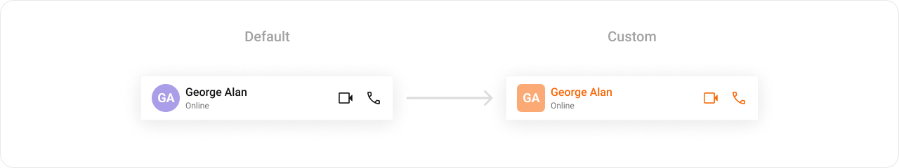
Styling Using Style you can customize the look and feel of the component in your app. Pass a styling object as a prop to the CometChatMessageHeader component.
import { CometChatMessageHeader } from "@cometchat/chat-uikit-react-native" ; function StylingDemo () { return ( < CometChatMessageHeader group = { group } style = { { avatarStyle: { containerStyle: { borderRadius: 8 , backgroundColor: "#FBA46B" , }, imageStyle: { borderRadius: 8 , }, }, titleTextStyle: { color: "#F76808" , }, callButtonStyle: { audioCallButtonIconStyle: { tintColor: "#F76808" , }, videoCallButtonIconStyle: { tintColor: "#F76808" , }, }, } } /> ); }
Visibility Props Property Description Code showBackButtonToggle visibility of the back button in the app bar showBackButton?: booleanhideVoiceCallButtonToggle visibility of the voice call button hideVoiceCallButton?: booleanhideVideoCallButtonToggle visibility of the video call button hideVideoCallButton?: booleanusersStatusVisibilityToggle user status visibility usersStatusVisibility?: booleanhideNewChatButtonToggle visibility of new chat button for AI Assistants hideNewChatButton?: booleanhideChatHistoryButtonToggle visibility of chat history button for AI Assistants hideChatHistoryButton?: boolean
options Custom menu items for the header options menu.
options ?: ({ user , group }) => MenuItemInterface []
import { CometChatMessageHeader } from "@cometchat/chat-uikit-react-native" ; import { CometChat } from "@cometchat/chat-sdk-react-native" ; function OptionsDemo () { const getOptions = ({ user , group , } : { user ?: CometChat . User ; group ?: CometChat . Group ; }) => { return [ { text: "View Profile" , onPress : () => { /* view profile logic */ }, }, { text: "Block User" , onPress : () => { /* block logic */ }, }, ]; }; return < CometChatMessageHeader user = { user } options = { getOptions } /> ; }
Next Steps
Message List Display the list of messages in a conversation
Message Composer Compose and send messages in a chat
Messages Complete messaging interface with header, list, and composer
Component Styling Customize the appearance of UI Kit components