Message Bubble
Overview
CometChatMessageBubble is the reusable components which forms different types of message bubbles accordingly.
There are different section available in message bubble which can be altered by passing CometChatMessageTemplate in CometChatMessages
Sections
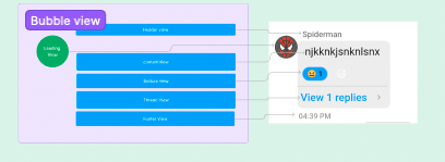
Following are the sections in message bubble
- Header View
- Leading View
- Content View
- Bottom View
- Thread View
- footer view
Properties
| Properties | Type | Description |
|---|---|---|
| LeadingView | () => JSX.Element | used to set view in leading View section |
| headerView | () => JSX.Element | used to set view in header view section |
| replyView | () => JSX.Element | used to set view in reply view section |
| contentView | () => JSX.Element | used to set content view , by default all different type of bubble are shown here |
| threadView | () => JSX.Element | used to set view in thread view section , by default threaded section is shown |
| footerView | () => JSX.Element | used to set footer view for message bubble , by default message receipt is shown |
| alignment | 'left' | 'right' | 'center' | used to set bubble alignment , can be left, right and centar |
| style | MessageBubbleStyle | used to set styling properties foe message bubble |
| bottomView | () => JSX.Element | used to set bottom view for message bubble , by default reactions are shown here |
style
| Properties | Type | Description |
|---|---|---|
| height | string | number | used to set height |
| width | string | number | used to set width |
| backgroundColor | string | used to set the background colour |
| border | BorderStyle | used to set border |
| borderRadius | number | used to set border radius |