Threaded Messages
Overview
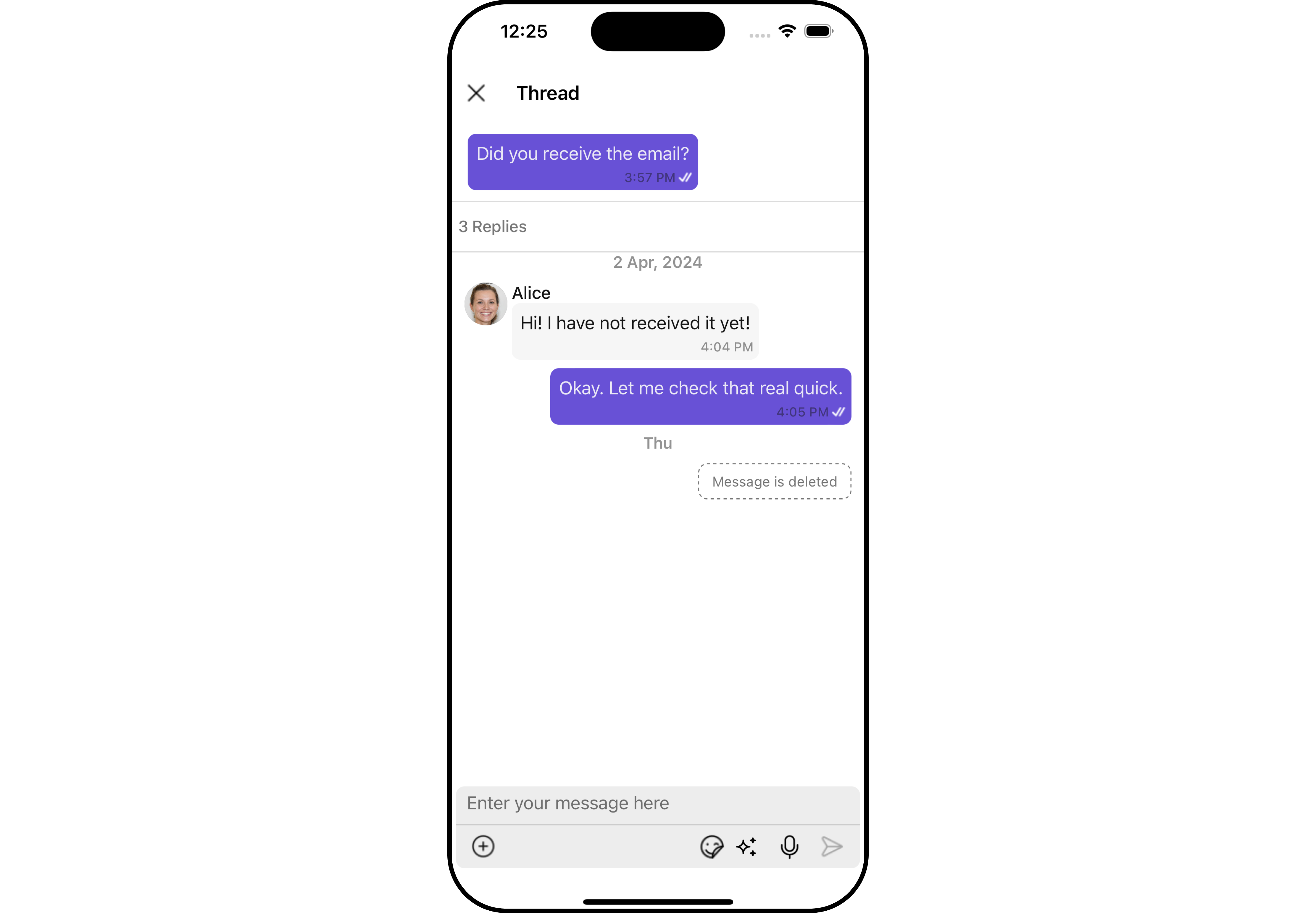
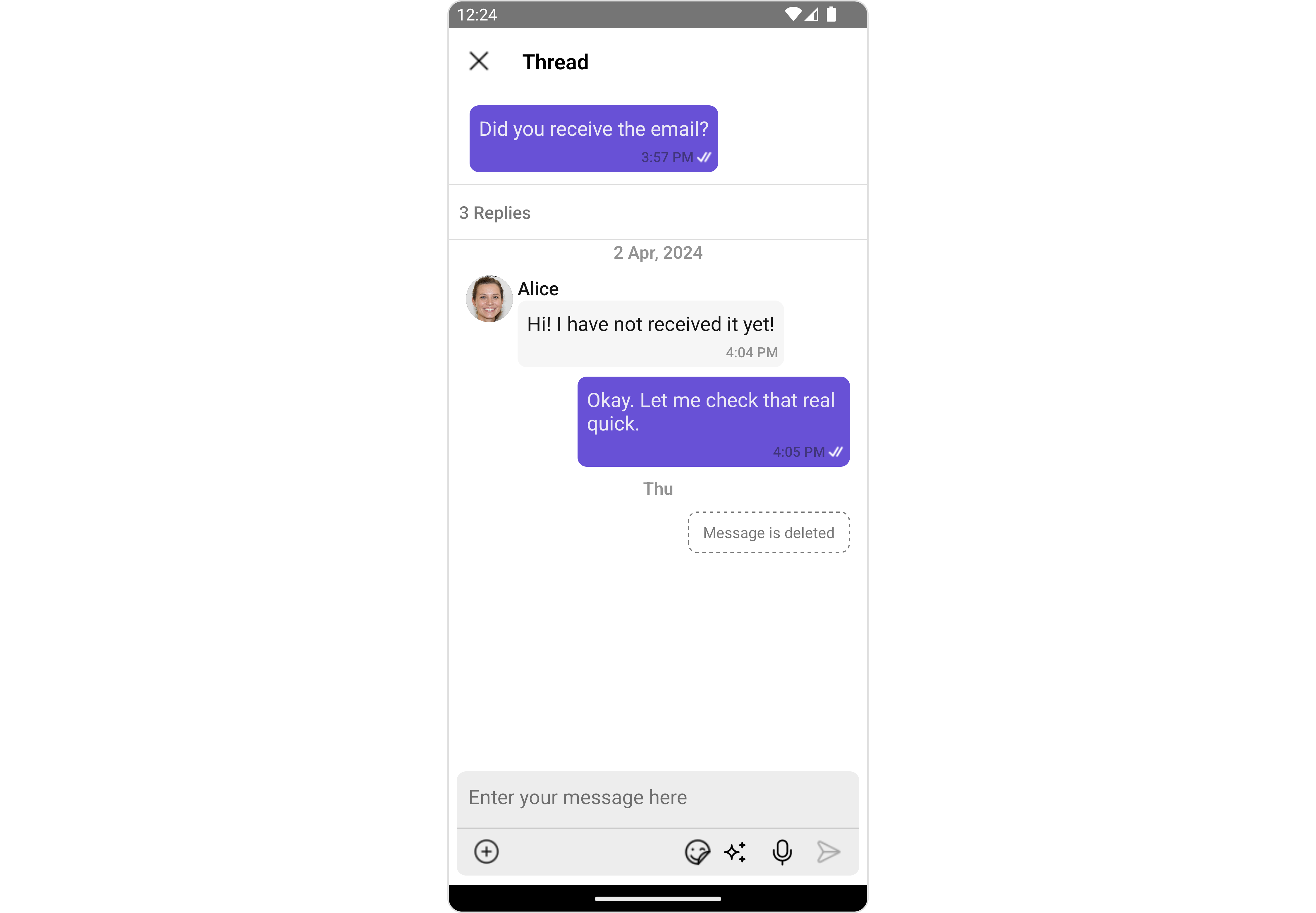
ThreadedMessages is a Composite Component that displays all replies made to a particular message in a conversation. By default, the parent message will be displayed at the top, the message composer will be at the bottom and between them a message list will contain all replies.
- iOS
- Android
ThreadedMessages is composed of the following components:
| Component | Description |
|---|---|
| MessageList | CometChatMessageList is a component that displays a list of Messages |
| MessageComposer | CometChatMessageComposer is a component that helps in writing and editing of messages and also sending attachments |
Usage
Integration
The following code snippet illustrates how you can directly incorporate the ThreadedMessages component into your Application.
- App.tsx
import { CometChat } from '@cometchat/chat-sdk-react-native';
import { CometChatThreadedMessages, ThreadedMessagesStyleInterface } from '@cometchat/chat-uikit-react-native';

function App(): React.JSX.Element {

    const [chatUser, setChatUser] = React.useState<CometChat.User>();
    const [message, setMessage] = React.useState<CometChat.TextMessage | undefined>(undefined);

    React.useEffect(() => {
          //after login
          CometChat.getUser("alice-uid").then((user) => {
              setChatUser(user);
          })
          CometChat.getMessageDetails(614).then((message: any) => {
              setMessage(message);
          })

    }, []);

    const listItemStyle : ListItemStyleInterface = {
      width: "500",
      height: "100%",
      borderRadius: 12,
      titleColor:"#ffffff",
      backgroundColor:"#6851D6",
    };

    const customBubbleView = () => {
       return(
         <CometChatListItem id="info" title ={(message as CometChat.TextMessage).getText()}
         listItemStyle={listItemStyle} />
       )
    };

    const threadedMessagesStyle : ThreadedMessagesStyleInterface = {
       titleStyle: {
         fontFamily: 'Arial',
         fontWeight: 'bold',
         fontSize: 15,
       },
       background: "#ebdeff",
       width: "100%",
       height: "600px",
       closeIconTint: "#6851D6"
    };


    return (
      <>
         {  chatUser && message &&
            <CometChatThreadedMessages
            parentMessage={message}
            BubbleView={customBubbleView}
            title={`Thread ${chatUser?.getName()}`}
            threadedMessagesStyle={threadedMessagesStyle}
           ></CometChatThreadedMessages> }
      </>
    );
}
Actions
Actions dictate how a component functions. They are divided into two types: Predefined and User-defined. You can override either type, allowing you to tailor the behavior of the component to fit your specific needs.
ThreadedMessages does not have its own actions. However, you can override the behavior of the ThreadedMessages component by using the actions of its Components, with the help of Configurations.
Example
In this example, we are overriding the onClose callback.
- App.tsx
import { CometChat } from '@cometchat/chat-sdk-react-native';
import { CometChatThreadedMessages, ThreadedMessagesStyleInterface } from '@cometchat/chat-uikit-react-native';

function App(): React.JSX.Element {

    const [chatUser, setChatUser] = React.useState<CometChat.User>();
    const [message, setMessage] = React.useState<CometChat.TextMessage | undefined>(undefined);

    React.useEffect(() => {
          //after login
          CometChat.getUser("alice-uid").then((user) => {
              setChatUser(user);
          })
          CometChat.getMessageDetails(614).then((message: any) => {
              setMessage(message);
          })

    }, []);

    const listItemStyle : ListItemStyleInterface = {
      width: "500",
      height: "100%",
      borderRadius: 12,
      titleColor:"#ffffff",
      backgroundColor:"#6851D6",
    };

    const customBubbleView = () => {
       return(
         <CometChatListItem id="info" title ={(message as CometChat.TextMessage).getText()}
         listItemStyle={listItemStyle} />
       )
    };

    const threadedMessagesStyle : ThreadedMessagesStyleInterface = {
       titleStyle: {
         fontFamily: 'Arial',
         fontWeight: 'bold',
         fontSize: 15,
       },
       background: "#ebdeff",
       width: "100%",
       height: "600px",
       closeIconTint: "#6851D6"
    };

    const onCloseHandler = () => {
      //code
    }

    return (
      <>
         {  chatUser && message &&
            <CometChatThreadedMessages
            parentMessage={message}
            BubbleView={customBubbleView}
            title={`Thread ${chatUser?.getName()}`}
            threadedMessagesStyle={threadedMessagesStyle}
            onClose={onCloseHandler}
           ></CometChatThreadedMessages> }
      </>
    );
}
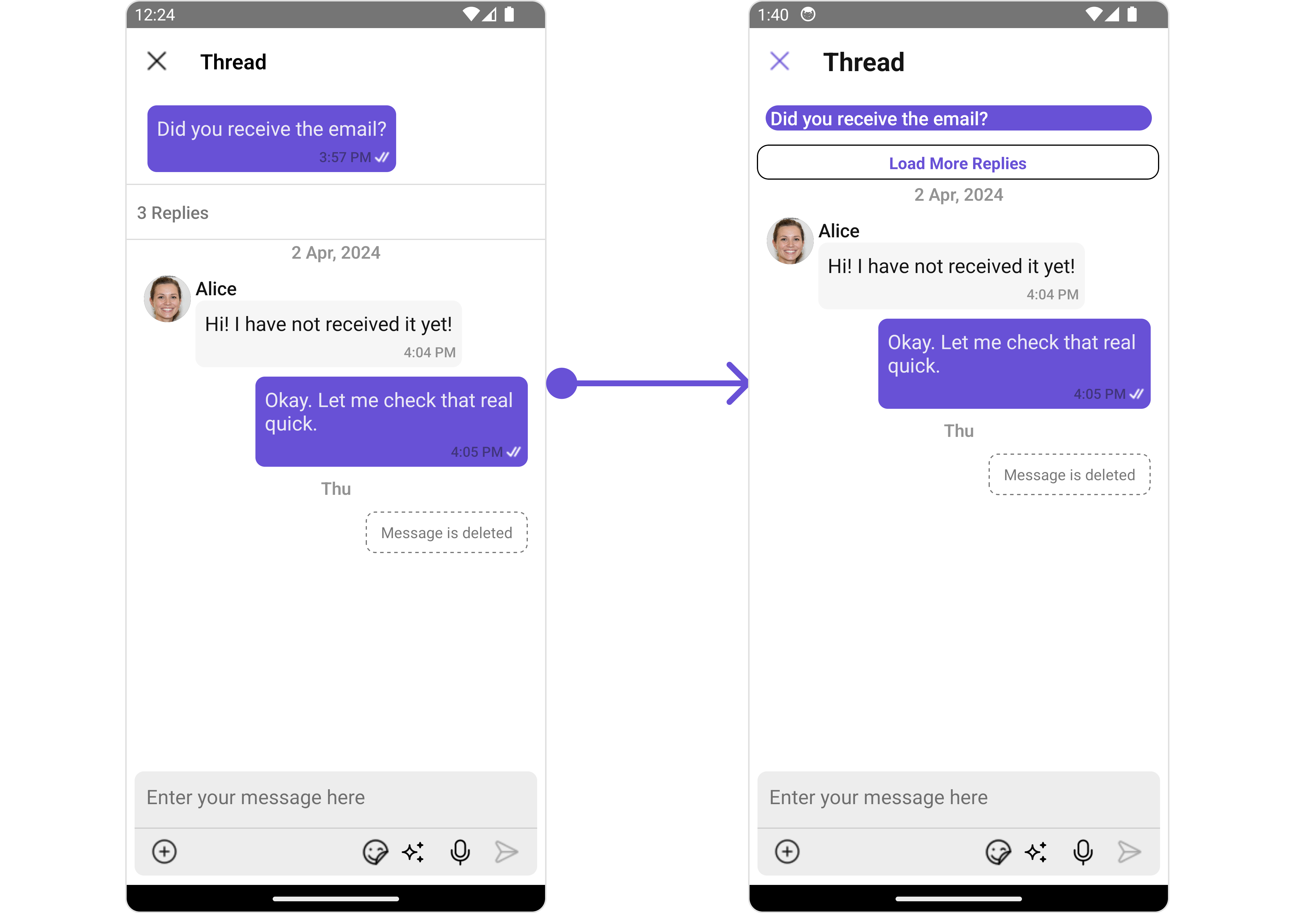
Filters
Filters allow you to customize the data displayed in a list within a Component. You can filter the list based on your specific criteria, allowing for a more customized. Filters can be applied using RequestBuilders of Chat SDK.
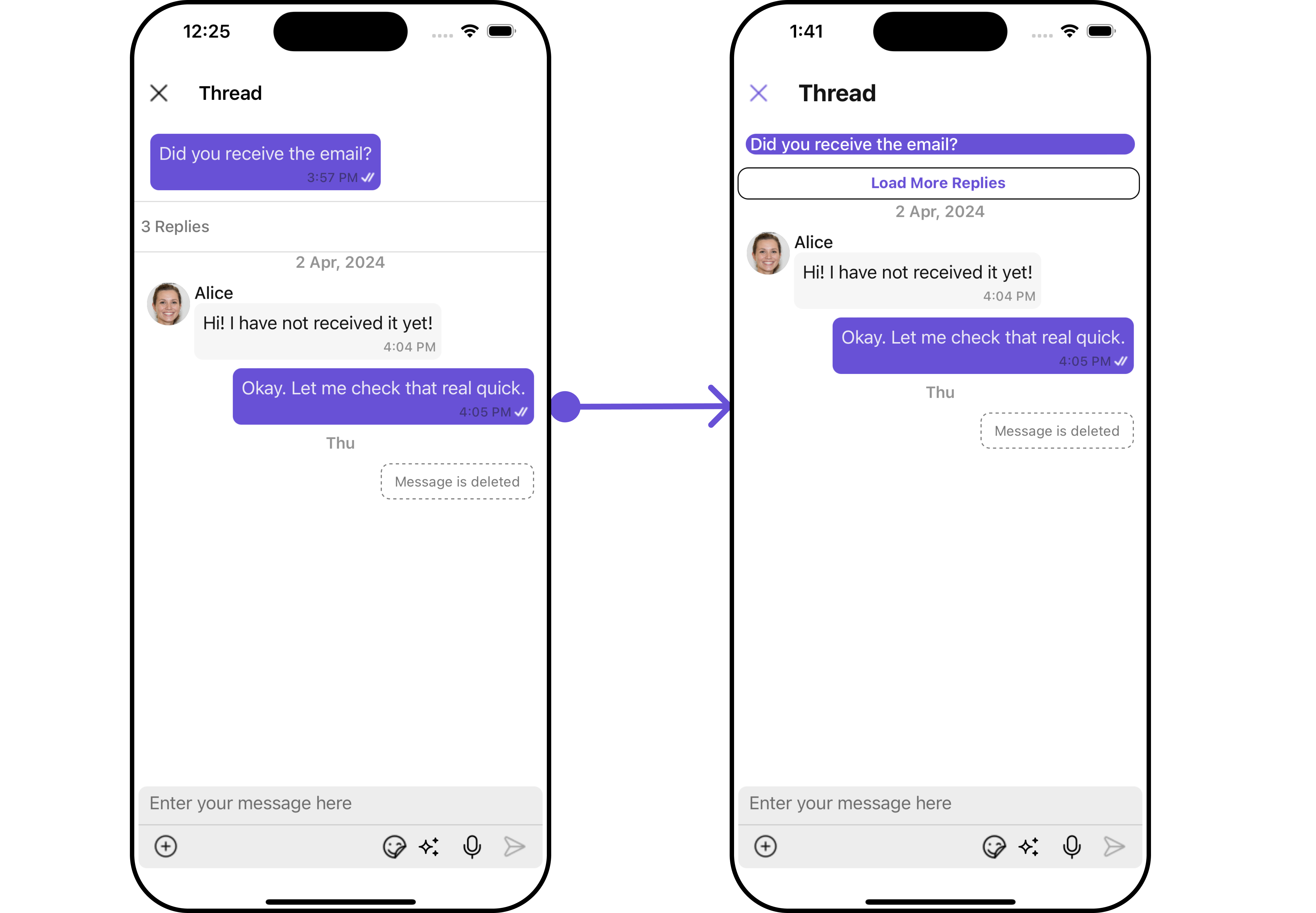
ThreadedMessages does not have its own Filters. However, you can filter the messages list in ThreadedMessages Component using MessageListConfiguration.
Example
In this example, we are filtering messages based on the ParentMessageID and searching for messages that contain the keyword "hi".
- App.tsx
import { CometChat } from '@cometchat/chat-sdk-react-native';
import { CometChatThreadedMessages, ThreadedMessagesStyleInterface } from '@cometchat/chat-uikit-react-native';

function App(): React.JSX.Element {

    const [chatUser, setChatUser] = React.useState<CometChat.User>();
    const [message, setMessage] = React.useState<CometChat.TextMessage | undefined>(undefined);

    React.useEffect(() => {
          //after login
          CometChat.getUser("alice-uid").then((user) => {
              setChatUser(user);
          })
          CometChat.getMessageDetails(614).then((message: any) => {
              setMessage(message);
          })

    }, []);

    const listItemStyle : ListItemStyleInterface = {
      width: "500",
      height: "100%",
      borderRadius: 12,
      titleColor:"#ffffff",
      backgroundColor:"#6851D6",
    };

    const customBubbleView = () => {
       return(
         <CometChatListItem id="info" title ={(message as CometChat.TextMessage).getText()}
         listItemStyle={listItemStyle} />
       )
    };

    const threadedMessagesStyle : ThreadedMessagesStyleInterface = {
       titleStyle: {
         fontFamily: 'Arial',
         fontWeight: 'bold',
         fontSize: 15,
       },
       background: "#ebdeff",
       width: "100%",
       height: "600px",
       closeIconTint: "#6851D6"
    };

    const messageRequestBuilder : CometChat.MessagesRequestBuilder = new CometChat.MessagesRequestBuilder()
                                                                .setLimit(2).setSearchKeyword('keyword');


    const messageListConfiguration : MessageListConfigurationInterface = {
       messageRequestBuilder: messageRequestBuilder
    }

    return (
      <>
         {  chatUser && message &&
            <CometChatThreadedMessages
            parentMessage={message}
            BubbleView={customBubbleView}
            title={`Thread ${chatUser?.getName()}`}
            threadedMessagesStyle={threadedMessagesStyle}
            messageListConfiguration={messageListConfiguration}
           ></CometChatThreadedMessages> }
      </>
    );
}
Events
Events are emitted by a Component. By using event you can extend existing functionality. Being global events, they can be applied in Multiple Locations and are capable of being Added or Removed.
The ThreadedMessages Component does not emit any events of its own.
Customization
To fit your app's design requirements, you can customize the appearance of the conversation component. We provide exposed methods that allow you to modify the experience and behavior according to yfEventour specific needs.
Style
Using Style you can customize the look and feel of the component in your app, These parameters typically control elements such as the color, size, shape, and fonts used within the component.
1. threadedMessagesStyle
To modify the styling, you can apply the ThreadedMessageStyle to the ThreadedMessage Component using the threadedMessagesStyle property.
- ThreadedMessagesDemo.tsx
import { CometChat } from '@cometchat/chat-sdk-react-native';
import { CometChatThreadedMessages, ThreadedMessagesStyleInterface } from '@cometchat/chat-uikit-react-native';

function App(): React.JSX.Element {

    const [chatUser, setChatUser] = React.useState<CometChat.User>();
    const [message, setMessage] = React.useState<CometChat.TextMessage | undefined>(undefined);

    React.useEffect(() => {
          //after login
          CometChat.getUser("alice-uid").then((user) => {
              setChatUser(user);
          })
          CometChat.getMessageDetails(614).then((message: any) => {
              setMessage(message);
          })

    }, []);

    const listItemStyle : ListItemStyleInterface = {
      width: "500",
      height: "100%",
      borderRadius: 12,
      titleColor:"#ffffff",
      backgroundColor:"#6851D6",
    };

    const customBubbleView = () => {
       return(
         <CometChatListItem id="info" title ={(message as CometChat.TextMessage).getText()}
         listItemStyle={listItemStyle} />
       )
    };

    const threadedMessagesStyle : ThreadedMessagesStyleInterface = {
       titleStyle: {
         fontFamily: 'Arial',
         fontWeight: 'bold',
         fontSize: 15,
       },
       background: "#ebdeff",
       width: "100%",
       height: "600px",
       closeIconTint: "#6851D6"
    };


    return (
      <>
         {  chatUser && message &&
            <CometChatThreadedMessages
            parentMessage={message}
            BubbleView={customBubbleView}
            threadedMessagesStyle={threadedMessagesStyle}
           ></CometChatThreadedMessages> }
      </>
    );
}
The following properties are exposed by ThreadedMessagesStyle:
| Methods | Description | Type |
|---|---|---|
| border | Used to set border | border?: BorderStyleInterface, |
| borderRadius | Used to set border radius | borderRadius?: string; |
| background | Used to set background colour | background?: number | string; |
| height | Used to set height | height?: number | string; |
| width | Used to set width | width?: number | string; |
| titleStyle | used to customise the font of the title in the app bar | titleStyle?: FontStyleInterface; |
| closeIconTint | used to set the color of the close icon in the app bar | closeIconTint?: string; |
Functionality
These are a set of small functional customizations that allow you to fine-tune the overall experience of the component. With these, you can change text, set custom icons, and toggle the visibility of UI elements.
- App.tsx
import { CometChat } from '@cometchat/chat-sdk-react-native';
import { CometChatThreadedMessages, ThreadedMessagesStyleInterface } from '@cometchat/chat-uikit-react-native';
import CloseIcon from './close-icon.png';

function App(): React.JSX.Element {

    const [chatUser, setChatUser] = React.useState<CometChat.User>();
    const [message, setMessage] = React.useState<CometChat.TextMessage | undefined>(undefined);

    React.useEffect(() => {
          //after login
          CometChat.getUser("alice-uid").then((user) => {
              setChatUser(user);
          })
          CometChat.getMessageDetails(614).then((message: any) => {
              setMessage(message);
          })

    }, []);

    const listItemStyle : ListItemStyleInterface = {
      width: "500",
      height: "100%",
      borderRadius: 12,
      titleColor:"#ffffff",
      backgroundColor:"#6851D6",
    };

    const customBubbleView = () => {
       return(
         <CometChatListItem id="info" title ={(message as CometChat.TextMessage).getText()}
         listItemStyle={listItemStyle} />
       )
    };

    const threadedMessagesStyle : ThreadedMessagesStyleInterface = {
       titleStyle: {
         fontFamily: 'Arial',
         fontWeight: 'bold',
         fontSize: 15,
       },
       background: "#ebdeff",
       width: "100%",
       height: "600px",
       closeIconTint: "#6851D6"
    };


    return (
      <>
         {  chatUser && message &&
            <CometChatThreadedMessages
            parentMessage={message}
            BubbleView={customBubbleView}
            title={`Thread ${chatUser?.getName()}`}
            threadedMessagesStyle={threadedMessagesStyle}
            closeIcon={CloseIcon}
            hideMessageComposer={true}
           ></CometChatThreadedMessages> }
      </>
    );
}
Below is a list of customizations along with corresponding code snippets
Advanced
For advanced-level customization, you can set custom views to the component. This lets you tailor each aspect of the component to fit your exact needs and application aesthetics. You can create and define your views, layouts, and UI elements and then incorporate those into the component.
BubbleView
By using bubbleView, You can set parent message bubble view inside ThreadedMessage Component.
Example
- iOS
- Android
In this example, we will set parent message bubble view using bubbleView and apply custom styles on it.
- ThreadedMessagesDemo.tsx
import { CometChat } from '@cometchat/chat-sdk-react-native';
import { CometChatThreadedMessages, ListItemStyleInterface } from '@cometchat/chat-uikit-react-native';

function App(): React.JSX.Element {

    const [chatUser, setChatUser] = React.useState<CometChat.User>();
    const [message, setMessage] = React.useState<CometChat.TextMessage | undefined>(undefined);

    React.useEffect(() => {
          //after login
          CometChat.getUser("alice-uid").then((user) => {
              setChatUser(user);
          })
          CometChat.getMessageDetails(614).then((message: any) => {
              setMessage(message);
          })

    }, []);

    const listItemStyle : ListItemStyleInterface = {
      width: "500",
      height: "100%",
      borderRadius: 12,
      titleColor:"#ffffff",
      backgroundColor:"#6851D6",
    };

    const customBubbleView = () => {
       return(
         <CometChatListItem id="info" title ={(message as CometChat.TextMessage).getText()}
         listItemStyle={listItemStyle} />
       )
    };


    return (
      <>
         {  chatUser && message &&
            <CometChatThreadedMessages
            parentMessage={message}
            BubbleView={customBubbleView}
           ></CometChatThreadedMessages> }
      </>
    );
}
MessageActionView
By utilizing the MessageActionView method, you can assign custom actions to the parent message bubble view inside the ThreadedMessage Component.
Example
- iOS
- Android
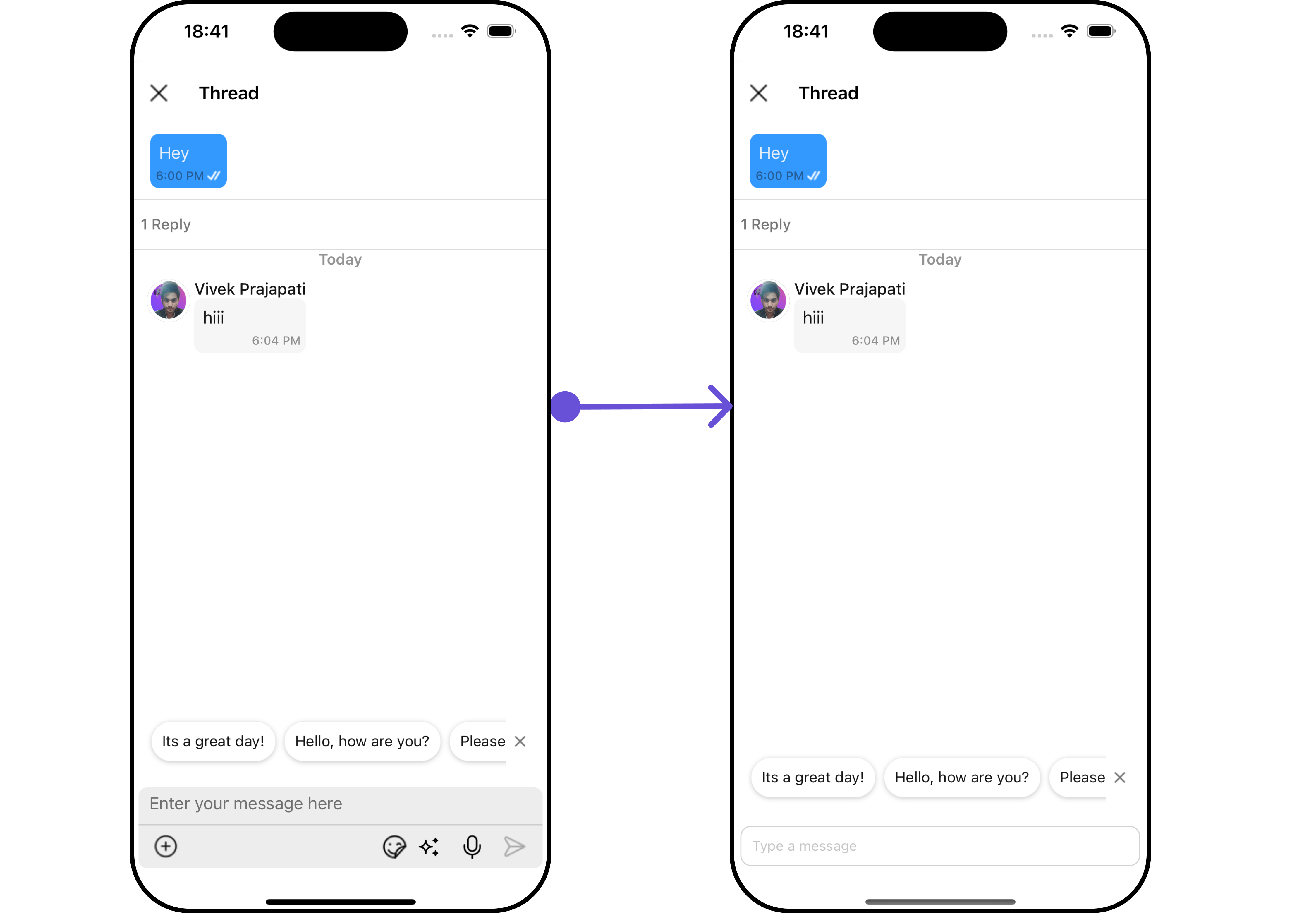
In this example, we are setting mock Load More Replies as message action view in ThreadedMessages Component.
- App.tsx
import { CometChat } from '@cometchat/chat-sdk-react-native';
import { CometChatThreadedMessages, ListItemStyleInterface } from '@cometchat/chat-uikit-react-native';

function App(): React.JSX.Element {

    const [chatUser, setChatUser] = React.useState<CometChat.User>();
    const [message, setMessage] = React.useState<CometChat.TextMessage | undefined>(undefined);

    React.useEffect(() => {
          //after login
          CometChat.getUser("alice-uid").then((user) => {
              setChatUser(user);
          })
          CometChat.getMessageDetails(614).then((message: any) => {
              setMessage(message);
          })

    }, []);

    const listItemStyle : ListItemStyleInterface = {
      width: "500",
      height: "100%",
      borderRadius: 12,
      titleColor:"#ffffff",
      backgroundColor:"#6851D6",
    };

    const customBubbleView = () => {
       return(
         <CometChatListItem id="info" title ={(message as CometChat.TextMessage).getText()}
         listItemStyle={listItemStyle} />
       )
    };

    const viewStyle: StyleProp<ViewStyle> = {
      flexDirection: 'row',
      alignItems: 'flex-start',
      justifyContent: 'center',
      padding: 5,
      borderColor: 'black',
      borderWidth: 1,
      backgroundColor: 'white',
      borderRadius: 10,
      margin: 2,
      marginLeft: 7.4,
      height: 30,
      width: '95.5%',
    };

    const customMessageActionView  = () : JSX.Element => {
      return <View style={viewStyle}>
               <Text style={{color: "#6851D6", fontWeight: "bold"}}>Load More Replies</Text>
            </View>
    };

    return (
      <>
         {  chatUser && message &&
            <CometChatThreadedMessages
            parentMessage={message}
            BubbleView={customBubbleView}
            MessageActionView={customMessageActionView}
           ></CometChatThreadedMessages> }
      </>
    );
}
MessageComposerView
By utilizing the MessageComposerView method, you can override the default CometChatMessageComposer.
Example
- iOS
- Android
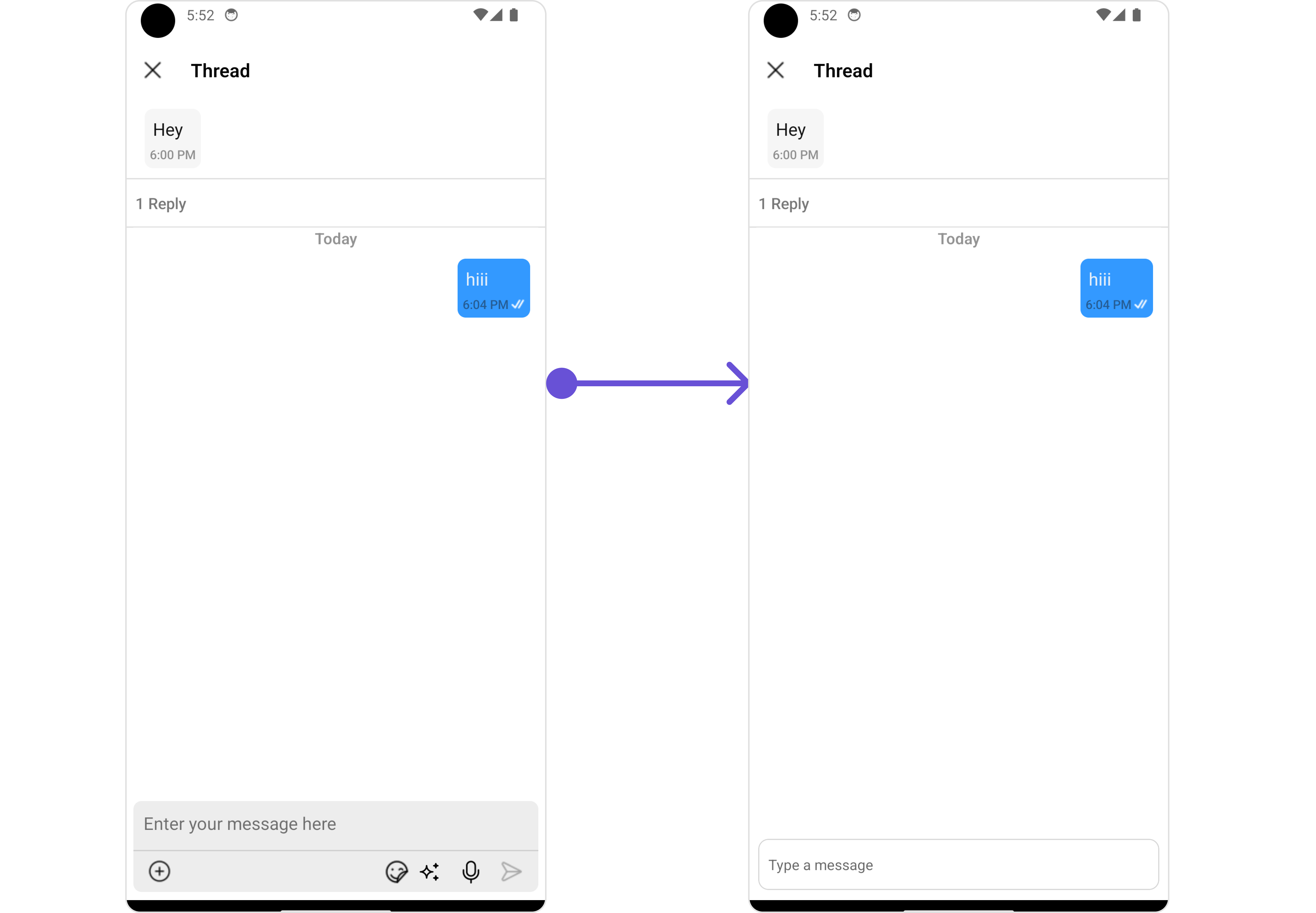
In this example, we are setting a custom MessageComposerView.
- App.tsx
import { CometChat } from '@cometchat/chat-sdk-react-native';
import { CometChatThreadedMessages, ListItemStyleInterface } from '@cometchat/chat-uikit-react-native';

function App(): React.JSX.Element {

    const [chatUser, setChatUser] = React.useState<CometChat.User>();
    const [message, setMessage] = React.useState<CometChat.TextMessage | undefined>(undefined);

    React.useEffect(() => {
          //after login
          CometChat.getUser("alice-uid").then((user) => {
              setChatUser(user);
          })
          CometChat.getMessageDetails(614).then((message: any) => {
              setMessage(message);
          })

    }, []);

    const listItemStyle : ListItemStyleInterface = {
      width: "500",
      height: "100%",
      borderRadius: 12,
      titleColor:"#ffffff",
      backgroundColor:"#6851D6",
    };

    const customBubbleView = () => {
       return(
         <CometChatListItem id="info" title ={(message as CometChat.TextMessage).getText()}
         listItemStyle={listItemStyle} />
       )
    };

    const CustomMessageComposer = ({ user, group, parentMessage }: {
        user?: CometChat.User | undefined;
        group?: CometChat.Group | undefined;
        parentMessage: CometChat.BaseMessage;
    }) => {
        return <TextInput style={{
            padding: 10, margin: 10,
            borderRadius: 10,
            borderWidth: 1, borderColor: "lightgray",
        }} placeholder="Type a message" />
    };

    const viewStyle: StyleProp<ViewStyle> = {
      flexDirection: 'row',
      alignItems: 'flex-start',
      justifyContent: 'center',
      padding: 5,
      borderColor: 'black',
      borderWidth: 1,
      backgroundColor: 'white',
      borderRadius: 10,
      margin: 2,
      marginLeft: 7.4,
      height: 30,
      width: '95.5%',
    };

    const customMessageActionView  = () : JSX.Element => {
      return <View style={viewStyle}>
               <Text style={{color: "#6851D6", fontWeight: "bold"}}>Load More Replies</Text>
            </View>
    };

    return (
      <>
         {  chatUser && message &&
            <CometChatThreadedMessages
            parentMessage={message}
            BubbleView={customBubbleView}
            MessageActionView={customMessageActionView}
            MessageComposerView={CustomMessageComposer}
           ></CometChatThreadedMessages> }
      </>
    );
}
MessageListView
By utilizing the MessageListView method, you can override the default CometChatMessageList.
Example
- iOS
- Android
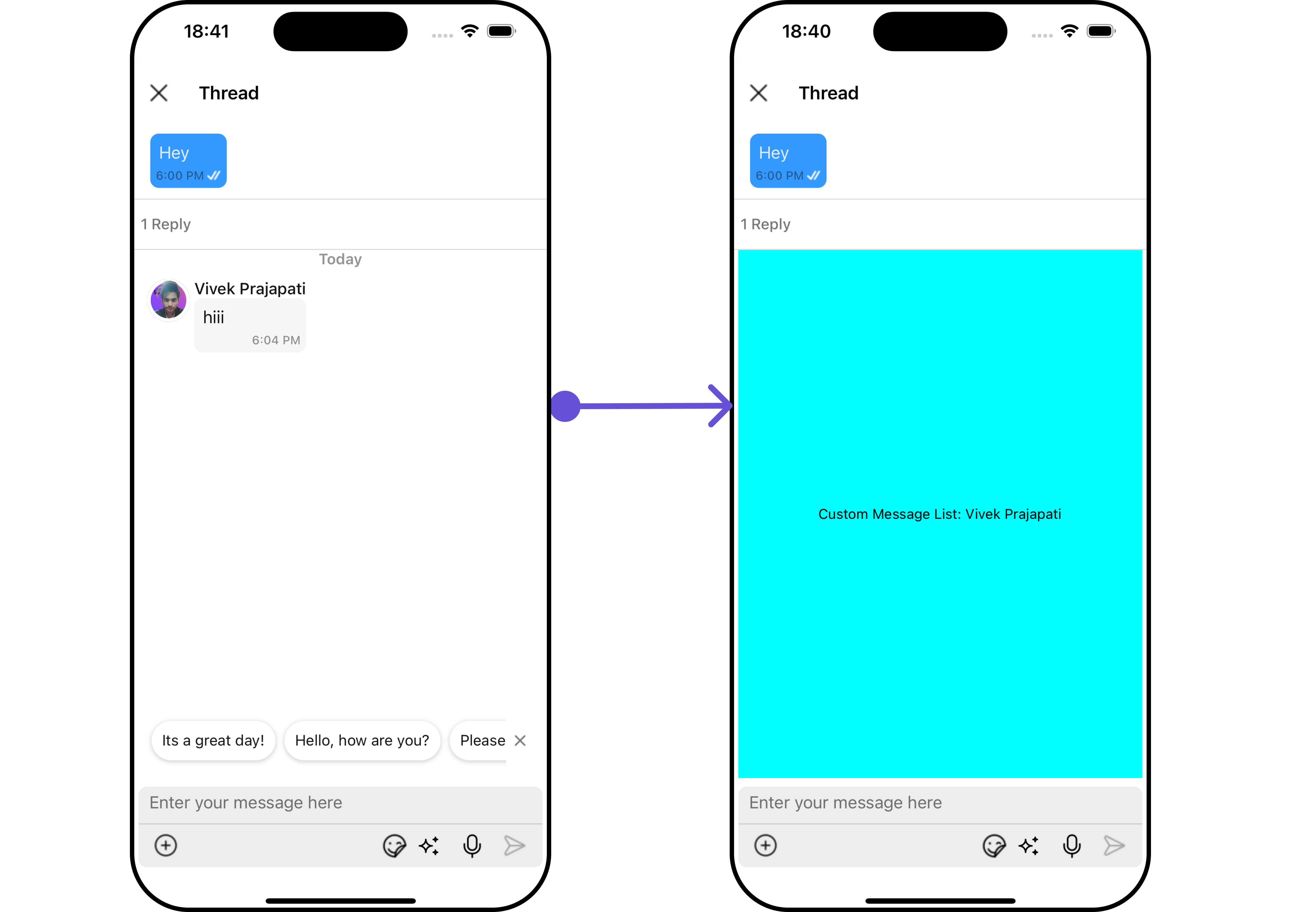
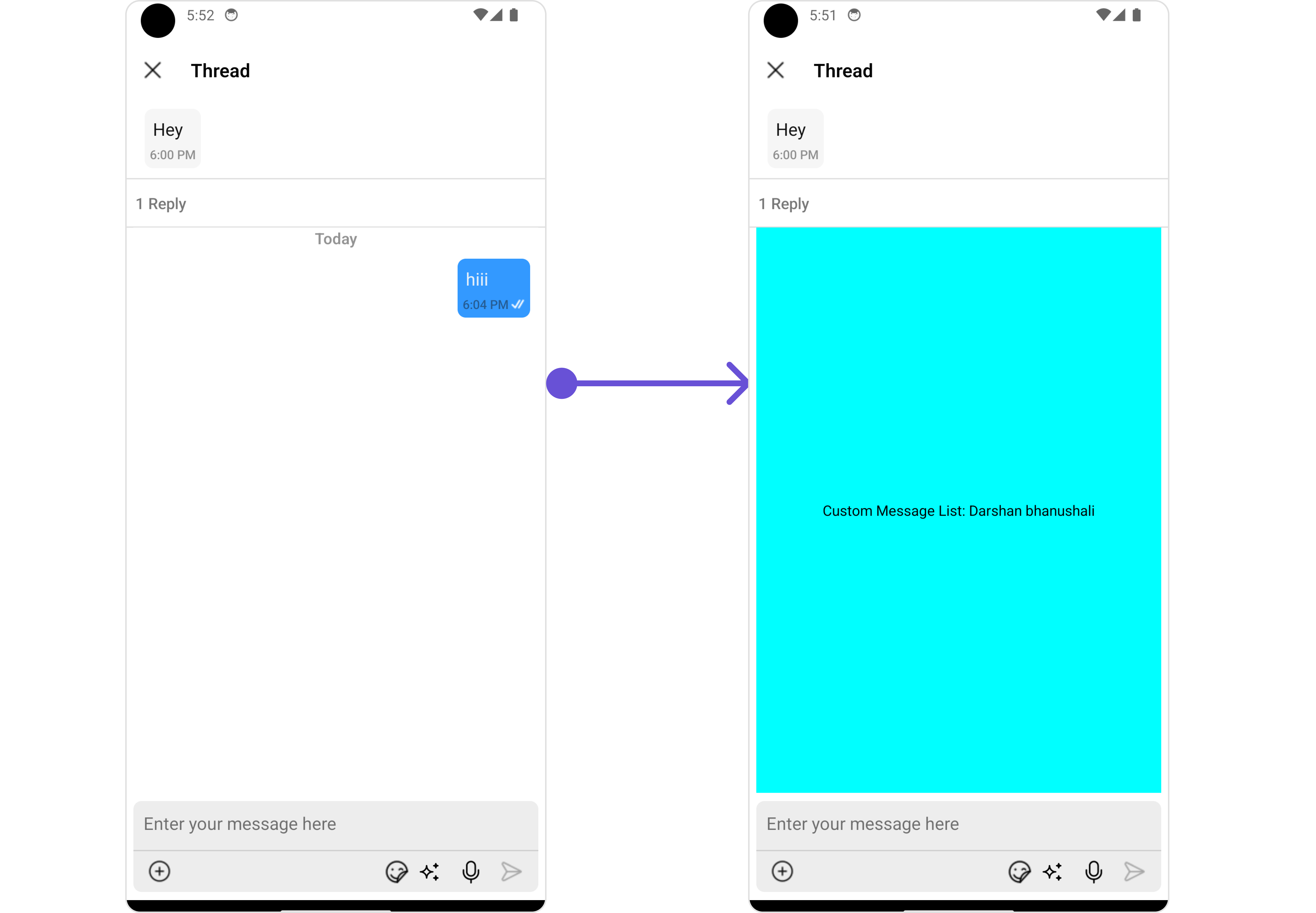
In this example, we are setting a custom MessageListView.
- App.tsx
import { CometChat } from '@cometchat/chat-sdk-react-native';
import { CometChatThreadedMessages, ListItemStyleInterface } from '@cometchat/chat-uikit-react-native';

function App(): React.JSX.Element {

    const [chatUser, setChatUser] = React.useState<CometChat.User>();
    const [message, setMessage] = React.useState<CometChat.TextMessage | undefined>(undefined);

    React.useEffect(() => {
          //after login
          CometChat.getUser("alice-uid").then((user) => {
              setChatUser(user);
          })
          CometChat.getMessageDetails(614).then((message: any) => {
              setMessage(message);
          })

    }, []);

    const listItemStyle : ListItemStyleInterface = {
      width: "500",
      height: "100%",
      borderRadius: 12,
      titleColor:"#ffffff",
      backgroundColor:"#6851D6",
    };

    const customBubbleView = () => {
       return(
         <CometChatListItem id="info" title ={(message as CometChat.TextMessage).getText()}
         listItemStyle={listItemStyle} />
       )
    };

    const CustomMessageComposer = ({ user, group, parentMessage }: {
        user?: CometChat.User | undefined;
        group?: CometChat.Group | undefined;
        parentMessage: CometChat.BaseMessage;
    }) => {
        return <TextInput style={{
            padding: 10, margin: 10,
            borderRadius: 10,
            borderWidth: 1, borderColor: "lightgray",
        }} placeholder="Type a message" />
    };

    const CustomMessagesListView = ({ user, group, parentMessage }: {
        user?: CometChat.User | undefined;
        group?: CometChat.Group | undefined;
        parentMessage: CometChat.BaseMessage;
    }) => {
        let name = user?.getName() || group?.getName();
        return <View style={{
                flex: 1,
                alignItems: 'center',
                justifyContent: 'center',
                backgroundColor: 'cyan'
            }}>
                <Text style={{ color: "#000" }}>Custom Message List: {name}</Text>
            </View>
    };

    const viewStyle: StyleProp<ViewStyle> = {
      flexDirection: 'row',
      alignItems: 'flex-start',
      justifyContent: 'center',
      padding: 5,
      borderColor: 'black',
      borderWidth: 1,
      backgroundColor: 'white',
      borderRadius: 10,
      margin: 2,
      marginLeft: 7.4,
      height: 30,
      width: '95.5%',
    };

    const customMessageActionView  = () : JSX.Element => {
      return <View style={viewStyle}>
               <Text style={{color: "#6851D6", fontWeight: "bold"}}>Load More Replies</Text>
            </View>
    };

    return (
      <>
         {  chatUser && message &&
            <CometChatThreadedMessages
            parentMessage={message}
            BubbleView={customBubbleView}
            MessageActionView={customMessageActionView}
            MessageComposerView={CustomMessageComposer}
           ></CometChatThreadedMessages> }
      </>
    );
}
Configuration
Configurations offer the ability to customize the properties of each individual component within a Composite Component.
The ThreadedMessages is a Composite Component, and it has a distinct set of configurations for each of its components as follows.
MessageList
If you want to customize the properties of the MessageList Component inside ThreadedMessages Component, you need use the MessageListConfiguration object.
- App.tsx
import { CometChat } from '@cometchat/chat-sdk-react-native';
import { CometChatThreadedMessages, MessageListConfigurationInterface } from '@cometchat/chat-uikit-react-native';

function App(): React.JSX.Element {

    const [chatUser, setChatUser] = React.useState<CometChat.User>();
    const [message, setMessage] = React.useState<CometChat.TextMessage | undefined>(undefined);

    React.useEffect(() => {
          //after login
          CometChat.getUser("alice-uid").then((user) => {
              setChatUser(user);
          })
          CometChat.getMessageDetails(614).then((message: any) => {
              setMessage(message);
          })

    }, []);

    const listItemStyle : ListItemStyleInterface = {
      width: "500",
      height: "100%",
      borderRadius: 12,
      titleColor:"#ffffff",
      backgroundColor:"#6851D6",
    };

    const customBubbleView = () => {
       return(
         <CometChatListItem id="info" title ={(message as CometChat.TextMessage).getText()}
         listItemStyle={listItemStyle} />
       )
    };

   const messageRequestBuilder : CometChat.MessagesRequestBuilder = new CometChat.MessagesRequestBuilder()
                                                                .setLimit(2).setSearchKeyword('check');


   const messageListConfiguration : MessageListConfigurationInterface = {
       //config
       messageRequestBuilder: messageRequestBuilder
   }


    return (
      <>
         {  chatUser && message &&
            <CometChatThreadedMessages
            parentMessage={message}
            BubbleView={customBubbleView}
            messageListConfiguration={messageListConfiguration}
           ></CometChatThreadedMessages> }
      </>
    );
}
The MessageListConfiguration provides access to all the Action, Filters, Styles, Functionality, and Advanced properties of the MessageList component.
Example
- iOS
- Android
In this example, we will be changing the list alignment and modifying the message list styles in the MessageList component using MessageListConfiguration.
- App.tsx
import { CometChat } from '@cometchat/chat-sdk-react-native';
import { CometChatThreadedMessages, MessageListConfigurationInterface, CometChatUiKitConstants,
MessageListStyleInterface } from '@cometchat/chat-uikit-react-native';

function App(): React.JSX.Element {

    const [chatUser, setChatUser] = React.useState<CometChat.User>();
    const [message, setMessage] = React.useState<CometChat.TextMessage | undefined>(undefined);

    React.useEffect(() => {
          //after login
          CometChat.getUser("alice-uid").then((user) => {
              setChatUser(user);
          })
          CometChat.getMessageDetails(614).then((message: any) => {
              setMessage(message);
          })

    }, []);

    const listItemStyle : ListItemStyleInterface = {
      width: "500",
      height: "100%",
      borderRadius: 12,
      titleColor:"#ffffff",
      backgroundColor:"#6851D6",
    };

    const customBubbleView = () => {
       return(
         <CometChatListItem id="info" title ={(message as CometChat.TextMessage).getText()}
         listItemStyle={listItemStyle} />
       )
    };

    const messageListStyle : MessageListStyleInterface = {
       backgroundColor:"#e7e3fc",
       loadingIconTint:"#e7e3fc"
    };

    const messageRequestBuilder : CometChat.MessagesRequestBuilder = new CometChat.MessagesRequestBuilder()
                                                                .setLimit(2).setSearchKeyword('check');

    const alignment : CometChatUiKitConstants.MessageListAlignmentType = "leftAligned";

    const messageListConfiguration : MessageListConfigurationInterface = {
       messageRequestBuilder: messageRequestBuilder,
       alignment: alignment,
       messageListStyle: messageListStyle
    }

    return (
      <>
         {  chatUser && message &&
            <CometChatThreadedMessages
            parentMessage={message}
            BubbleView={customBubbleView}
            messageListConfiguration={messageListConfiguration}
           ></CometChatThreadedMessages> }
      </>
    );
}
MessageComposer
If you want to customize the properties of the MessageComposer Component inside ThreadedMessages Component, you need use the MessageComposerConfiguration object.
- App.tsx
import { CometChat } from '@cometchat/chat-sdk-react-native';
import { CometChatThreadedMessages, CometChatMessageComposerInterface } from '@cometchat/chat-uikit-react-native';

function App(): React.JSX.Element {

    const [chatUser, setChatUser] = React.useState<CometChat.User>();
    const [message, setMessage] = React.useState<CometChat.TextMessage | undefined>(undefined);

    React.useEffect(() => {
          //after login
          CometChat.getUser("alice-uid").then((user) => {
              setChatUser(user);
          })
          CometChat.getMessageDetails(614).then((message: any) => {
              setMessage(message);
          })

    }, []);

    const listItemStyle : ListItemStyleInterface = {
      width: "500",
      height: "100%",
      borderRadius: 12,
      titleColor:"#ffffff",
      backgroundColor:"#6851D6",
    };

    const customBubbleView = () => {
       return(
         <CometChatListItem id="info" title ={(message as CometChat.TextMessage).getText()}
         listItemStyle={listItemStyle} />
       )
    };

    const messageComposerConfiguration : CometChatMessageComposerInterface = {
       //config
    }

    return (
      <>
         {  chatUser && message &&
            <CometChatThreadedMessages
            parentMessage={message}
            BubbleView={customBubbleView}
            messageComposerConfiguration={messageComposerConfiguration}
           ></CometChatThreadedMessages> }
      </>
    );
}
The MessageComposerConfiguration provides access to all the Action, Filters, Styles, Functionality, and Advanced properties of the MessageComposer component.
Example
- iOS
- Android
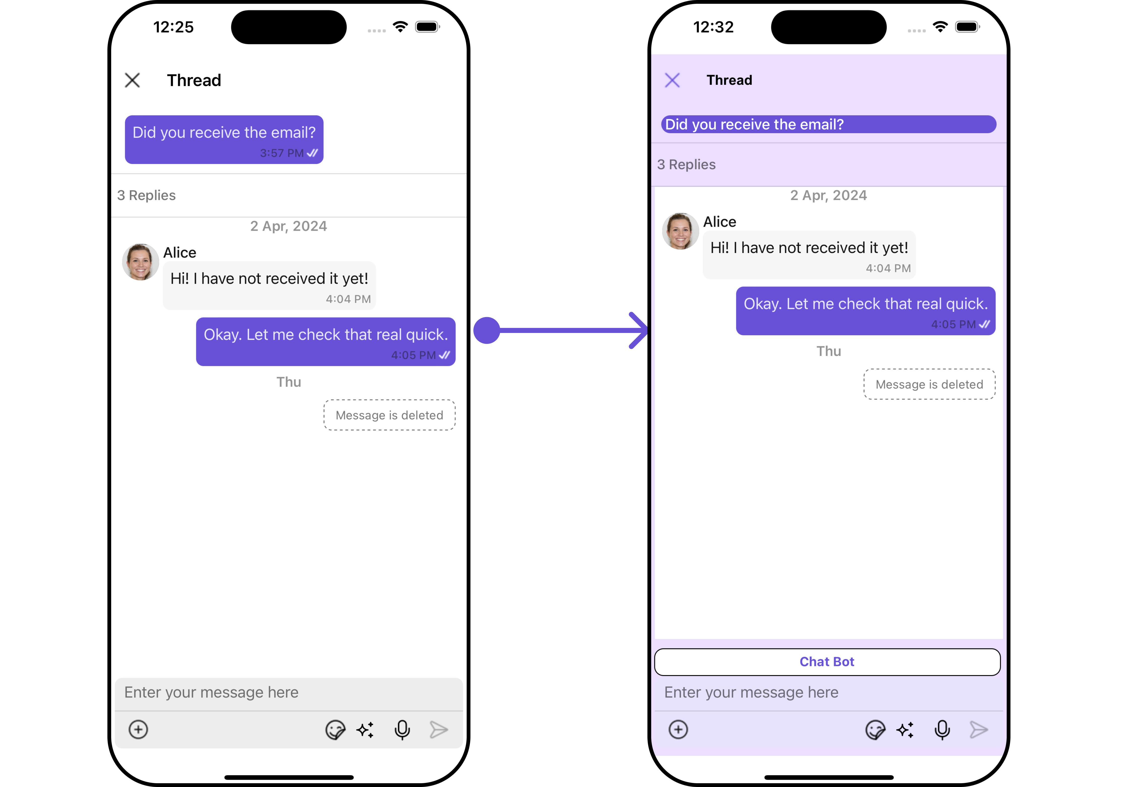

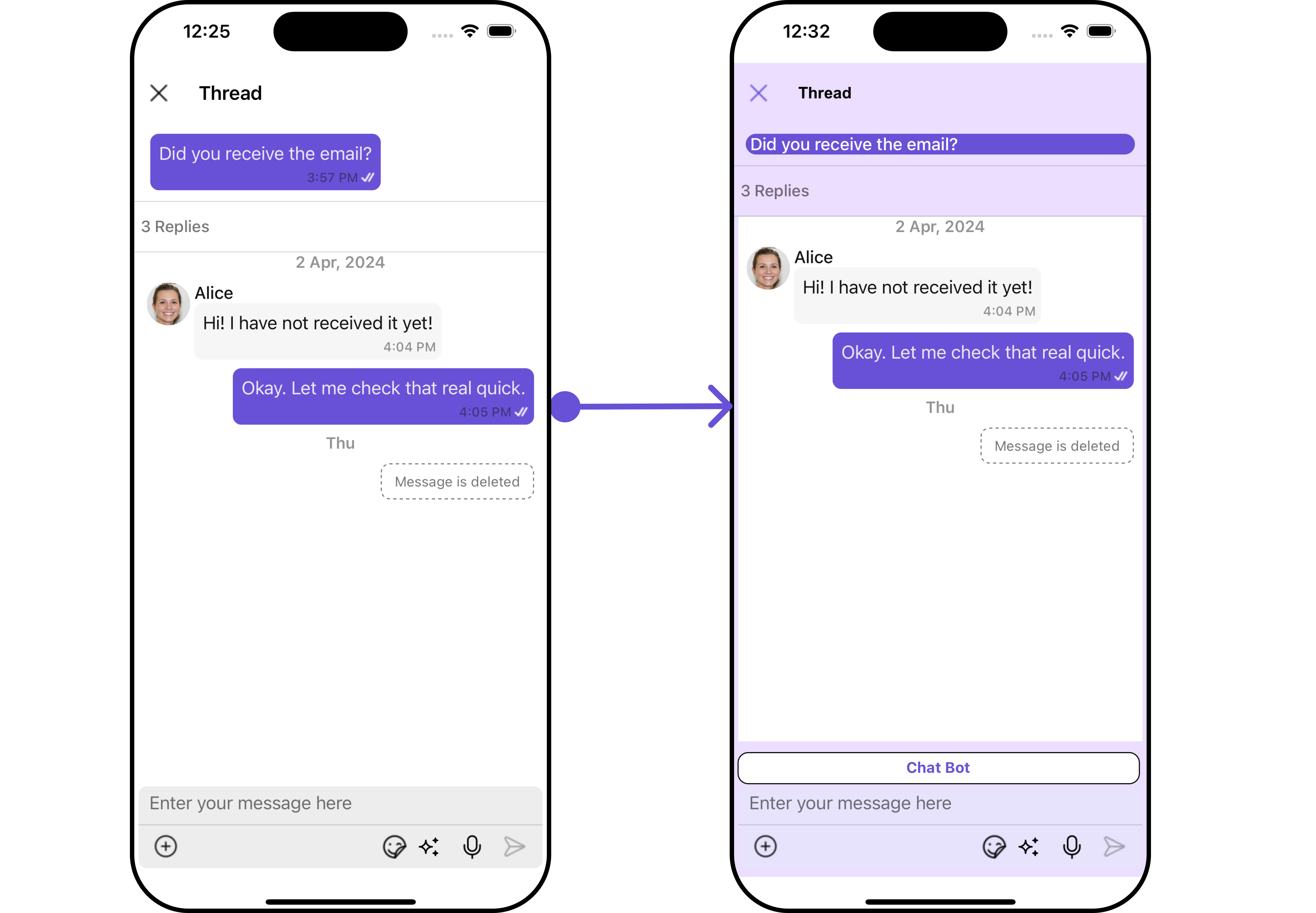
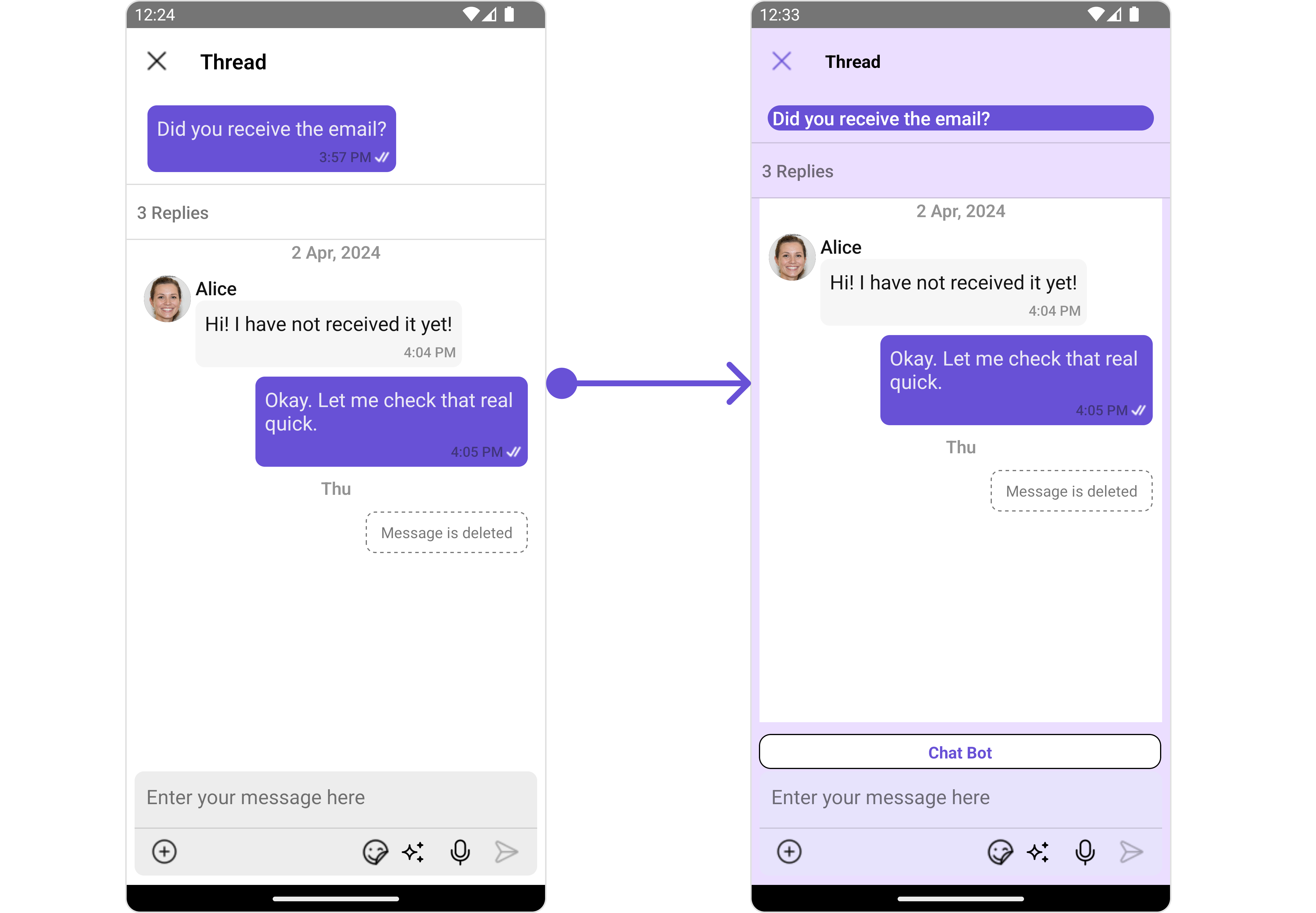
In this example, we'll be adding a custom header view and customizing some properties of the MessageComposer component using MessageComposerConfiguration.
- ThreadedMessagesDemo.tsx
import { CometChat } from '@cometchat/chat-sdk-react-native';
import { CometChatThreadedMessages, CometChatMessageComposerInterface } from '@cometchat/chat-uikit-react-native';

function App(): React.JSX.Element {

    const [chatUser, setChatUser] = React.useState<CometChat.User>();
    const [message, setMessage] = React.useState<CometChat.TextMessage | undefined>(undefined);

    React.useEffect(() => {
          //after login
          CometChat.getUser("alice-uid").then((user) => {
              setChatUser(user);
          })
          CometChat.getMessageDetails(614).then((message: any) => {
              setMessage(message);
          })

    }, []);

    const listItemStyle : ListItemStyleInterface = {
      width: "500",
      height: "100%",
      borderRadius: 12,
      titleColor:"#ffffff",
      backgroundColor:"#6851D6",
    };

    const customBubbleView = () => {
       return(
         <CometChatListItem id="info" title ={(message as CometChat.TextMessage).getText()}
         listItemStyle={listItemStyle} />
       )
    };

    const viewStyleComposerHeader: StyleProp<ViewStyle> = {
      flexDirection: 'row',
      alignItems: 'flex-start',
      justifyContent: 'center',
      padding: 5,
      borderColor: 'black',
      borderWidth: 1,
      backgroundColor: 'white',
      borderRadius: 10,
      margin: 2,
      marginLeft: 7.4,
      height: 30,
      width: '95.5%',
    };


    const customHeaderViewForComposer = () => {
       return <View style={viewStyleComposerHeader}>
                 <Text style={{color: "#6851D6", fontWeight: "bold"}}>Chat Bot</Text>
              </View>
    }

    const messageComposerStyle : MessageComposerStyleInterface = {
      sendIconTint: "red",
      inputBackground: "#e7e3fc",
      borderRadius: 20,
      textColor:"red",
    }

    const messageComposerConfiguration : CometChatMessageComposerInterface = {
       HeaderView: customHeaderViewForComposer,
       messageComposerStyle: messageComposerStyle,
    }

    return (
      <>
         {  chatUser && message &&
            <CometChatThreadedMessages
            parentMessage={message}
            BubbleView={customBubbleView}
            messageComposerConfiguration={messageComposerConfiguration}
           ></CometChatThreadedMessages> }
      </>
    );
}