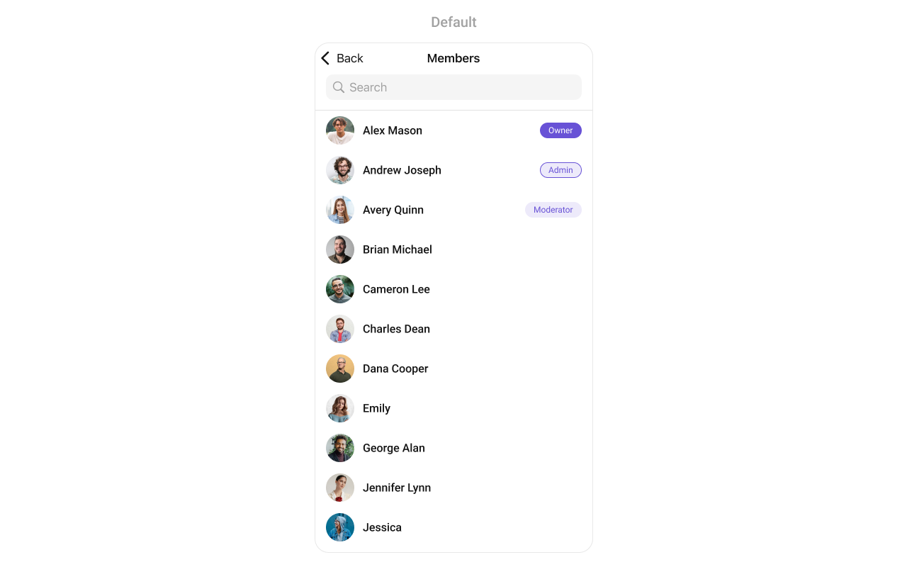
CometChatGroupMembers component displays all members of a group with their roles (owner, admin, moderator, participant). It supports member management actions like kick, ban, and role changes based on the logged-in user’s permissions.
AI Integration Quick Reference
AI Integration Quick Reference
| Field | Value |
|---|---|
| Component | CometChatGroupMembers |
| Package | CometChatUIKitSwift |
| Inherits | UIViewController |
Where It Fits
CometChatGroupMembers displays all members of a specific group. It’s typically accessed from group details or settings screens.
Minimal Render
Filtering
UseGroupMembersRequest.GroupMembersRequestBuilder to filter which members appear in the list.
Filter Recipes
| Recipe | Code |
|---|---|
| Admins only | .set(scopes: ["admin"]) |
| Admins and moderators | .set(scopes: ["admin", "moderator"]) |
| Search by name | .set(searchKeyword: "john") |
| Limit results | .set(limit: 20) |
Actions and Events
Callback Props
onItemClick
Fires when a user taps on a member. Use this to start a direct chat or view profile.onItemLongClick
Fires when a user long-presses on a member. Use this to show member options.onBack
Fires when the back button is pressed.onSelection
Fires when members are selected in selection mode.onError
Fires when an error occurs while loading members.onEmpty
Fires when the member list is empty.onLoad
Fires when members are successfully loaded.Actions Reference
| Method | Description | Example |
|---|---|---|
set(onItemClick:) | Triggered when a member is tapped | Start direct chat |
set(onItemLongClick:) | Triggered on long press | Show options menu |
set(onBack:) | Triggered when back button is pressed | Custom navigation |
set(onSelection:) | Triggered in selection mode | Multi-select members |
set(onError:) | Triggered when an error occurs | Show error alert |
set(onEmpty:) | Triggered when list is empty | Show empty state |
set(onLoad:) | Triggered when members load | Analytics tracking |
Global UI Events
| Event | Fires when | Payload |
|---|---|---|
ccGroupMemberKicked | A member is kicked | User, Group |
ccGroupMemberBanned | A member is banned | User, Group |
ccGroupMemberScopeChanged | A member’s role is changed | User, Group, MemberScope |
SDK Events (Real-Time, Automatic)
| SDK Listener | Internal behavior |
|---|---|
onGroupMemberKicked | Removes member from list |
onGroupMemberBanned | Removes member from list |
onGroupMemberUnbanned | Updates member info |
onGroupMemberScopeChanged | Updates member role badge |
onMemberAddedToGroup | Adds new member to list |
Custom View Slots
| Slot | Setter Method | Signature | Replaces |
|---|---|---|---|
listItemView | set(listItemView:) | (GroupMember?) -> UIView | Entire member row |
leadingView | set(leadingView:) | (GroupMember?) -> UIView | Avatar / left section |
titleView | set(titleView:) | (GroupMember?) -> UIView | Name / title text |
subtitleView | set(subtitleView:) | (GroupMember?) -> UIView | Role / subtitle text |
trailView | set(trailView:) | (GroupMember?) -> UIView | Right side (role badge) |
emptyStateView | - | UIView | Empty state display |
errorStateView | - | UIView | Error state display |
loadingStateView | - | UIView | Loading state display |
set(titleView:)
Replaces the default title view (member name) with a custom implementation.| Signature | (GroupMember?) -> UIView |
| Replaces | Member name / title text |
set(leadingView:)
Replaces the default leading view (avatar) with a custom implementation.| Signature | (GroupMember?) -> UIView |
| Replaces | Avatar / left section |
subtitleView
Customize the subtitle area below the member name.tailView
Customize the right side of the member row (role badge). Note: The setter method isset(trailView:).
Styling
Style Hierarchy
- Global styles (
CometChatGroupMembers.style) apply to all instances - Instance styles override global for specific instances
Global Level Styling
Instance Level Styling
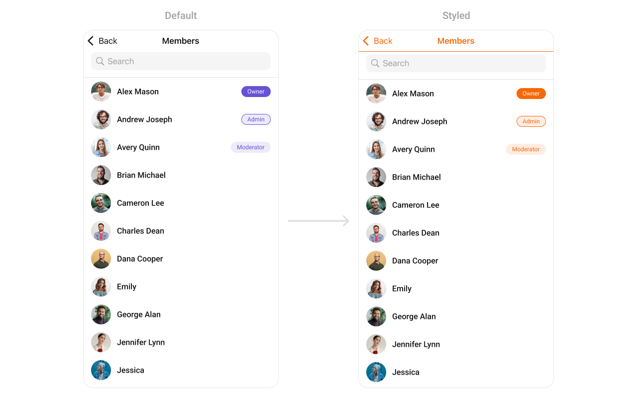
Key Style Properties
| Property | Type | Default | Description |
|---|---|---|---|
backgroundColor | UIColor | CometChatTheme.backgroundColor01 | Background color |
titleColor | UIColor | CometChatTheme.textColorPrimary | Navigation title color |
titleFont | UIFont | CometChatTypography.Heading4.medium | Navigation title font |
listItemTitleTextColor | UIColor | CometChatTheme.textColorPrimary | Member name color |
listItemTitleFont | UIFont | CometChatTypography.Heading4.medium | Member name font |
listItemSubTitleTextColor | UIColor | CometChatTheme.textColorSecondary | Subtitle color |
listItemBackground | UIColor | .clear | List item background |
Customization Matrix
| What to change | Where | Property/API | Example |
|---|---|---|---|
| Background color | Style | backgroundColor | UIColor.systemBackground |
| Title appearance | Style | titleColor, titleFont | Custom colors and fonts |
| List item look | Style | listItemBackground | UIColor.white |
| Avatar appearance | Style | avatarStyle | AvatarStyle() with custom radius |
| Hide search | Property | hideSearch | groupMembers.hideSearch = true |
| Hide kick option | Property | hideKickMemberOption | groupMembers.hideKickMemberOption = true |
| Custom row | View Slot | set(listItemView:) | See Custom View Slots |
Props
All props are optional exceptgroup. Sorted alphabetically.
avatarStyle
Customizes the appearance of member avatars in the list.| Type | AvatarStyle |
| Default | AvatarStyle() |
group (required)
The group whose members to display.| Type | Group |
| Required | true |
groupMembersRequestBuilder
Custom request builder for filtering members.| Type | GroupMembersRequest.GroupMembersRequestBuilder? |
| Default | nil |
hideBackIcon
Hides the back button in the navigation bar.| Type | Bool |
| Default | false |
hideBanMemberOption
Hides the ban member option in swipe actions.| Type | Bool |
| Default | false |
hideErrorView
Hides the error state view.| Type | Bool |
| Default | false |
hideKickMemberOption
Hides the kick member option in swipe actions.| Type | Bool |
| Default | false |
hideLoadingState
Hides the loading state indicator.| Type | Bool |
| Default | false |
hideNavigationBar
Hides the entire navigation bar.| Type | Bool |
| Default | false |
hideScopeChangeOption
Hides the role change option in swipe actions.| Type | Bool |
| Default | false |
hideSearch
Hides the search bar.| Type | Bool |
| Default | false |
hideUserStatus
Hides online/offline status indicators.| Type | Bool |
| Default | false |
selectionMode
Sets the selection mode for multi-select functionality.| Type | SelectionMode |
| Default | .none |
statusIndicatorStyle
Customizes the appearance of online/offline status indicators.| Type | StatusIndicatorStyle |
| Default | StatusIndicatorStyle() |
Events
| Event | Payload | Fires when |
|---|---|---|
ccGroupMemberKicked | User, Group | A member is kicked |
ccGroupMemberBanned | User, Group | A member is banned |
ccGroupMemberScopeChanged | User, Group, MemberScope | A member’s role is changed |
Methods
Swipe Action Methods
set(options:)
Sets custom swipe actions for group member list items, replacing the default options. These options appear when the user swipes on a member cell.| Parameter | Type | Description |
|---|---|---|
options | ((Group, GroupMember?) -> [CometChatGroupMemberOption])? | Closure that returns an array of swipe action options for a member |
add(options:)
Adds additional swipe actions to the existing default options.| Parameter | Type | Description |
|---|---|---|
options | ((Group, GroupMember?) -> [CometChatGroupMemberOption])? | Closure that returns additional swipe action options to append |
Data Manipulation Methods
add(groupMember:)
Adds a new group member to the list.| Parameter | Type | Description |
|---|---|---|
groupMember | GroupMember | The group member to add to the list |
update(groupMember:)
Updates an existing group member in the list.| Parameter | Type | Description |
|---|---|---|
groupMember | GroupMember | The group member with updated information |
remove(groupMember:)
Removes a group member from the list.| Parameter | Type | Description |
|---|---|---|
groupMember | GroupMember | The group member to remove from the list |
insert(groupMember:at:)
Inserts a group member at a specific index in the list.| Parameter | Type | Description |
|---|---|---|
groupMember | GroupMember | The group member to insert |
index | Int | The position at which to insert the member |
clearList()
Removes all group members from the list.size()
Returns the number of group members currently in the list.Selection Properties
onSelectedItemProceed
Callback that fires when the user proceeds with selected members in selection mode. This is typically triggered when the user taps a “Done” or “Proceed” button after selecting members.| Type | (([GroupMember]) -> Void)? |
| Default | nil |
Custom Swipe Options
Add custom actions when swiping on a member: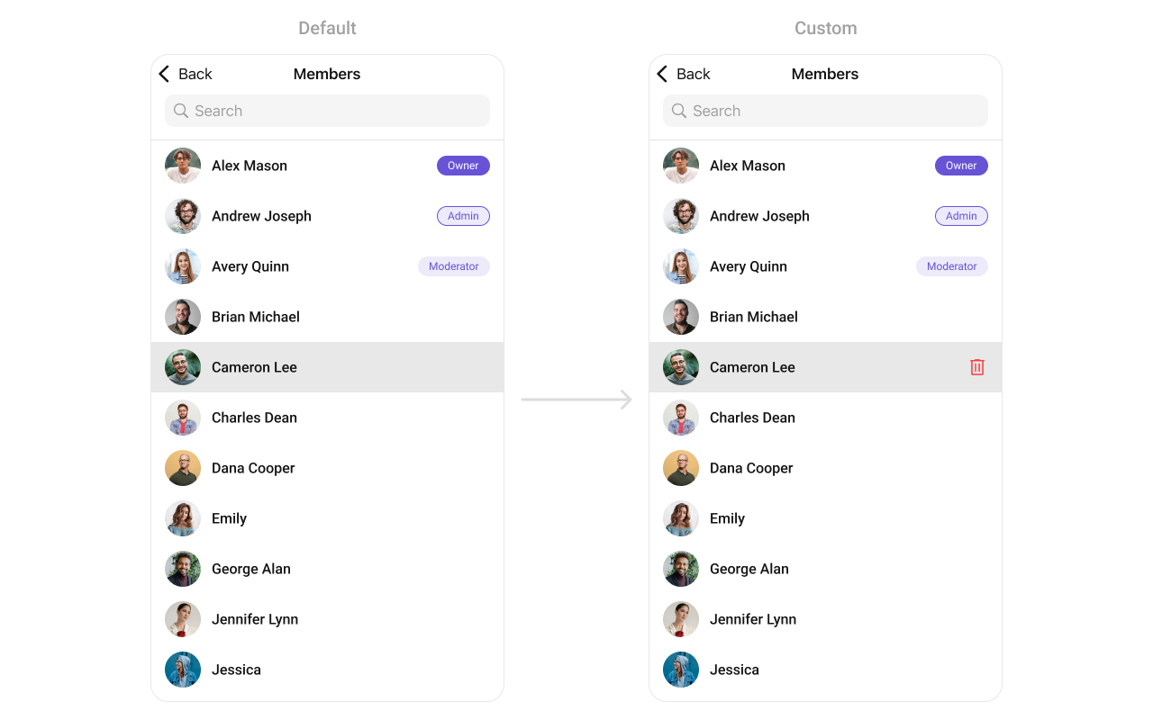
Custom Menu Buttons
Add buttons to the navigation bar: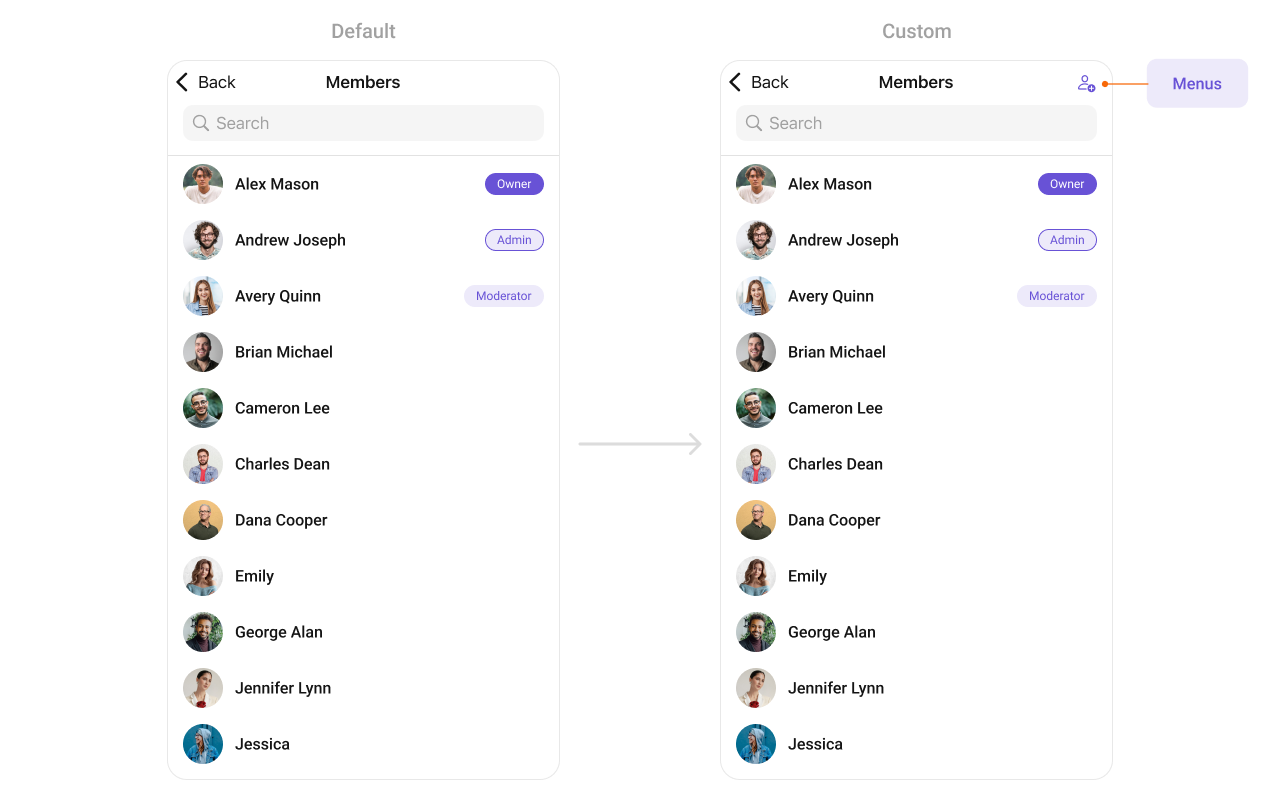
Common Patterns
Admins and moderators only
Hide management options for participants
Custom empty state
Multi-select members
Related Components
- Groups - List all groups
- Messages - Display messages in a group
- Add Members - Add new members to a group
- Banned Members - View banned members
- Transfer Ownership - Transfer group ownership