Overview
ThreadedMessages is a Composite Widget that displays all replies made to a particular message in a conversation. By default, the parent message will be displayed at the top, the message composer will be at the bottom and between them a message list will contain all replies.
| Widget | Description |
|---|---|
| MessageList | CometChatMessageList is a widget that displays a list of Messages |
| MessageComposer | CometChatMessageComposer is a widget that helps in writing and editing of messages and also sending attachments |
Usage
Integration
You can launchCometChatThreadedHeader directly using Navigator.push, or you can define it as a widget within the build method of your State class.
1. Using Navigator to Launch CometChatThreadedHeader
- Dart
2. Embedding CometChatThreadedHeader as a Widget in the build Method
- Dart
Customization
To fit your app’s design requirements, you can customize the appearance of the conversation widget. We provide exposed methods that allow you to modify the experience and behavior according to your specific needs.Style
Using Style you can customize the look and feel of the widget in your app, These parameters typically control elements such as the color, size, shape, and fonts used within the widget.Thread Header
To modify the styling, you can apply theThreadedHeaderStyle to the CometChatThreadedHeader Widget using the style property.
- Dart
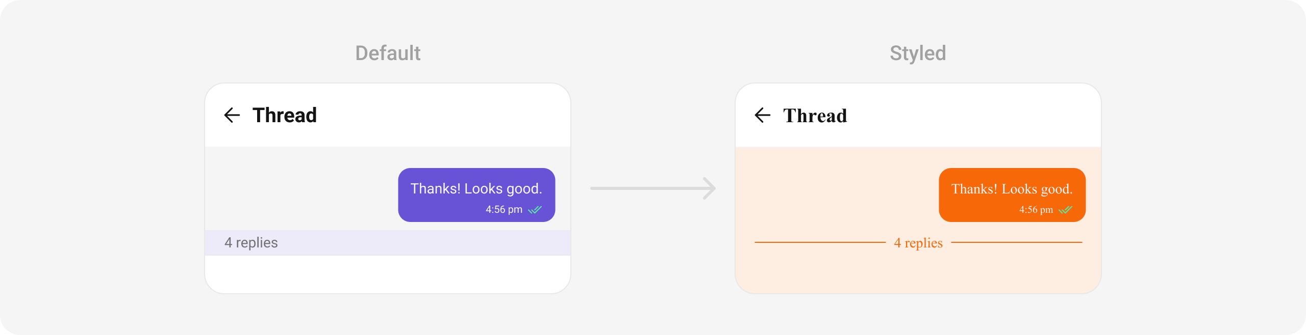
ThreadedMessagesStyle:
| Property | Data Type | Description |
|---|---|---|
bubbleContainerBackGroundColor | Color? | Sets background color for the bubble container. |
bubbleContainerBorder | BoxBorder? | Sets border for the bubble container. |
bubbleContainerBorderRadius | BorderRadiusGeometry? | Sets border radius for the bubble container. |
countTextStyle | TextStyle? | Sets text style for the reply count. |
countTextColor | Color? | Sets color for the reply count text. |
countContainerBackGroundColor | Color? | Sets background color for the count container. |
countContainerBorder | BoxBorder? | Sets border for the count container. |
constraints | BoxConstraints? | Sets constraints for the message container. |
incomingMessageBubbleStyle | CometChatIncomingMessageBubbleStyle? | Sets style for the incoming message bubble. |
outgoingMessageBubbleStyle | CometChatOutgoingMessageBubbleStyle? | Sets style for the outgoing message bubble. |
Functionality
These are a set of small functional customizations that allow you to fine-tune the overall experience of the widget. With these, you can change text, set custom icons, and toggle the visibility of UI elements. Below is a list of customizations along with corresponding code snippets| Property | Data Type | Description |
|---|---|---|
parentMessage | BaseMessage | Parent message for the thread. |
messageActionView | Function(BaseMessage message, BuildContext context)? | Custom action view for the message. |
style | CometChatThreadedHeaderStyle? | Style parameter for the threaded header. |
loggedInUser | User | Represents the logged-in user. |
template | CometChatMessageTemplate? | Message template used in the thread. |
height | double? | Height of the widget. |
width | double? | Width of the widget. |
Advanced
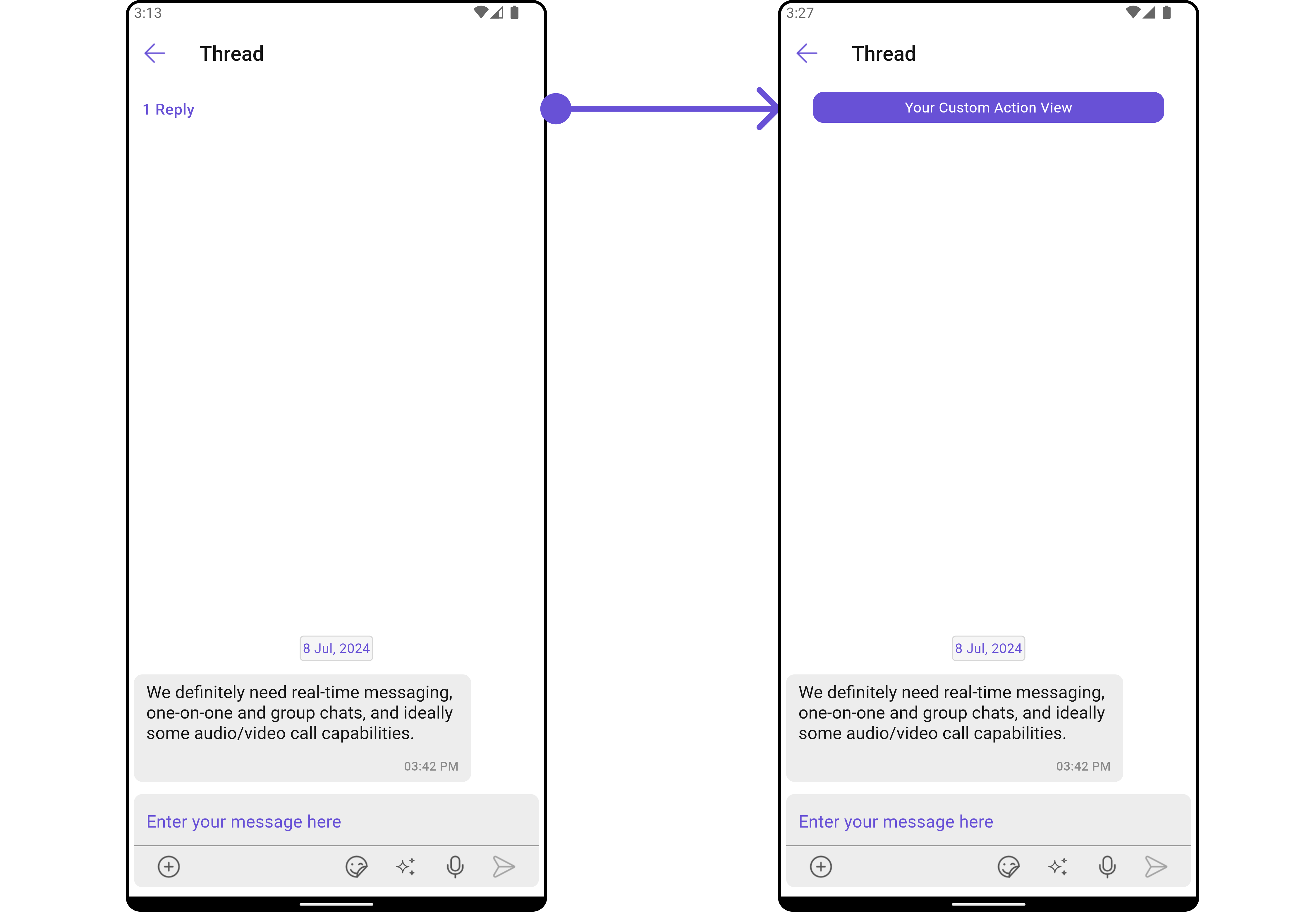
For advanced-level customization, you can set custom widgets to the widget. This lets you tailor each aspect of the widget to fit your exact needs and application aesthetics. You can create and define your widgets, layouts, and UI elements and then incorporate those into the widget.MessageActionView
By utilizing themessageActionView method, you can assign custom actions to the parent message bubble widget inside the CometChatThreadedHeader Widget.
Example
Here is the complete example for reference:
- Dart
- Android
- iOS