Incoming Call
Overview
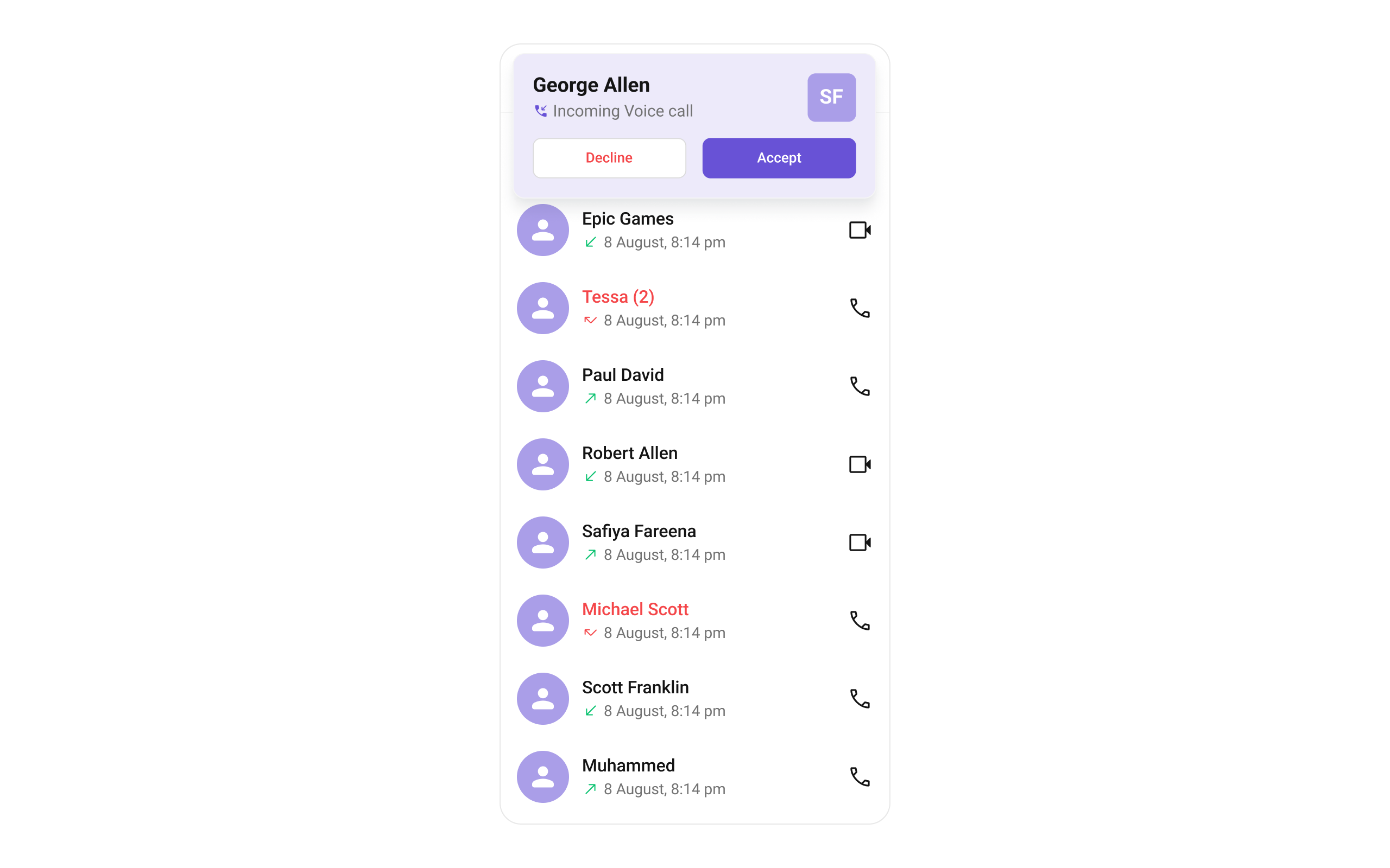
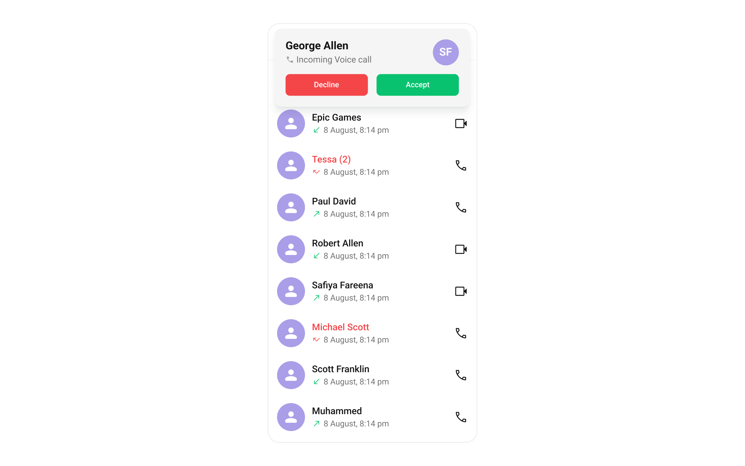
The CometChatIncomingCall is a Widget that serves as a visual representation when the user receives an incoming call, such as a voice call or video call, providing options to answer or decline the call.

Usage
Integration
CometChatIncomingCall being a custom widget, offers versatility in its integration. It can be seamlessly launched via button clicks or any user-triggered action, enhancing the overall user experience and facilitating smoother interactions within the application.
You can launch CometChatIncomingCall directly using Navigator.push, or you can define it as a widget within the build method of your State class.
1. Using Navigator to Launch CometChatIncomingCall
- Dart
Navigator.push(context, MaterialPageRoute(builder: (context) => CometChatIncomingCall(user: user, call: callObject))); // User object and Call object is required to launch the incoming call widget.
2. Embedding CometChatIncomingCall as a Widget in the build Method
- Dart
import 'package:cometchat_calls_uikit/cometchat_calls_uikit.dart';
import 'package:flutter/material.dart';
class IncomingCallExample extends StatefulWidget {
const IncomingCallExample({super.key});
State<IncomingCallExample> createState() => _IncomingCallExampleState();
}
class _IncomingCallExampleState extends State<IncomingCallExample> {
Widget build(BuildContext context) {
return Scaffold(
body: SafeArea(
child: CometChatIncomingCall(
user: user, // User Object
call: callObject
), // User object and Call object is required to launch the incoming call widget.
),
);
}
}
Actions
Actions dictate how a widget functions. They are divided into two types: Predefined and User-defined. You can override either type, allowing you to tailor the behavior of the widget to fit your specific needs.
1. onAccept
The onAccept action is typically triggered when the user clicks on the accept button, initiating a predefined action. However, by implementing the following code snippet, you can easily customize or override this default behavior to suit your specific requirements.
- Dart
CometChatIncomingCall(
  user: user, // User Object
  call: callObject, // Call Object
  onAccept: (BuildContext context, Call call) {
    // TODO("Not yet implemented")
  },
)
2. onDecline
The onDecline action is typically triggered when the user clicks on the reject button, initiating a predefined action. However, by implementing the following code snippet, you can easily customize or override this default behavior to suit your specific requirements.
- Dart
CometChatIncomingCall(
  user: user, // User Object
  call: callObject, // Call Object
  onDecline: (BuildContext context, Call call) {
    // TODO("Not yet implemented")
  },
)
3. onError
You can customize this behavior by using the provided code snippet to override the onError and improve error handling.
- Dart
CometChatIncomingCall(
  user: user, // User Object
  call: callObject, // Call Object
  onError: (e) {
    // TODO("Not yet implemented")
  },
)
Filters
Filters allow you to customize the data displayed in a list within a Widget. You can filter the list based on your specific criteria, allowing for a more customized. Filters can be applied using RequestBuilders of Chat SDK.
The CometChatIncomingCall widget does not have any exposed filters.
Events
Events are emitted by a Widget. By using event you can extend existing functionality. Being global events, they can be applied in Multiple Locations and are capable of being Added or Removed.
The CometChatIncomingCall widget does not have any exposed events.
Customization
To fit your app's design requirements, you can customize the appearance of the conversation widget. We provide exposed methods that allow you to modify the experience and behavior according to your specific needs.
Style
You can customize the appearance of the CometChatIncomingCall Widget by applying the CometChatIncomingCallStyle to it using the following code snippet.
Here is the complete example for reference:
- Dart
CometChatIncomingCall(
  user: user, // User Object
  call: callObject, // Call Object
  incomingCallStyle: CometChatIncomingCallStyle(
      backgroundColor: Color(0xFFEDEAFA),
      avatarStyle: CometChatAvatarStyle(
            backgroundColor: Color(0xFFAA9EE8),
            borderRadius: BorderRadius.circular(7.5),
          ),
      acceptButtonColor: Color(0xFF6852D6),
      declineButtonColor: Colors.white,
      declineTextColor: Color(0xFFF44649),
      callIconColor: Color(0xFF6852D6),
   ),
)
Functionality
These are a set of small functional customizations that allow you to fine-tune the overall experience of the widget. With these, you can change text, set custom icons, and toggle the visibility of UI elements.
Example
In this example, we're enhancing the interface by customizing the accept and decline button icons. By setting custom icons for both the accept and decline buttons, users can enjoy a more visually appealing and personalized experience.
This level of customization allows developers to tailor the user interface to match the overall theme and branding of their application.
Here is the complete example for reference:
- Dart
CometChatIncomingCall(
  user: user, // User Object
  call: callObject, // Call Object
  disableSoundForCalls: true,
  declineButtonText: "Decline",
  acceptButtonText: "Accept"
)
Below is a list of customizations along with corresponding code snippets
| Property | Description | Code |
|---|---|---|
| Accept Button Text | Sets the text for the accept button. | acceptButtonText: String? |
| Custom Sound For Calls | Sets the custom sound for incoming calls. | customSoundForCalls: String? |
| Call Icon | Sets the Call Icon. | callIcon: Widget? |
| Decline Button Icon Url Package | Sets the package for the decline button icon URL. | declineButtonIconUrlPackage: String? |
| Decline Button Text | Sets the text for the decline button. | declineButtonText: String? |
| Disable Sound For Calls | Disables sound for incoming calls. | disableSoundForCalls: bool? |
Advanced
For advanced-level customization, you can set custom widget to the widget. This lets you tailor each aspect of the widget to fit your exact needs and application aesthetics. You can create and define your widget, layouts, and UI elements and then incorporate those into the widget.
itemView
Allows setting a custom item view to be rendered.
Use Cases:
- Customize the call card UI for incoming calls.
- Display additional user details (e.g., caller ID, location).
- Integrate custom animations for call alerts.
- Dart
CometChatIncomingCall(
 itemView: (context, call) {
          // return itemView
      },
)
leadingView
Customizes the leading section of the component, usually the caller’s avatar or profile picture.
Use Cases:
- Display a profile picture with call status effects.
- Show a custom ringing animation around the avatar.
- Replace the avatar with a caller ID card.
- Dart
CometChatIncomingCall(
 leadingView: (context, call) {
          // return leadingView
      },
)
titleView
Allows setting a custom title view, typically used for the caller’s name or call type.
Use Cases:
- Display the caller’s full name with a verified badge.
- Indicate the call type (Voice Call, Video Call).
- Show real-time status ("Ringing...", "Call from Work Contact", etc.).
- Dart
CometChatIncomingCall(
 titleView: (context, call) {
          // return titleView
      },
)
subtitleView
Enables customizing the subtitle view, typically used for additional call details.
Use Cases:
- Display call duration if available.
- Show network strength indicators.
- Include a custom message like "Connecting...".
- Dart
CometChatIncomingCall(
 subTitleView: (context, call) {
          // return subTitleView
      },
)
trailingView
Customizes the trailing section for actions or additional call-related UI elements.
Use Cases:
- Add custom accept/reject buttons.
- Show a mute button before answering.
- Display a text response option (e.g., "Can’t talk now").
- Dart
CometChatIncomingCall(
 titleView: (context, call) {
          // return titleView
      },
)