CometChatMessageHeader renders the header of a chat conversation showing user/group avatar, name, online/offline status, typing indicators, back navigation, and action buttons (call buttons, menu).

Where It Fits
CometChatMessageHeader is a toolbar component. It sits at the top of a chat screen above CometChatMessageList and CometChatMessageComposer. It automatically shows typing indicators and user presence in real-time.
- Dart
Quick Start
- Dart
Group object instead:
- Dart
CometChatUIKit.init(), a user logged in, and a valid User or Group object.
Actions and Events
Callback Methods
onBack
Fires when the user presses the back button.
- Dart
onError
Fires on internal errors.
- Dart
SDK Events (Real-Time, Automatic)
The component listens to these SDK events internally. No manual setup needed.| SDK Listener | Internal behavior |
|---|---|
onUserOnline / onUserOffline | Updates online/offline status and last seen |
onTypingStarted / onTypingEnded | Shows/hides typing indicator in subtitle |
onGroupMemberJoined / onGroupMemberLeft | Updates group member count |
onGroupMemberKicked / onGroupMemberBanned | Updates group member count |
onMemberAddedToGroup | Updates group member count |
ccOwnershipChanged | Updates group owner info |
onUserBlocked / onUserUnblocked | Updates user blocked state |
| Connection reconnected | Refreshes user/group data |
Functionality
| Property | Type | Default | Description |
|---|---|---|---|
user | User? | null | User object for 1:1 chat header |
group | Group? | null | Group object for group chat header |
showBackButton | bool? | true | Toggle back button visibility |
backButton | Widget? | null | Custom back button widget |
appBarOptions | List<Widget>? | null | Additional widgets in the app bar (e.g., call buttons, menu) |
hideUserStatus | bool? | false | Hide online/offline status for users |
disableTypingIndicator | bool? | false | Disable typing indicator display |
Custom View Slots
Subtitle View
Replace the default subtitle (online status / typing indicator / member count).- Dart
Leading View
Replace the avatar / left section.- Dart
Title View
Replace the name / title text.- Dart
Trailing View
Replace the right section (call buttons, menu, etc.).- Dart
Common Patterns
Header with info button for groups
- Dart
Hide back button (embedded in tab layout)
- Dart
Advanced
BLoC Access
Provide a customMessageHeaderBloc:
- Dart
Public BLoC Methods
| Method | Returns | Description |
|---|---|---|
getTypingNotifier() | ValueNotifier<TypingIndicator?> | Typing indicator notifier for isolated rebuilds |
Style
- Dart
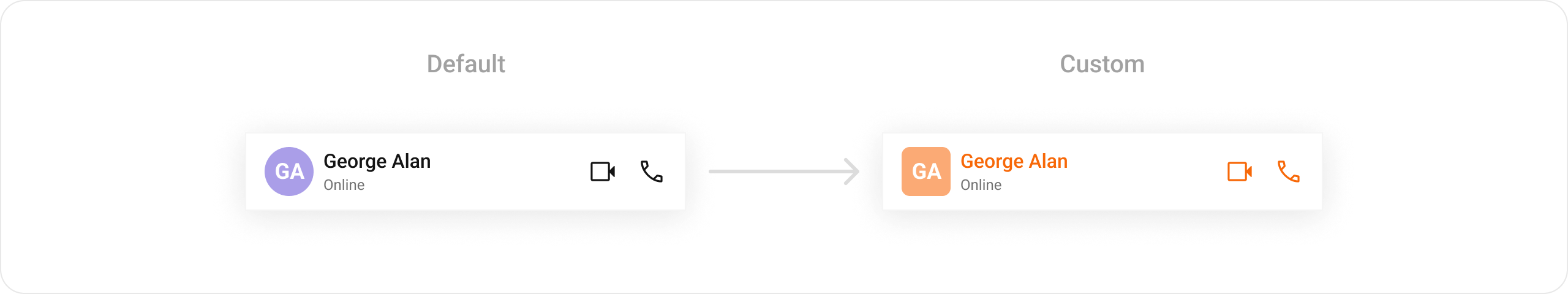
Style Properties
| Property | Description |
|---|---|
backgroundColor | Header background color |
avatarStyle | Avatar appearance |
statusIndicatorStyle | Online/offline indicator |
typingIndicatorStyle | Typing indicator text style |
Next Steps
Message List
Display messages in a conversation
Message Composer
Compose and send messages
Call Buttons
Add voice and video call buttons
Component Styling
Detailed styling reference