Overview
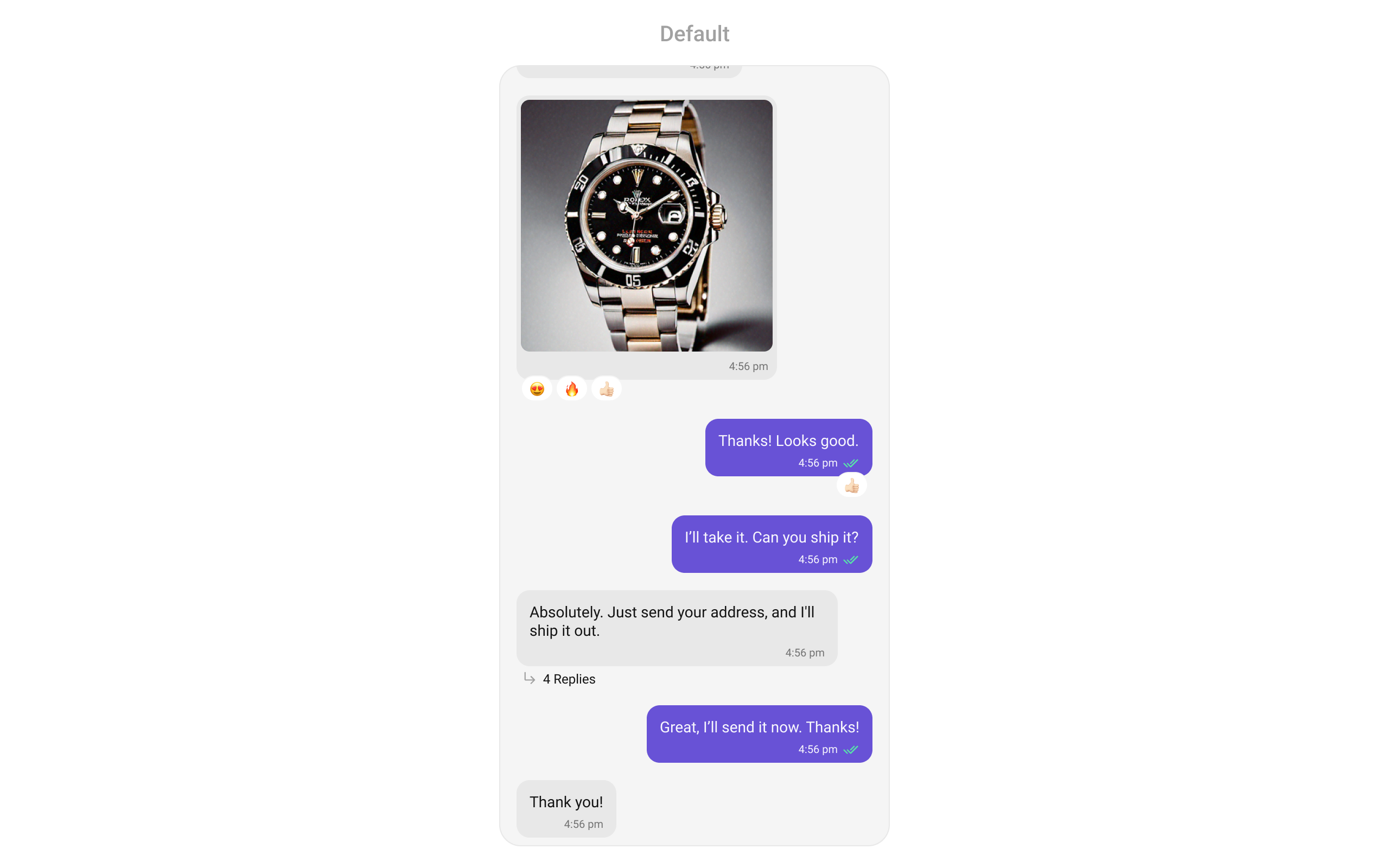
MessageList is a Composite Widget that displays a list of messages and effectively manages real-time operations. It includes various types of messages such as Text Messages, Media Messages, Stickers, and more.
MessageList is primarily a list of the base widget MessageBubble. The MessageBubble Widget is utilized to create different types of chat bubbles depending on the message type.
Usage
Integration
You can launchCometChatMessageList directly using Navigator.push, or you can define it as a widget within the build method of your State class.
1. Using Navigator to Launch CometChatMessageList
- Dart
2. Embedding CometChatMessageList as a Widget in the build Method
- Dart
Actions
Actions dictate how a widget functions. They are divided into two types: Predefined and User-defined. You can override either type, allowing you to tailor the behavior of the widget to fit your specific needs.onThreadRepliesClick
onThreadRepliesClick is triggered when you click on the threaded message bubble. The onThreadRepliesClick action doesn’t have a predefined behavior. You can override this action using the following code snippet.
- Dart
onError
You can customize this behavior by using the provided code snippet to override theonError and improve error handling.
- Dart
onLoad
Invoked when the list is successfully fetched and loaded, helping track component readiness.- Dart
onEmpty
Called when the list is empty, enabling custom handling such as showing a placeholder message.- Dart
onReactionLongPress
Function triggered when a user long presses on a reaction pill, allowing developers to override the default behavior.- Dart
addMoreReactionTap
Function triggered when a user clicks on the ‘Add More Reactions’ button, allowing developers to handle this action.- Dart
onReactionClick
The listener to be set for reacting to a message.Pass a non-null instance of onReactionClick to enable it.- Dart
onReactionListItemClick
Function triggered when a reaction list item is clicked, allowing developers to override its behavior in CometChatReactionsList.- Dart
Filters
You can adjust theMessagesRequestBuilder in the MessageList Widget to customize your message list. Numerous options are available to alter the builder to meet your specific needs. For additional details on MessagesRequestBuilder, please visit MessagesRequestBuilder.
In the example below, we are applying a filter to the messages based on a search substring and for a specific user. This means that only messages that contain the search term and are associated with the specified user will be displayed
- Dart
The following parameters in messageRequestBuilder will always be altered inside the message list
- UID
- GUID
- types
- categories
Events
Events are emitted by aWidget. By using event you can extend existing functionality. Being global events, they can be applied in Multiple Locations and are capable of being Added or Removed.
The MessageList Widget does not emit any events of its own.
Customization
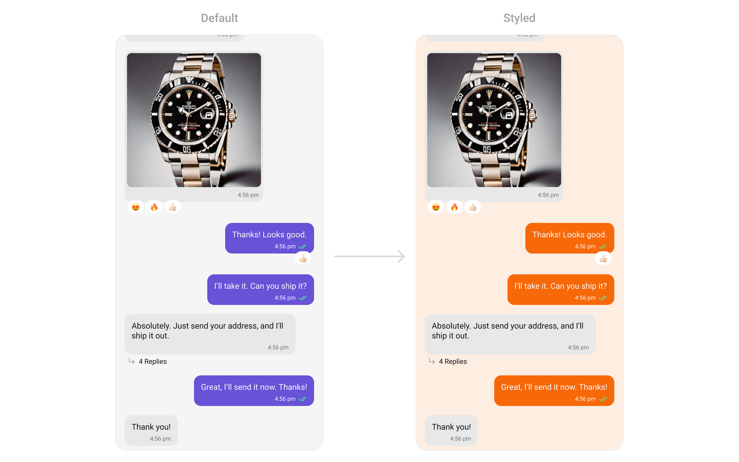
To fit your app’s design requirements, you can customize the appearance of the conversation widget. We provide exposed methods that allow you to modify the experience and behavior according to your specific needs.Style
Using Style you can customize the look and feel of the widget in your app, These parameters typically control elements such as the color, size, shape, and fonts used within the widget.1. MessageList Style
You can set thestyle to the CometChatMessageList Widget to customize the styling.
- Dart
2. Avatar Style
To apply customized styles to theAvatar widget in the CometChatGroups widget, you can use the following code snippet. For further insights on Avatar Styles refer
- Dart
Functionality
These are a set of small functional customizations that allow you to fine-tune the overall experience of the widget. With these, you can change text, set custom icons, and toggle the visibility of UI elements.- Dart
CometChatMessageList Properties
Below is a list of customizations along with corresponding code snippets:| Property | Data Type | Description |
|---|---|---|
user | User? | User object for the user message list. |
group | Group? | Group object for the group message list. |
messagesRequestBuilder | MessagesRequestBuilder? | Custom request builder passed to CometChat’s SDK. |
style | CometChatMessageListStyle? | Sets style for the message list. |
scrollController | ScrollController? | Controller for the message list. |
emptyStateText | String? | Text to display when the list is empty. |
errorStateText | String? | Text to display when an error occurs. |
loadingStateView | WidgetBuilder? | View for the loading state. |
emptyStateView | WidgetBuilder? | View for the empty state. |
errorStateView | WidgetBuilder? | View for the error state behind the dialog. |
stateCallBack | Function(CometChatMessageListController controller)? | Access controller functions from the parent. |
disableSoundForMessages | bool? | Disables sound for sent/received messages. |
customSoundForMessages | String? | URL for the custom sound for outgoing messages. |
customSoundForMessagePackage | String? | Package name if the sound URL is from another package. |
readIcon | Widget? | Custom read icon for message receipt. |
deliveredIcon | Widget? | Custom delivered icon for message receipt. |
sentIcon | Widget? | Custom sent icon for message receipt. |
waitIcon | Widget? | Custom wait icon for message receipt. |
alignment | ChatAlignment | Chat alignment setting. |
avatarVisibility | bool? | Toggle visibility of avatars. |
datePattern | String Function(BaseMessage message)? | Custom date pattern visible in message receipts. |
hideTimestamp | bool? | Toggle visibility of timestamps. |
templates | List<CometChatMessageTemplate>? | Templates for the message list. |
onThreadRepliesClick | ThreadRepliesClick? | Callback for clicking on the thread indicator. |
headerView | Widget? Function(BuildContext, {User? user, Group? group, int? parentMessageId})? | Custom header view. |
footerView | Widget? Function(BuildContext, {User? user, Group? group, int? parentMessageId})? | Custom footer view. |
dateSeparatorPattern | String Function(DateTime)? | Pattern for the date separator. |
onError | OnError? | Callback triggered when an error occurs. |
receiptsVisibility | bool? | Controls visibility of read receipts. |
dateSeparatorStyle | CometChatDateStyle? | Style for the date separator. |
disableReactions | bool? | Toggle visibility of reactions. |
addReactionIcon | Widget? | Custom icon for adding a reaction. |
addMoreReactionTap | Function(BaseMessage message)? | Custom onTap for adding reactions. |
favoriteReactions | List<String>? | List of frequently used reactions. |
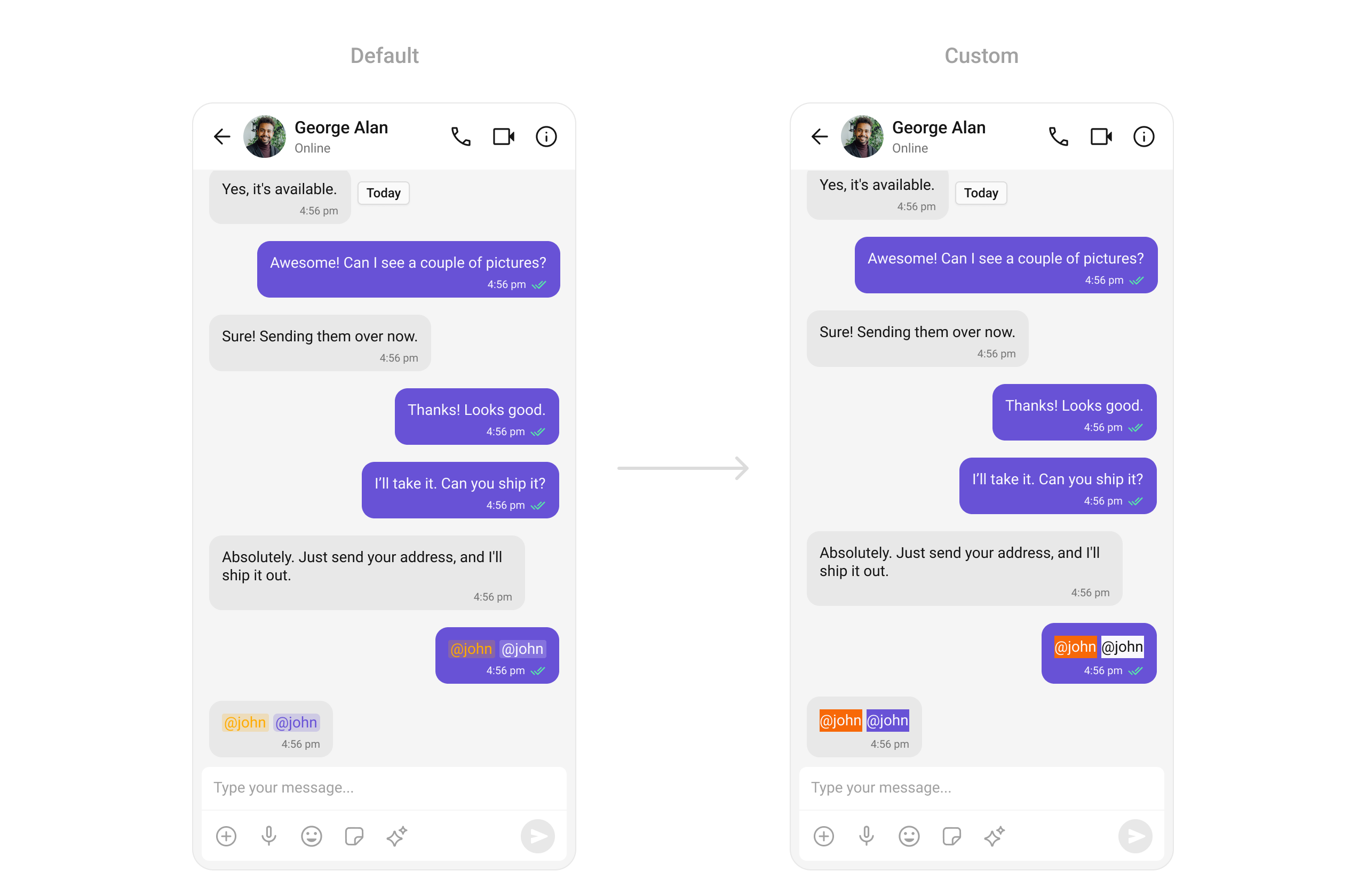
textFormatters | List<CometChatTextFormatter>? | List of text formatters for text messages. |
disableMentions | bool? | Disables formatting of mentions. |
padding | EdgeInsetsGeometry? | Sets padding for the message list. |
margin | EdgeInsetsGeometry? | Sets margin for the message list. |
width | double? | Sets the width of the message list. |
height | double? | Sets the height of the message list. |
reactionsRequestBuilder | ReactionsRequestBuilder? | Fetches reactions for a specific message. |
onLoad | OnLoad<BaseMessage>? | Callback triggered when the list is loaded. |
onEmpty | OnEmpty? | Callback triggered when the list is empty. |
onReactionClick | Function(String? emoji, BaseMessage message)? | Custom action for clicking on a reaction pill. |
onReactionLongPress | Function(String? emoji, BaseMessage message)? | Custom action for long pressing on a reaction pill. |
onReactionListItemClick | Function(String? reaction, BaseMessage? message)? | Custom action for clicking on a reaction list item. |
hideStickyDate | bool? | Hide the date separator. |
hideReplyInThreadOption | bool? | Hide the “Reply in Thread” option. |
hideTranslateMessageOption | bool? | Hide the “Translate Message” option. |
hideEditMessageOption | bool? | Hide the “Edit Message” option. |
hideDeleteMessageOption | bool? | Hide the “Delete Message” option. |
hideReactionOption | bool? | Hide the “Reaction” option. |
hideMessagePrivatelyOption | bool? | Hide the “Message Privately” option. |
hideCopyMessageOption | bool? | Hide the “Copy Message” option. |
hideMessageInfoOption | bool? | Hide the “Message Info” option. |
hideGroupActionMessages | bool? | Hide group action messages. |
enableConversationStarters | bool? | Enables conversation starters in new conversations. |
enableSmartReplies | bool? | Enables smart replies in the chat. |
hideShareMessageOption | bool? | Hide the “Share Message” option. |
smartRepliesDelayDuration | int? | Delay in milliseconds before triggering Smart Replies. |
smartRepliesKeywords | List<String>? | Keywords that trigger Smart Replies. |
addTemplate | List<CometChatMessageTemplate>? | Add custom message templates to the existing templates. |
dateTimeFormatterCallback | DateTimeFormatterCallback? | Callback that can be used to format the date and time. |
hideModerationView | bool? | Hide the moderation view |
hideThreadView | bool? | Hide the thread view |
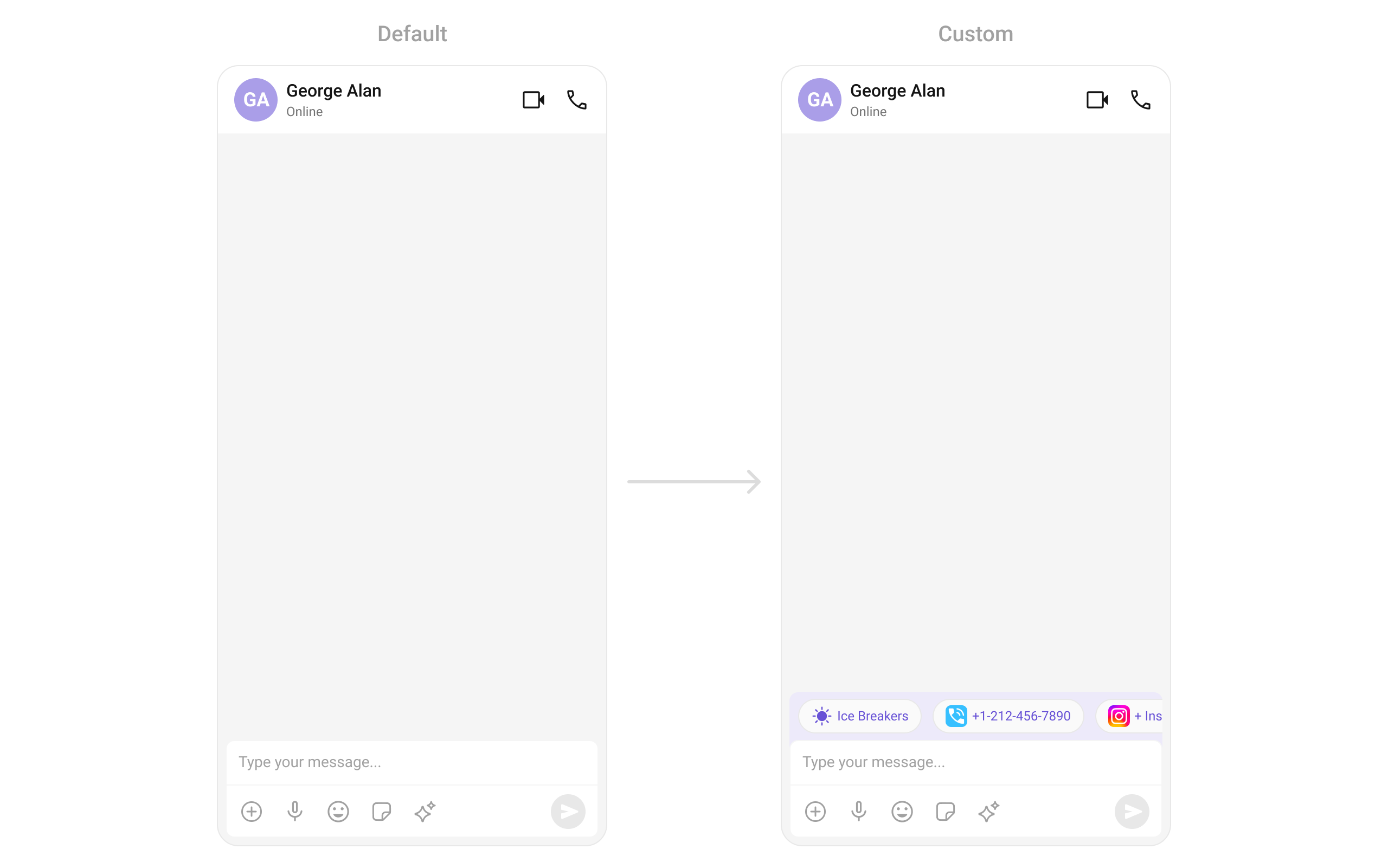
suggestedMessages | List<String>? | List of predefined replies for the AI assistant |
hideSuggestedMessages | bool? | Hide the suggested messages |
emptyChatGreetingView | WidgetBuilder? | View for empty chat view in AI assistant |
setAiAssistantTools | Map<String, Function(String? args)>? | Registers tool names with their corresponding callback functions |
streamingSpeed | int? | Sets the speed of streaming for AI assistant |
hideDateSeparator | bool? | Hide the date separator |
mentionAllLabelId | String? | Allows setting a custom label id for group mentions (@channel, @everyone, etc.). |
mentionAllLabel | String? | Allows setting a custom label for group mentions (@channel, @everyone, etc.). |
hideFlagOption | bool? | Hide the visibility of the “Report” option in the message actions menu. |
hideFlagRemarkField | bool? | Hide the remark text area in the flag message dialog. |
unreadMessageThreshold | int? | Sets the threshold for unread messages, determining when a message is marked as unread. |
startFromUnreadMessages | bool? | Starts the message list from the first unread message. |
showMarkAsUnreadOption | bool? | show the visibility of the “Mark unread” option in the message actions menu. |
newMessageIndicatorView | Widget? | Custom view for the unread message indicator. |
Advance
For advanced-level customization, you can set custom views to the widget. This lets you tailor each aspect of the widget to fit your exact needs and application aesthetics. You can create and define your own widget and then incorporate those into the widget.Template
CometChatMessageTemplate is a pre-defined structure for creating message views that can be used as a starting point or blueprint for creating message views often known as message bubbles. For more information, you can refer to CometChatMessageTemplate. You can set message Templates to MessageList by using the following code snippet- Dart
- Dart
getTemplate()
- Dart
- Android
- iOS
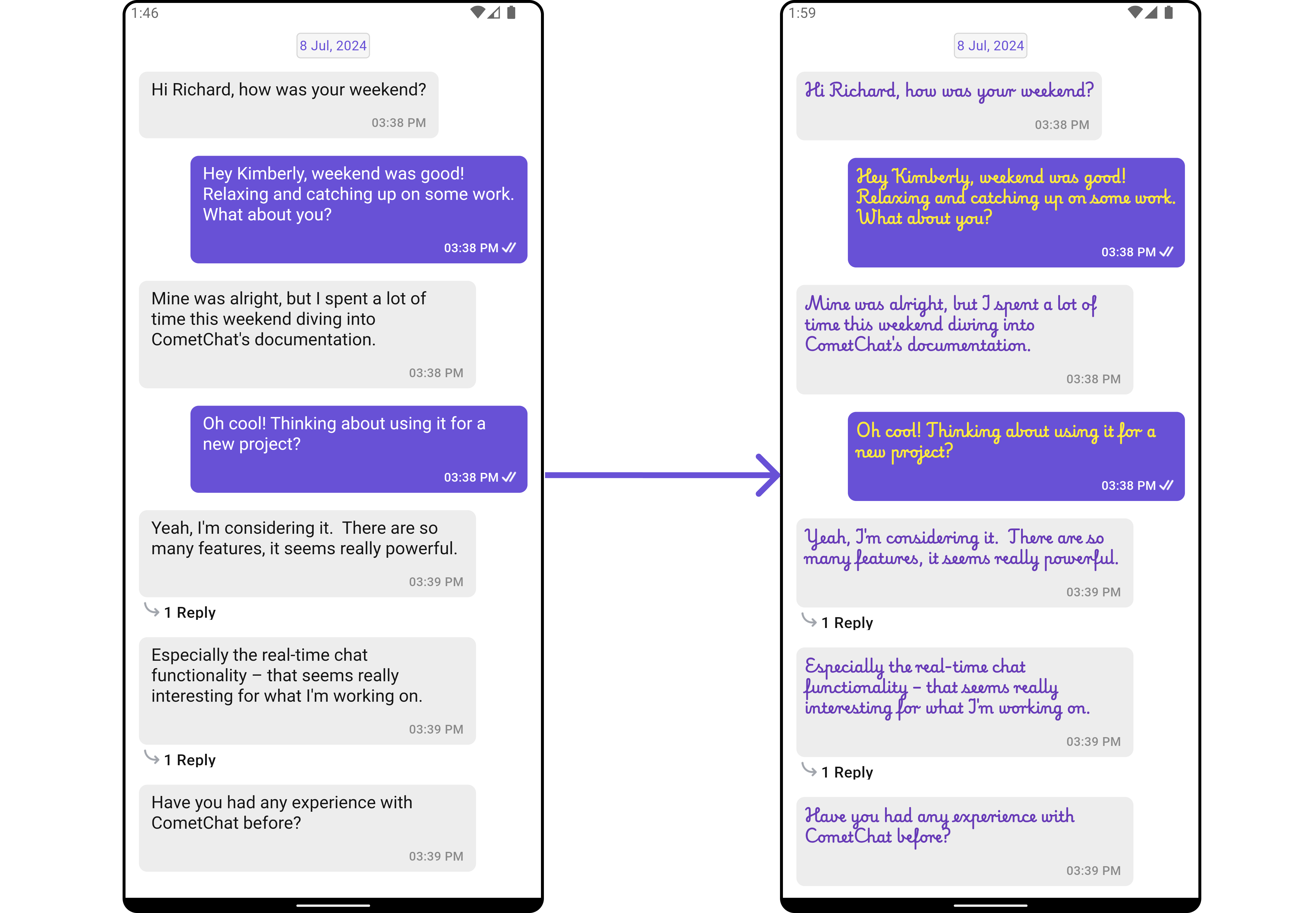
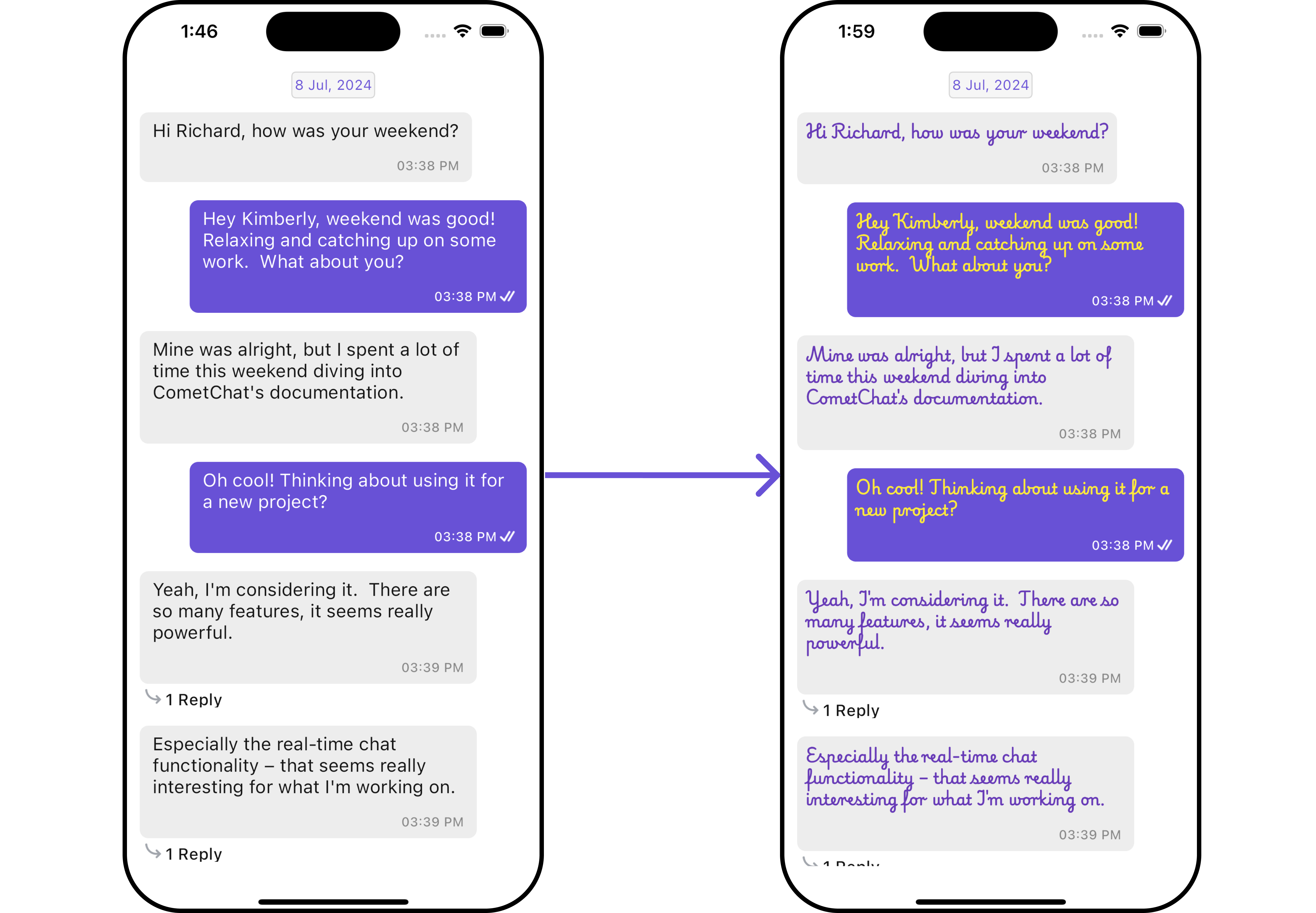
DateSeparatorPattern
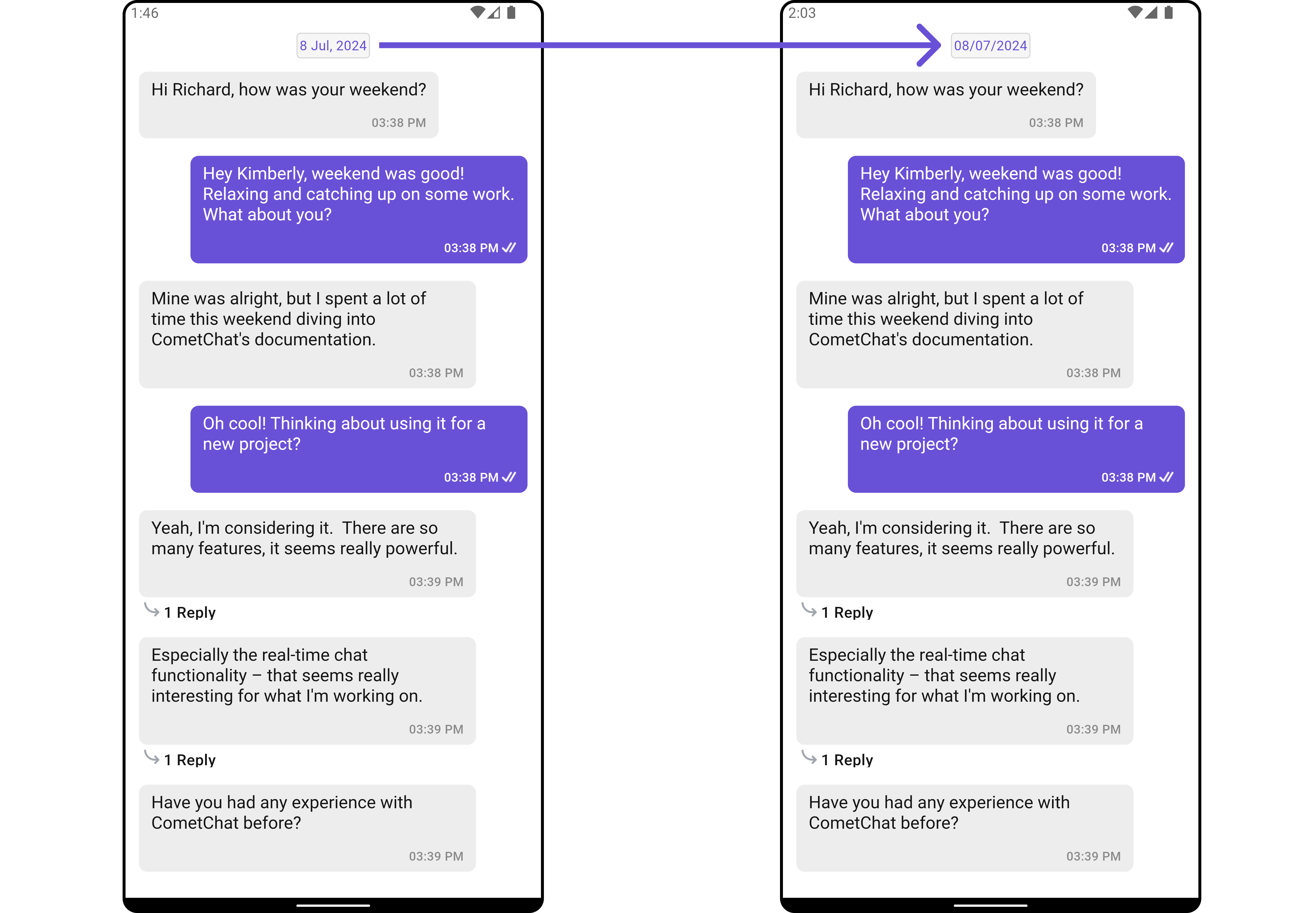
You can modify the date pattern of the message list date separator to your requirement usingsetDateSeparatorPattern(). This method accepts a function with a return type String. Inside the function, you can create your own pattern and return it as a String.
- Dart
- Dart
- Android
- iOS
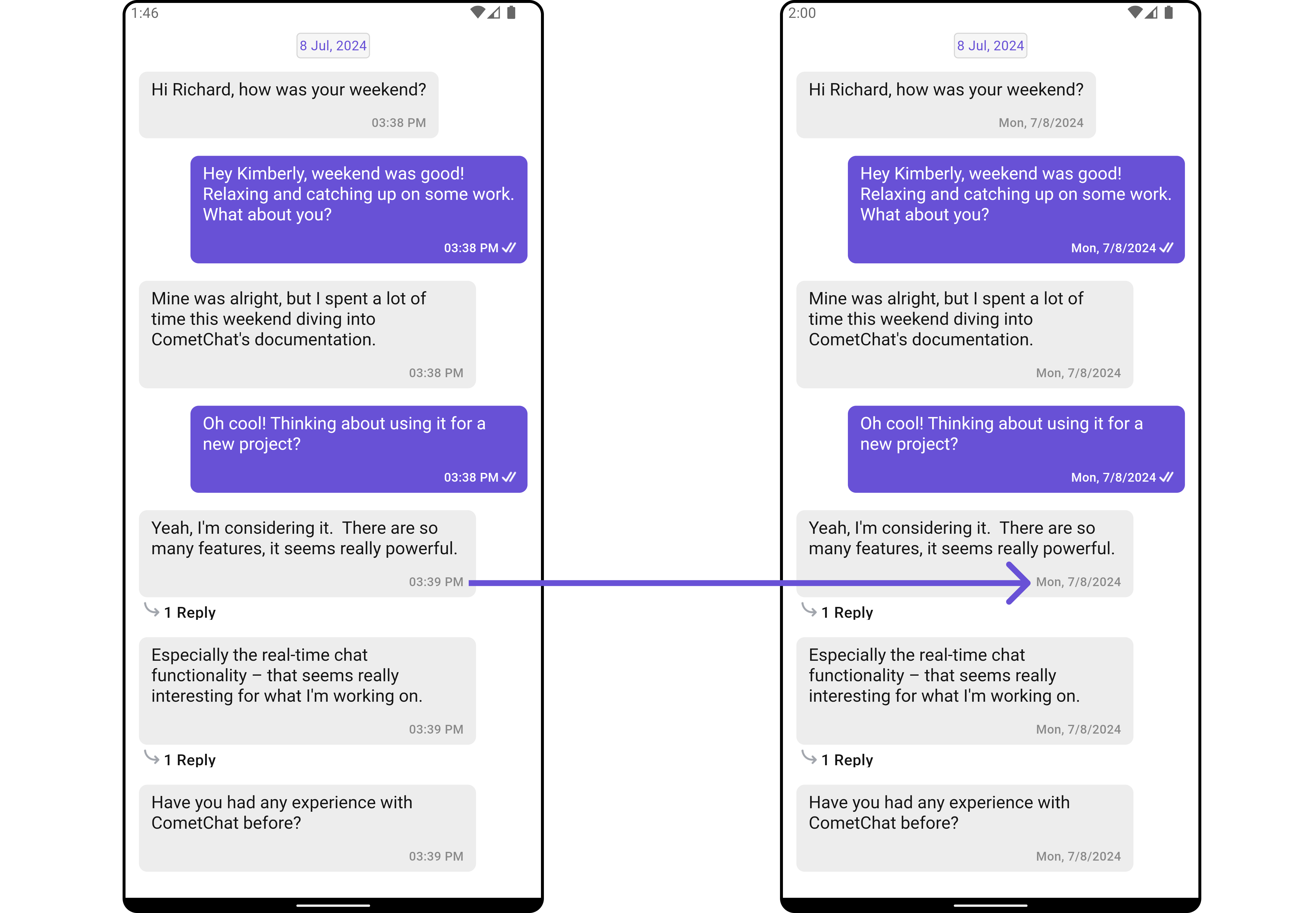
SetDatePattern
You can modify the date pattern to your requirement using .setDatePattern. This method accepts a function with a return type String. Inside the function, you can create your own pattern and return it as a String.- Dart
- Dart
- Android
- iOS
loadingStateView
Customizes the loading indicator when messages are being fetched. Use Cases:- Show a spinner or skeleton loader for smooth UX.
- Display a “Fetching messages…” text.
- Dart
emptyStateView
Defines a custom view to be displayed when no messages are available. Use Cases:- Show a friendly message like “No messages yet. Start the conversation!“.
- Dart
errorStateView
Custom error state view displayed when fetching messages fails. Use Cases:- Show a retry button when an error occurs.
- Display a friendly message like “Couldn’t load messages. Check your connection.”.
- Dart
TextFormatters
Assigns the list of text formatters. If the provided list is not null, it sets the list. Otherwise, it assigns the default text formatters retrieved from the data source. To configure the existing Mentions look and feel check out MentionsFormatter Guide Here is the complete example for reference:- Dart
HeaderView
Allows developers to set a custom widget as the header of the message list. It provides context and access touser, group, and parentMessageId, enabling tailored designs for different use cases, such as displaying user details or group information.
- headerView
- MessageListHeader
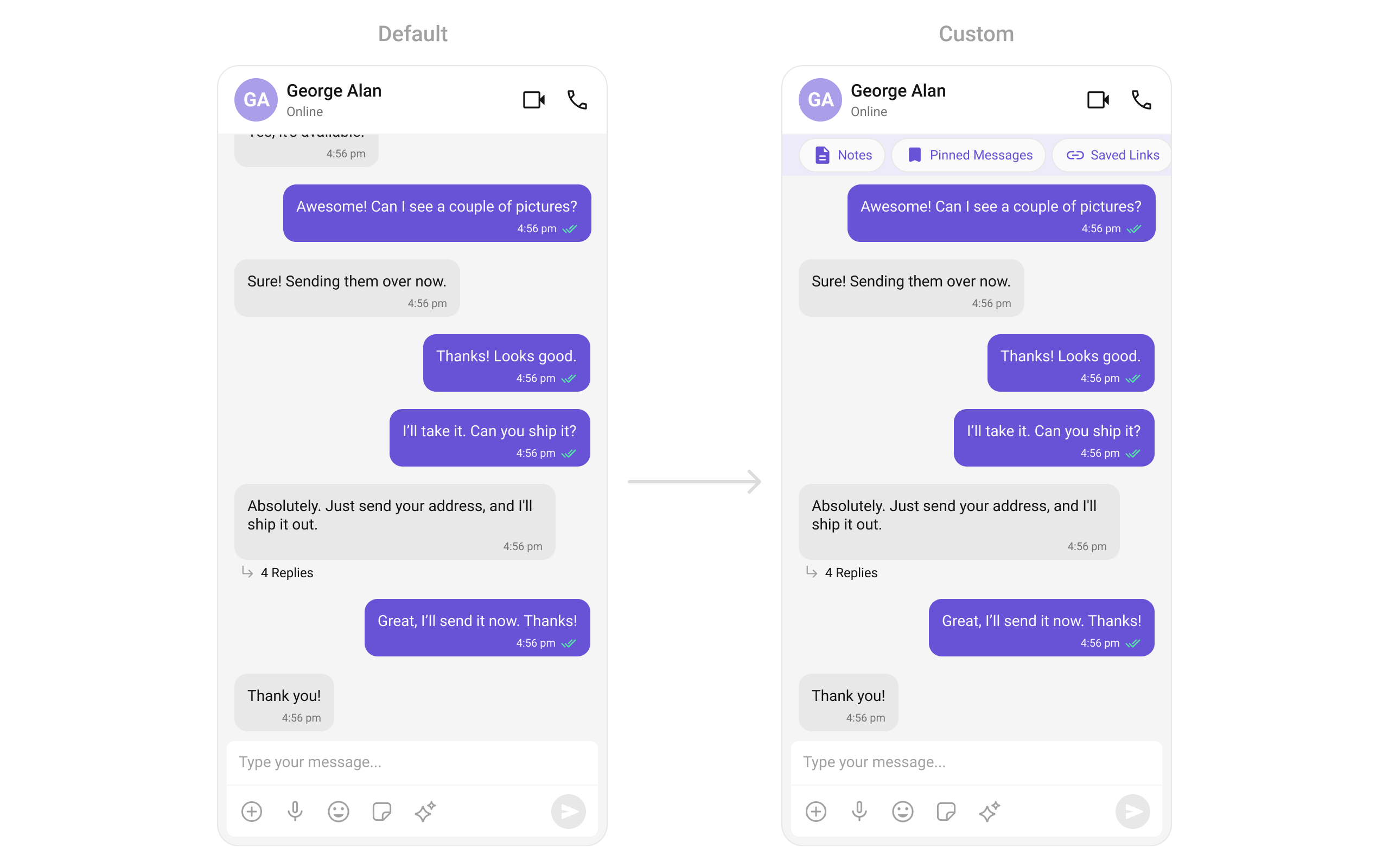
FooterView
Enables developers to add a custom widget to the footer of the message list. LikeheaderView, it supports user, group, and parentMessageId for context, offering flexibility to add components like timestamps, typing indicators, or action buttons.
newMessageIndicatorView
Customizes the unread message indicator view. Use Cases:- Set a custom view for the unread message indicator.
- Dart