AI Integration Quick Reference
AI Integration Quick Reference
| Field | Value |
|---|---|
| Platform | iOS UI Kit |
| Global Styling | CometChatConversations.style.titleColor = UIColor |
| Instance Styling | let style = ConversationsStyle(); conversations.style = style |
| Style Classes | ConversationsStyle, UsersStyle, GroupsStyle, MessageListStyle, etc. |
| Base Styles | AvatarStyle, BadgeStyle, StatusIndicatorStyle, ReceiptStyle |
| Apply Timing | Global styles before CometChatUIKit.init() |
| Precedence | Instance styles override global styles |
Overview
Every CometChat component can be styled to match your app’s design. You can apply styles globally (affects all instances) or per-instance (affects one component).Styling Methods
Global Styling
Apply once, affects all instances of a component:- Swift
import CometChatUIKitSwift

// Set before using any components (e.g., in AppDelegate)
CometChatConversations.style.titleColor = UIColor(hex: "#6200EE")
CometChatConversations.style.titleFont = UIFont.systemFont(ofSize: 28, weight: .bold)
CometChatConversations.style.backgroundColor = .systemBackground
Instance Styling
Apply to a specific component instance:- Swift
import CometChatUIKitSwift

let style = ConversationsStyle()
style.titleColor = UIColor(hex: "#6200EE")
style.titleFont = UIFont.systemFont(ofSize: 28, weight: .bold)
style.backgroundColor = .systemBackground

let conversations = CometChatConversations()
conversations.style = style
Component Styles
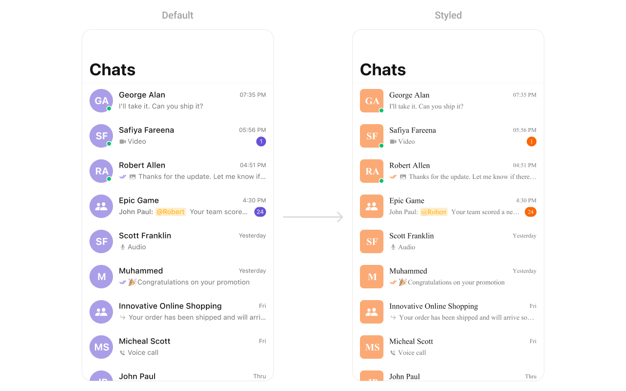
Conversations
- Swift
import CometChatUIKitSwift

// Create custom styles
let avatarStyle = AvatarStyle()
avatarStyle.backgroundColor = UIColor(hex: "#FBAA75")
avatarStyle.cornerRadius = CometChatCornerStyle(cornerRadius: 8)

let badgeStyle = BadgeStyle()
badgeStyle.backgroundColor = UIColor(hex: "#F76808")
badgeStyle.textColor = .white
badgeStyle.textFont = UIFont.systemFont(ofSize: 12, weight: .bold)

let receiptStyle = ReceiptStyle()
receiptStyle.readIconTint = UIColor(hex: "#6200EE")
receiptStyle.deliveredIconTint = UIColor(hex: "#9E9E9E")

// Apply to conversations
let conversations = CometChatConversations()
conversations.avatarStyle = avatarStyle
conversations.badgeStyle = badgeStyle
conversations.receiptStyle = receiptStyle

// Style the list
conversations.style.titleColor = UIColor(hex: "#212121")
conversations.style.titleFont = UIFont.systemFont(ofSize: 17, weight: .semibold)
conversations.style.subtitleColor = UIColor(hex: "#757575")
conversations.style.subtitleFont = UIFont.systemFont(ofSize: 14)
conversations.style.backgroundColor = .systemBackground
conversations.style.listItemBackground = .systemBackground
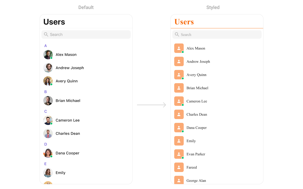
Users
- Swift
import CometChatUIKitSwift

// Avatar style
let avatarStyle = AvatarStyle()
avatarStyle.backgroundColor = UIColor(hex: "#FBAA75")
avatarStyle.cornerRadius = CometChatCornerStyle(cornerRadius: 8)

// Status indicator style
let statusStyle = StatusIndicatorStyle()
statusStyle.backgroundColor = .systemGreen
statusStyle.borderColor = .white
statusStyle.borderWidth = 2

// Apply styles
let users = CometChatUsers()
users.avatarStyle = avatarStyle
users.statusIndicatorStyle = statusStyle

// List styling
users.style.titleColor = UIColor(hex: "#F76808")
users.style.titleFont = UIFont(name: "Helvetica-Bold", size: 28)
users.style.listItemTitleColor = UIColor(hex: "#212121")
users.style.listItemTitleFont = UIFont.systemFont(ofSize: 16, weight: .medium)
users.style.backgroundColor = .systemBackground
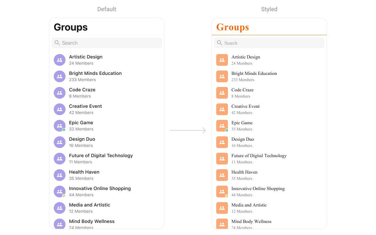
Groups
- Swift
import CometChatUIKitSwift

// Avatar style for group icons
let avatarStyle = AvatarStyle()
avatarStyle.backgroundColor = UIColor(hex: "#FBAA75")
avatarStyle.cornerRadius = CometChatCornerStyle(cornerRadius: 8)

// Apply styles
let groups = CometChatGroups()
groups.avatarStyle = avatarStyle

// List styling
groups.style.titleColor = UIColor(hex: "#F76808")
groups.style.titleFont = UIFont(name: "Helvetica-Bold", size: 28)
groups.style.listItemTitleColor = UIColor(hex: "#212121")
groups.style.listItemSubtitleColor = UIColor(hex: "#757575")
groups.style.backgroundColor = .systemBackground
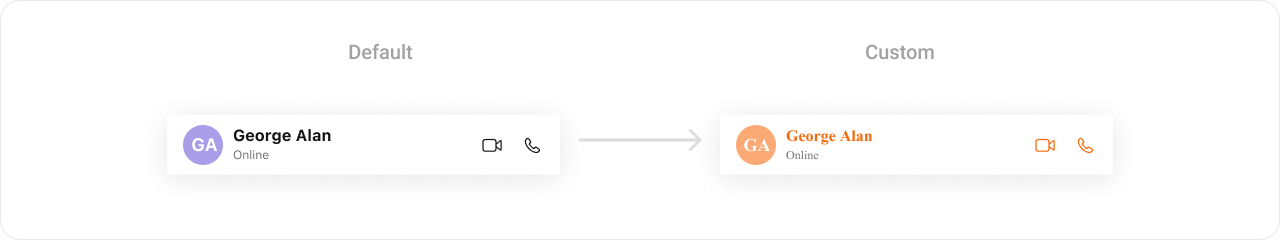
Message Header
- Swift
import CometChatUIKitSwift

// Avatar style
let avatarStyle = AvatarStyle()
avatarStyle.backgroundColor = UIColor(hex: "#FBAA75")
avatarStyle.cornerRadius = CometChatCornerStyle(cornerRadius: 20)

// Apply to message header
CometChatMessageHeader.style.titleTextColor = UIColor(hex: "#F76808")
CometChatMessageHeader.style.titleTextFont = UIFont(name: "Helvetica-Bold", size: 18)
CometChatMessageHeader.style.subtitleTextColor = UIColor(hex: "#757575")
CometChatMessageHeader.style.backgroundColor = .systemBackground
CometChatMessageHeader.avatarStyle = avatarStyle
Message List
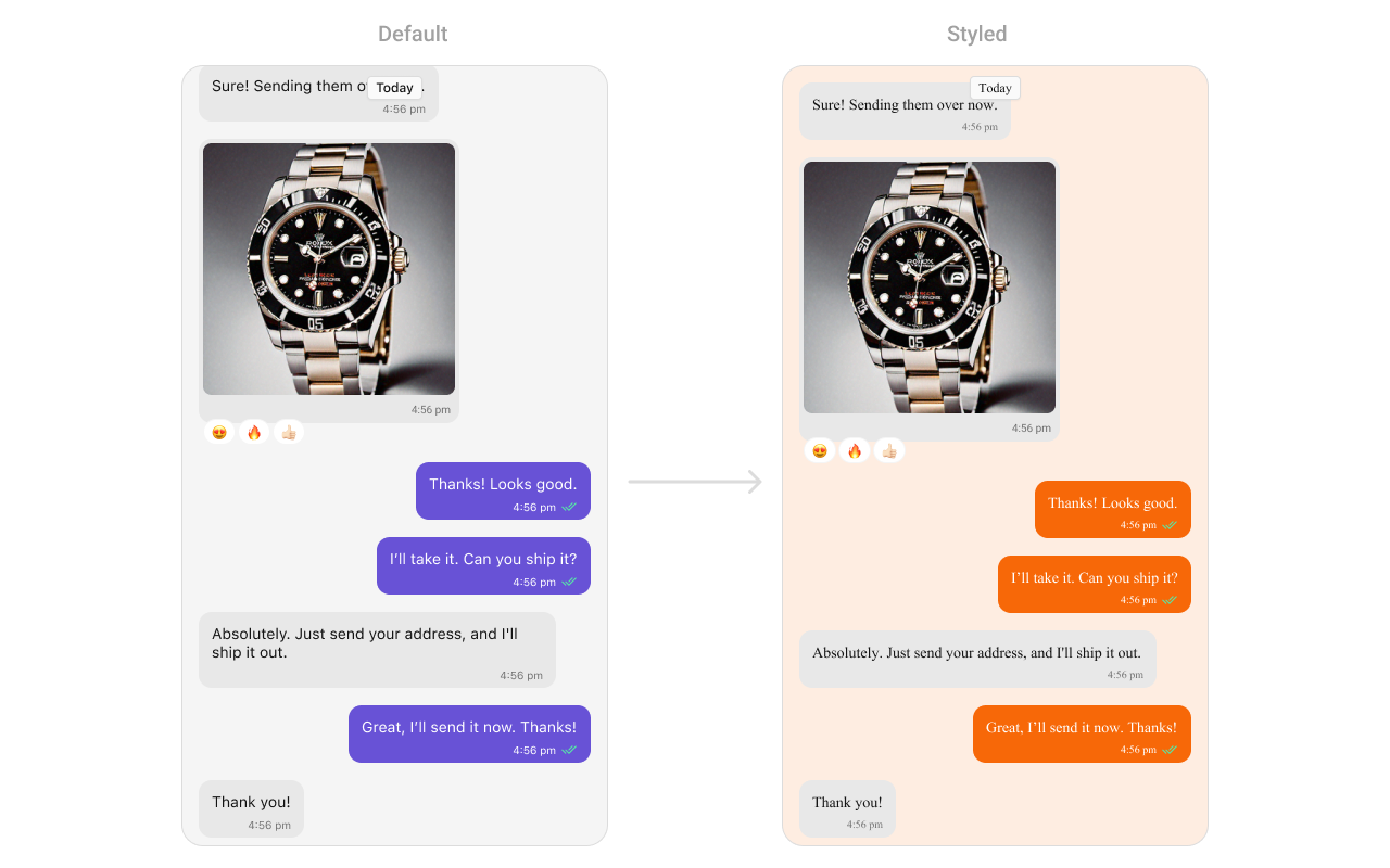
- Swift
import CometChatUIKitSwift

// Background color
CometChatMessageList.style.backgroundColor = UIColor(hex: "#FBAA75")

// Outgoing message bubbles (your messages)
CometChatMessageBubble.style.outgoing.backgroundColor = UIColor(hex: "#F76808")
CometChatMessageBubble.style.outgoing.textBubbleStyle.textColor = .white
CometChatMessageBubble.style.outgoing.textBubbleStyle.textFont = UIFont.systemFont(ofSize: 15)

// Incoming message bubbles (other's messages)
CometChatMessageBubble.style.incoming.backgroundColor = UIColor(hex: "#E8E8E8")
CometChatMessageBubble.style.incoming.textBubbleStyle.textColor = UIColor(hex: "#212121")
CometChatMessageBubble.style.incoming.textBubbleStyle.textFont = UIFont.systemFont(ofSize: 15)

// Timestamp style
CometChatMessageList.style.timestampTextColor = UIColor(hex: "#9E9E9E")
CometChatMessageList.style.timestampTextFont = UIFont.systemFont(ofSize: 11)
Message Composer
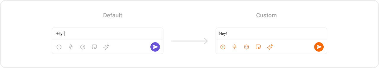
- Swift
import CometChatUIKitSwift

// Send button
CometChatMessageComposer.style.activeSendButtonImageBackgroundColor = UIColor(hex: "#F76808")
CometChatMessageComposer.style.sendButtonImageTint = .white

// Action icons
CometChatMessageComposer.style.attachmentImageTint = UIColor(hex: "#F76808")
CometChatMessageComposer.style.voiceRecordingImageTint = UIColor(hex: "#F76808")
CometChatMessageComposer.style.stickerTint = UIColor(hex: "#F76808")
CometChatMessageComposer.style.aiImageTint = UIColor(hex: "#F76808")

// Input field
CometChatMessageComposer.style.inputBackgroundColor = UIColor(hex: "#F5F5F5")
CometChatMessageComposer.style.inputTextColor = UIColor(hex: "#212121")
CometChatMessageComposer.style.inputTextFont = UIFont.systemFont(ofSize: 16)
CometChatMessageComposer.style.placeholderTextColor = UIColor(hex: "#9E9E9E")

// Background
CometChatMessageComposer.style.backgroundColor = .systemBackground
CometChatMessageComposer.style.borderColor = UIColor(hex: "#E8E8E8")
Call Logs
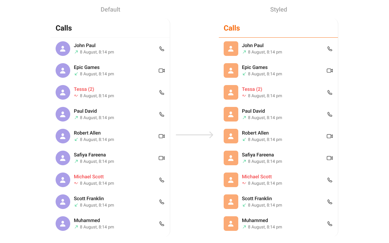
- Swift
import CometChatUIKitSwift

// Avatar style
let avatarStyle = AvatarStyle()
avatarStyle.backgroundColor = UIColor(hex: "#FBAA75")
avatarStyle.cornerRadius = CometChatCornerStyle(cornerRadius: 8)

// Apply styles
CometChatCallLogs.style.titleColor = UIColor(hex: "#F76808")
CometChatCallLogs.style.titleFont = UIFont(name: "Helvetica-Bold", size: 24)
CometChatCallLogs.style.listItemTitleTextColor = UIColor(hex: "#212121")
CometChatCallLogs.style.listItemSubTitleTextColor = UIColor(hex: "#757575")
CometChatCallLogs.style.backgroundColor = .systemBackground

// Call type icons
CometChatCallLogs.style.incomingCallIconTint = .systemRed
CometChatCallLogs.style.outgoingCallIconTint = .systemGreen
CometChatCallLogs.style.missedCallTitleColor = .systemRed

CometChatCallLogs.avatarStyle = avatarStyle
Search
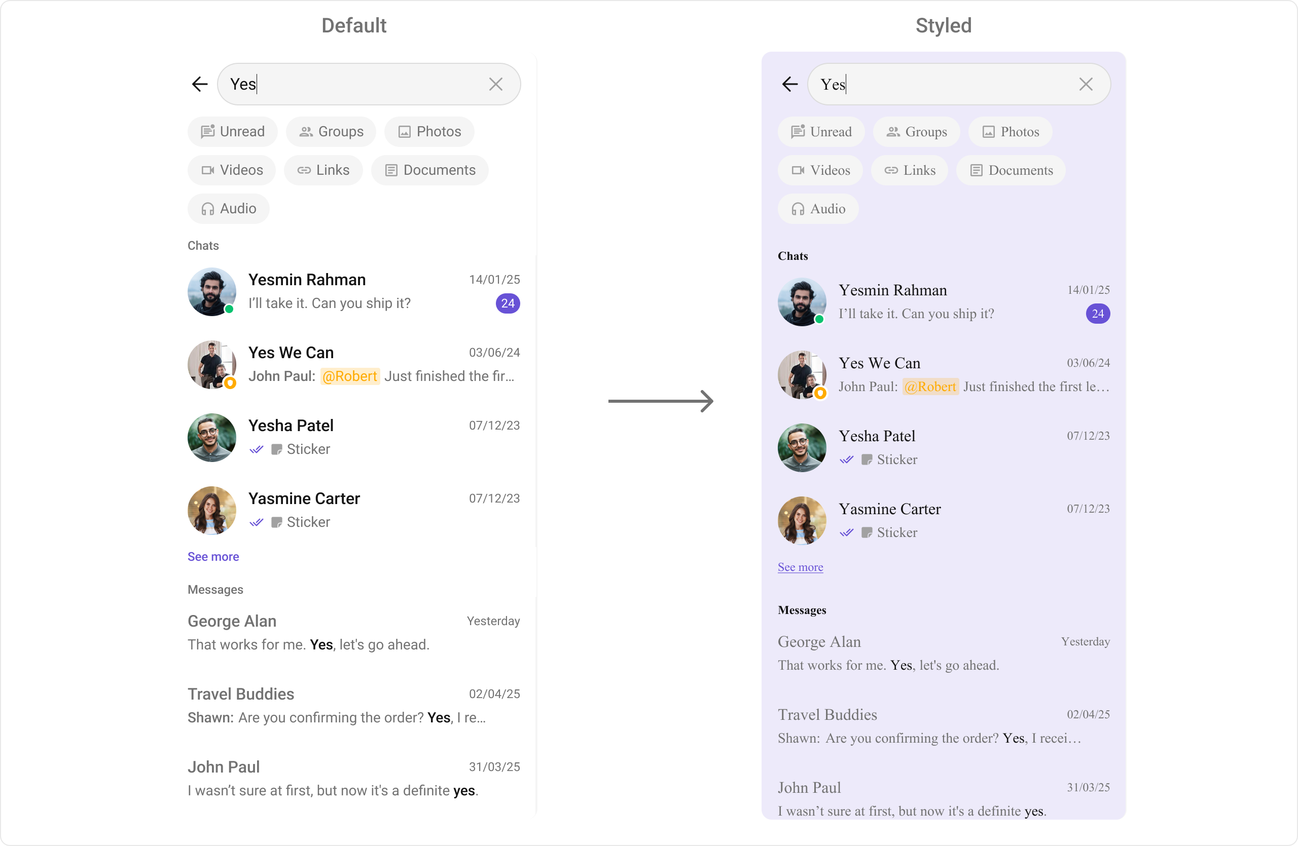
- Swift
import CometChatUIKitSwift

// Instance styling
let style = SearchStyle()
style.backgroundColor = UIColor(hex: "#EDEAFA")
style.listItemBackground = UIColor(hex: "#EDEAFA")
style.listItemTitleFont = UIFont(name: "Helvetica", size: 16)
style.titleFont = UIFont(name: "Helvetica-Bold", size: 12)
style.searchBarPlaceholderTextFont = UIFont(name: "Helvetica", size: 12)
style.searchBarBackgroundColor = .white
style.searchBarTextColor = UIColor(hex: "#212121")

let searchVC = CometChatSearch()
searchVC.style = style

// Or global styling
CometChatSearch.style.backgroundColor = UIColor(hex: "#EDEAFA")
CometChatSearch.style.listItemBackground = UIColor(hex: "#EDEAFA")
AI Assistant Chat History
- Swift
import CometChatUIKitSwift

// Date separator style
let dateStyle = CometChatDateStyle()
dateStyle.textColor = UIColor(hex: "#8E8E93")
dateStyle.textFont = UIFont.systemFont(ofSize: 12)

// Apply styles
CometChatAIAssistantChatHistory.style.backgroundColor = UIColor(hex: "#FFF9F2")
CometChatAIAssistantChatHistory.style.headerBackgroundColor = UIColor(hex: "#FFF9F2")
CometChatAIAssistantChatHistory.style.headerTitleTextColor = UIColor(hex: "#141414")
CometChatAIAssistantChatHistory.style.headerTitleTextFont = UIFont.boldSystemFont(ofSize: 18)
CometChatAIAssistantChatHistory.style.newChatIconColor = UIColor(hex: "#F76808")
CometChatAIAssistantChatHistory.style.itemTextColor = UIColor(hex: "#141414")
CometChatAIAssistantChatHistory.style.itemTextFont = UIFont.systemFont(ofSize: 14)
CometChatAIAssistantChatHistory.style.dateSeparatorStyle = dateStyle
Base Component Styles
Avatar
- Swift
let avatarStyle = AvatarStyle()
avatarStyle.backgroundColor = UIColor(hex: "#6200EE")
avatarStyle.cornerRadius = CometChatCornerStyle(cornerRadius: 24)  // Circle
avatarStyle.borderWidth = 2
avatarStyle.borderColor = .white
avatarStyle.textFont = UIFont.systemFont(ofSize: 16, weight: .bold)
avatarStyle.textColor = .white
Badge
- Swift
let badgeStyle = BadgeStyle()
badgeStyle.backgroundColor = UIColor(hex: "#F44336")
badgeStyle.textColor = .white
badgeStyle.textFont = UIFont.systemFont(ofSize: 12, weight: .bold)
badgeStyle.cornerRadius = CometChatCornerStyle(cornerRadius: 10)
badgeStyle.borderWidth = 0
Status Indicator
- Swift
let statusStyle = StatusIndicatorStyle()
statusStyle.backgroundColor = .systemGreen  // Online color
statusStyle.borderColor = .white
statusStyle.borderWidth = 2
statusStyle.cornerRadius = CometChatCornerStyle(cornerRadius: 6)  // Circle
Receipt
- Swift
let receiptStyle = ReceiptStyle()
receiptStyle.sentIconTint = UIColor(hex: "#9E9E9E")
receiptStyle.deliveredIconTint = UIColor(hex: "#9E9E9E")
receiptStyle.readIconTint = UIColor(hex: "#6200EE")
receiptStyle.errorIconTint = UIColor(hex: "#F44336")
Complete Styling Example
Apply consistent branding across all components:- Swift
import CometChatUIKitSwift
import UIKit

class StyleManager {

    // Brand colors
    static let primaryColor = UIColor(hex: "#6200EE")
    static let secondaryColor = UIColor(hex: "#03DAC6")
    static let backgroundColor = UIColor.systemBackground
    static let surfaceColor = UIColor(hex: "#F5F5F5")
    static let textPrimary = UIColor(hex: "#212121")
    static let textSecondary = UIColor(hex: "#757575")

    static func applyGlobalStyles() {
        // Theme colors
        CometChatTheme.primaryColor = primaryColor

        // Avatar style (used everywhere)
        let avatarStyle = AvatarStyle()
        avatarStyle.backgroundColor = secondaryColor
        avatarStyle.cornerRadius = CometChatCornerStyle(cornerRadius: 20)

        // Badge style
        let badgeStyle = BadgeStyle()
        badgeStyle.backgroundColor = primaryColor
        badgeStyle.textColor = .white

        // Apply to Conversations
        CometChatConversations.avatarStyle = avatarStyle
        CometChatConversations.badgeStyle = badgeStyle
        CometChatConversations.style.titleColor = textPrimary
        CometChatConversations.style.titleFont = UIFont.systemFont(ofSize: 28, weight: .bold)
        CometChatConversations.style.backgroundColor = backgroundColor

        // Apply to Users
        CometChatUsers.avatarStyle = avatarStyle
        CometChatUsers.style.titleColor = textPrimary
        CometChatUsers.style.backgroundColor = backgroundColor

        // Apply to Groups
        CometChatGroups.avatarStyle = avatarStyle
        CometChatGroups.style.titleColor = textPrimary
        CometChatGroups.style.backgroundColor = backgroundColor

        // Apply to Message Header
        CometChatMessageHeader.avatarStyle = avatarStyle
        CometChatMessageHeader.style.titleTextColor = textPrimary
        CometChatMessageHeader.style.backgroundColor = backgroundColor

        // Apply to Message List
        CometChatMessageList.style.backgroundColor = surfaceColor
        CometChatMessageBubble.style.outgoing.backgroundColor = primaryColor
        CometChatMessageBubble.style.outgoing.textBubbleStyle.textColor = .white
        CometChatMessageBubble.style.incoming.backgroundColor = .white
        CometChatMessageBubble.style.incoming.textBubbleStyle.textColor = textPrimary

        // Apply to Message Composer
        CometChatMessageComposer.style.activeSendButtonImageBackgroundColor = primaryColor
        CometChatMessageComposer.style.attachmentImageTint = primaryColor
        CometChatMessageComposer.style.backgroundColor = backgroundColor

        // Apply to Call Logs
        CometChatCallLogs.avatarStyle = avatarStyle
        CometChatCallLogs.style.titleColor = textPrimary
        CometChatCallLogs.style.backgroundColor = backgroundColor
    }
}

// Apply in AppDelegate
@main
class AppDelegate: UIResponder, UIApplicationDelegate {
    func application(_ application: UIApplication, didFinishLaunchingWithOptions launchOptions: [UIApplication.LaunchOptionsKey: Any]?) -> Bool {
        StyleManager.applyGlobalStyles()
        return true
    }
}
Related
Color Resources
Theme colors
Theme Introduction
Complete theming
Components Overview
All components