Overview
ThreadedMessages is a Composite Component that displays all replies made to a particular message in a conversation. By default, the parent message will be displayed at the top, the message composer will be at the bottom and between them a message list will contain all replies.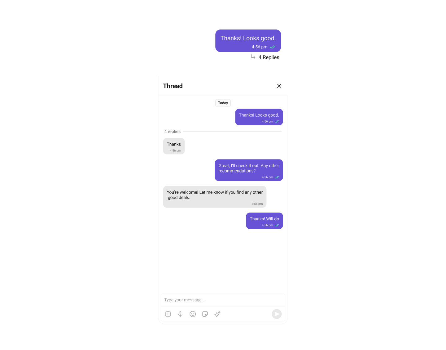
| Component | Description |
|---|---|
| MessageList | CometChatMessageList is a component that displays a list of Messages |
| MessageComposer | CometChatMessageComposer is a component that helps in writing and editing of messages and also sending attachments |
Usage
Integration
AsCometChatThreadedMessageHeader is a view, you can add it to your view controller by adding the following code snippet.
- Swift
Ensure to pass and present
threadedMessage. If a navigation controller is already in use, utilize the pushViewController function instead of directly presenting the view controller.Filters
Filters allow you to customize the data displayed in a list within a Component. You can filter the list based on your specific criteria, allowing for a more customized. Filters can be applied using RequestBuilders of Chat SDK. ThreadedMessages does not have its own Filters. However, you can filter the messages list in ThreadedMessages Component using MessageListConfiguration. Example In this example, we are filtering messages and searching for messages that contain the keyword “payment”.- Swift
Events
Events are emitted by aComponent. By using event you can extend existing functionality. Being global events, they can be applied in Multiple Locations and are capable of being Added or Removed.
The MessageList Component does not emit any events of its own.
Customization
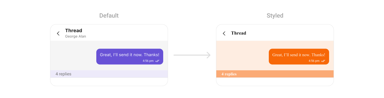
To fit your app’s design requirements, you can customize the appearance of the conversation component. We provide exposed methods that allow you to modify the experience and behavior according to your specific needs.Style
ThreadedMessagesStyle contains various properties which can be used to customize the UI of CometChatThreadedMessages.
Global level styling
- Swift
- Swift
| Property | Description | Code |
|---|---|---|
| Background Color | Background color for the header. | CometChatThreadedMessageHeader.style.backgroundColor = CometChatTheme.backgroundColor03 |
| Border Color | Border color for the header. | CometChatThreadedMessageHeader.style.borderColor = UIColor.clear |
| Border Width | Border width for the header. | CometChatThreadedMessageHeader.style.borderWith = 0 |
| Corner Radius | Corner radius for the header. | CometChatThreadedMessageHeader.style.cornerRadius = CometChatCornerStyle? |
| Bubble Container Background Color | Background color for the bubble container. | CometChatThreadedMessageHeader.style.bubbleContainerBackgroundColor = UIColor.clear |
| Bubble Container Border Color | Border color for the bubble container. | CometChatThreadedMessageHeader.style.bubbleContainerBorderColor = UIColor.clear |
| Bubble Container Border Width | Border width for the bubble container. | CometChatThreadedMessageHeader.style.bubbleContainerBorderWidth = 0 |
| Bubble Container Corner Radius | Corner radius for the bubble container. | CometChatThreadedMessageHeader.style.bubbleContainerCornerRadius = CometChatCornerStyle? |
| Divider Tint Color | Tint color for the divider. | CometChatThreadedMessageHeader.style.dividerTintColor = CometChatTheme.extendedPrimaryColor100 |
| Count Text Color | Text color for the message count text. | CometChatThreadedMessageHeader.style.countTextColor = CometChatTheme.textColorSecondary |
| Count Text Font | Font for the message count text. | CometChatThreadedMessageHeader.style.countTextFont = CometChatTypography.Body.regular |
Functionality
These are a set of small functional customizations that allow you to fine-tune the overall experience of the component. With these, you can set maximum lines text area will show before scrolling in the composer, edit a message, add header view and footer view to the composer, etc. Below is a list of customizations along with corresponding code snippets message composer offers| Property | Description | Code |
|---|---|---|
| hideReplyCount | Hides the reply count for threaded messages. | hideReplyCount = true |
| hideReplyCountBar | Hides the reply count bar in the thread. | hideReplyCountBar = true |
| hideReceipts | Hides read and delivery receipts for messages. | hideReceipts = true |
| hideAvatar | Hides the avatar in the threaded message view. | hideAvatar = true |
| setMaxHeight | Sets the maximum height for the threaded message view. | setMaxHeight(300) |
| setMessageAlignment | Sets the alignment of messages (e.g., left or right). | setMessageAlignment(.right) |
| setParentMessage | Sets the parent message for the threaded conversation. | setParentMessage(parentMessage) |
Advanced
For advanced-level customization, you can set custom views to the component. This lets you tailor each aspect of the component to fit your exact needs and application aesthetics. You can create and define your views, layouts, and UI elements and then incorporate those into the component.SetDatePattern
You can modify the date pattern to your requirement using .set(datePattern:). This method accepts a function with a return type String. Inside the function, you can create your own pattern and return it as a String. Example- Swift
SetTextFormatters
This functionality dynamically assigns a list of text formatters. If a custom list is provided, it uses that list. Otherwise, it gracefully falls back to the default text formatters retrieved from the data source for seamless integration. Example This code customizes a CometChat text formatter to identify and style the word “sure”, with handling options for interactions like string search, scrolling, and item clicks. The custom formatter is then applied to CometChat messages.Swift
- MyCustomTextFormatter
SetTemplate and AddTemplate
CometChatMessageTemplate is a pre-defined structure for creating message views that can be used as a starting point or blueprint for creating message views often known as message bubbles. For more information, you can refer to CometChatMessageTemplate.To ensure that the
ThreadedMessages is properly configured, passing the controller is mandatory.- Swift