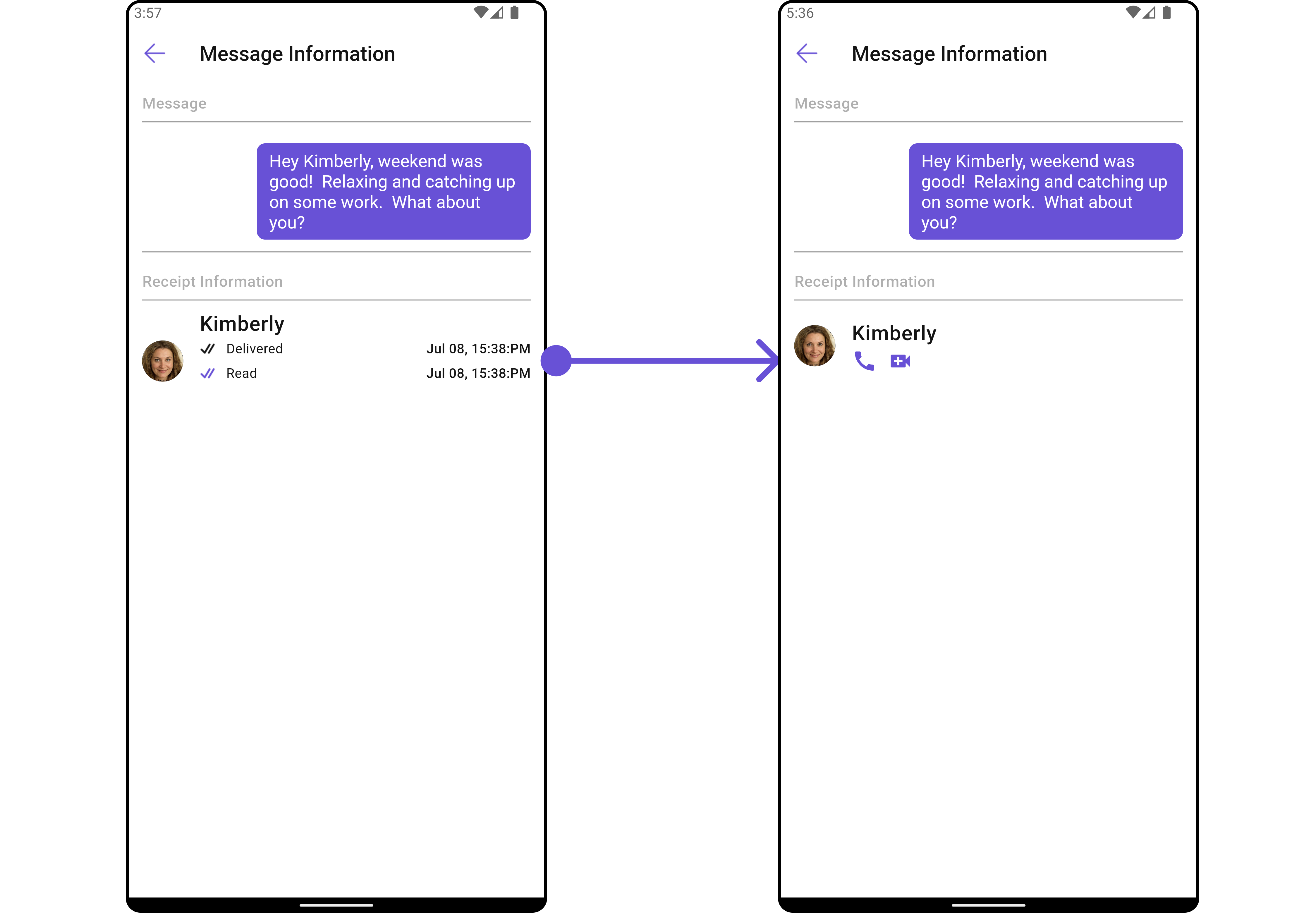
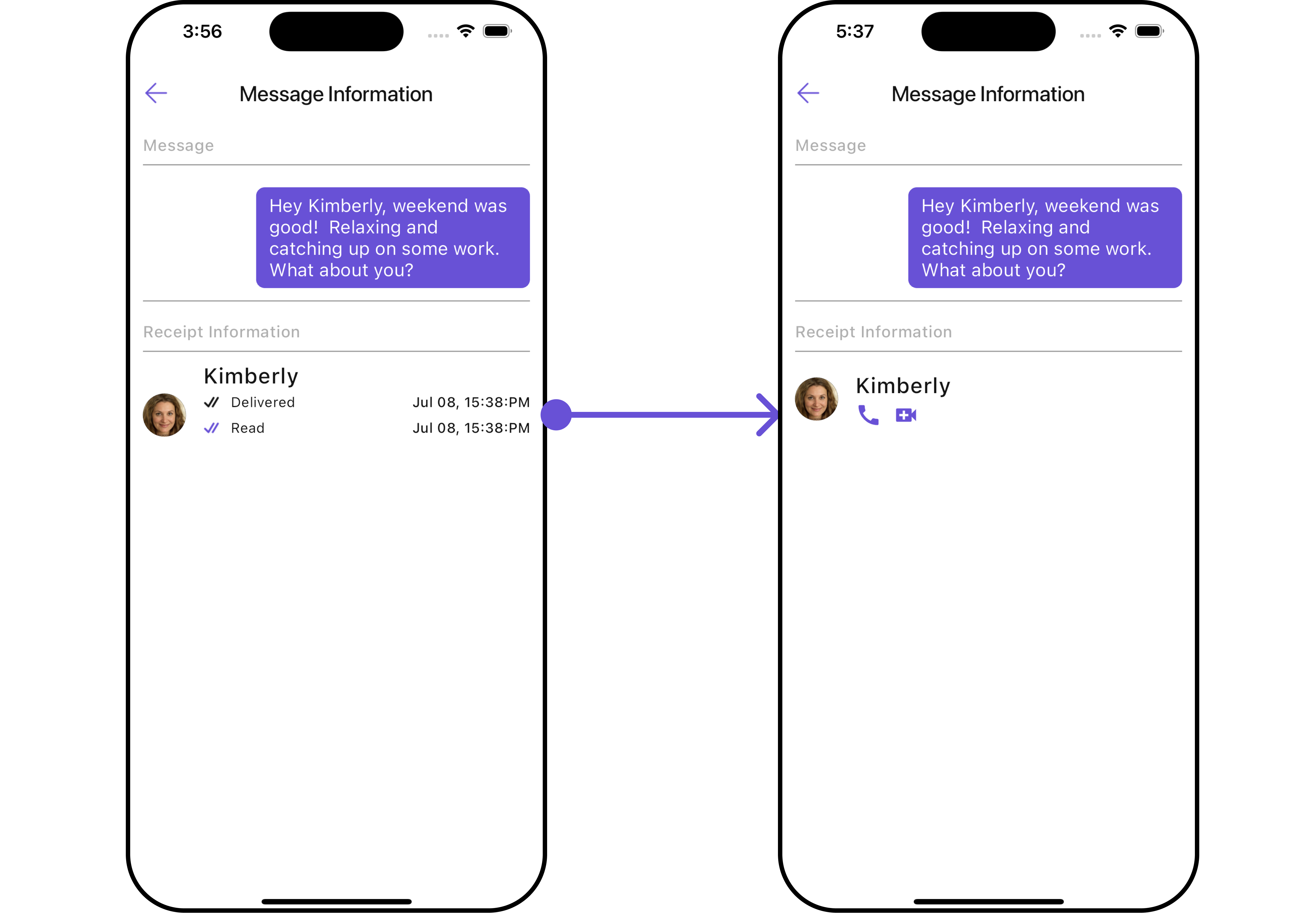
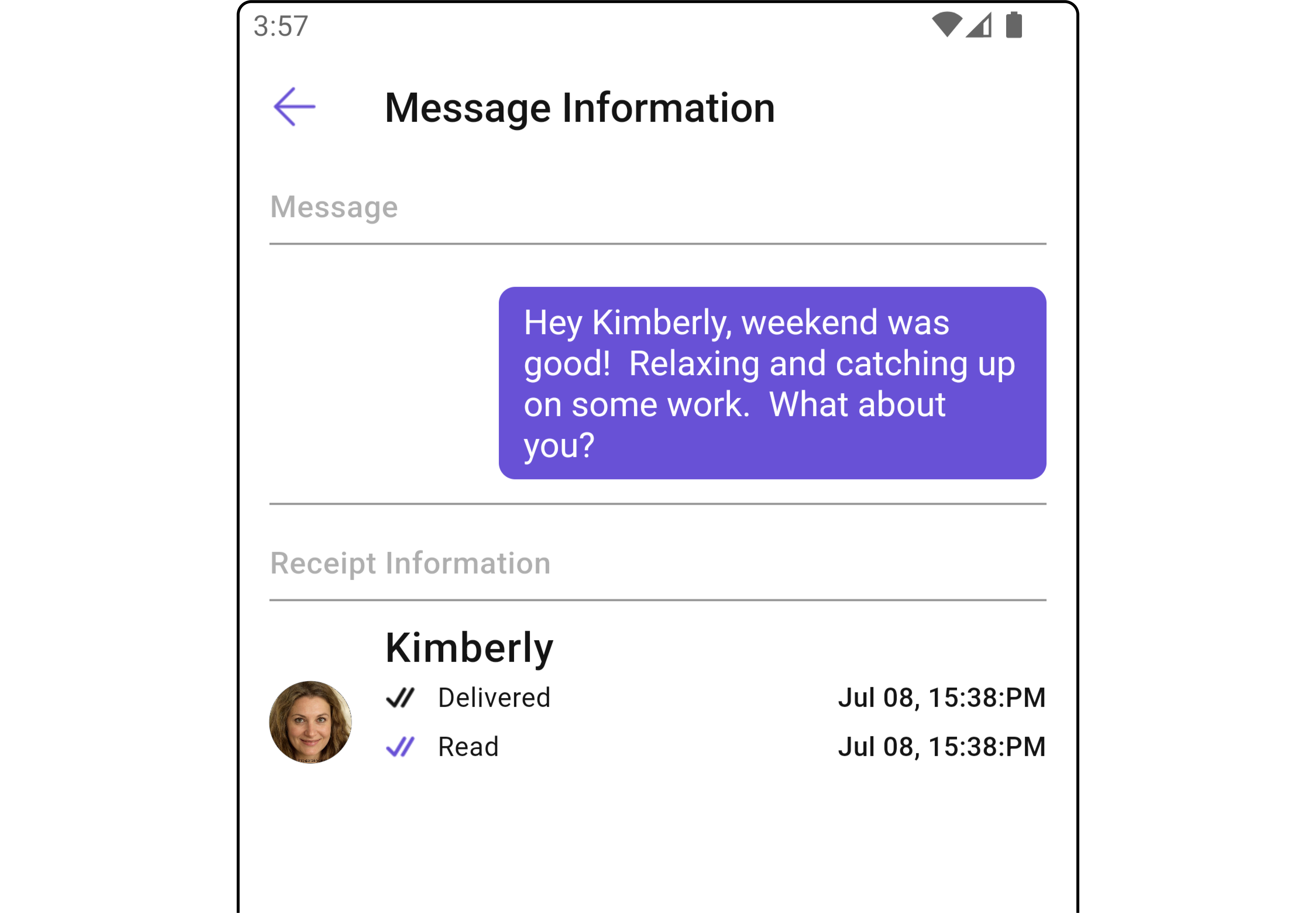
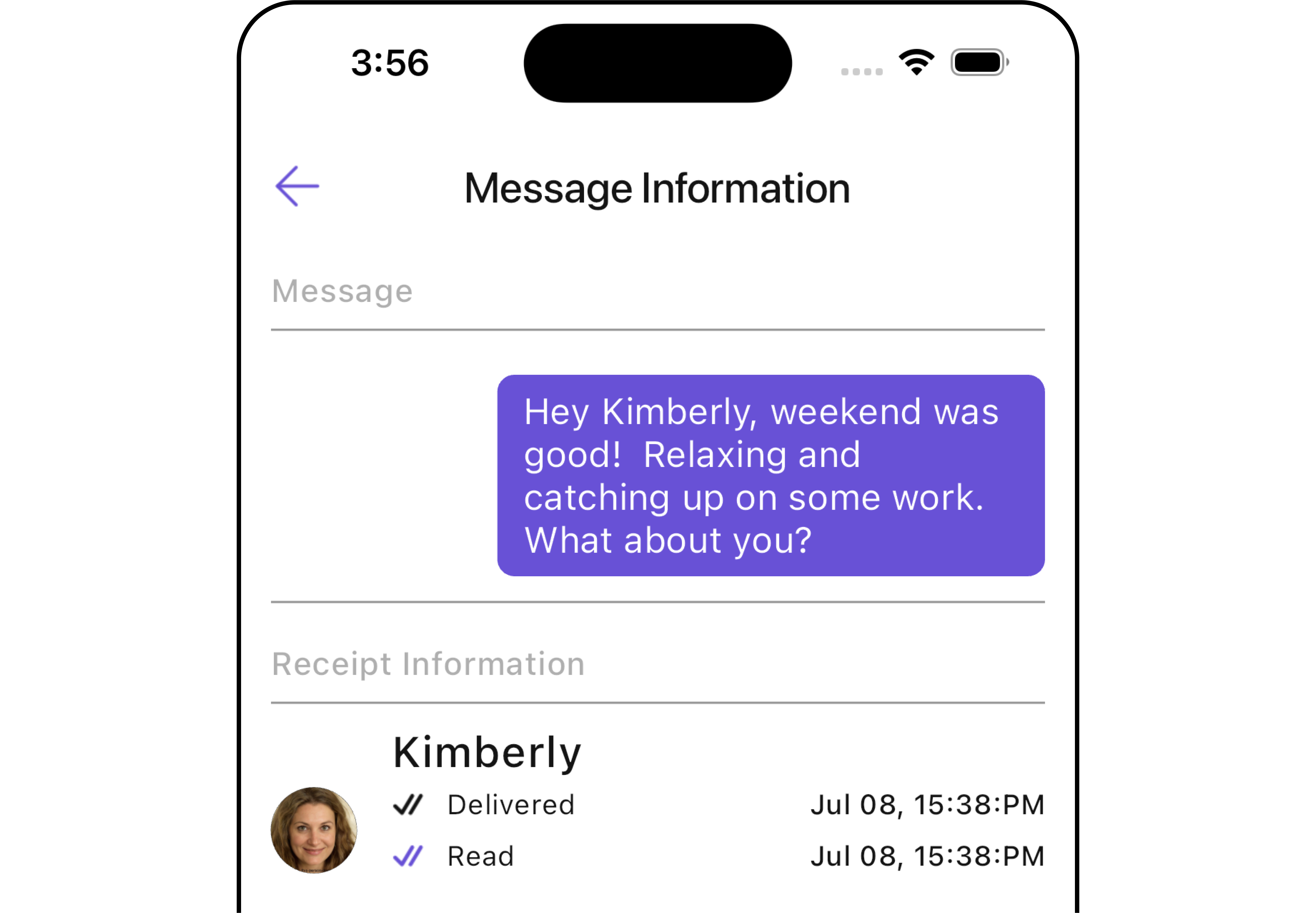
Message Information
The CometChatMessageInformation is a Widget designed to display message-related information, such as delivery and read receipts. It serves as an integral part of the CometChat UI UI Kit, extending the ListBase class, which provides the underlying infrastructure for CometChat UI widgets. With its rich set of methods and properties, developers can easily customize and tailor the appearance and behavior of the message information widget to suit the specific requirements of their application.
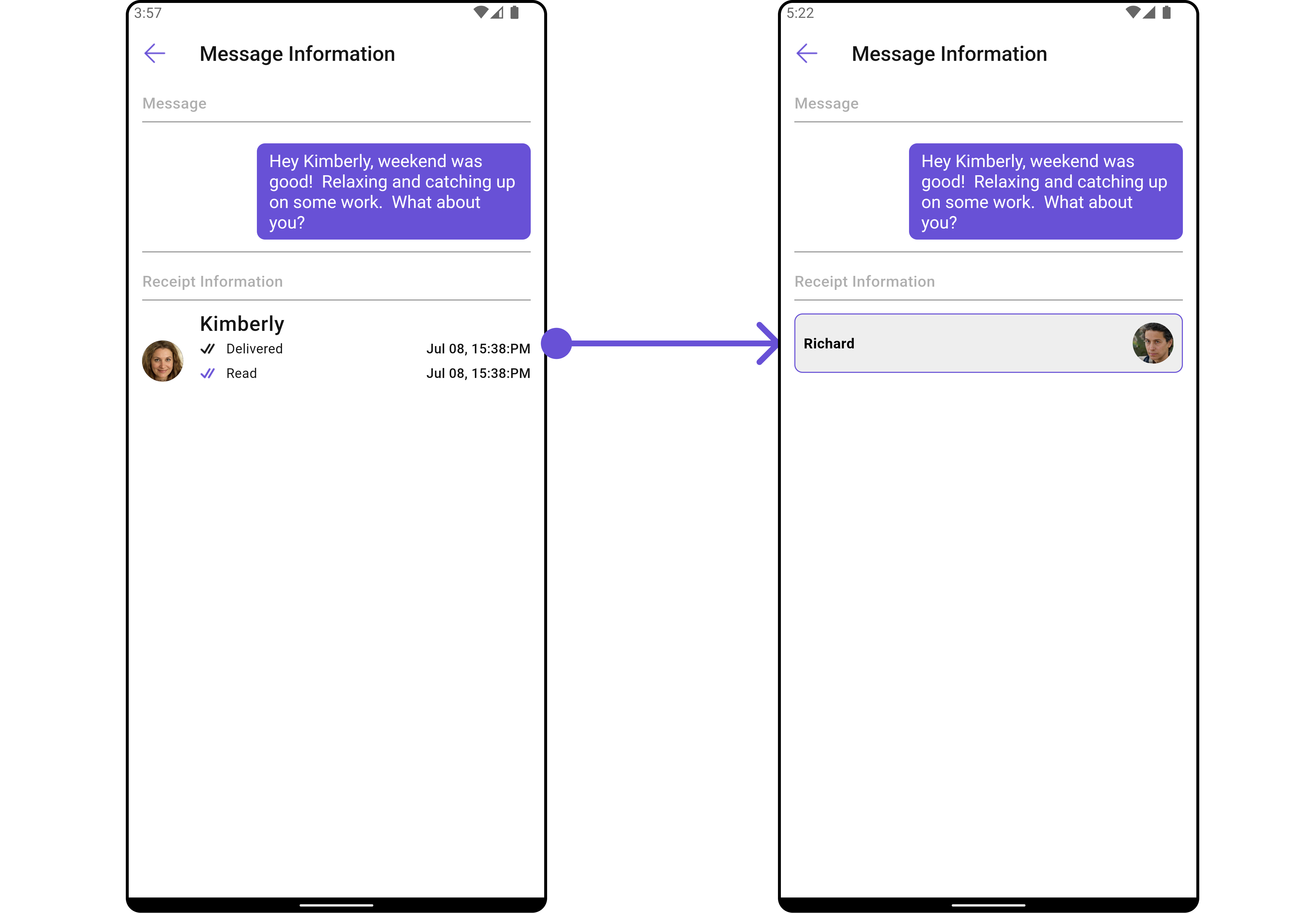
- Android
- iOS
CometChatMessageInformation is comprised of the following Base Widgets:
| Base Widgets | Description |
|---|---|
| List Base | This renders common widgets used across Conversations, Groups & Users. |
Usage
Integration
You can launch CometChatMessageInformation directly using Navigator.push, or you can define it as a widget within the build method of your State class.
1. Using Navigator to Launch CometChatMessageInformation
- Dart
Navigator.push(context, MaterialPageRoute(builder: (context) => CometChatMessageInformation())); // Message object is required to launch this widget.
2. Embedding CometChatMessageInformation as a Widget in the build Method
- Dart
import 'package:cometchat_chat_uikit/cometchat_chat_uikit.dart';
import 'package:flutter/material.dart';
class MessageInformation extends StatefulWidget {
const MessageInformation({super.key});
State<MessageInformation> createState() => _MessageInformationState();
}
class _MessageInformationState extends State<MessageInformation> {
Widget build(BuildContext context) {
return Scaffold(
body: SafeArea(
child: CometChatMessageInformation(message: baseMessage) // Message object is required to launch this widget.
)
);
}
}
Actions
Actions dictate how a widget functions. They are divided into two types: Predefined and User-defined. You can override either type, allowing you to tailor the behavior of the widget to fit your specific needs.
1. onClose
The onClose event is typically triggered when the back button is pressed and it carries a default action. However, with the following code snippet, you can effortlessly override this default operation.
- Dart
CometChatMessageInformation(
  message: baseMessage!,
  onClose: () {
    // TODO("Not yet implemented")
  },
)
2. onError
This action doesn't change the behavior of the widget but rather listens for any errors that occur in the MessageList widget.
- Dart
CometChatMessageInformation(
  message: baseMessage!,
  onError: (e) {
    // TODO("Not yet implemented")
  },
)
Filters
CometChatMessageInformation widget does not have any available filters.
Events
CometChatMessageInformation widget does not have any available events.
Customization
To fit your app's design requirements, you can customize the appearance of the CometChatMessageInformation widget. We provide exposed methods that allow you to modify the experience and behavior according to your specific needs.
Style
Using Style you can customize the look and feel of the widget in your app, These parameters typically control elements such as the color, size, shape, and fonts used within the widget.
1. MessageInformation Style
To modify the styling, you can apply the MessageInformationStyle to the CometChatMessageInformation Widget using the messageInformationStyle method.
- Dart
CometChatMessageInformation(
  message: baseMessage!,
    messageInformationStyle: `MessageInformationStyle`(
      background: Color(0xFFE4EBF5),
      border: Border.all(width: 1, color: Colors.red),
      titleStyle: const TextStyle(color: Colors.red, fontFamily: "PlaywritePL"),
    )
)
- Android
- iOS
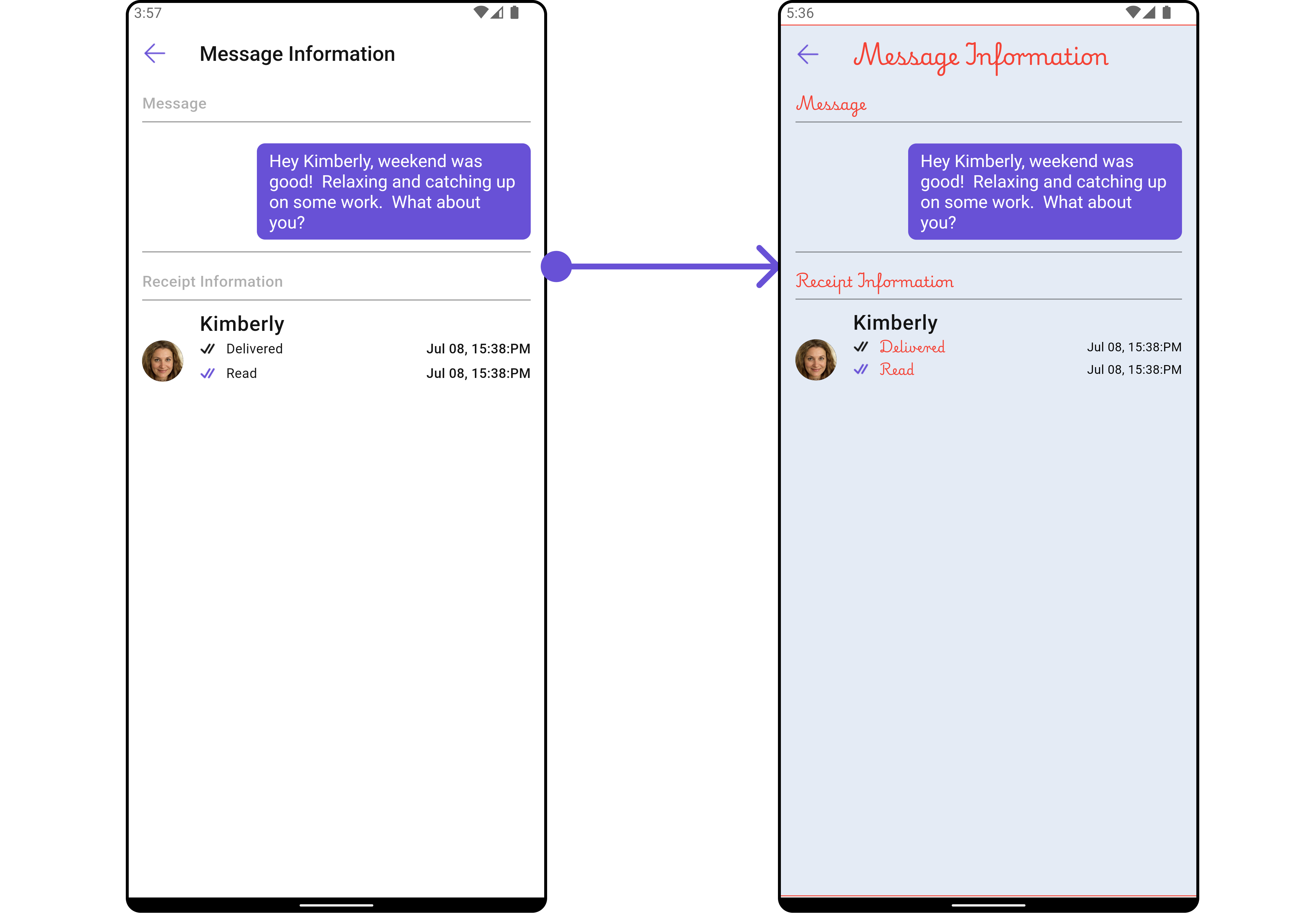
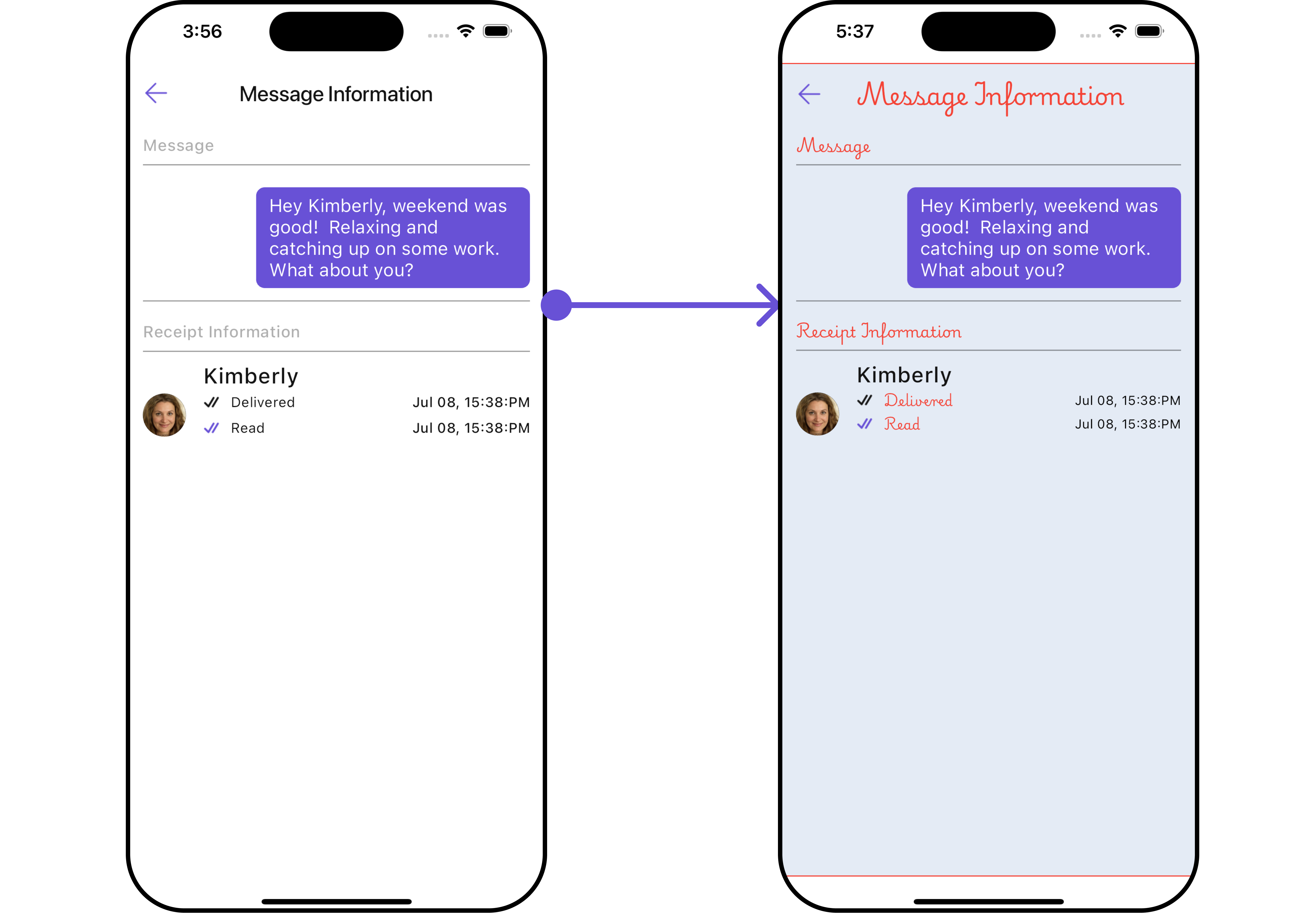
The following properties are exposed by MessageInformationStyle:
| Property | Description | Code |
|---|---|---|
| Background | Sets the background color of the message information. | background: Color? |
| Border | Sets the border properties of the message information. | border: Border? |
| Border Radius | Sets the border radius of the message information. | borderRadius: BorderRadius? |
| Close Icon Tint | Sets the tint color for the close icon. | closeIconTint: Color? |
| Delivered Icon Tint | Sets the tint color for the delivered icon. | deliveredIconTint: Color? |
| Divider Tint | Sets the tint color for the divider. | dividerTint: Color? |
| Empty Text Style | Sets the text style for the empty state message. | emptyTextStyle: TextStyle? |
| Error Text Style | Sets the text style for error messages. | errorTextStyle: TextStyle? |
| Gradient | Sets the gradient applied to the message information. | gradient: Gradient? |
| Height | Sets the height of the message information. | height: double? |
| Loading Icon Tint | Sets the tint color for the loading icon. | loadingIconTint: Color? |
| Read Icon Tint | Sets the tint color for the read icon. | readIconTint: Color? |
| Sub Title Style | Sets the text style for the subtitle. | subTitleStyle: TextStyle? |
| Title Style | Sets the text style for the title. | titleStyle: TextStyle? |
| Width | Sets the width of the message information. | width: double? |
2. ListItem Style
To apply customized styles to the ListItemStyle widget in the CometChatMessageInformation Widget, you can use the following code snippet. For more information, visit List Item Styles.
- Dart
CometChatMessageInformation(
    message: baseMessage!,
    listItemStyle: ListItemStyle(
        background: Color(0xFFE4EBF5),
        borderRadius: 20,
        border: Border.all(width: 2),
        margin: EdgeInsets.only(top: 10),
        padding: EdgeInsets.only(left: 10)
    ),
)
Functionality
These are a set of small functional customizations that allow you to fine-tune the overall experience of the widget. With these, you can change text, set custom icons, and toggle the visibility of UI elements.
- Dart
CometChatMessageInformation(
  message: baseMessage!,
  title: "Your Title",
  closeIcon: Icon(Icons.close, color: Color(0xFF6851D6)),
  receiptDatePattern: "dd MMM, hh:mm a",
)
- Android
- iOS
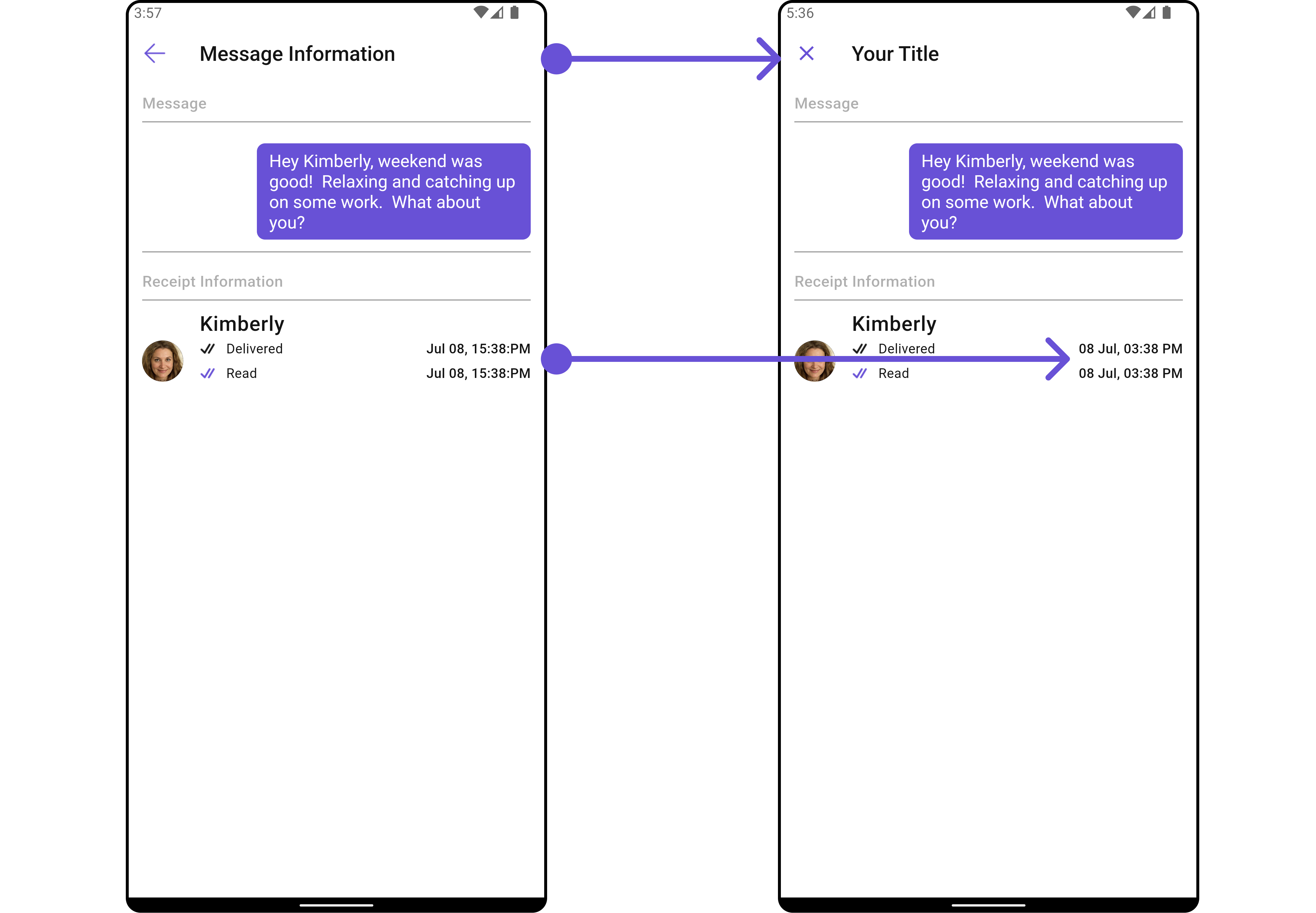
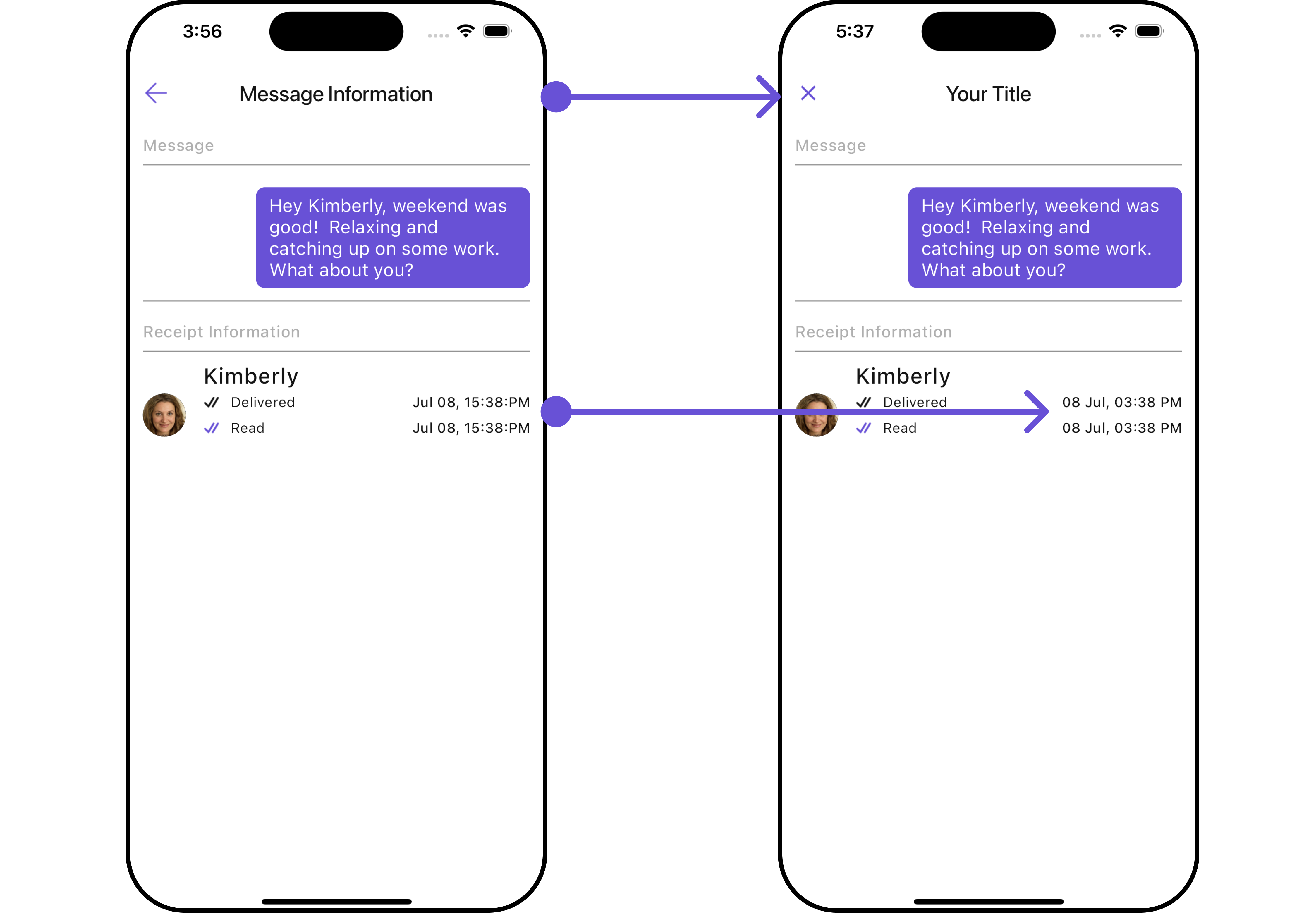
Below is a list of customizations along with corresponding code snippets
| Property | Description | Code |
|---|---|---|
| Close Icon | Sets the icon for closing the message information. | closeIcon: Icon? |
| Empty State Text | Sets the text for the empty state. | emptyStateText: String? |
| Error State Text | Sets the text for the error state. | errorStateText: String? |
| Loading Icon Url | Sets the URL for the loading icon. | loadingIconUrl: String? |
| Read Icon | Sets the icon for read receipts. | readIcon: Icon? |
| Receipt Date Pattern | Sets the date pattern for the receipt timestamp. | receiptDatePattern: String? |
| Title | Sets the title for the message information. | title: String? |
| Delivered Icon | Sets the icon for delivered receipts. | deliveredIcon: Icon? |
Advanced
For advanced-level customization, you can set custom widgets to the widget. This lets you tailor each aspect of the widget to fit your exact needs and application aesthetics. You can create and define your widgets and then incorporate those into the widget.
ListItem Widget
With this function, you can assign a custom ListItem to the CometChatMessageInformation Widget.
- Dart
CometChatMessageInformation(
  message: baseMessage!,
  listItemView: (message, messageReceipt, context) {
    return Placeholder(); // Replace this placeholder with your custom widget.
  },
)
Example
Here is the complete example for reference:
- Dart
import 'package:flutter/material.dart';
import 'package:intl/intl.dart';
import '../helper/utils/custom_colors.dart';
class CustomListItems extends StatelessWidget {
final String name;
final DateTime? lastMessageTime;
final String? avatarUrl;
const CustomListItems({
super.key,
required this.name,
this.lastMessageTime,
this.avatarUrl,
});
String formatDateTime(DateTime dateTime) {
final now = DateTime.now();
final difference = now.difference(dateTime);
if (difference.inDays == 0) {
return DateFormat('HH:mm').format(dateTime);
} else if (difference.inDays == 1) {
return 'Yesterday';
} else {
return DateFormat('yyyy-MM-dd').format(dateTime);
}
}
Widget build(BuildContext context) {
return Container(
margin: const EdgeInsets.only(top: 5, bottom: 5),
padding: const EdgeInsets.all(8.0),
decoration: BoxDecoration(
border: Border.all(color: Color(0xFF6851D6), width: 1), // Example border color
borderRadius: BorderRadius.circular(8.0),
color: Color(0xFFEEEEEE)
),
child: Row(
crossAxisAlignment: CrossAxisAlignment.center,
children: [
Expanded(
child: Column(
crossAxisAlignment: CrossAxisAlignment.start,
mainAxisAlignment: MainAxisAlignment.center,
children: [
Text(
name,
style: const TextStyle(
fontWeight: FontWeight.bold,
),
),
lastMessageTime == null ? Container() : Text(formatDateTime(lastMessageTime!)),
],
),
),
const SizedBox(width: 8.0),
if (avatarUrl != null)
ClipOval(
child: Image.network(
avatarUrl!,
width: 40.0,
height: 40.0,
fit: BoxFit.cover,
errorBuilder: (context, error, stackTrace) {
return const Icon(
Icons.person,
size: 40.0,
);
},
),
)
else
const Icon(
Icons.person,
size: 40.0,
),
],
),
);
}
}
- Dart
CometChatMessageInformation(
  message: baseMessage!,
  listItemView: (message, messageReceipt, context) {
    return CustomListItems(
      name: message.sender!.name,
      avatarUrl: message.sender!.avatar,
    );
  },
)
- Android
- iOS
Subtitle Widget
You can customize the subtitle widget for each item to meet your specific preferences and needs.
- Dart
CometChatMessageInformation(
  message: baseMessage!,
  subTitleView: (BaseMessage message, MessageReceipt messageReceipt, BuildContext context) {
    return const Row(
      children: [
        Icon(Icons.call, color: Color(0xFF6851D6), size: 25,),
        SizedBox(width: 10),
        Icon(Icons.video_call, color: Color(0xFF6851D6), size: 25,),
      ],
    );
  },
)
- Android
- iOS