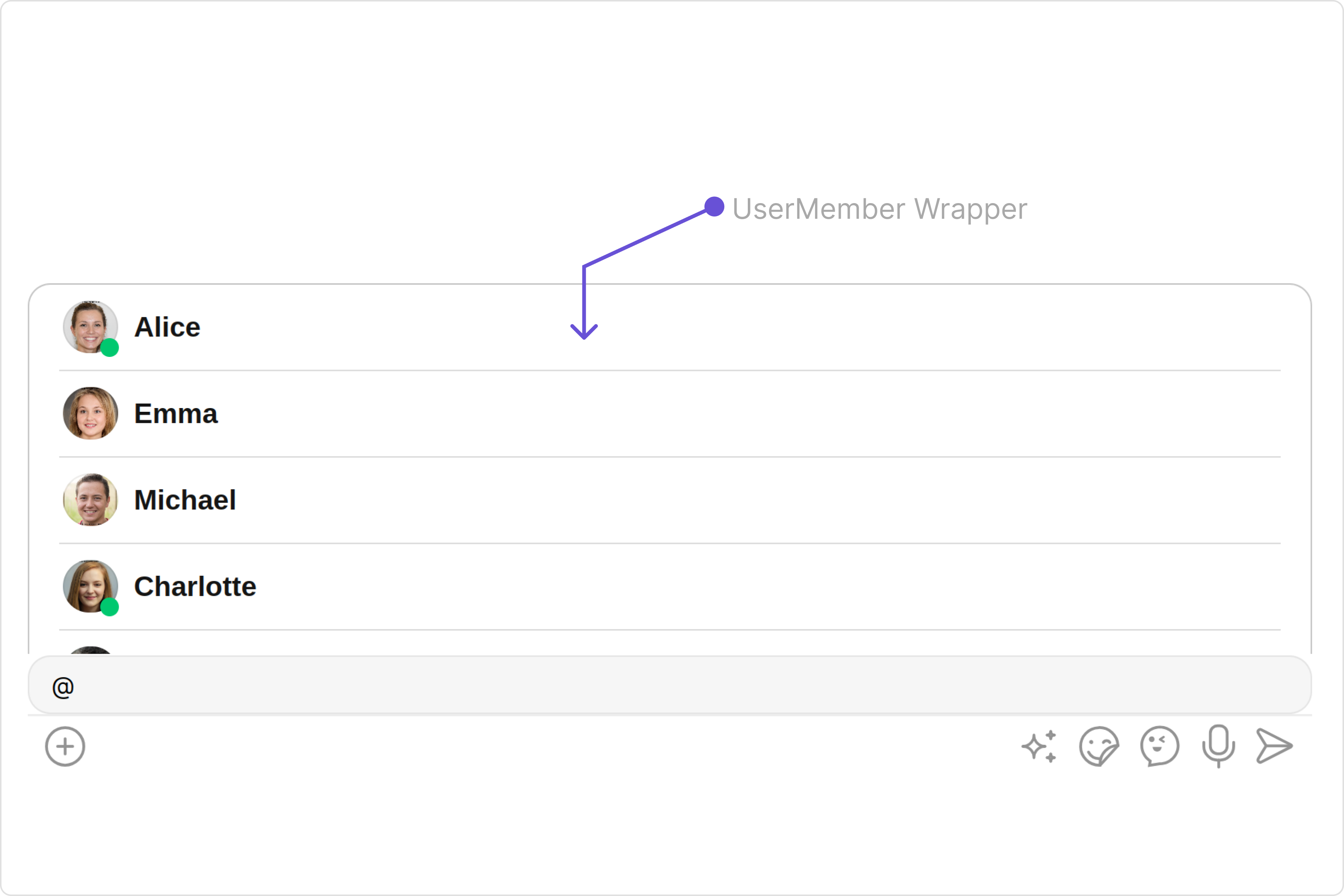
User Member Wrapper
Overview
The UserMemberWrapper component is an intuitive interface that presents a list of users or group members according to the chat context. by default it shows the list of users.
Usage
Integration
The following code snippet illustrates how you can directly incorporate the CometChatUserMemberWrapper component into your app.
- UserMemberWrapperDemo.tsx
- App.tsx
import React from "react";
import { CometChatUserMemberWrapper } from "@cometchat/chat-uikit-react";

const UserMemberWrapperDemo = () => {
  return <CometChatUserMemberWrapper />;
};

export default UserMemberWrapperDemo;
import { UserMemberWrapperDemo } from "./UserMemberWrapperDemo";

export default function App() {
  return (
    <div className="App">
      <div>
        <UserMemberWrapperDemo />
      </div>
    </div>
  );
}
Actions
Actions dictate how a component functions. They are divided into two types: Predefined and User-defined. You can override either type, allowing you to tailor the behavior of the component to fit your specific needs.
1. onItemClick
onItemClick is triggered when you click on a ListItem of UserMemberWrapper component. You can override this action using the following code snippet.
- UserMemberWrapperDemo.tsx
import React from "react";
import { CometChatUserMemberWrapper } from "@cometchat/chat-uikit-react";

const UserMemberWrapperDemo = () => {
  const handleOnItemClick = () => {
    console.log("Your custom actions");
  };

  return <CometChatUserMemberWrapper onItemClick={handleOnItemClick} />;
};

export default UserMemberWrapperDemo;
2. onError
This action doesn't change the behavior of the component but rather listens for any errors that occur in the UserMemberWrapper component.
- UserMemberWrapperDemo.tsx
import React from "react";
import { CometChatUserMemberWrapper } from "@cometchat/chat-uikit-react";

const UserMemberWrapperDemo = () => {
  function handleError(): void {
    console.log("your custom on error actions");
  }

  return <CometChatUserMemberWrapper onError={handleError} />;
};

export default UserMemberWrapperDemo;
3. onEmpty
This action allows you to specify a callback function to be executed when a certain condition, typically the absence of data or content, is met within the component or element.
- UserMemberWrapperDemo.tsx
import React from "react";
import { CometChatUserMemberWrapper } from "@cometchat/chat-uikit-react";

const UserMemberWrapperDemo = () => {
  const getOnEmpty = () => {
    console.log("your custom on empty actions");
  };

  return <CometChatUserMemberWrapper onEmpty={getOnEmpty} />;
};

export default UserMemberWrapperDemo;
Filters
Filters allow you to customize the data displayed in a list within a Component. You can filter the list based on your specific criteria, allowing for a more customized. Filters can be applied using RequestBuilders of Chat SDK.
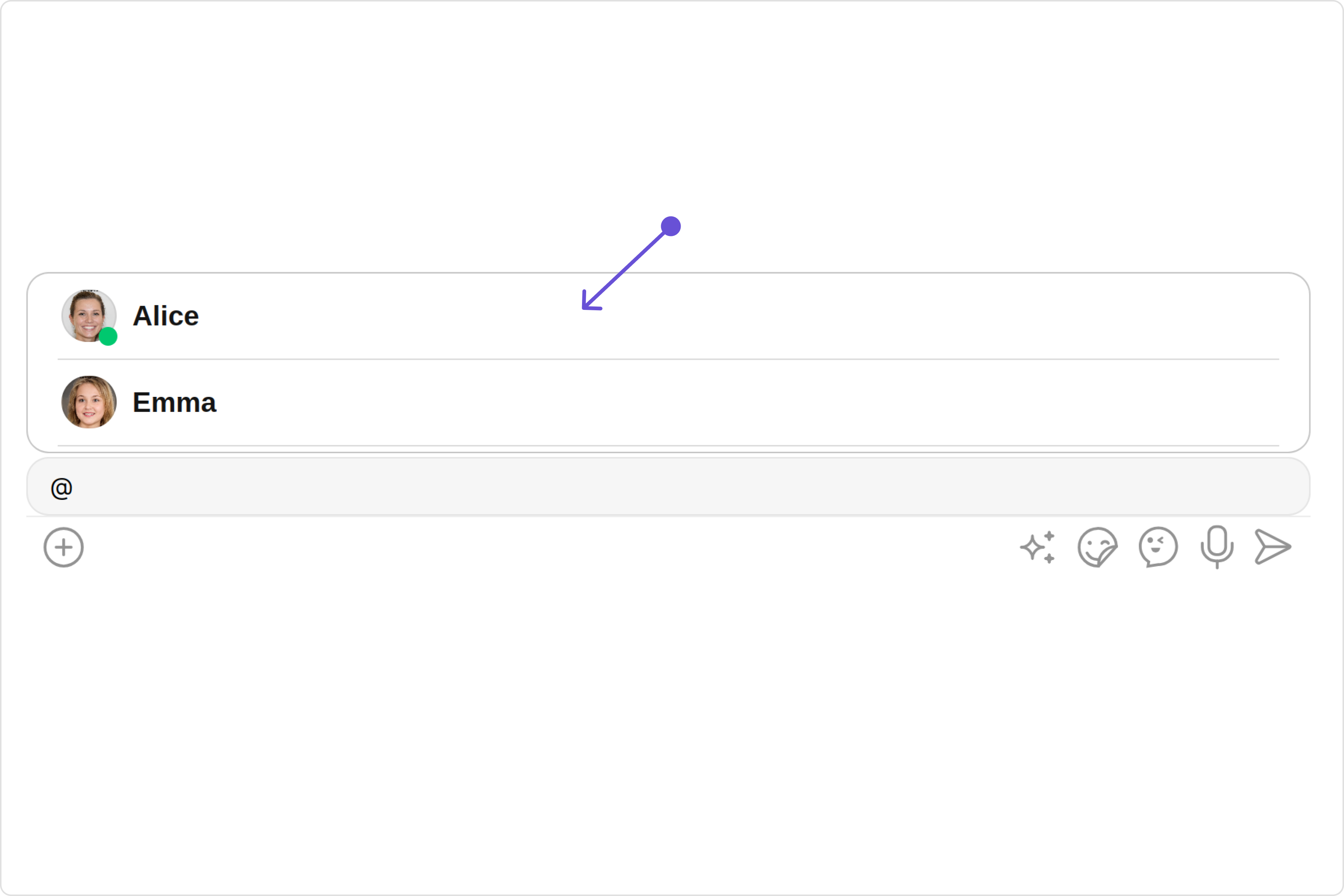
You can set usersRequestBuilderand groupMemberRequestBuilder in the UserMemberWrapper Component to filter the list. You can modify the builder as per your specific requirements with multiple options available to know more refer to UsersRequestBuilder and GroupMemberRequestBuilder
- UsersRequestBuilder
- GroupMemberRequestBuilder
import React from "react";
import { CometChatUserMemberWrapper } from "@cometchat/chat-uikit-react";
import { CometChat } from "@cometchat/chat-sdk-javascript";

const UserMemberWrapperDemo = () => {
  return (
    <CometChatUserMemberWrapper
      usersRequestBuilder={new CometChat.UsersRequestBuilder().setLimit(2)}
    />
  );
};

export default UserMemberWrapperDemo;
import React from 'react';
import { CometChatUserMemberWrapper } from '@cometchat/chat-uikit-react';
import {CometChat} from '@cometchat/chat-sdk-javascript';

const UserMemberWrapperDemo = () => {
const [chatGroup, setChatGroup] = React.useState<CometChat.Group | undefined>();

    React.useEffect(() => {
        CometChat.getGroup("uid").then((group) => {
            setChatGroup(group);
        })
    }, [])
  return (
    <CometChatUserMemberWrapper
    group={chatGroup}
    groupMemberRequestBuilder={new CometChat.GroupMembersRequestBuilder('uid').setLimit(2)}
    />
  );
}

export default UserMemberWrapperDemo;
Events
Events are emitted by a Component. By using event you can extend existing functionality. Being global events, they can be applied in Multiple Locations and are capable of being Added or Removed.
The CometChatUserMemberWrapper component does not produce any events.
Customization
To fit your app's design requirements, you can customize the appearance of the UserMemberWrapper component. We provide exposed methods that allow you to modify the experience and behavior according to your specific needs.
Style
Using Style you can customize the look and feel of the component in your app, These parameters typically control elements such as the color, size, shape, and fonts used within the component.
1. Avatar Style
If you want to apply customized styles to the Avatar component within the UserMemberWrapper Component, you can use the following code snippet. For more information you can refer Avatar Styles.
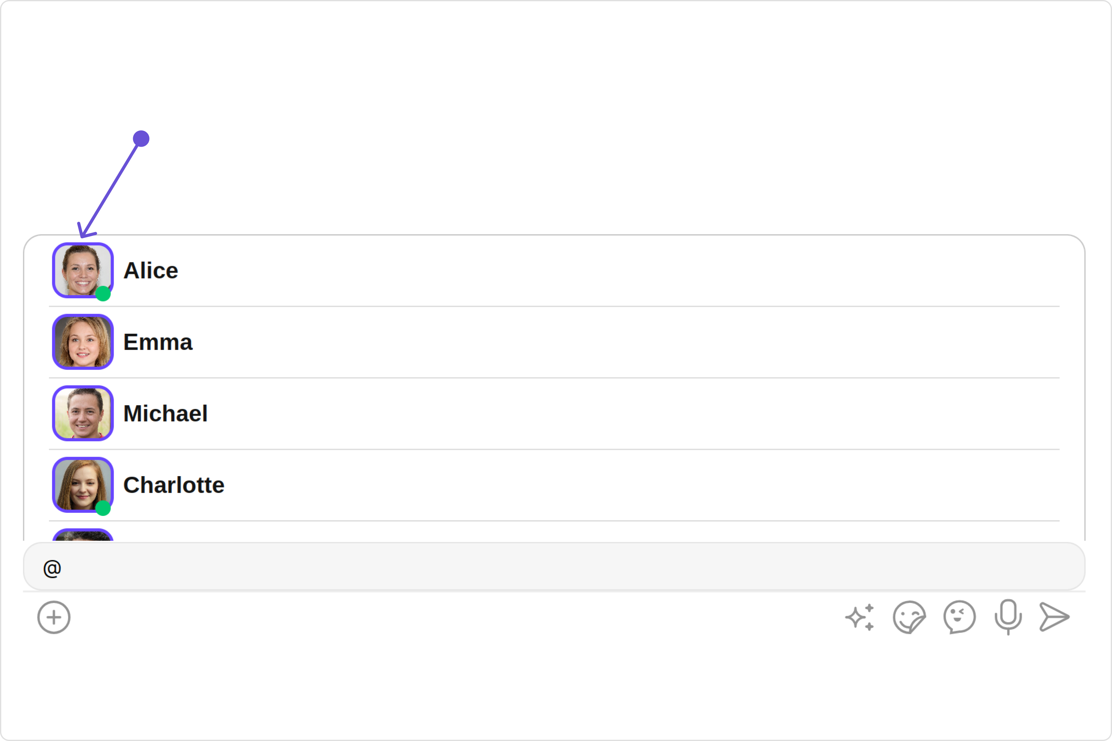
- UserMemberWrapperDemo.tsx
import React from "react";
import {
  CometChatUserMemberWrapper,
  AvatarStyle,
} from "@cometchat/chat-uikit-react";

const UserMemberWrapperDemo = () => {
  const avatarStyle = new AvatarStyle({
    backgroundColor: "#cdc2ff",
    border: "2px solid #6745ff",
    borderRadius: "10px",
    outerViewBorderColor: "#ca45ff",
    outerViewBorderRadius: "5px",
    nameTextColor: "#4554ff",
  });

  return <CometChatUserMemberWrapper avatarStyle={avatarStyle} />;
};

export default UserMemberWrapperDemo;
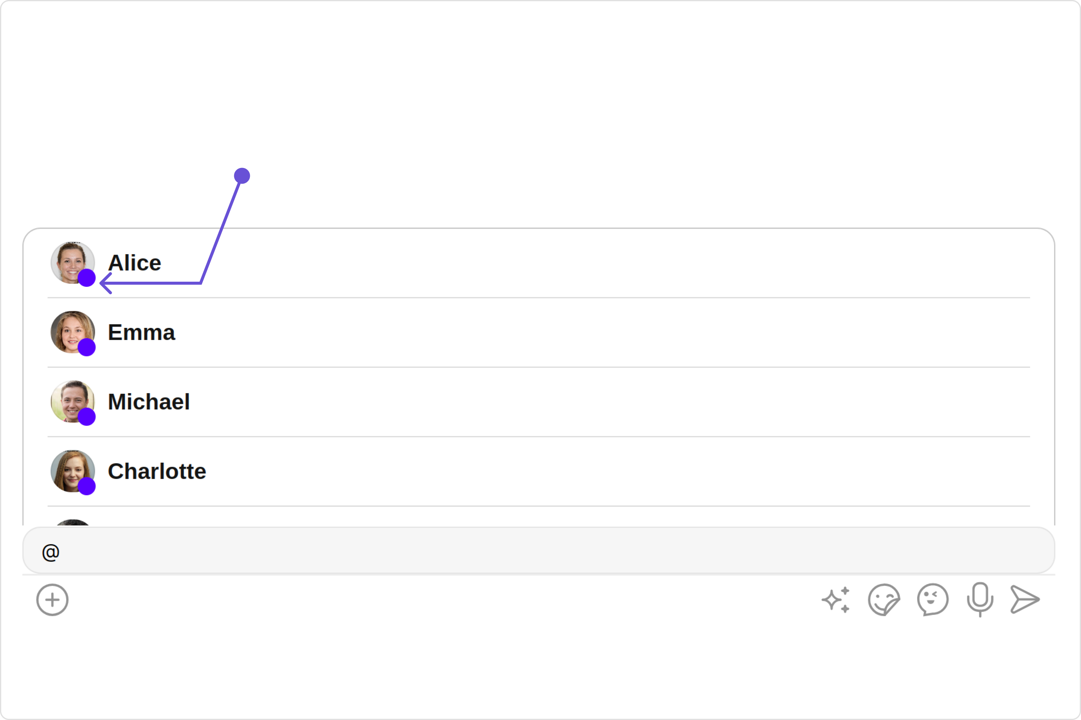
2. StatusIndicator Style
To apply customized styles to the Status Indicator component in the UserMemberWrapper Component, you can use the following code snippet. For further insights on Status Indicator Styles refer
- UserMemberWrapperDemo.tsx
import React from "react";
import { CometChatUserMemberWrapper } from "@cometchat/chat-uikit-react";

const UserMemberWrapperDemo = () => {
  const statusIndicatorStyle = {
    color: "red",
    fontSize: "16px",
    fontWeight: "bold",
  };

  return (
    <CometChatUserMemberWrapper statusIndicatorStyle={statusIndicatorStyle} />
  );
};

export default UserMemberWrapperDemo;
Functionality
These are a set of small functional customizations that allow you to fine-tune the overall experience of the component. With these, you can change text, set custom icons, and toggle the visibility of UI elements.
- UserMemberWrapperDemo.tsx
import React from "react";
import {
  CometChatUserMemberWrapper,
  UserMemberListType,
} from "@cometchat/chat-uikit-react";

const UserMemberWrapperDemo = () => {
  return (
    <CometChatUserMemberWrapper
      userMemberListType={UserMemberListType.users}
      disableUsersPresence={true}
    />
  );
};

export default UserMemberWrapperDemo;
below is a list of customizations along with corresponding code snippets
Below is a customizations list along with corresponding code snippets
Advanced
For advanced-level customization, you can set custom views to the component. This lets you tailor each aspect of the component to fit your exact needs and application aesthetics. You can create and define your views, layouts, and UI elements and then incorporate those into the component.
ListItemView
With the listItemVIew property, you can assign a custom ListItem to the UserMemberWrapper Component.
- UserMemberWrapperDemo.tsx
import React from "react";
import {
  CometChatUserMemberWrapper,
  UserMemberListType,
} from "@cometchat/chat-uikit-react";

const UserMemberWrapperDemo = () => {
  const getListItemView = (
    item?: CometChat.User | CometChat.GroupMember
  ): JSX.Element => {
    //your custom list item view
    return <div>{item?.getName()}</div>;
  };
  return <CometChatUserMemberWrapper listItemView={getListItemView} />;
};

export default UserMemberWrapperDemo;