Avatar
CometChatAvatar component displays an image or user's avatar with fallback to the first two letters of the username or group's icon with fallback to the first two letter of the group name.
Properties
| Name | Type | Description |
|---|---|---|
| image | string | Image URL of the avatar |
| name | string | Fallback name of the avatar |
| avatarStyle | Avatar Style | Styling properties of the element |
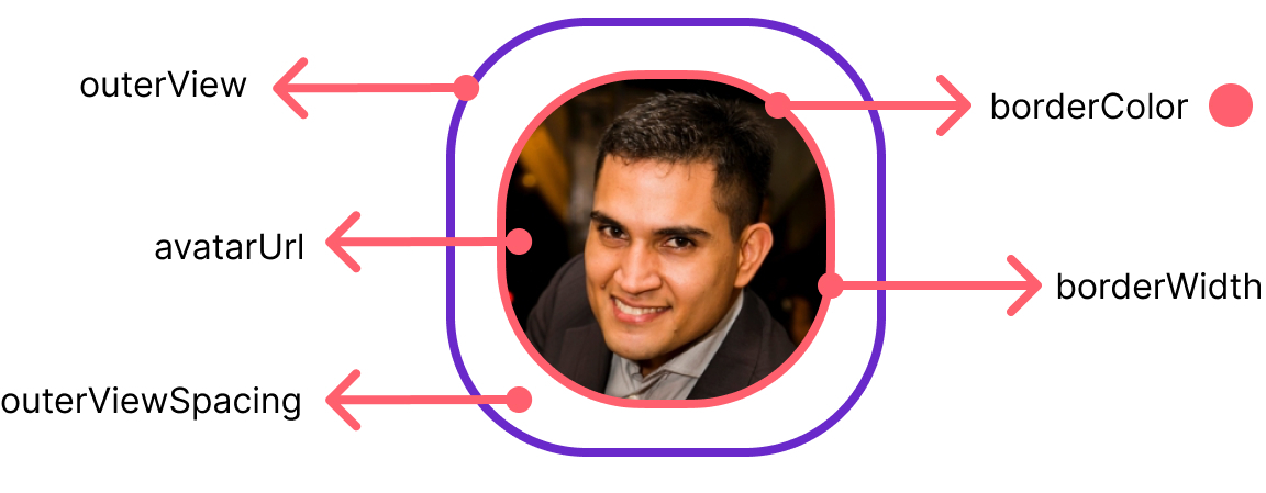
Avatar Style
Styling properties and values of the avatar element
| Name | Description |
|---|---|
| width | Sets the width of the element |
| height | Sets the height of the element |
| border | Sets the border of the element |
| outerViewBorder | Sets the border of the outer edge of the element |
| outerViewBorderSpacing | Sets the spacing between the profile picture and the outerViewBorder |
| borderRadius | Sets the border radius of the element |
| backgroundColor | Sets the background color of the element. Reference link |
| backgroundSize | Sets the size of the element's background image. Reference link |
| nameTextColor | Sets the foreground color of the initials. |
| nameTextFont | Sets all the different properties of font for the initials. Reference link |
Usage
- Javascript
import '@cometchat/uikit-elements'; //import the web elements package.
import  { AvatarStyle } from '@cometchat/uikit-elements'; //import the style class.

//profile pic
const profilePic = "https://media.istockphoto.com/id/1394637422/photo/confident-handsome-30s-caucasian-millennial-man-businessman.jpg?s=612x612&w=0&k=20&c=yAaiBJ7NNX1dC2XE-HZecZkUF62f-J-ypKiIT_xn7eA=";

//styling properties
const avatarStyle = new AvatarStyle({width: "28px",height: "28px"});

//use the element
<cometchat-avatar image={profilePic} avatarStyle={avatarStyle} />