Conversations with Messages
Overview
The ConversationsWithMessages is a Composite Component encompassing components such as Conversations, Messages, and Contacts. Each of these component contributes to the functionality and structure of the overall ConversationsWithMessages component.

| Components | Description |
|---|---|
| Conversations | The Conversations component is designed to display a list of either User or Group. This essentially represents your recent conversation history. |
| Messages | The Messages component is designed to manage the messaging interaction for either individual User or Group conversations. |
| Contacts | The CometChatContacts component is specifically designed to facilitate the display and management of both User and Groups. |
Usage
Integration
- ConversationsWithMessagesDemo.tsx
- App.tsx
import { CometChatConversationsWithMessages } from "@cometchat/chat-uikit-react";
function ConversationsWithMessagesDemo() {
  return (
    <div
      className="conversationswithmessages"
      style={{ width: "100%", height: "100%" }}
    >
      <div>
        <CometChatConversationsWithMessages messageText="Conversations With Messages" />
      </div>
    </div>
  );
}

export default ConversationsWithMessagesDemo;
import ConversationsWithMessagesDemo from "./ConversationsWithMessages";

export default function App() {
  return (
    <div className="App">
      <ConversationsWithMessagesDemo />
    </div>
  );
}
Actions
Actions dictate how a component functions. They are divided into two types: Predefined and User-defined. You can override either type, allowing you to tailor the behavior of the component to fit your specific needs.
While the ConversationsWithMessages component does not have its actions, its components - Conversation, Messages, and Contacts - each have their own set of actions.
The Action of the components can be overridden through the use of the Configurations object of its components. Here is an example code snippet.
- ConversationsWithMessagesDemo.tsx
import {
  CometChatConversationsWithMessages,
  ConversationsConfiguration,
  ContactsConfiguration,
} from "@cometchat/chat-uikit-react";

const getOnError = (error: CometChat.CometChatException) => {
  console.log("error:", error);
  //Your Error handling action.
};
const getOnClose = () => {
  // Your Action on Close.
};
function ConversationsWithMessagesDemo() {
  return (
    <div
      className="conversationswithmessages"
      style={{ width: "100%", height: "100%" }}
    >
      <div>
        <CometChatConversationsWithMessages
          conversationsConfiguration={
            new ConversationsConfiguration({
              onError: getOnError,
            })
          }
          startConversationConfiguration={
            new ContactsConfiguration({
              onClose: getOnClose,
            })
          }
        />
      </div>
    </div>
  );
}

export default ConversationsWithMessagesDemo;
The ConversationsWithMessages component overrides several actions from its components to reach its default behavior. The list of actions overridden by ConversationsWithMessages includes:
-
OnItemClick : By overriding the
OnItemClickof the Conversation Component, ConversationsWithMessages achieves navigation from Conversation to Messages component.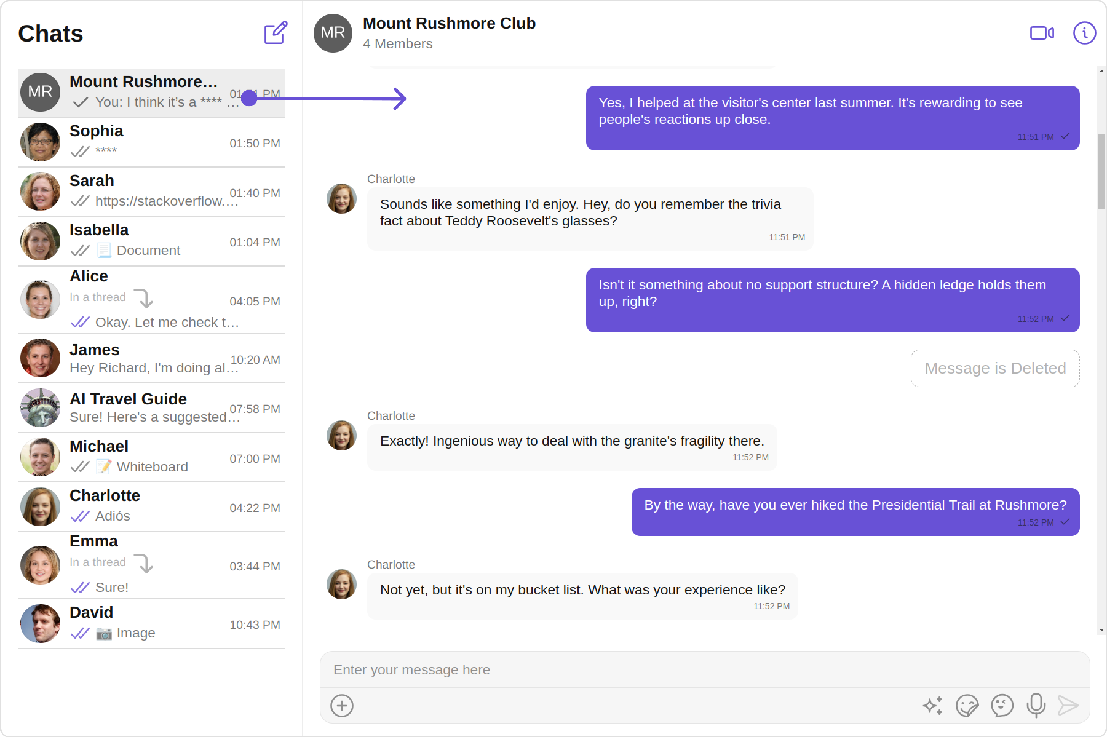
Filters
Filters allow you to customize the data displayed in a list within a Component. You can filter the list based on your specific criteria, allowing for a more customized. Filters can be applied using RequestBuilders of Chat SDK.
While the ConversationsWithMessages component does not have filters, its components do, For more detail on individual filters of its component refer to Conversations Filters and Messages Filters.
By utilizing the Configurations object of its components, you can apply filters.
In the following example, we're filtering Conversation to only show User
- ConversationsWithMessagesDemo.tsx
import {
  CometChatConversationsWithMessages,
  ConversationsConfiguration,
} from "@cometchat/chat-uikit-react";

function ConversationsWithMessagesDemo() {
  return (
    <div
      className="conversationswithmessages"
      style={{ width: "100%", height: "100%" }}
    >
      <div>
        <CometChatConversationsWithMessages
          conversationsConfiguration={
            new ConversationsConfiguration({
              conversationsRequestBuilder:
                new CometChat.ConversationsRequestBuilder()
                  .setConversationType("user")
                  .setLimit(10),
            })
          }
        />
      </div>
    </div>
  );
}

export default ConversationsWithMessagesDemo;
Events
Events are emitted by a Component. By using event you can extend existing functionality. Being global events, they can be applied in Multiple Locations and are capable of being Added or Removed.
The ConversationsWithMessages does not generate its events but its component does. For a full list of these events, you can refer to Conversations events and Messages events.
In the following example, we're incorporating observers for the ConversationDeleted event of Conversations and the MessageSent event of the Messages component.
- ConversationsWithMessagesDemo.tsx
const ccConversationDeleted = CometChatConversationEvents.ccConversationDeleted
  .subscribe
  // Your Action
  ();
const ccMessageSent = CometChatMessageEvents.ccMessageSent
  .subscribe
  //Your Action
  ();
Customization
To fit your app's design requirements, you have the ability to customize the appearance of the ConversationsWithMessages component. We provide exposed methods that allow you to modify the experience and behavior according to your specific needs.
Style
Using Style you can customize the look and feel of the component in your app, These parameters typically control elements such as the color, size, shape, and fonts used within the component. ConversationsWithMessages component doesn't have its own style parameters. But you can customize its component styles. For more details on individual component styles, you can refer Conversation Styles, Messages Styles, and Contacts Styles
Styles can be applied to SubComponents using their respective configurations.
Example
- ConversationsWithMessagesDemo.tsx
import {
  CometChatConversationsWithMessages,
  ConversationsConfiguration,
  ConversationsStyle,
} from "@cometchat/chat-uikit-react";

const conversationsStyle = new ConversationsStyle({
  width: "100%",
  height: "100%",
  border: "1px solid #ee7752",
  background: "linear-gradient(#ee7752, #e73c7e, #23a6d5, #23d5ab)",
});

function ConversationsWithMessagesDemo() {
  return (
    <div
      className="conversationswithmessages"
      style={{ width: "100%", height: "100%" }}
    >
      <div>
        <CometChatConversationsWithMessages
          conversationsConfiguration={
            new ConversationsConfiguration({
              conversationsStyle: conversationsStyle,
            })
          }
        />
      </div>
    </div>
  );
}

export default ConversationsWithMessagesDemo;
Functionality
These are a set of small functional customizations that allow you to fine-tune the overall experience of the component. With these, you can change text, set custom icons, and toggle the visibility of UI elements.
user
you can utilize the user method with a User object as input to the ConversationsWithMessages component. This will automatically direct you to the Messages component for the specified User.
- ConversationsWithMessagesDemo.tsx
import { CometChat } from "@cometchat/chat-sdk-javascript";
import { CometChatConversationsWithMessages } from "@cometchat/chat-uikit-react";

function ConversationsWithMessagesDemo() {
  const [user, setUser] = (useState < CometChat.User) | (undefined > undefined);

  useEffect(() => {
    const getUser = async () => {
      const user = await CometChat.getUser("cometchat-uid-1");
      setUser(user);
    };
    getUser();
  }, []);

  return (
    <div
      className="conversationswithmessages"
      style={{ width: "100%", height: "100%" }}
    >
      <div>
        <CometChatConversationsWithMessages user={user} />
      </div>
    </div>
  );
}

export default ConversationsWithMessagesDemo;
group
you can utilize the group method with a Group object as input to the ConversationsWithMessages component. This will automatically direct you to the Messages component for the specified Group.
- ConversationsWithMessagesDemo.tsx
import { CometChat } from "@cometchat/chat-sdk-javascript";
import { CometChatConversationsWithMessages } from "@cometchat/chat-uikit-react";

function ConversationsWithMessagesDemo() {
  const [group, setGroup] =
    (useState < CometChat.Group) | (undefined > undefined);

  useEffect(() => {
    const getGroup = async () => {
      const group = await CometChat.getGroup("cometchat-guid-1");
      setGroup(group);
    };
    getGroup();
  }, []);

  return (
    <div
      className="conversationswithmessages"
      style={{ width: "100%", height: "100%" }}
    >
      <div>
        <CometChatConversationsWithMessages group={group} />
      </div>
    </div>
  );
}

export default ConversationsWithMessagesDemo;
Components
Nearly all functionality customizations available for a Component are also available for the composite component. Using Configuration, you can modify the properties of its components to suit your needs.
You can find the list of all Functionality customization of individual components in Conversations , Messages, and Contacts
Example
- ConversationsWithMessagesDemo.tsx
import {
  CometChatConversationsWithMessages,
  ConversationsConfiguration,
  TitleAlignment,
} from "@cometchat/chat-uikit-react";

function ConversationsWithMessagesDemo() {
  return (
    <div
      className="conversationswithmessages"
      style={{ width: "100%", height: "100%" }}
    >
      <div>
        <CometChatConversationsWithMessages
          conversationsConfiguration={
            new ConversationsConfiguration({
              titleAlignment: TitleAlignment.center,
              hideError: true,
            })
          }
          messagesConfiguration={
            new MessagesConfiguration({
              disableTyping: true,
              hideMessageHeader: true,
            })
          }
        />
      </div>
    </div>
  );
}

export default ConversationsWithMessagesDemo;
Advanced
For advanced-level customization, you can set custom views to the component. This lets you tailor each aspect of the component to fit your exact needs and application aesthetics. You can create and define your own views, layouts, and UI elements and then incorporate those into the component.
By utilizing the Configuration object of each component, you can apply advanced-level customizations to the ConversationsWithMessages.
Example
- ConversationsWithMessagesDemo.tsx
import {
  CometChatConversationsWithMessages,
  ConversationsConfiguration,
} from "@cometchat/chat-uikit-react";

function ConversationsWithMessagesDemo() {
  const getErrorStateView = () => {
    return (
      <div style={{ height: "100vh", width: "100vw" }}>
        <img
          src="img"
          alt="error icon"
          style={{ height: "100px", width: "100px", justifyContent: "center" }}
        ></img>
      </div>
    );
  };
  return (
    <div
      className="conversationswithmessages"
      style={{ width: "100%", height: "100%" }}
    >
      <div>
        <CometChatConversationsWithMessages
          conversationsConfiguration={
            new ConversationsConfiguration({
              errorStateView: getErrorStateView(),
            })
          }
        />
      </div>
    </div>
  );
}

export default ConversationsWithMessagesDemo;
To find all the details on individual Component advance customization you can refer, Conversations Advance,Messages Advance and Contacts Advance
ConversationsWithMessages uses advanced-level customization of both Conversation & Messages components to achieve its default behavior.
-
ConversationsWithMessages utilizes the menus of the
Conversationssubcomponent to navigate the user from Conversations to Contacts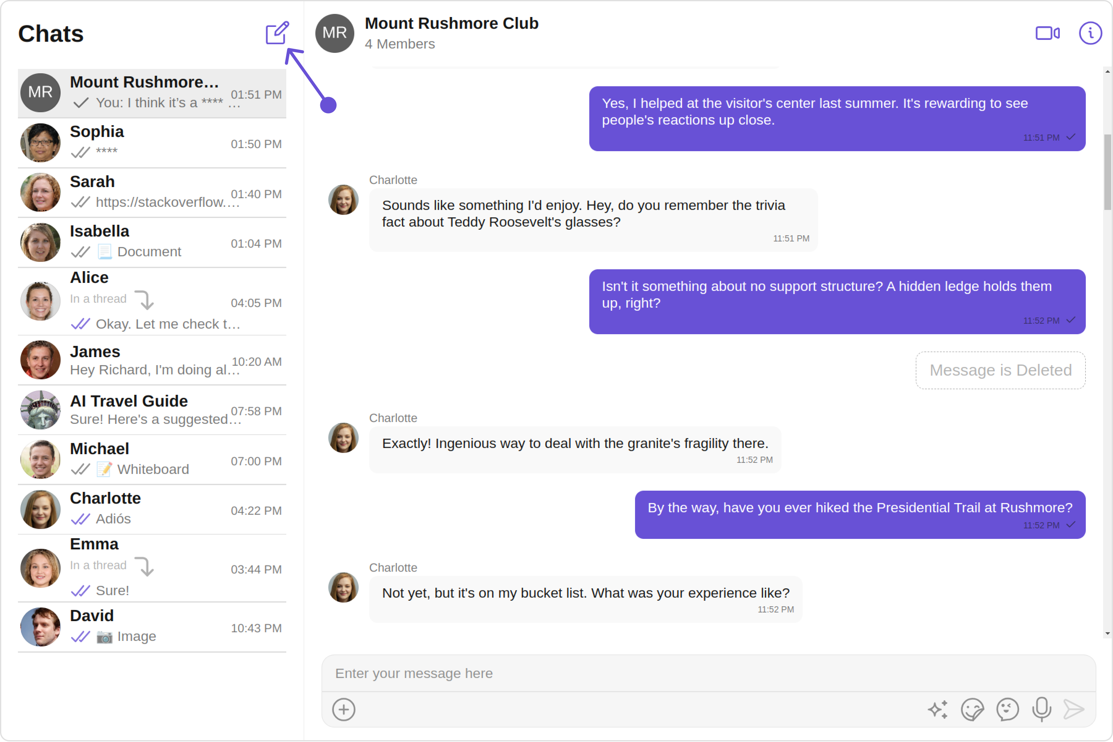
-
ConversationsWithMessages utilizes the menus of the
Messagessubcomponent to navigate from Messages to Details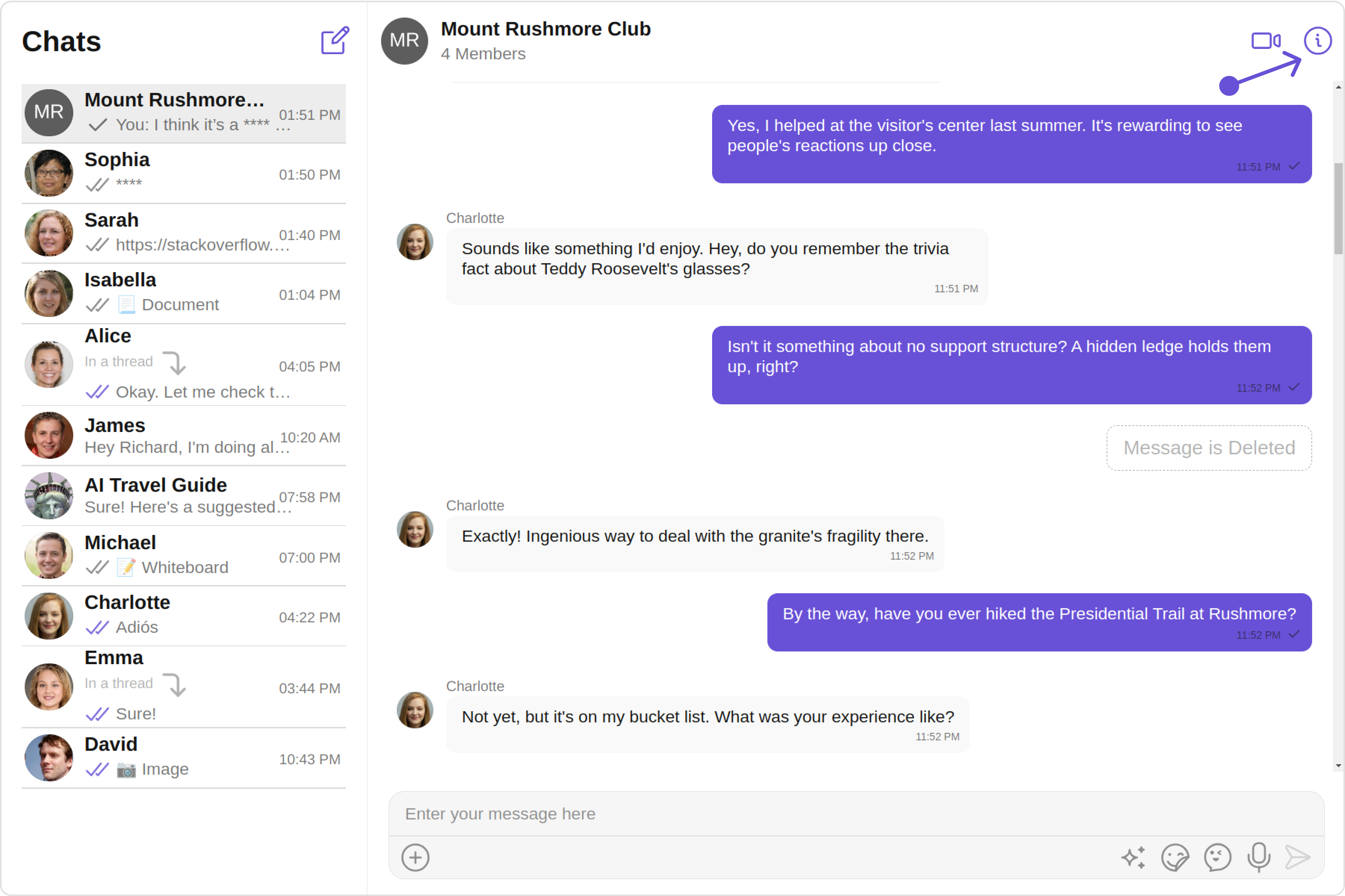
When you override menus, the default behavior of ConversationsWithMessages will also be overridden.
Configurations
Configurations offer the ability to customize the properties of each component within a Composite Component.
ConversationsWithMessages has Conversations, Messages, and Contacts component. Hence, each of these components will have its individual `Configuration``.
Configurationsexpose properties that are available in its individual components.
Conversations
You can customize the properties of the Conversations component by making use of the conversationsConfiguration. You can accomplish this by employing the conversationsConfiguration props as demonstrated below:
- TypeScript
 conversationsConfiguration={new ConversationsConfiguration({
            //override properties of conversations
          })}
All exposed properties of ConversationsConfiguration can be found under Conversations. Properties marked with the symbol are not accessible within the Configuration Object.
Example
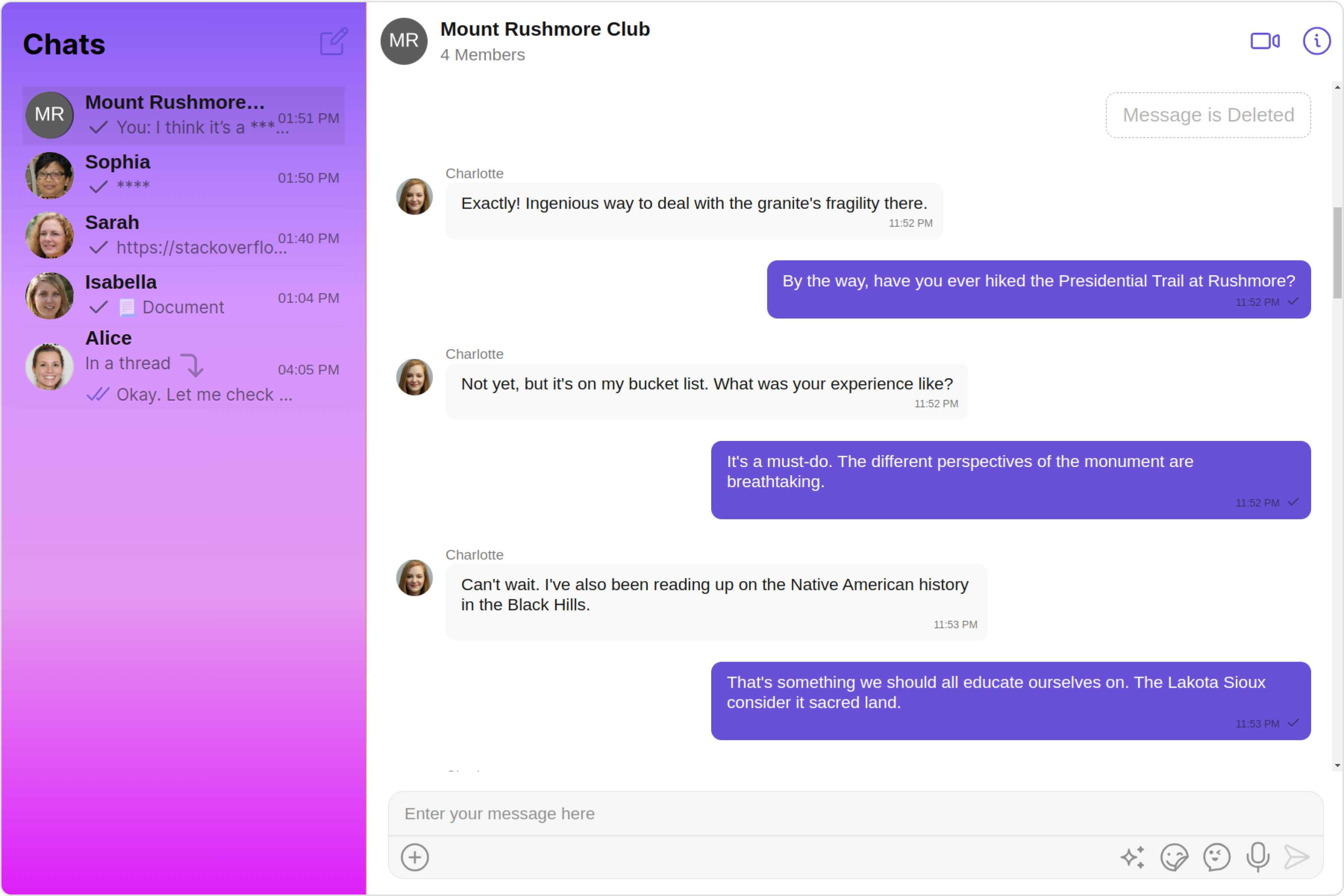
Let's say you want to change the style of the Conversations subcomponent and, in addition, you only want to display users in the conversation list.
You can modify the style using the conversationsStyle property and filter the list with the conversationsRequestBuilder property.
- TypeScript
import {
  CometChatConversationsWithMessages,
  ConversationsConfiguration,
  ConversationsStyle,
} from "@cometchat/chat-uikit-react";

const conversationsStyle = new ConversationsStyle({
  width: "100%",
  height: "100%",
  border: "1px solid #ee7752",
  background: "linear-gradient(#ee7752, #e73c7e, #23a6d5, #23d5ab)",
});

function ConversationsWithMessagesDemo() {
  return (
    <div
      className="conversationswithmessages"
      style={{ width: "100%", height: "100%" }}
    >
      <div>
        <CometChatConversationsWithMessages
          conversationsConfiguration={
            new ConversationsConfiguration({
              conversationsStyle: conversationsStyle,
              conversationsRequestBuilder:
                new CometChat.ConversationsRequestBuilder()
                  .setConversationType("user")
                  .setLimit(5),
            })
          }
        />
      </div>
    </div>
  );
}

export default ConversationsWithMessagesDemo;
Messages
You can customize the properties of the Messages component by making use of the messagesConfiguration. You can accomplish this by employing the messagesConfiguration props as demonstrated below:
- TypeScript
 messagesConfiguration={new MessagesConfiguration({
           //override properties of messages
          })}
All exposed properties of MessagesConfiguration can be found under Messages. Properties marked with the symbol are not accessible within the Configuration Object.
Example
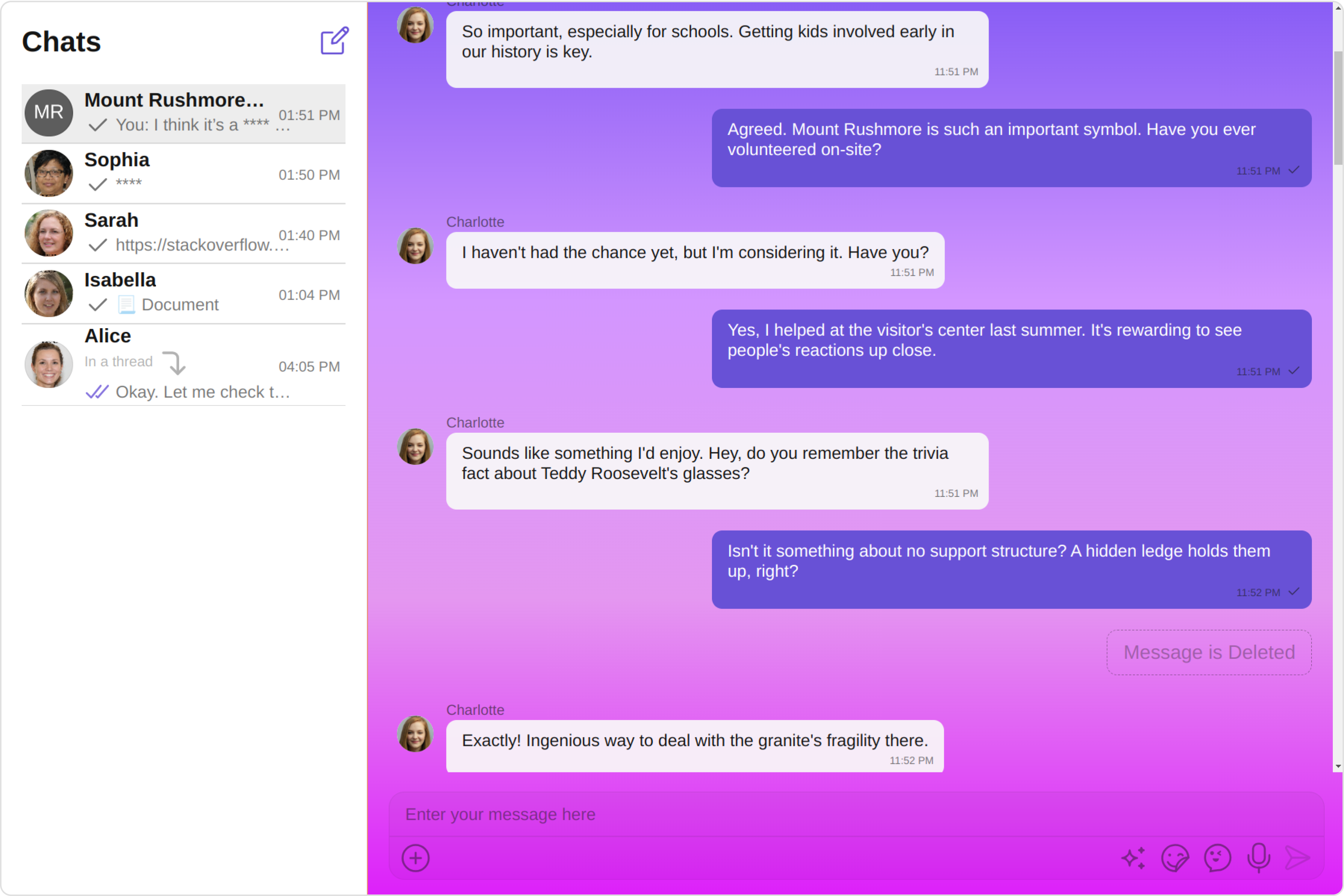
Let's say you want to change the style of the Messages subcomponent and, in addition, you only want to hide message header.
You can modify the style using the messagesStyle property and hide the message header with the hideMessageHeader property.
- TypeScript
import {
  CometChatConversationsWithMessages,
  MessagesConfiguration,
  MessagesStyle,
} from "@cometchat/chat-uikit-react";

const messagesStyle = new MessagesStyle({
  width: "100%",
  height: "100%",
  border: "1px solid #ee7752",
  background: "linear-gradient(#ee7752, #e73c7e, #23a6d5, #23d5ab)",
  messageTextColor: "yellow",
});

function ConversationsWithMessagesDemo() {
  return (
    <div
      className="conversationswithmessages"
      style={{ width: "100%", height: "100%" }}
    >
      <div>
        <CometChatConversationsWithMessages
          messagesConfiguration={
            new MessagesConfiguration({
              hideMessageHeader: true,
              messagesStyle: messagesStyle,
            })
          }
        />
      </div>
    </div>
  );
}

export default ConversationsWithMessagesDemo;
Contacts
You can customize the properties of the Contacts component by making use of the ContactsConfiguration. You can accomplish this by employing the startConversationConfiguration props as demonstrated below:
- TypeScript
 startConversationConfiguration={new ContactsConfiguration({
    // override properties of contacts
})}
All exposed properties of ContactsConfiguration can be found under Contacts. Properties marked with the symbol are not accessible within the Configuration Object.
Example
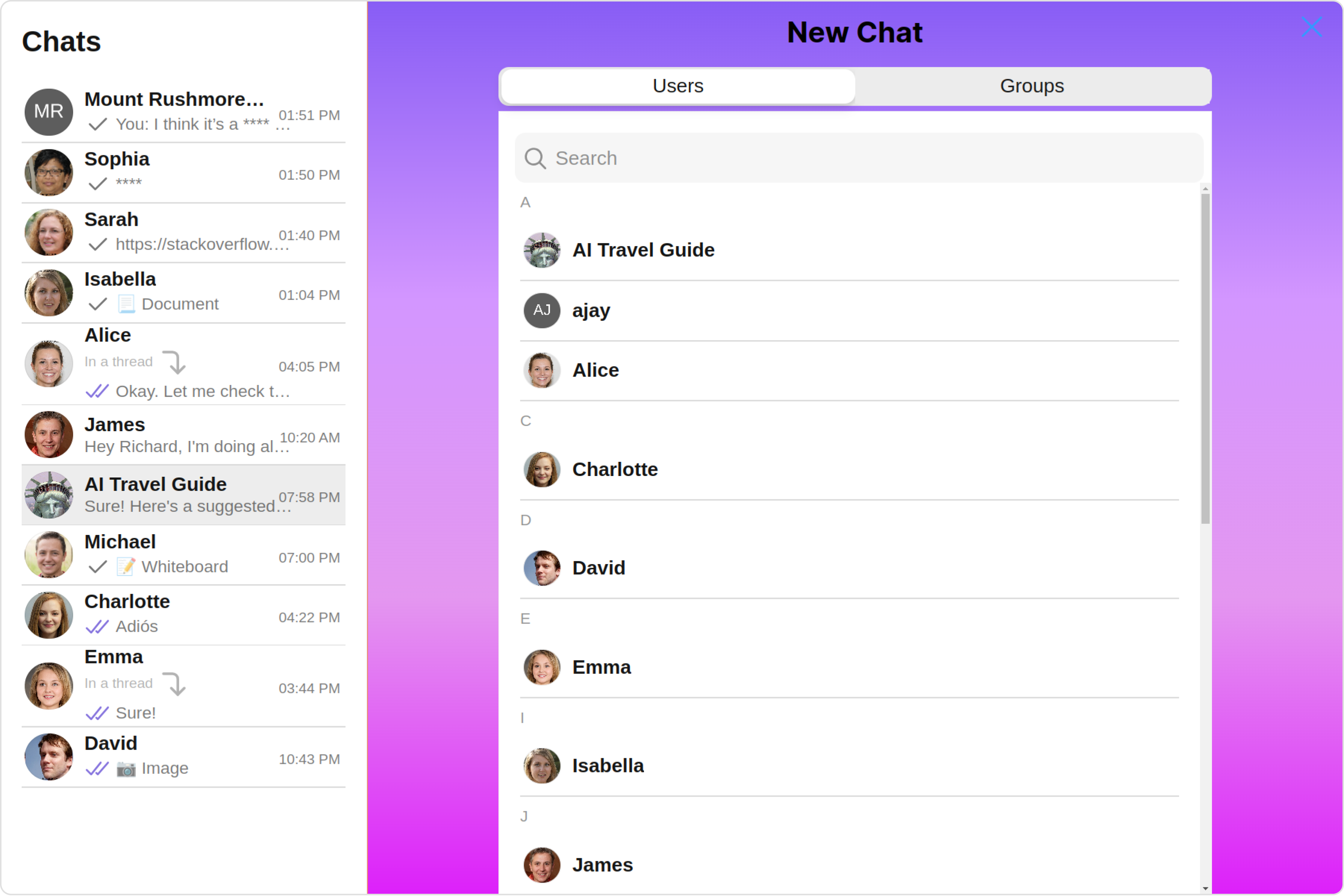
Let's say you want to change the style of the Contacts subcomponent and, in addition, you only want to hide the submit button.
You can modify the style using the contactsStyle property and hide the submit button with the hideSubmitButton property.
- TypeScript
import {
  CometChatConversationsWithMessages,
  ContactsConfiguration,
  ContactsStyle,
} from "@cometchat/chat-uikit-react";

const contactsStyle = new ContactsStyle({
  background:'linear-gradient(#ee7752, #e73c7e, #23a6d5, #23d5ab)'
  width: "100%",
  height: "100%",
  border: "1px solid #ee7752",
  titleTextColor: "#7E57C2",
  activeTabBackground: "#B39DDB",
});

function ConversationsWithMessagesDemo() {
  return (
    <div
      className="conversationswithmessages"
      style={{ width: "100%", height: "100%" }}
    >
      <div>
        <CometChatConversationsWithMessages
          startConversationConfiguration={
            new ContactsConfiguration({
              contactsStyle: contactsStyle,
              hideSubmitButton: true,
            })
          }
        />
      </div>
    </div>
  );
}

export default ConversationsWithMessagesDemo;