Overview
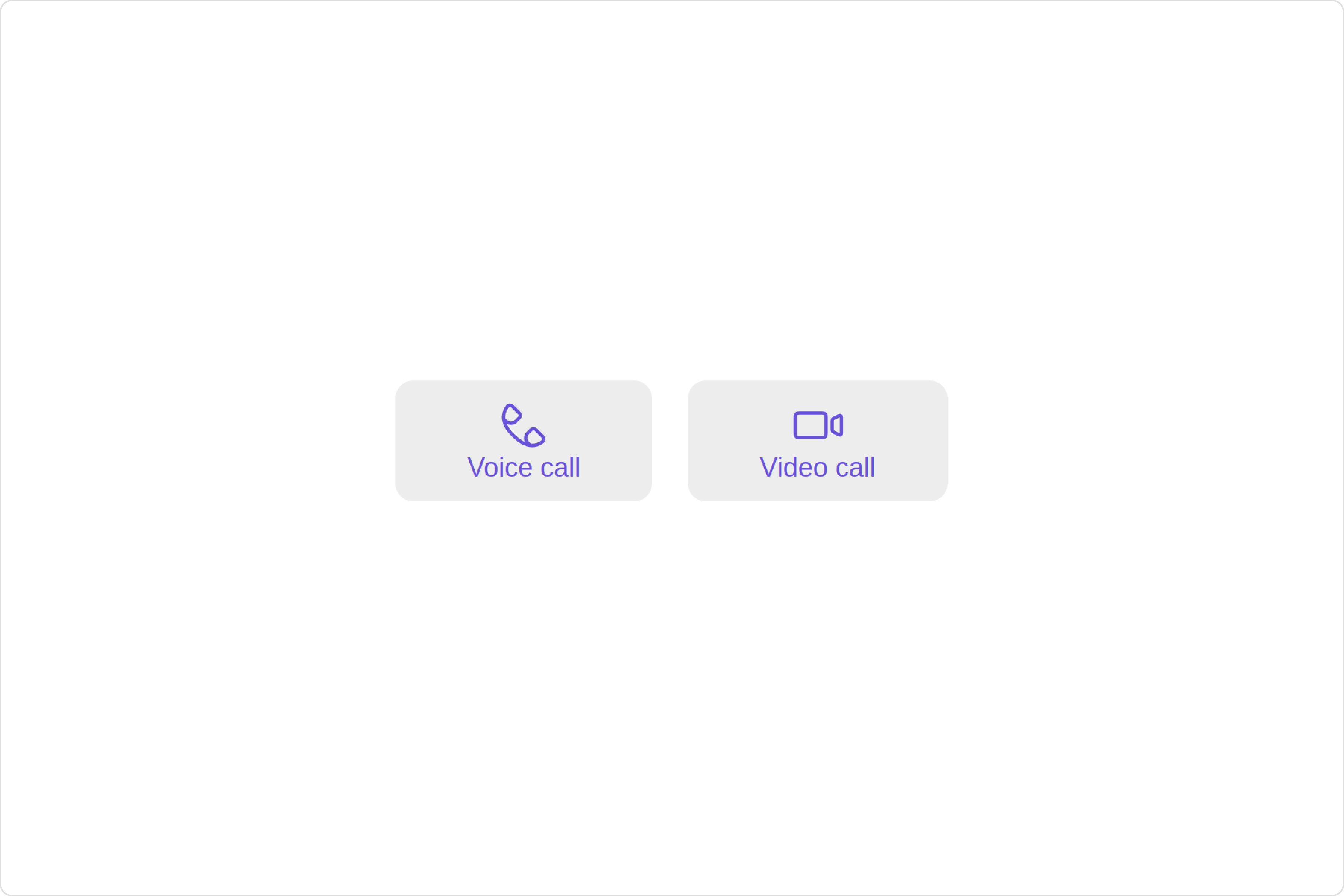
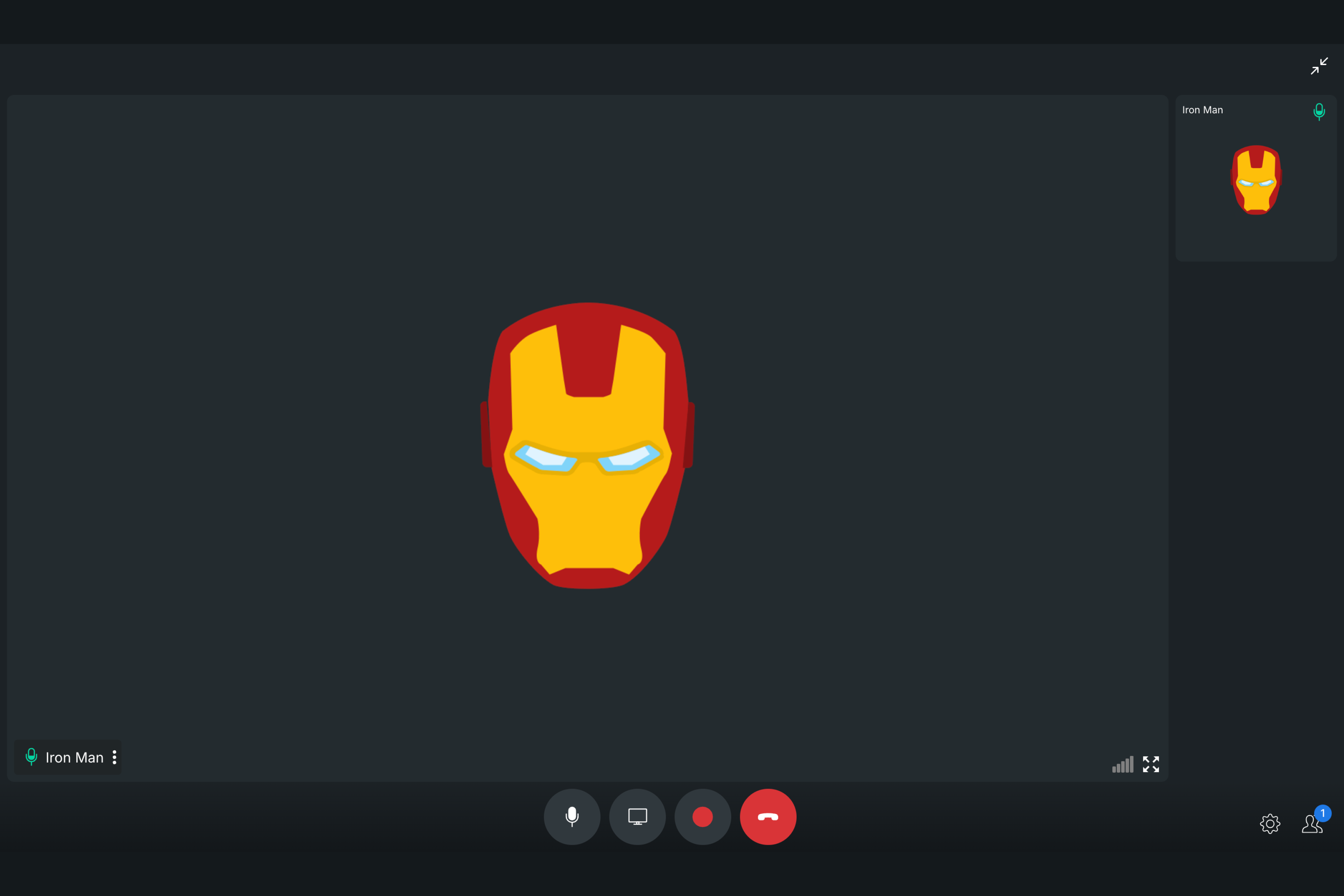
TheCall Button is a Component provides users with the ability to make calls, access call-related functionalities, and control call settings. Clicking this button typically triggers the call to be placed to the desired recipient.
Usage
Integration
- app.module.ts
- app.component.ts
- app.component.html
Actions
Actions dictate how a component functions. They are divided into two types: Predefined and User-defined. You can override either type, allowing you to tailor the behavior of the component to fit your specific needs.1. onVoiceCallClick
onVoiceCallClick is triggered when you click the voice call button of the Call Buttons component. You can override this action using the following code snippet.
- app.component.ts
- app.component.html
2. onVideoCallClick
onVideoCallClick is triggered when you click the video call button of the Call Buttons component. You can override this action using the following code snippet.
- app.component.ts
- app.component.html
3. onError
This action doesn’t change the behavior of the component but rather listens for any errors that occur in the Call Button component.- app.component.ts
- app.component.html
Filters
Filters allow you to customize the data displayed in a list within aComponent. You can filter the list based on your specific criteria, allowing for a more customized. Filters can be applied using RequestBuilders of Chat SDK.
The Call Buttons component does not have any exposed filters.
Events
Events are emitted by aComponent. By using event you can extend existing functionality. Being global events, they can be applied in Multiple Locations and are capable of being Added or Removed.
The list of events emitted by the Call Buttons component is as follows.
| Event | Description |
|---|---|
| ccCallRejected | This event is triggered when the initiated call is rejected by the receiver. |
| ccCallEnded | This event is triggered when the initiated call successfully ends. |
| ccOutgoingCall | This event is triggered when the user initiates a voice/video call. |
| ccMessageSent | This event is triggered when the sent message is in transit and also when it is received by the receiver. |
- TypeScript
Removing
CometChatCallEvents Listener’s
- TypeScript
Customization
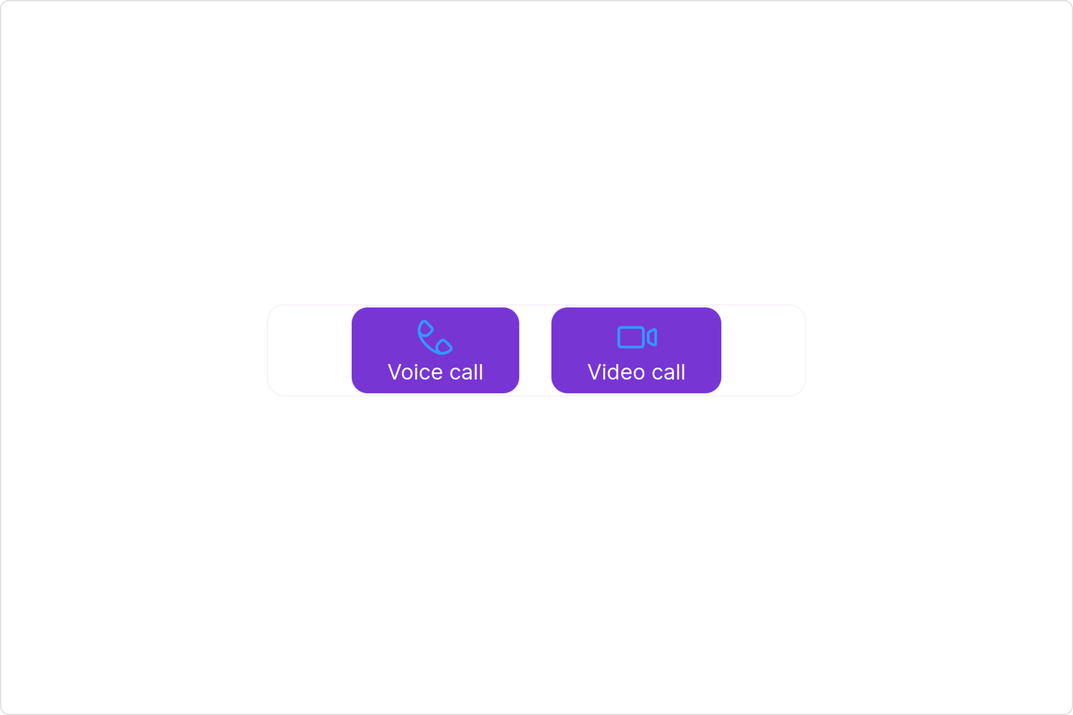
To fit your app’s design requirements, you can customize the appearance of the Call Buttons component. We provide exposed methods that allow you to modify the experience and behavior according to your specific needs.Style
Using Style you can customize the look and feel of the component in your app, These parameters typically control elements such as the color, size, shape, and fonts used within the component.1. CallButtons Style
To customize the appearance, you can assign aCallButtonsStyle object to the Call Buttons component.
callButtonsStyle.
- app.component.ts
- app.component.html
The following properties are exposed by
CallButtonsStyle:
| Property | Description | Code |
|---|---|---|
| border | Used to set border | border?: string, |
| borderRadius | Used to set border radius | borderRadius?: string; |
| background | Used to set background colour | background?: string; |
| height | Used to set height | height?: string; |
| width | Used to set width | width?: string; |
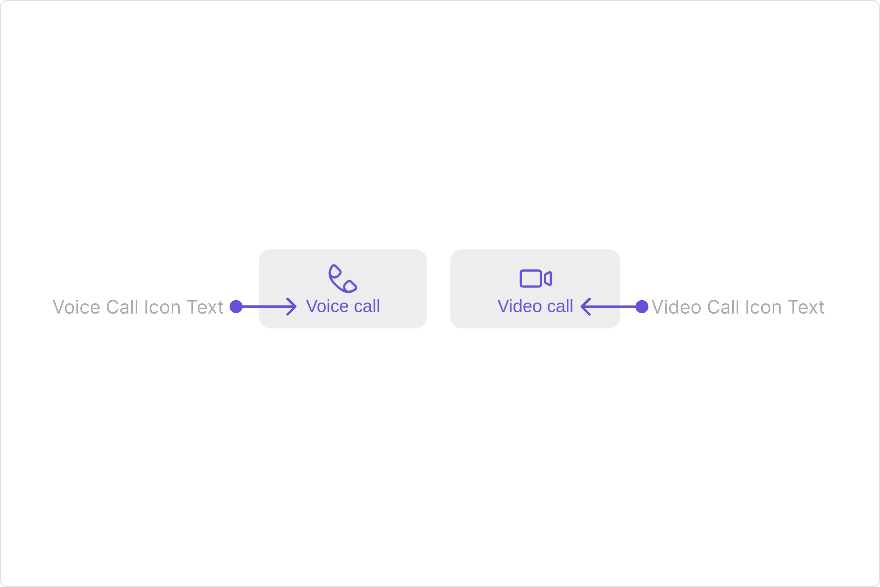
| voiceCallIconTint | Used to set voice call icon tint | voiceCallIconTint?: string, |
| videoCallIconTint | Used to set video call icon tint | videoCallIconTint?: string; |
| voiceCallIconTextFont | Used to set voice call icon text font | voiceCallIconTextFont?: string; |
| videoCallIconTextFont | Used to set video call icon text font | videoCallIconTextFont?: string; |
| voiceCallIconTextColor | Used to set voice call icon text color | voiceCallIconTextColor?: string; |
| videoCallIconTextColor | Used to set video call icon text color | videoCallIconTextColor?: string; |
| buttonBackground | Used to set button background color | buttonBackground?: string; |
| buttonBorder | Used to set button border | buttonBorder?: string; |
| buttonBorderRadius | Used to set button border radius | buttonBorderRadius?: string; |
| buttonPadding | Used to set button padding | buttonPadding?: string; |
Functionality
These are a set of small functional customizations that allow you to fine-tune the overall experience of the component. With these, you can change text, set custom icons, and toggle the visibility of UI elements. Here is a code snippet demonstrating how you can customize the functionality of theCall Buttons component.
- app.component.ts
- app.component.html
| Property | Description | Code |
|---|---|---|
| videoCallIconHoverText | Used to set the custom text or tooltip displayed on the video call button on mouse over. | [videoCallIconHoverText]="'Your Custom Video Call Icon Hover Text'" |
| voiceCallIconHoverText | Used to set the custom text or tooltip displayed on the voice call button on mouse over. | [voiceCallIconHoverText]="'Your Custom Voice Call Icon Hover text'" |
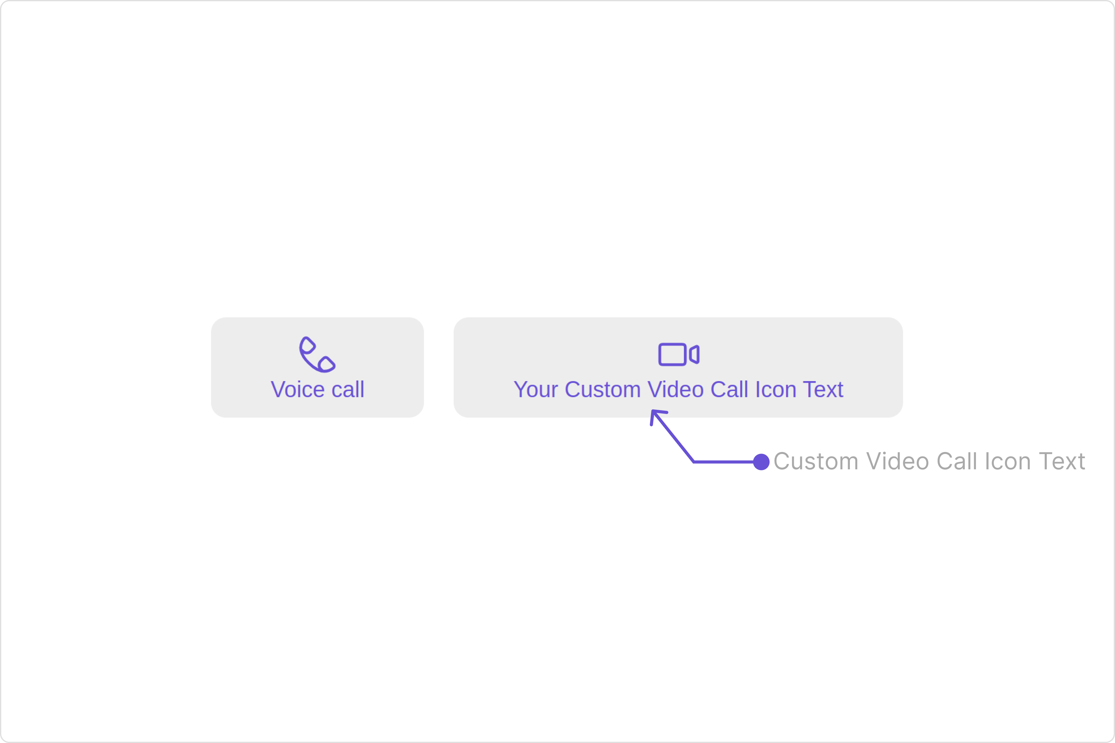
| videoCallIconText | Used to set custom video call icon text | [videoCallIconText]="'Your Custom Video Call Icon Text'" |
| voiceCallIconText | Used to set custom voice call icon text | [voiceCallIconText]="'Your Custom Voice Call Icon Text'" |
| videoCallIconURL | Used to set custom Icon for Video Call Button | [videoCallIconURL]="videoCallIconURL" |
| voiceCallIconURL | Used to set custom Icon for Voice Call Button | [videoCallIconURL]="videoCallIconURL" |
| group | Used to set the group object for Call Buttons | [group]="groupObject" |
| user | Sets the user object for Call Buttons | [user]="userObject" |
Advanced
For advanced-level customization, you can set custom views to the component. This lets you tailor each aspect of the component to fit your exact needs and application aesthetics. You can create and define your views, layouts, and UI elements and then incorporate those into the component. theCall Buttons component does not offer any advanced functionalities beyond this level of customization.
Configuration
Configurations offer the ability to customize the properties of each individual component within a Composite Component. The Call Buttons Component is a Composite Component and it has a specific set of configuration for each of its components.OngoingCall
If you want to customize the properties of the OngoingCall Component inside Call Buttons Component, you need use theCallScreenConfiguration object.
The OngoingCallConfiguration provides access to all the Action, Filters, Styles, Functionality, and Advanced properties of the OngoingCall component.
Please note that the Properties marked with the 🛑 symbol are not accessible within the Configuration Object.Example
ongoingCallConfiguration.
- app.component.ts
- app.component.html
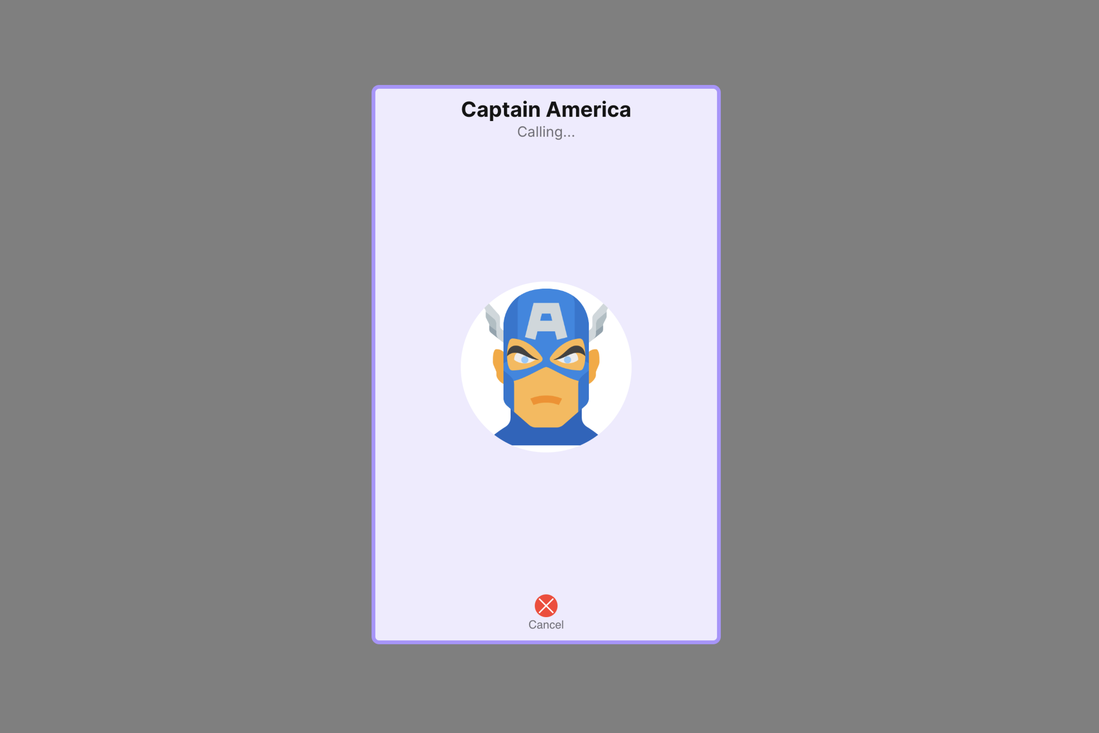
OutGoingCall
If you want to customize the properties of the OutGoingCall Component inside Call Buttons Component, you need use theOutGoingCallConfiguration object.
The OutGoingCallConfiguration provides access to all the Action, Filters, Styles, Functionality, and Advanced properties of the OutGoingCall component.
Please note that the Properties marked with the 🛑 symbol are not accessible within the Configuration Object.Example
OutGoingCallConfiguration.
- app.component.ts
- app.component.html