Add Members
Overview
CometChatAddMembers
is a Component that allows administrators or group owners to add new members to a specific group. It enables administrators or group owners to extend the membership of a group by adding new users to participate in the group's discussions and activities. By utilising this feature, administrators can manage group membership, and control access to group content.
The administrator can select the desired users to be added to the group. This can be done by searching for specific users, selecting from a list of available users. The selected users will receive notifications to join the group.
The Add Members component is composed of the following Components:
Components | Description |
---|---|
cometchat-button | This component represents a button with optional icon and text. |
CometChatUsers | This component the list of users |
Usage
Integration
The following code snippet illustrates how you can directly incorporate the Add Members component into your Application.
- app.module.ts
- app.component.ts
- app.component.html
import { CUSTOM_ELEMENTS_SCHEMA, NgModule } from "@angular/core";
import { BrowserModule } from "@angular/platform-browser";
import { CometChatAddMembers } from "@cometchat/chat-uikit-angular";
import { AppComponent } from "./app.component";
@NgModule({
imports: [BrowserModule, CometChatAddMembers],
declarations: [AppComponent],
providers: [],
bootstrap: [AppComponent],
schemas: [CUSTOM_ELEMENTS_SCHEMA],
})
export class AppModule {}
import { CometChat } from '@cometchat/chat-sdk-javascript';
import { Component, OnInit } from '@angular/core';
import { CometChatThemeService, CometChatUIKit } from '@cometchat/chat-uikit-angular';
import "@cometchat/uikit-elements";
@Component({
selector: 'app-root',
templateUrl: './app.component.html',
styleUrls: ['./app.component.css']
})
export class AppComponent {
public groupObject!: CometChat.Group;
ngOnInit(): void {
CometChat.getGroup("guid").then((group: CometChat.Group) => {
this.groupObject = group;
});
}
constructor(private themeService:CometChatThemeService) {
themeService.theme.palette.setMode("light")
themeService.theme.palette.setPrimary({ light: "#6851D6", dark: "#6851D6" })
}
onLogin(UID?: any) {
CometChatUIKit.login({ uid: UID }).then(
(user) => {
setTimeout(() => {
window.location.reload();
}, 1000);
},
(error) => {
console.log("Login failed with exception:", { error });
}
);
}
}
<div class="fullwidth">
<cometchat-add-members
*ngIf="groupObject"
[group]="groupObject"
></cometchat-add-members>
</div>
Actions
Actions dictate how a component functions. They are divided into two types: Predefined and User-defined. You can override either type, allowing you to tailor the behavior of the component to fit your specific needs.
1. onSelect
The onSelect
action is activated when you select the done icon while in selection mode. This returns a list of all the users that you have selected.
This action does not come with any predefined behavior. However, you have the flexibility to override this event and tailor it to suit your needs using the following code snippet.
- app.component.ts
- app.component.html
import { CometChat } from '@cometchat/chat-sdk-javascript';
import { Component, OnInit } from '@angular/core';
import { CometChatThemeService, CometChatUIKit } from '@cometchat/chat-uikit-angular';
import "@cometchat/uikit-elements";
@Component({
selector: 'app-root',
templateUrl: './app.component.html',
styleUrls: ['./app.component.css']
})
export class AppComponent {
public groupObject!: CometChat.Group;
ngOnInit(): void {
CometChat.getGroup("guid").then((group: CometChat.Group) => {
this.groupObject = group;
});
}
public handleOnSelect = (user: CometChat.User, selected: boolean): void => {
console.log("Custom on select action", user, selected);
};
constructor(private themeService:CometChatThemeService) {
themeService.theme.palette.setMode("light")
themeService.theme.palette.setPrimary({ light: "#6851D6", dark: "#6851D6" })
}
onLogin(UID?: any) {
CometChatUIKit.login({ uid: UID }).then(
(user) => {
setTimeout(() => {
window.location.reload();
}, 1000);
},
(error) => {
console.log("Login failed with exception:", { error });
}
);
}
}
<div class="fullwidth">
<cometchat-add-members
*ngIf="groupObject"
[group]="groupObject"
[onSelect]="handleOnSelect"
></cometchat-add-members>
</div>
2. onAddMembersButtonClick
The onAddMembersButtonClick
action is triggered when you click the add member button after choosing the users you wish to add in the group. By default, it returns the group GUID and an array of members to be added. However, you have the flexibility to override this event and tailor it to suit your needs using the following code snippet.
- app.component.ts
- app.component.html
import { CometChat } from '@cometchat/chat-sdk-javascript';
import { Component, OnInit } from '@angular/core';
import { CometChatThemeService, CometChatUIKit } from '@cometchat/chat-uikit-angular';
import "@cometchat/uikit-elements";
@Component({
selector: 'app-root',
templateUrl: './app.component.html',
styleUrls: ['./app.component.css']
})
export class AppComponent {
public groupObject!: CometChat.Group;
ngOnInit(): void {
CometChat.getGroup("guid").then((group: CometChat.Group) => {
this.groupObject = group;
});
}
public handleOnAddMembersButtonClick = (guid: string, members: CometChat.User[]) => {
console.log("youc custom on add members button click actions");
};
constructor(private themeService:CometChatThemeService) {
themeService.theme.palette.setMode("light")
themeService.theme.palette.setPrimary({ light: "#6851D6", dark: "#6851D6" })
}
onLogin(UID?: any) {
CometChatUIKit.login({ uid: UID }).then(
(user) => {
setTimeout(() => {
window.location.reload();
}, 1000);
},
(error) => {
console.log("Login failed with exception:", { error });
}
);
}
}
<div class="fullwidth">
<cometchat-add-members
*ngIf="groupObject"
[group]="groupObject"
[onAddMembersButtonClick]="handleOnAddMembersButtonClick"
></cometchat-add-members>
</div>
3. OnBack
OnBack
is triggered when you click on the back button of the Add Members component. You can override this action using the following code snippet.
- app.component.ts
- app.component.html
import { CometChat } from '@cometchat/chat-sdk-javascript';
import { Component, OnInit } from '@angular/core';
import { CometChatThemeService, CometChatUIKit } from '@cometchat/chat-uikit-angular';
import "@cometchat/uikit-elements";
@Component({
selector: 'app-root',
templateUrl: './app.component.html',
styleUrls: ['./app.component.css']
})
export class AppComponent {
public groupObject!: CometChat.Group;
ngOnInit(): void {
CometChat.getGroup("guid").then((group: CometChat.Group) => {
this.groupObject = group;
});
}
public handleOnBack = () => {
console.log("Your custom on back action");
}
constructor(private themeService:CometChatThemeService) {
themeService.theme.palette.setMode("light")
themeService.theme.palette.setPrimary({ light: "#6851D6", dark: "#6851D6" })
}
onLogin(UID?: any) {
CometChatUIKit.login({ uid: UID }).then(
(user) => {
setTimeout(() => {
window.location.reload();
}, 1000);
},
(error) => {
console.log("Login failed with exception:", { error });
}
);
}
}
<div class="fullwidth">
<cometchat-add-members
*ngIf="groupObject"
[group]="groupObject"
[onBack]="handleOnBack"
></cometchat-add-members>
</div>
4. onClose
onClose
is triggered when you click on the close button of the Add Members component. You can override this action using the following code snippet.
- app.component.ts
- app.component.html
import { CometChat } from '@cometchat/chat-sdk-javascript';
import { Component, OnInit } from '@angular/core';
import { CometChatThemeService, CometChatUIKit } from '@cometchat/chat-uikit-angular';
import "@cometchat/uikit-elements";
@Component({
selector: 'app-root',
templateUrl: './app.component.html',
styleUrls: ['./app.component.css']
})
export class AppComponent {
public groupObject!: CometChat.Group;
ngOnInit(): void {
CometChat.getGroup("guid").then((group: CometChat.Group) => {
this.groupObject = group;
});
}
public handleOnClose = () => {
console.log("Your custom on close actions");
}
constructor(private themeService:CometChatThemeService) {
themeService.theme.palette.setMode("light")
themeService.theme.palette.setPrimary({ light: "#6851D6", dark: "#6851D6" })
}
onLogin(UID?: any) {
CometChatUIKit.login({ uid: UID }).then(
(user) => {
setTimeout(() => {
window.location.reload();
}, 1000);
},
(error) => {
console.log("Login failed with exception:", { error });
}
);
}
}
<div class="fullwidth">
<cometchat-add-members
*ngIf="groupObject"
[group]="groupObject"
[onClose]="handleOnClose"
></cometchat-add-members>
</div>
5. onError
This action doesn't change the behavior of the component but rather listens for any errors that occur in the Add Members component.
- app.component.ts
- app.component.html
import { CometChat } from '@cometchat/chat-sdk-javascript';
import { Component, OnInit } from '@angular/core';
import { CometChatThemeService, CometChatUIKit } from '@cometchat/chat-uikit-angular';
import "@cometchat/uikit-elements";
@Component({
selector: 'app-root',
templateUrl: './app.component.html',
styleUrls: ['./app.component.css']
})
export class AppComponent {
public groupObject!: CometChat.Group;
ngOnInit(): void {
CometChat.getGroup("guid").then((group: CometChat.Group) => {
this.groupObject = group;
});
}
public handleOnError = (error: CometChat.CometChatException) => {
console.log("your custom on error action", error);
};
constructor(private themeService:CometChatThemeService) {
themeService.theme.palette.setMode("light")
themeService.theme.palette.setPrimary({ light: "#6851D6", dark: "#6851D6" })
}
onLogin(UID?: any) {
CometChatUIKit.login({ uid: UID }).then(
(user) => {
setTimeout(() => {
window.location.reload();
}, 1000);
},
(error) => {
console.log("Login failed with exception:", { error });
}
);
}
}
<div class="fullwidth">
<cometchat-add-members
*ngIf="groupObject"
[group]="groupObject"
[onError]="handleOnError"
></cometchat-add-members>
</div>
Filters
Filters allow you to customize the data displayed in a list within a Component. You can filter the list based on your specific criteria, allowing for a more customized. Filters can be applied using RequestBuilders of Chat SDK.
1. UsersRequestBuilder
The UsersRequestBuilder enables you to filter and customize the users list based on available parameters in UsersRequestBuilder. This feature allows you to create more specific and targeted queries when fetching users. The following are the parameters available in UsersRequestBuilder
Methods | Type | Description |
---|---|---|
setLimit | number | sets the number of users that can be fetched in a single request, suitable for pagination |
setSearchKeyword | String | used for fetching users matching the passed string |
hideBlockedUsers | boolean | used for fetching all those users who are not blocked by the logged in user |
friendsOnly | boolean | used for fetching only those users in which logged in user is a member |
setRoles | List<String> | used for fetching users containing the passed tags |
setTags | List<String> | used for fetching users containing the passed tags |
withTags | boolean | used for fetching users containing tags |
setStatus | String | used for fetching users by their status online or offline |
setUIDs | List<String> | used for fetching users containing the passed users |
Example
In the example below, we are applying a filter to the UserList by setting the limit to eight and sorting the lists by their name.
- app.component.ts
- app.component.html
import { CometChat } from '@cometchat/chat-sdk-javascript';
import { Component, OnInit } from '@angular/core';
import { CometChatThemeService, CometChatUIKit } from '@cometchat/chat-uikit-angular';
import "@cometchat/uikit-elements";
@Component({
selector: 'app-root',
templateUrl: './app.component.html',
styleUrls: ['./app.component.css']
})
export class AppComponent {
public groupObject!: CometChat.Group;
ngOnInit(): void {
CometChat.getGroup("guid").then((group: CometChat.Group) => {
this.groupObject = group;
});
}
usersRequestBuilder = new CometChat.UsersRequestBuilder().setLimit(8).sortBy("name");
constructor(private themeService:CometChatThemeService) {
themeService.theme.palette.setMode("light")
themeService.theme.palette.setPrimary({ light: "#6851D6", dark: "#6851D6" })
}
onLogin(UID?: any) {
CometChatUIKit.login({ uid: UID }).then(
(user) => {
setTimeout(() => {
window.location.reload();
}, 1000);
},
(error) => {
console.log("Login failed with exception:", { error });
}
);
}
}
<div class="fullwidth">
<cometchat-add-members
*ngIf="groupObject"
[group]="groupObject"
[usersRequestBuilder]="usersRequestBuilder"
></cometchat-add-members>
</div>
2. SearchRequestBuilder
The SearchRequestBuilder uses UserRequestBuilder enables you to filter and customize the search list based on available parameters in UserRequestBuilder. This feature allows you to keep uniformity between the displayed UserList and searched UserList.
Example
- app.component.ts
- app.component.html
import { CometChat } from '@cometchat/chat-sdk-javascript';
import { Component, OnInit } from '@angular/core';
import { CometChatThemeService, CometChatUIKit } from '@cometchat/chat-uikit-angular';
import "@cometchat/uikit-elements";
@Component({
selector: 'app-root',
templateUrl: './app.component.html',
styleUrls: ['./app.component.css']
})
export class AppComponent {
public groupObject!: CometChat.Group;
ngOnInit(): void {
CometChat.getGroup("guid").then((group: CometChat.Group) => {
this.groupObject = group;
});
}
searchRequestBuilder = new CometChat.UsersRequestBuilder().setLimit(8).setSearchKeyword("**")
constructor(private themeService:CometChatThemeService) {
themeService.theme.palette.setMode("light")
themeService.theme.palette.setPrimary({ light: "#6851D6", dark: "#6851D6" })
}
onLogin(UID?: any) {
CometChatUIKit.login({ uid: UID }).then(
(user) => {
setTimeout(() => {
window.location.reload();
}, 1000);
},
(error) => {
console.log("Login failed with exception:", { error });
}
);
}
}
<div class="fullwidth">
<cometchat-add-members
*ngIf="groupObject"
[group]="groupObject"
[searchRequestBuilder]="searchRequestBuilder"
></cometchat-add-members>
</div>
Events
Events are emitted by a Component
. By using event you can extend existing functionality. Being global events, they can be applied in Multiple Locations and are capable of being Added or Removed.
Events emitted by the Add Members component is as follows.
Event | Description |
---|---|
ccGroupMemberAdded | Triggers when a user added to a group successfully |
- TypeScript
import {CometChatGroupEvents} from "@cometchat/chat-uikit-angular";
this.ccGroupMemberAdded = CometChatGroupEvents.ccGroupMemberAdded.subscribe(
(item: IGroupMemberAdded) => {
// Your Code
}
);
Removing CometChatGroupEvents
Listener's
- TypeScript
this.ccGroupMemberAdded.unsubscribe();
Customization
To fit your app's design requirements, you can customize the appearance of the Add Members component. We provide exposed methods that allow you to modify the experience and behavior according to your specific needs.
Style
Using Style you can customize the look and feel of the component in your app, These parameters typically control elements such as the color, size, shape, and fonts used within the component.
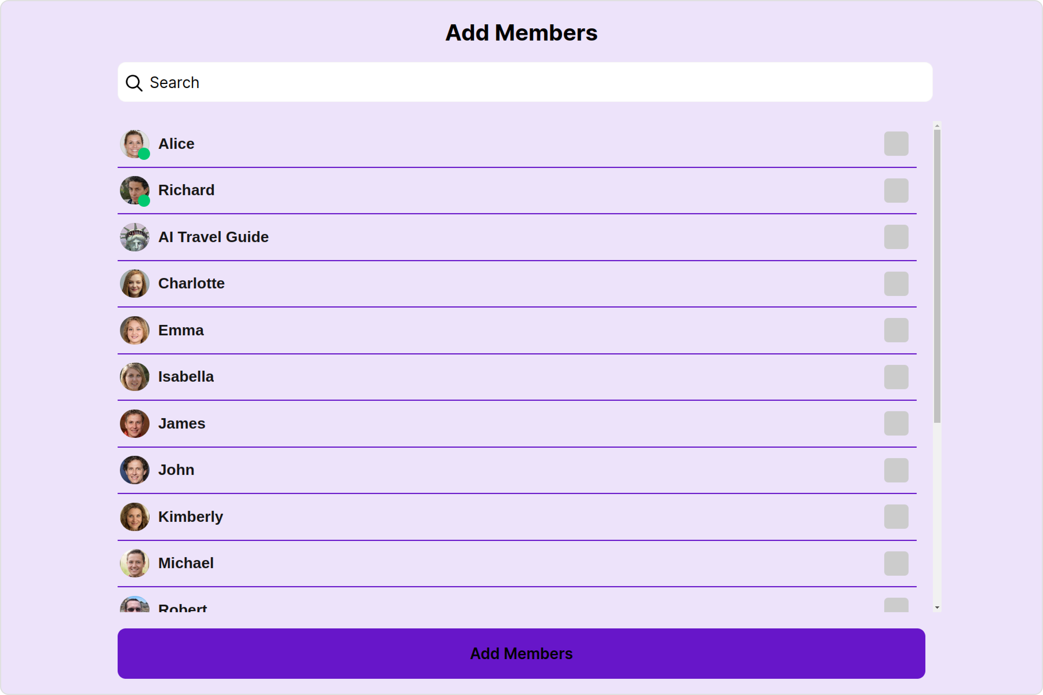
1. AddMembers Style
You can set the AddMembersStyle
to the Add Members Component to customize the styling.
- app.component.ts
- app.component.html
import { CometChat } from '@cometchat/chat-sdk-javascript';
import { Component, OnInit } from '@angular/core';
import { CometChatThemeService, CometChatUIKit } from '@cometchat/chat-uikit-angular';
import { AddMembersStyle } from '@cometchat/uikit-shared';
import "@cometchat/uikit-elements";
@Component({
selector: 'app-root',
templateUrl: './app.component.html',
styleUrls: ['./app.component.css']
})
export class AppComponent {
public groupObject!: CometChat.Group;
ngOnInit(): void {
CometChat.getGroup("guid").then((group: CometChat.Group) => {
this.groupObject = group;
});
}
addMembersStyle = new AddMembersStyle({
addMembersButtonBackground: "#6716c9",
addMembersButtonTextColor: "#ffffff",
background: "#d6b9fa",
searchBackground: "#6716c9",
searchPlaceholderTextColor: "#ffffff",
titleTextColor: "#ffffff",
searchIconTint: "#ffffff",
separatorColor: "#6716c9",
sectionHeaderTextColor: "#ffffff",
});
constructor(private themeService:CometChatThemeService) {
themeService.theme.palette.setMode("light")
themeService.theme.palette.setPrimary({ light: "#6851D6", dark: "#6851D6" })
}
onLogin(UID?: any) {
CometChatUIKit.login({ uid: UID }).then(
(user) => {
setTimeout(() => {
window.location.reload();
}, 1000);
},
(error) => {
console.log("Login failed with exception:", { error });
}
);
}
}
<div class="fullwidth">
<cometchat-add-members
*ngIf="groupObject"
[group]="groupObject"
[addMembersStyle]="addMembersStyle"
></cometchat-add-members>
</div>
List of properties exposed by AddMembersStyle:
Property | Description | Code |
---|---|---|
border | Used to set border | border?: string, |
borderRadius | Used to set border radius | borderRadius?: string; |
background | Used to set background colour | background?: string; |
height | Used to set height | height?: string; |
width | Used to set width | width?: string; |
titleTextFont | Used to set title text font | titleTextFont?: string, |
titleTextColor | Used to set title text color | titleTextColor?: string; |
searchPlaceholderTextFont | Used to set search placeholder font | searchPlaceholderTextFont?: string; |
searchPlaceholderTextColor | Used to set search placeholder color | searchPlaceholderTextColor?: string; |
searchTextFont | Used to set search text font | searchTextFont?: string; |
searchTextColor | Used to set search text color | searchTextColor?: string; |
emptyStateTextFont | Used to set empty state text font | emptyStateTextFont?: string; |
emptyStateTextColor | Used to set empty state text color | emptyStateTextColor?: string; |
errorStateTextFont | Used to set error state text font | errorStateTextFont?: string; |
errorStateTextColor | Used to set error state text color | errorStateTextColor?: string; |
loadingIconTint | Used to set loading icon tint | loadingIconTint?: string; |
searchIconTint | Used to set search icon tint | searchIconTint?: string; |
searchBorder | Used to set search border | searchBorder?: string; |
searchBorderRadius | Used to set search border radius | searchBorderRadius?: string; |
searchBackground | Used to set search background color | searchBackground?: string; |
onlineStatusColor | Used to set online status color | onlineStatusColor?: string; |
separatorColor | Used to set separator color | separatorColor?: string; |
sectionHeaderTextFont | Used to set section header text font | sectionHeaderTextFont?: string; |
sectionHeaderTextColor | Used to set section header text color | sectionHeaderTextColor?: string; |
boxShadow | Used to set box shadow | boxShadow?: string; |
backButtonIconTint | Used to set back button icon tint | backButtonIconTint?: string; |
closeButtonIconTint | Used to set close button icon tint | closeButtonIconTint?: string; |
addMembersButtonBackground | Used to set add members button background color | addMembersButtonBackground?: string; |
addMembersButtonTextColor | Used to set add members button text color | addMembersButtonTextColor?: string; |
addMembersButtonTextFont | Used to set add members button text font | addMembersButtonTextFont?: string; |
padding | Used to set padding | padding?: string; |
2. Avatar Style
To apply customized styles to the Avatar
component in the Add Members Component, you can use the following code snippet. For further insights on Avatar
Styles refer
- app.component.ts
- app.component.html
import { CometChat } from '@cometchat/chat-sdk-javascript';
import { Component, OnInit } from '@angular/core';
import { CometChatThemeService, CometChatUIKit, AvatarStyle } from '@cometchat/chat-uikit-angular';
import "@cometchat/uikit-elements";
@Component({
selector: 'app-root',
templateUrl: './app.component.html',
styleUrls: ['./app.component.css']
})
export class AppComponent {
public groupObject!: CometChat.Group;
ngOnInit(): void {
CometChat.getGroup("guid").then((group: CometChat.Group) => {
this.groupObject = group;
});
}
avatarStyle = new AvatarStyle({
backgroundColor: "#cdc2ff",
border: "2px solid #6745ff",
borderRadius: "10px",
outerViewBorderColor: "#ca45ff",
outerViewBorderRadius: "5px",
nameTextColor: "#4554ff"
});
constructor(private themeService:CometChatThemeService) {
themeService.theme.palette.setMode("light")
themeService.theme.palette.setPrimary({ light: "#6851D6", dark: "#6851D6" })
}
onLogin(UID?: any) {
CometChatUIKit.login({ uid: UID }).then(
(user) => {
setTimeout(() => {
window.location.reload();
}, 1000);
},
(error) => {
console.log("Login failed with exception:", { error });
}
);
}
}
<div class="fullwidth">
<cometchat-add-members
*ngIf="groupObject"
[group]="groupObject"
[avatarStyle]="avatarStyle"
></cometchat-add-members>
</div>
3. LisItem Style
To apply customized styles to the List Item
component in the Add Members
Component, you can use the following code snippet. For further insights on List Item
Styles refer
- app.component.ts
- app.component.html
import { CometChat } from '@cometchat/chat-sdk-javascript';
import { Component, OnInit } from '@angular/core';
import { CometChatThemeService, CometChatUIKit, ListItemStyle } from '@cometchat/chat-uikit-angular';
import "@cometchat/uikit-elements";
@Component({
selector: 'app-root',
templateUrl: './app.component.html',
styleUrls: ['./app.component.css']
})
export class AppComponent {
public groupObject!: CometChat.Group;
ngOnInit(): void {
CometChat.getGroup("guid").then((group: CometChat.Group) => {
this.groupObject = group;
});
}
listItemStyle: ListItemStyle = new ListItemStyle({
background: "transparent",
padding: "5px",
border: "1px solid #e9b8f5",
titleColor: "#8830f2",
borderRadius: "20px",
width: "100% !important"
});
constructor(private themeService:CometChatThemeService) {
themeService.theme.palette.setMode("light")
themeService.theme.palette.setPrimary({ light: "#6851D6", dark: "#6851D6" })
}
onLogin(UID?: any) {
CometChatUIKit.login({ uid: UID }).then(
(user) => {
setTimeout(() => {
window.location.reload();
}, 1000);
},
(error) => {
console.log("Login failed with exception:", { error });
}
);
}
}
<div class="fullwidth">
<cometchat-add-members
*ngIf="groupObject"
[group]="groupObject"
[listItemStyle]="listItemStyle"
></cometchat-add-members>
</div>
4. StatusIndicator Style
To apply customized styles to the Status Indicator component in the Add Members Component, You can use the following code snippet. For further insights on Status Indicator Styles refer
- app.component.ts
- app.component.html
import { CometChat } from '@cometchat/chat-sdk-javascript';
import { Component, OnInit } from '@angular/core';
import { CometChatThemeService, CometChatUIKit } from '@cometchat/chat-uikit-angular';
import "@cometchat/uikit-elements";
@Component({
selector: 'app-root',
templateUrl: './app.component.html',
styleUrls: ['./app.component.css']
})
export class AppComponent {
public groupObject!: CometChat.Group;
ngOnInit(): void {
CometChat.getGroup("guid").then((group: CometChat.Group) => {
this.groupObject = group;
});
}
statusIndicatorStyle: any = ({
height: '20px',
width: '20px',
backgroundColor: 'red'
});
constructor(private themeService:CometChatThemeService) {
themeService.theme.palette.setMode("light")
themeService.theme.palette.setPrimary({ light: "#6851D6", dark: "#6851D6" })
}
onLogin(UID?: any) {
CometChatUIKit.login({ uid: UID }).then(
(user) => {
setTimeout(() => {
window.location.reload();
}, 1000);
},
(error) => {
console.log("Login failed with exception:", { error });
}
);
}
}
<div class="fullwidth">
<cometchat-add-members
*ngIf="groupObject"
[group]="groupObject"
[StatusIndicatorStyle]="statusIndicatorStyle"
></cometchat-add-members>
</div>
Functionality
These are a set of small functional customizations that allow you to fine-tune the overall experience of the component. With these, you can change text, set custom icons, and toggle the visibility of UI elements.
- app.component.ts
- app.component.html
import { CometChat } from '@cometchat/chat-sdk-javascript';
import { Component, OnInit } from '@angular/core';
import { CometChatThemeService, CometChatUIKit } from '@cometchat/chat-uikit-angular';
import { TitleAlignment } from '@cometchat/uikit-resources';
import "@cometchat/uikit-elements";
@Component({
selector: 'app-root',
templateUrl: './app.component.html',
styleUrls: ['./app.component.css']
})
export class AppComponent {
public groupObject!: CometChat.Group;
ngOnInit(): void {
CometChat.getGroup("guid").then((group: CometChat.Group) => {
this.groupObject = group;
});
}
titleAlignment = TitleAlignment.left;
constructor(private themeService:CometChatThemeService) {
themeService.theme.palette.setMode("light")
themeService.theme.palette.setPrimary({ light: "#6851D6", dark: "#6851D6" })
}
onLogin(UID?: any) {
CometChatUIKit.login({ uid: UID }).then(
(user) => {
setTimeout(() => {
window.location.reload();
}, 1000);
},
(error) => {
console.log("Login failed with exception:", { error });
}
);
}
}
<div class="fullwidth">
<cometchat-add-members
*ngIf="groupObject"
[group]="groupObject"
[title]="'Your Custom Title'"
[buttonText]="'Your Custom Button Text'"
[titleAlignment]="titleAlignment"
></cometchat-add-members>
</div>
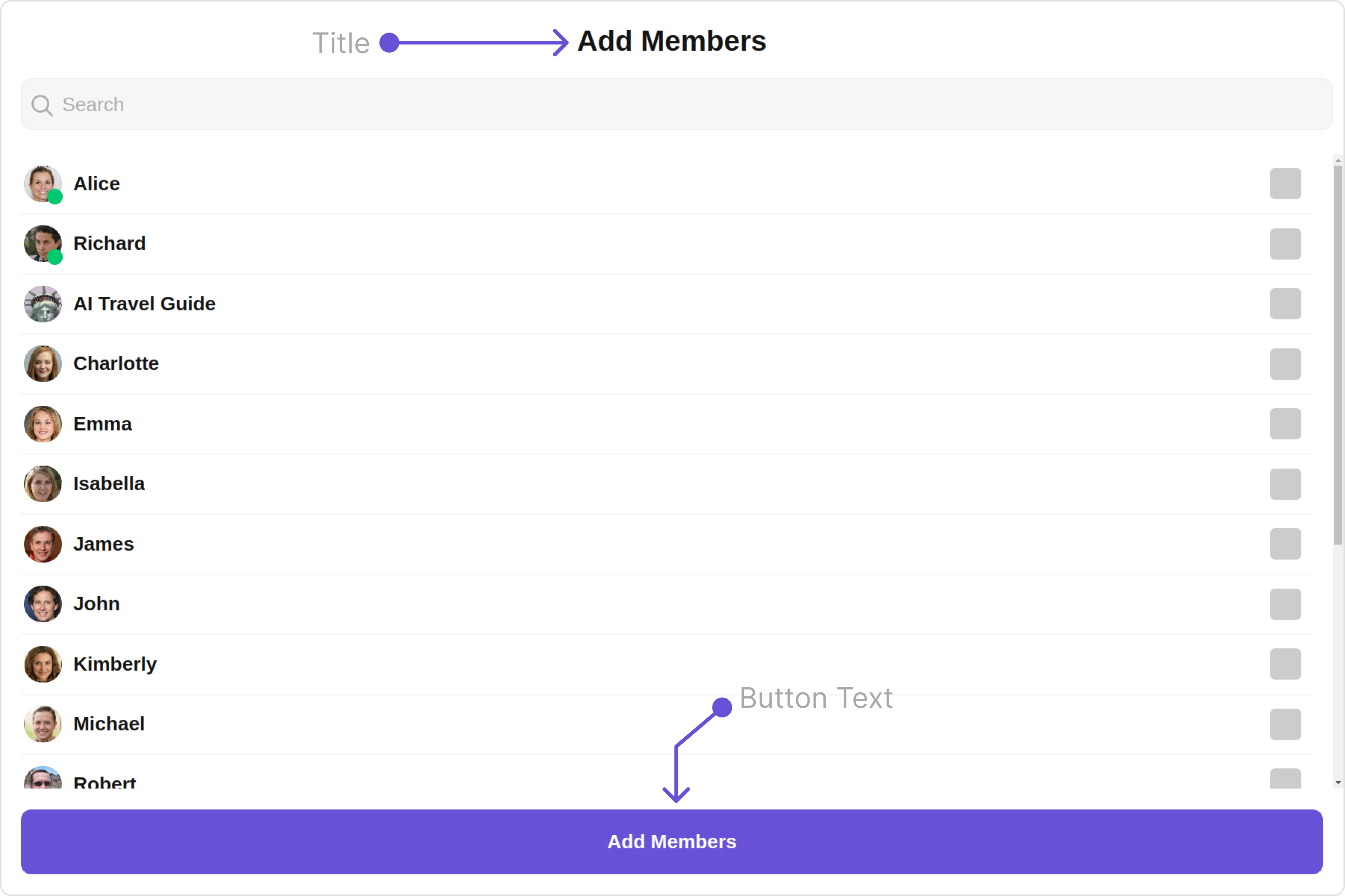
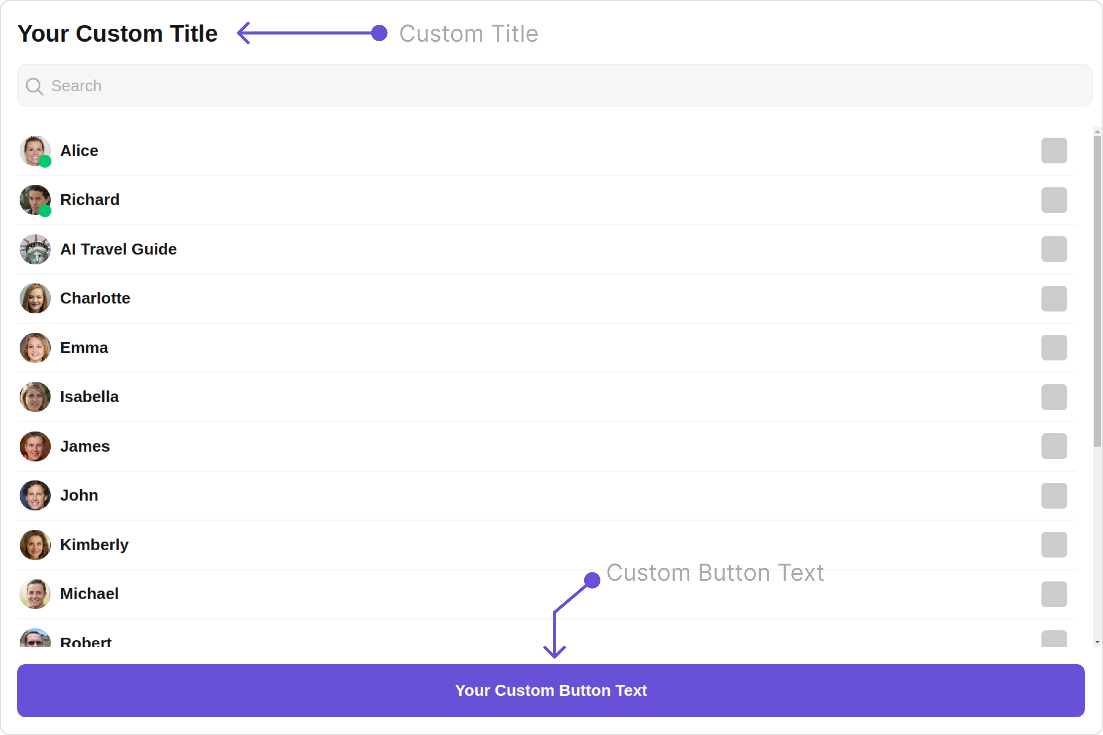
Default:
Custom:
Below is a list of customizations along with corresponding code snippets
Advance
For advanced-level customization, you can set custom views to the component. This lets you tailor each aspect of the component to fit your exact needs and application aesthetics. You can create and define your views, layouts, and UI elements and then incorporate those into the component.
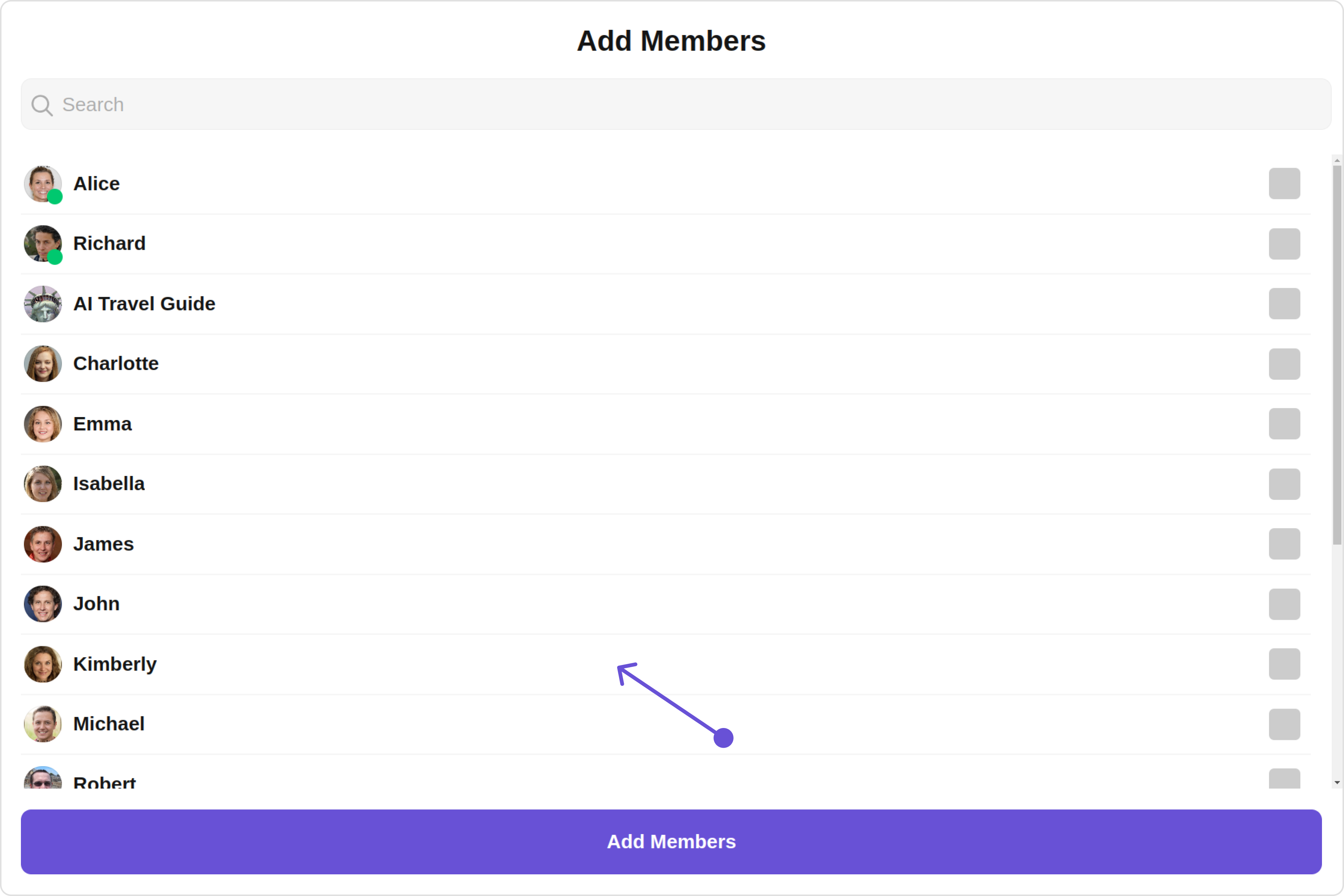
ListItemView
With this property, you can assign a custom ListItem to the Add Members Component.
Example
Default:
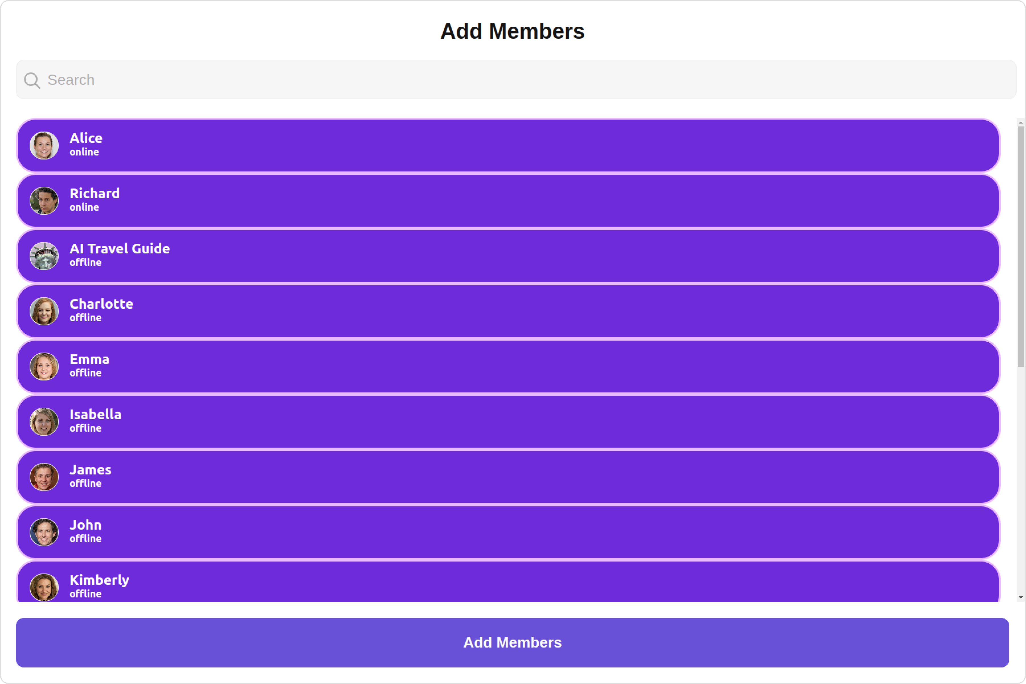
Custom:
- app.component.ts
- app.component.html
import { CometChat } from '@cometchat/chat-sdk-javascript';
import { Component, OnInit } from '@angular/core';
import { CometChatThemeService, CometChatUIKit } from '@cometchat/chat-uikit-angular';
import "@cometchat/uikit-elements";
@Component({
selector: 'app-root',
templateUrl: './app.component.html',
styleUrls: ['./app.component.css']
})
export class AppComponent {
public groupObject!: CometChat.Group;
ngOnInit(): void {
CometChat.getGroup("guid").then((group: CometChat.Group) => {
this.groupObject = group;
});
}
constructor(private themeService:CometChatThemeService) {
themeService.theme.palette.setMode("light")
themeService.theme.palette.setPrimary({ light: "#6851D6", dark: "#6851D6" })
}
onLogin(UID?: any) {
CometChatUIKit.login({ uid: UID }).then(
(user) => {
setTimeout(() => {
window.location.reload();
}, 1000);
},
(error) => {
console.log("Login failed with exception:", { error });
}
);
}
}
<div class="fullwidth">
<cometchat-add-members
*ngIf="groupObject"
[group]="groupObject"
[listItemView]="listItemViewTemplate"
></cometchat-add-members>
</div>
<ng-template #listItemViewTemplate let-user>
<div
[ngStyle]="{
display: 'flex',
alignItems: 'left',
padding: '10px',
border: '2px solid #e9baff',
borderRadius: '20px',
background: '#ffffff'
}"
>
<cometchat-avatar
[image]="user.getAvatar()"
[name]="user.getName()"
></cometchat-avatar>
<div [ngStyle]="{ display: 'flex', paddingLeft: '10px' }">
<div
[ngStyle]="{
fontWeight: 'bold',
color: '#937aff',
fontSize: '14px',
marginTop: '5px'
}"
>
{{ user.getName() }}
<div
[ngStyle]="{
color: '#cfc4ff',
fontSize: '10px',
textAlign: 'left'
}"
>
{{ user.getStatus() }}
</div>
</div>
</div>
</div>
</ng-template>
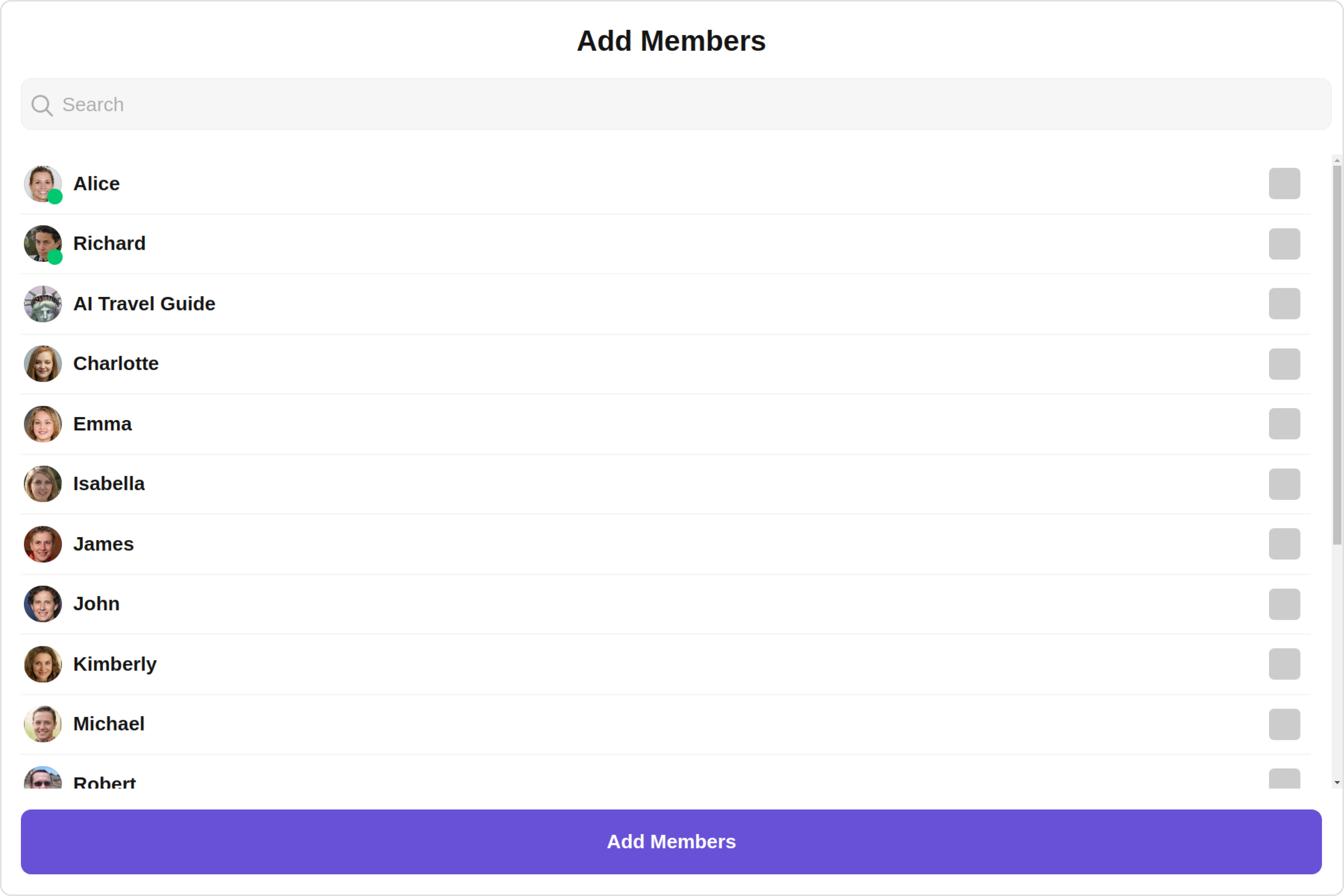
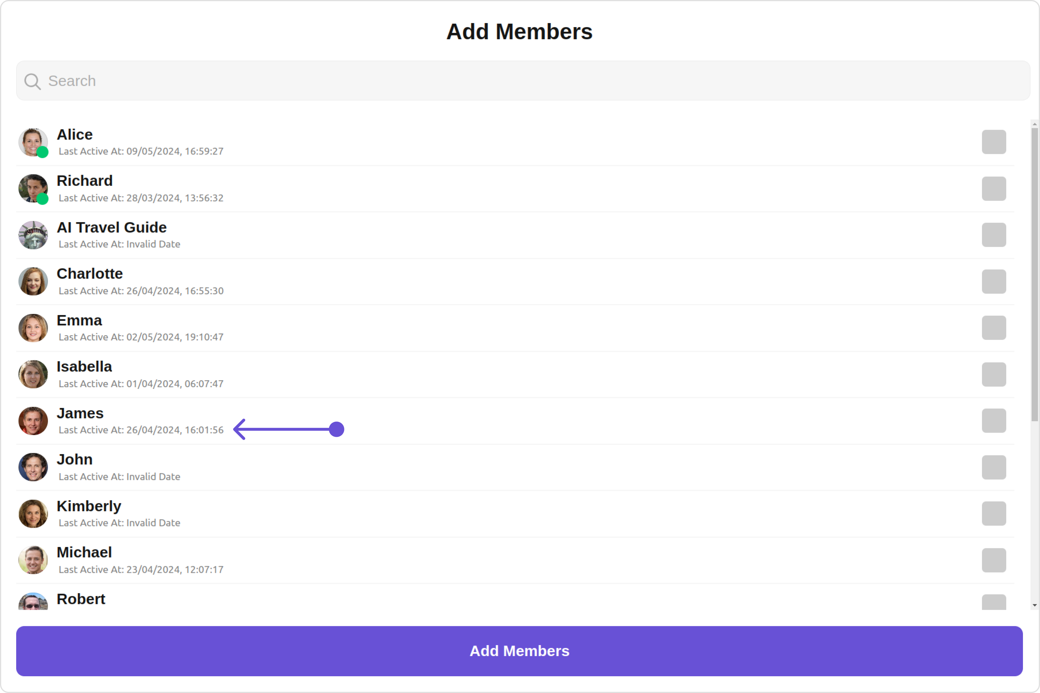
SubtitleView
You can customize the subtitle view for each users to meet your requirements
Default:
Custom:
- app.component.ts
- app.component.html
import { CometChat } from '@cometchat/chat-sdk-javascript';
import { Component, OnInit } from '@angular/core';
import { CometChatThemeService, CometChatUIKit } from '@cometchat/chat-uikit-angular';
import "@cometchat/uikit-elements";
@Component({
selector: 'app-root',
templateUrl: './app.component.html',
styleUrls: ['./app.component.css']
})
export class AppComponent {
public groupObject!: CometChat.Group;
ngOnInit(): void {
CometChat.getGroup("guid").then((group: CometChat.Group) => {
this.groupObject = group;
});
}
constructor(private themeService:CometChatThemeService) {
themeService.theme.palette.setMode("light")
themeService.theme.palette.setPrimary({ light: "#6851D6", dark: "#6851D6" })
}
onLogin(UID?: any) {
CometChatUIKit.login({ uid: UID }).then(
(user) => {
setTimeout(() => {
window.location.reload();
}, 1000);
},
(error) => {
console.log("Login failed with exception:", { error });
}
);
}
}
<div class="fullwidth">
<cometchat-add-members
*ngIf="groupObject"
[group]="groupObject"
[subtitleView]="subtitleTemplate"
></cometchat-add-members>
</div>
<ng-template #subtitleTemplate>
<div
style="display: flex; align-items: left; padding: 10px; font-size: 10px;"
>
your custom subtitle view
</div>
</ng-template>
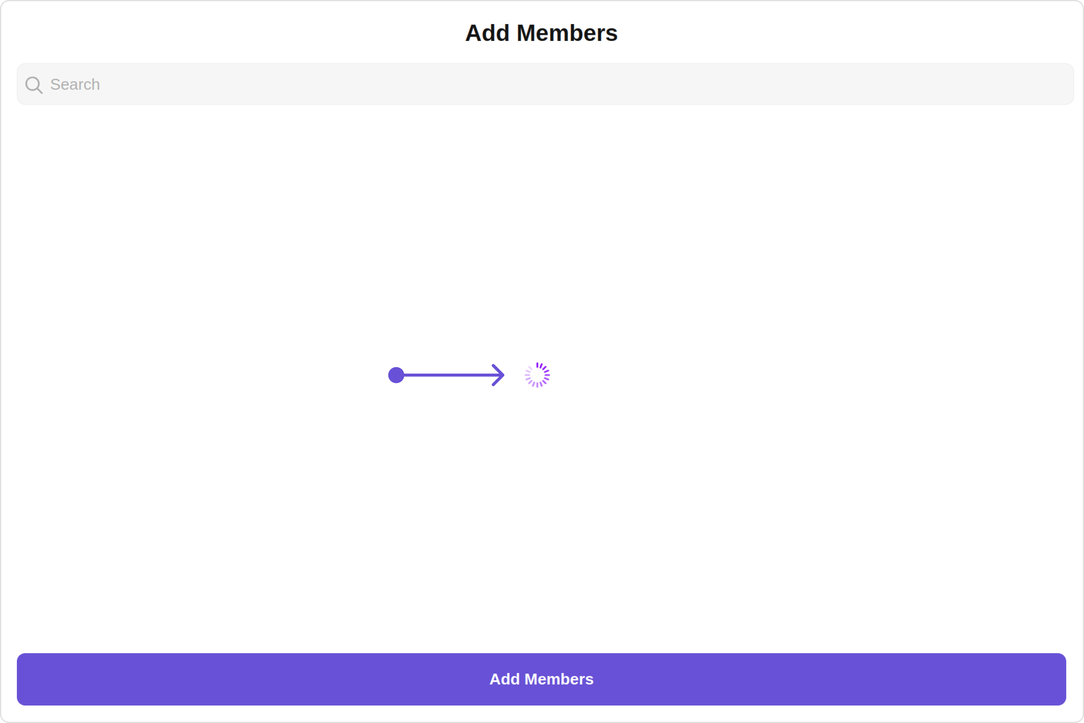
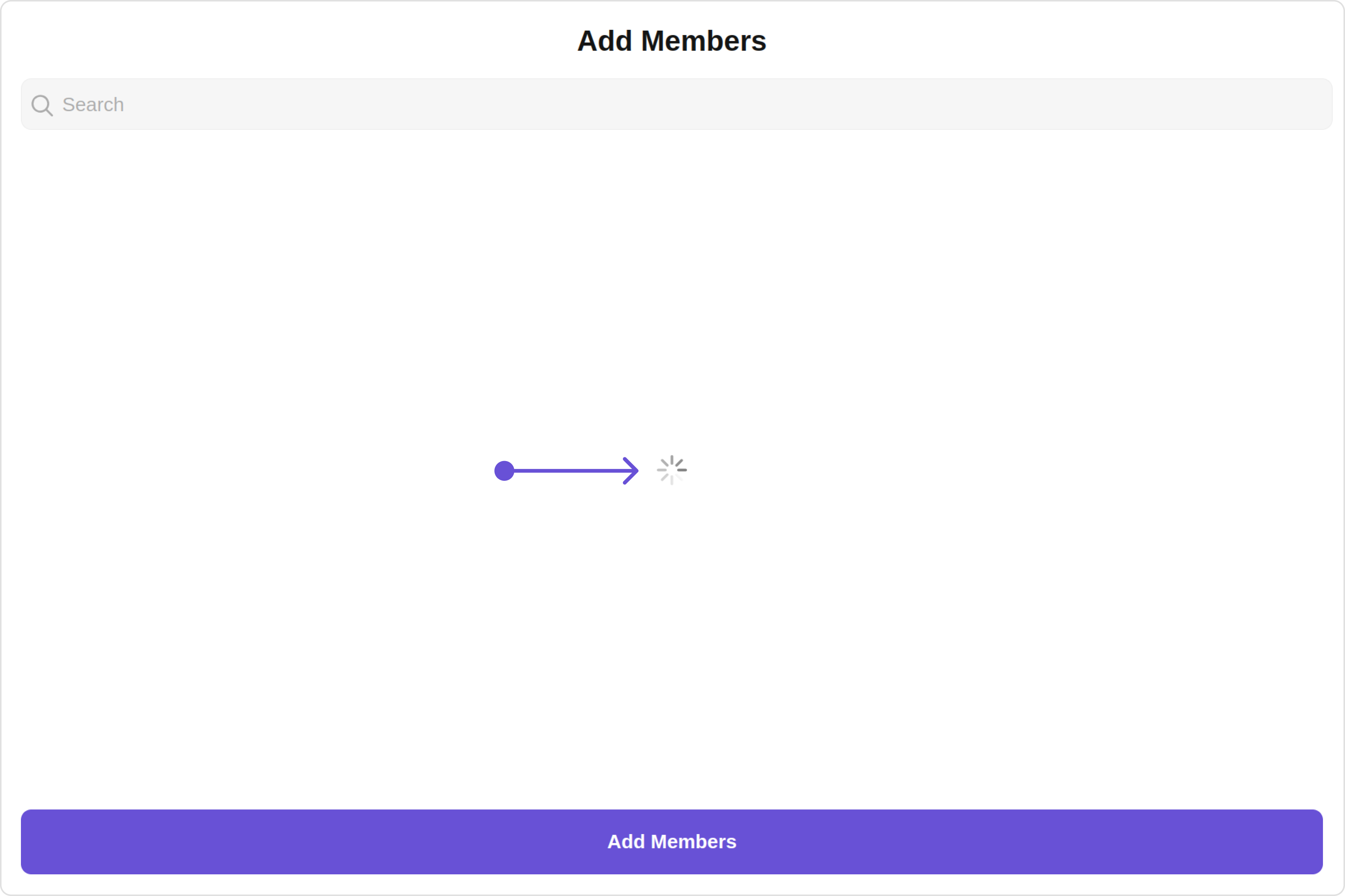
LoadingStateView
You can set a custom loader view using loadingStateView
to match the loading view of your app.
Default:
Custom:
- app.component.ts
- app.component.html
import { CometChat } from '@cometchat/chat-sdk-javascript';
import { Component, OnInit } from '@angular/core';
import { CometChatThemeService, CometChatUIKit, LoaderStyle } from '@cometchat/chat-uikit-angular';
import "@cometchat/uikit-elements";
@Component({
selector: 'app-root',
templateUrl: './app.component.html',
styleUrls: ['./app.component.css']
})
export class AppComponent {
public groupObject!: CometChat.Group;
ngOnInit(): void {
CometChat.getGroup("guid").then((group: CometChat.Group) => {
this.groupObject = group;
});
}
getLoaderStyle: LoaderStyle = new LoaderStyle({
iconTint: "red",
background: "transparent",
height: "20px",
width: "20px",
border: "none",
borderRadius: "0",
});
constructor(private themeService:CometChatThemeService) {
themeService.theme.palette.setMode("light")
themeService.theme.palette.setPrimary({ light: "#6851D6", dark: "#6851D6" })
}
onLogin(UID?: any) {
CometChatUIKit.login({ uid: UID }).then(
(user) => {
setTimeout(() => {
window.location.reload();
}, 1000);
},
(error) => {
console.log("Login failed with exception:", { error });
}
);
}
}
<div class="fullwidth">
<cometchat-add-members
*ngIf="groupObject"
[group]="groupObject"
[loadingStateView]="loadingStateView"
></cometchat-add-members>
</div>
<ng-template #loadingStateView>
<cometchat-loader
iconURL="icon"
[loaderStyle]="getLoaderStyle"
></cometchat-loader>
</ng-template>
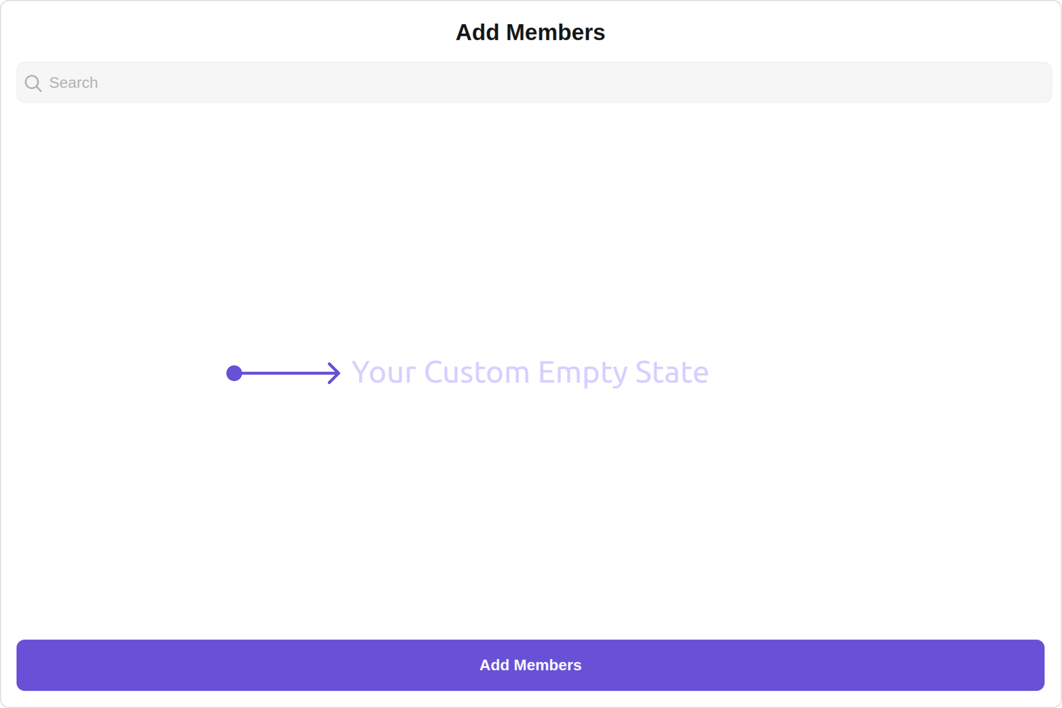
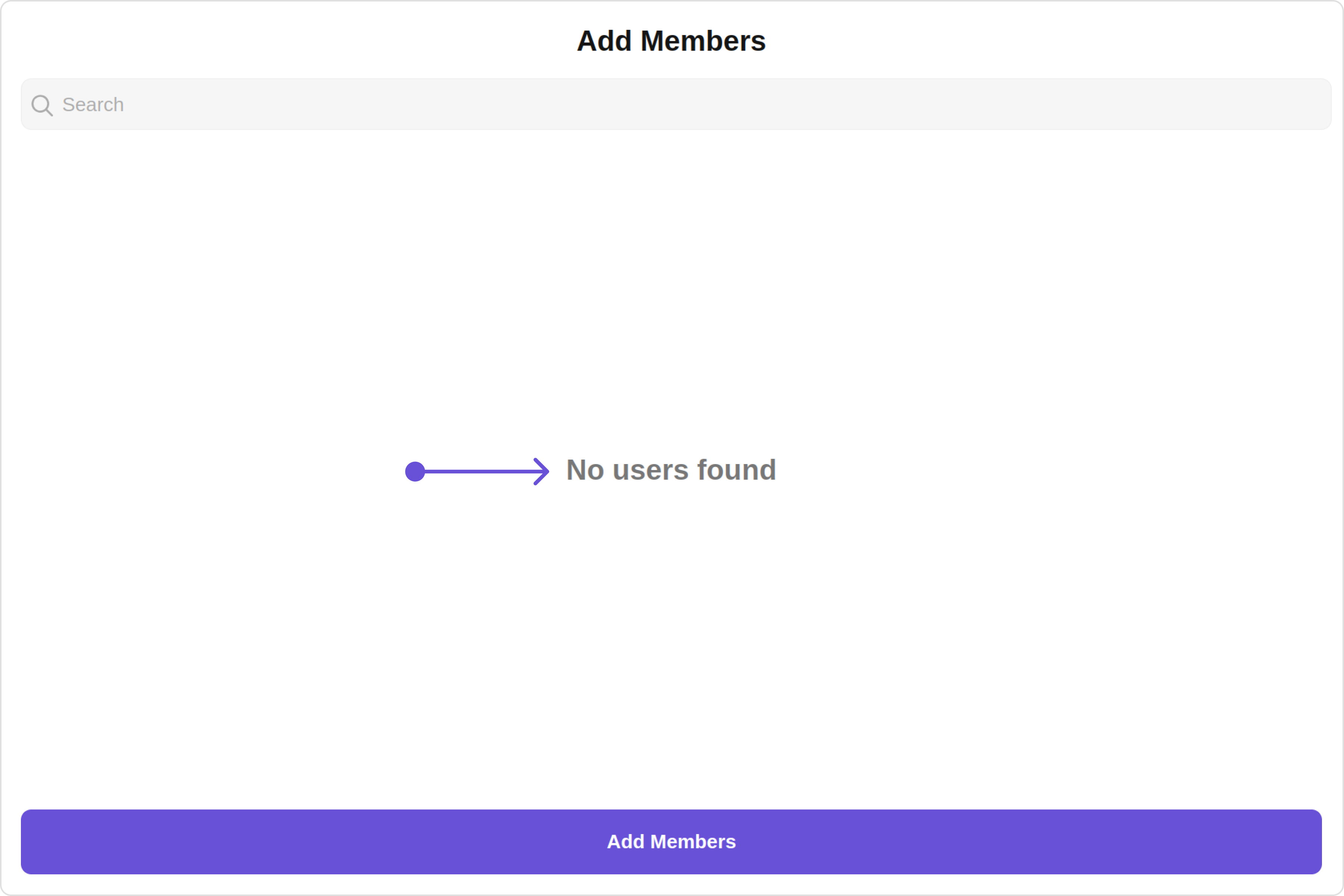
EmptyStateView
You can set a custom EmptyStateView
using emptyStateView
to match the empty view of your app.
Default:
Custom:
- app.component.ts
- app.component.html
import { CometChat } from '@cometchat/chat-sdk-javascript';
import { Component, OnInit } from '@angular/core';
import { CometChatThemeService, CometChatUIKit } from '@cometchat/chat-uikit-angular';
import "@cometchat/uikit-elements";
@Component({
selector: 'app-root',
templateUrl: './app.component.html',
styleUrls: ['./app.component.css']
})
export class AppComponent {
public groupObject!: CometChat.Group;
ngOnInit(): void {
CometChat.getGroup("guid").then((group: CometChat.Group) => {
this.groupObject = group;
});
}
constructor(private themeService:CometChatThemeService) {
themeService.theme.palette.setMode("light")
themeService.theme.palette.setPrimary({ light: "#6851D6", dark: "#6851D6" })
}
onLogin(UID?: any) {
CometChatUIKit.login({ uid: UID }).then(
(user) => {
setTimeout(() => {
window.location.reload();
}, 1000);
},
(error) => {
console.log("Login failed with exception:", { error });
}
);
}
}
<div class="fullwidth">
<cometchat-add-members
*ngIf="groupObject"
[group]="groupObject"
[emptyStateView]="emptyStateView"
></cometchat-add-members>
</div>
<ng-template #emptyStateView>
<div>Your Custom Empty State</div>
</ng-template>
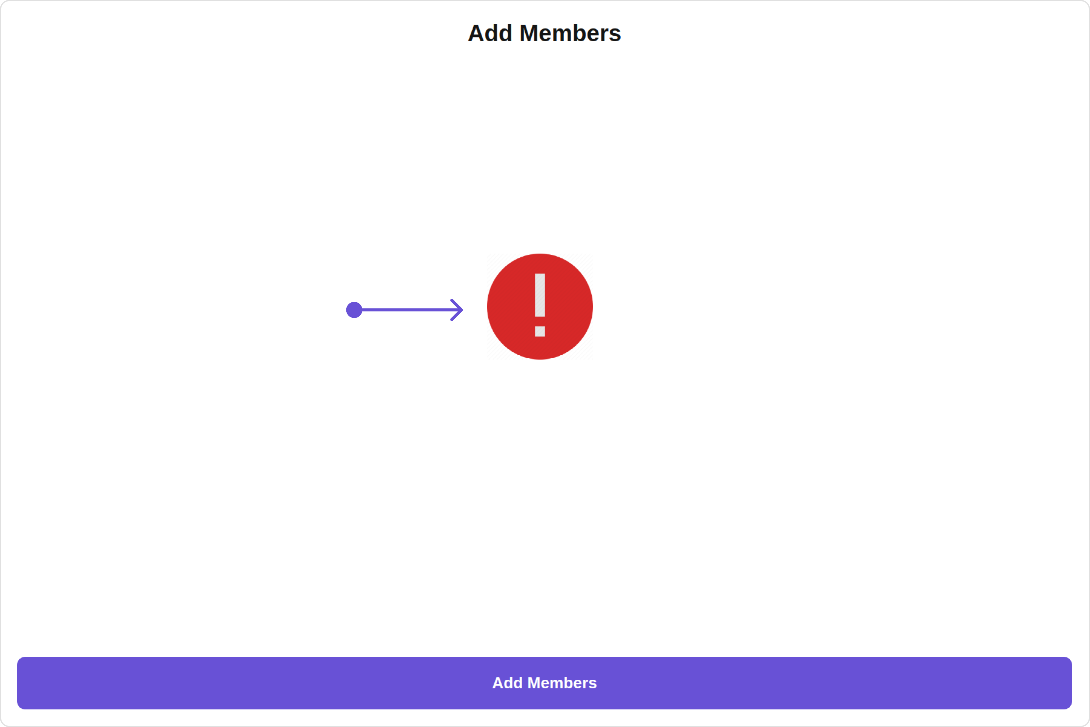
ErrorStateView
You can set a custom ErrorStateView
using errorStateView
to match the error view of your app.
Default:
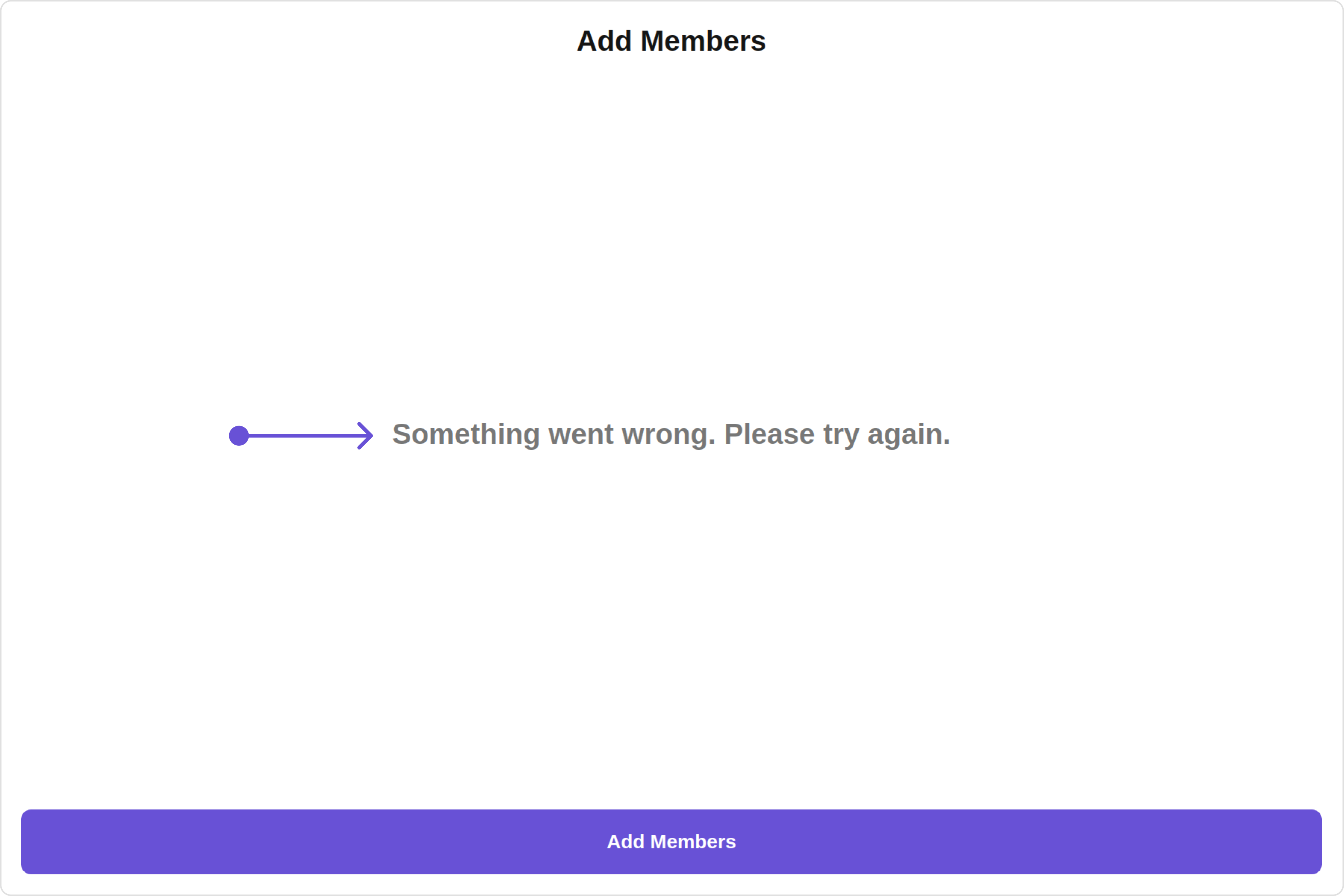
Custom:
- app.component.ts
- app.component.html
import { CometChat } from '@cometchat/chat-sdk-javascript';
import { Component, OnInit } from '@angular/core';
import { CometChatThemeService, CometChatUIKit } from '@cometchat/chat-uikit-angular';
import "@cometchat/uikit-elements";
@Component({
selector: 'app-root',
templateUrl: './app.component.html',
styleUrls: ['./app.component.css']
})
export class AppComponent {
public groupObject!: CometChat.Group;
ngOnInit(): void {
CometChat.getGroup("guid").then((group: CometChat.Group) => {
this.groupObject = group;
});
}
constructor(private themeService:CometChatThemeService) {
themeService.theme.palette.setMode("light")
themeService.theme.palette.setPrimary({ light: "#6851D6", dark: "#6851D6" })
}
onLogin(UID?: any) {
CometChatUIKit.login({ uid: UID }).then(
(user) => {
setTimeout(() => {
window.location.reload();
}, 1000);
},
(error) => {
console.log("Login failed with exception:", { error });
}
);
}
}
<div class="fullwidth">
<cometchat-add-members
*ngIf="groupObject"
[group]="groupObject"
[errorStateView]="errorStateView"
></cometchat-add-members>
</div>
<ng-template #errorStateView>
<div style="height: 100vh; width: 100vw">
<img
src="img"
alt="error icon"
style="height:100px; width: 100px; justify-content: center; margin-top: 250px; margin-right: 700px;"
/>
</div>
</ng-template>
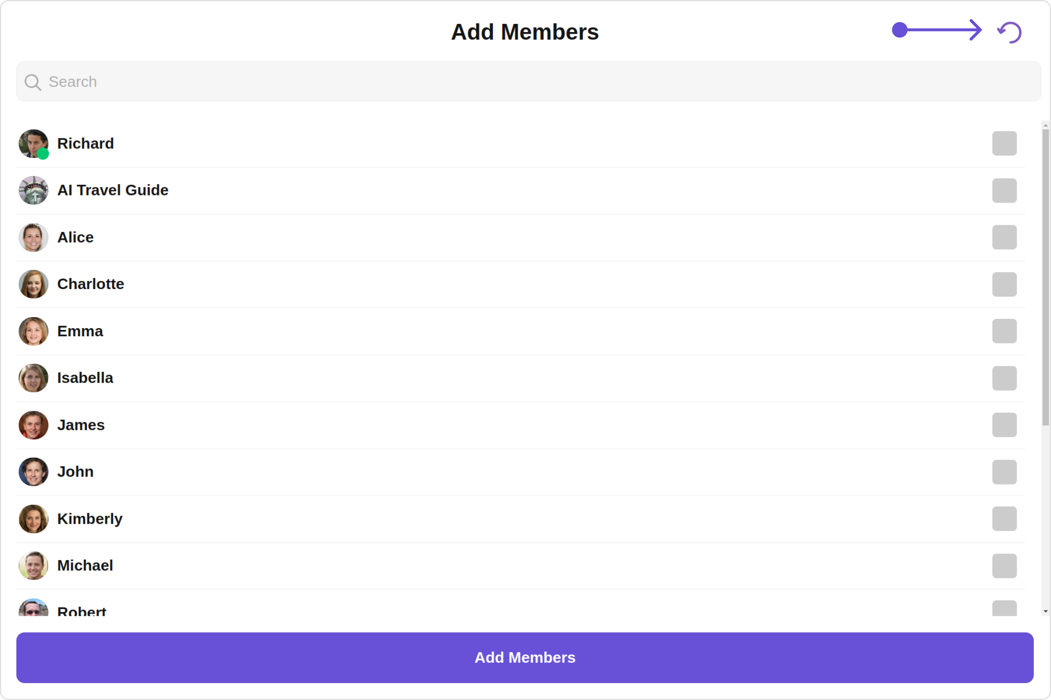
Menus
You can set the Custom Menu view to add more options to the Add Members component.
- app.component.ts
- app.component.html
import { CometChat } from '@cometchat/chat-sdk-javascript';
import { Component, OnInit } from '@angular/core';
import { CometChatThemeService, CometChatUIKit } from '@cometchat/chat-uikit-angular';
import "@cometchat/uikit-elements";
@Component({
selector: 'app-root',
templateUrl: './app.component.html',
styleUrls: ['./app.component.css']
})
export class AppComponent {
public groupObject!: CometChat.Group;
ngOnInit(): void {
CometChat.getGroup("guid").then((group: CometChat.Group) => {
this.groupObject = group;
});
}
handleReload(): void {
window.location.reload();
}
getButtonStyle() {
return {
height: '20px',
width: '20px',
border: 'none',
borderRadius: '0',
background: 'transparent'
};
}
getButtonIconStyle() {
return {
color: '#7E57C2'
};
}
constructor(private themeService:CometChatThemeService) {
themeService.theme.palette.setMode("light")
themeService.theme.palette.setPrimary({ light: "#6851D6", dark: "#6851D6" })
}
onLogin(UID?: any) {
CometChatUIKit.login({ uid: UID }).then(
(user) => {
setTimeout(() => {
window.location.reload();
}, 1000);
},
(error) => {
console.log("Login failed with exception:", { error });
}
);
}
}
<div class="fullwidth">
<cometchat-add-members
*ngIf="groupObject"
[group]="groupObject"
[menu]="menuTemplate"
></cometchat-add-members>
</div>
<ng-template #menuTemplate>
<div style="margin-right: 20px;">
<button [ngStyle]="getButtonStyle()" (click)="handleReload()">
<img src="img" [ngStyle]="getButtonIconStyle()" alt="Reload Icon" />
</button>
</div>
</ng-template>
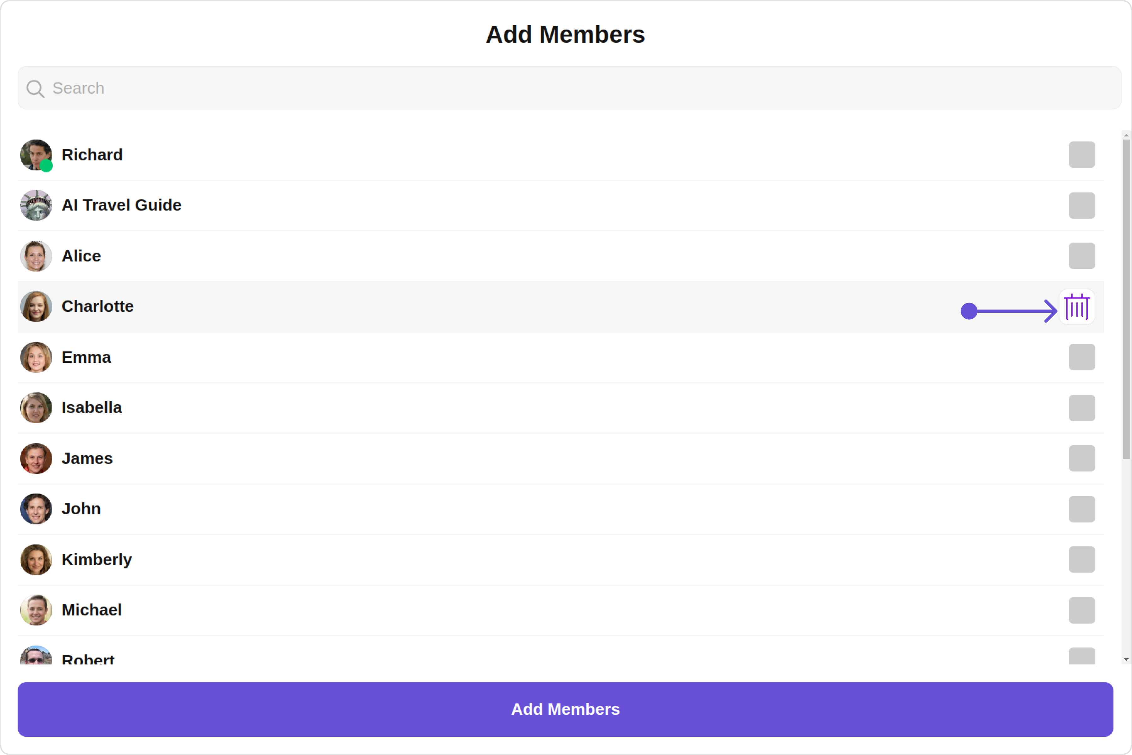
Options
You can set the Custom options to the Add Members component.
- app.component.ts
- app.component.html
import { CometChat } from '@cometchat/chat-sdk-javascript';
import { Component, OnInit } from '@angular/core';
import { CometChatThemeService, CometChatUIKit } from '@cometchat/chat-uikit-angular';
import { CometChatOption } from '@cometchat/uikit-resources';
import "@cometchat/uikit-elements";
@Component({
selector: 'app-root',
templateUrl: './app.component.html',
styleUrls: ['./app.component.css']
})
export class AppComponent {
public groupObject!: CometChat.Group;
ngOnInit(): void {
CometChat.getGroup("guid").then((group: CometChat.Group) => {
this.groupObject = group;
});
}
getOptions = (user: any) => {
const customOptions = [
new CometChatOption({
id: "1",
title: "Title",
iconURL: icon,
iconTint:'green',
backgroundColor: "transparent",
onClick: () => {
console.log("Custom option clicked for user:", user);
},
}),
];
return customOptions;
};
constructor(private themeService:CometChatThemeService) {
themeService.theme.palette.setMode("light")
themeService.theme.palette.setPrimary({ light: "#6851D6", dark: "#6851D6" })
}
onLogin(UID?: any) {
CometChatUIKit.login({ uid: UID }).then(
(user) => {
setTimeout(() => {
window.location.reload();
}, 1000);
},
(error) => {
console.log("Login failed with exception:", { error });
}
);
}
}
<div class="fullwidth">
<cometchat-add-members
*ngIf="groupObject"
[group]="groupObject"
[options]="getOptions"
></cometchat-add-members>
</div>