MessageList is a Composite Component that displays a list of messages and effectively manages real-time operations. It includes various types of messages such as Text Messages, Media Messages, Stickers, and more.MessageList is primarily a list of the base component MessageBubble. The MessageBubble Component is utilized to create different types of chat bubbles depending on the message type.
Actions dictate how a component functions. They are divided into two types: Predefined and User-defined. You can override either type, allowing you to tailor the behavior of the component to fit your specific needs.
1. onThreadRepliesClick
onThreadRepliesClick is triggered when you click on the threaded message bubble. The onThreadRepliesClick action doesn’t have a predefined behavior. You can override this action using the following code snippet.
You can adjust the MessagesRequestBuilder in the MessageList Component to customize your message list. Numerous options are available to alter the builder to meet your specific needs. For additional details on MessagesRequestBuilder, please visit MessagesRequestBuilder.In the example below, we are applying a filter to the messages based on a search substring and for a specific user. This means that only messages that contain the search term and are associated with the specified user will be displayed
Events are emitted by a Component. By using event you can extend existing functionality. Being global events, they can be applied in Multiple Locations and are capable of being Added or Removed.The list of events emitted by the Message List component is as follows.
Event
Description
ccOpenChat
this event alerts the listeners if the logged-in user has opened a user or a group chat
ccMessageEdited
Triggers whenever a loggedIn user edits any message from the list of messages .it will have three states such as: inProgress, success and error
ccMessageDeleted
Triggers whenever a loggedIn user deletes any message from the list of messages
ccActiveChatChanged
This event is triggered when the user navigates to a particular chat window.
ccMessageRead
Triggers whenever a loggedIn user reads any message.
ccLiveReaction
Triggers whenever a loggedIn clicks on live reaction
Adding CometChatMessageEvents Listener’s
TypeScript
import {CometChatMessageEvents} from "@cometchat/chat-uikit-angular";this.ccOpenChat = CometChatMessageEvents.ccOpenChat.subscribe( () => { // Your Code });this.ccMessageEdited = CometChatMessageEvents.ccMessageEdited.subscribe( () => { // Your Code });this.ccMessageDeleted = CometChatMessageEvents.ccMessageDeleted.subscribe( () => { // Your Code });this.ccActiveChatChanged = CometChatMessageEvents.ccActiveChatChanged.subscribe( () => { // Your Code });this.ccMessageRead = CometChatMessageEvents.ccMessageRead.subscribe( () => { // Your Code });this.ccLiveReaction = CometChatMessageEvents.ccLiveReaction.subscribe( () => { // Your Code });
To fit your app’s design requirements, you can customize the appearance of the Message List component. We provide exposed properties that allow you to modify the experience and behavior according to your specific needs.
Using Style you can customize the look and feel of the component in your app, These parameters typically control elements such as the color, size, shape, and fonts used within the component.
1. MessageList Style
You can set the MessageListStyle to the MessageList Component Component to customize the styling.
used to set sender/receiver name text color on a message bubble.
nameTextColor?: string;
nameTextFont
used to set sender/receiver name text font on a message bubble
nameTextFont?: string;
TimestampTextColor
used to set time stamp text color
TimestampTextColor?: string;
TimestampTextFont
used to set time stamp text font
TimestampTextFont?: string;
threadReplyTextColor
used to set thread reply text color
threadReplyTextColor?: string;
threadReplyTextFont
used to set thread reply text font
threadReplyTextFont?: string;
threadReplyIconTint
used to set thread reply icon tint
threadReplyIconTint?: string;
threadReplyUnreadTextColor
used to set thread reply unread text color
threadReplyUnreadTextColor?: string;
threadReplyUnreadTextFont
used to set thread reply unread text font
threadReplyUnreadTextFont?: string;
threadReplyUnreadBackground
used to set thread reply unread background
threadReplyUnreadBackground?: string;
2. Avatar Style
To apply customized styles to the Avatar component in the Message List Component, you can use the following code snippet. For further insights on Avatar Styles refer
These are a set of small functional customizations that allow you to fine-tune the overall experience of the component. With these, you can change text, set custom icons, and toggle the visibility of UI elements.
Below is a list of customizations along with corresponding code snippets
Property
Description
Code
user
Used to pass user object of which header specific details will be shown
[user]="userObject"
group
Used to pass group object of which header specific details will be shown
[group]="groupObject"
alignment
used to set the alignmet of messages in CometChatMessageList. It can be either left or standard
MessageListAlignment.left
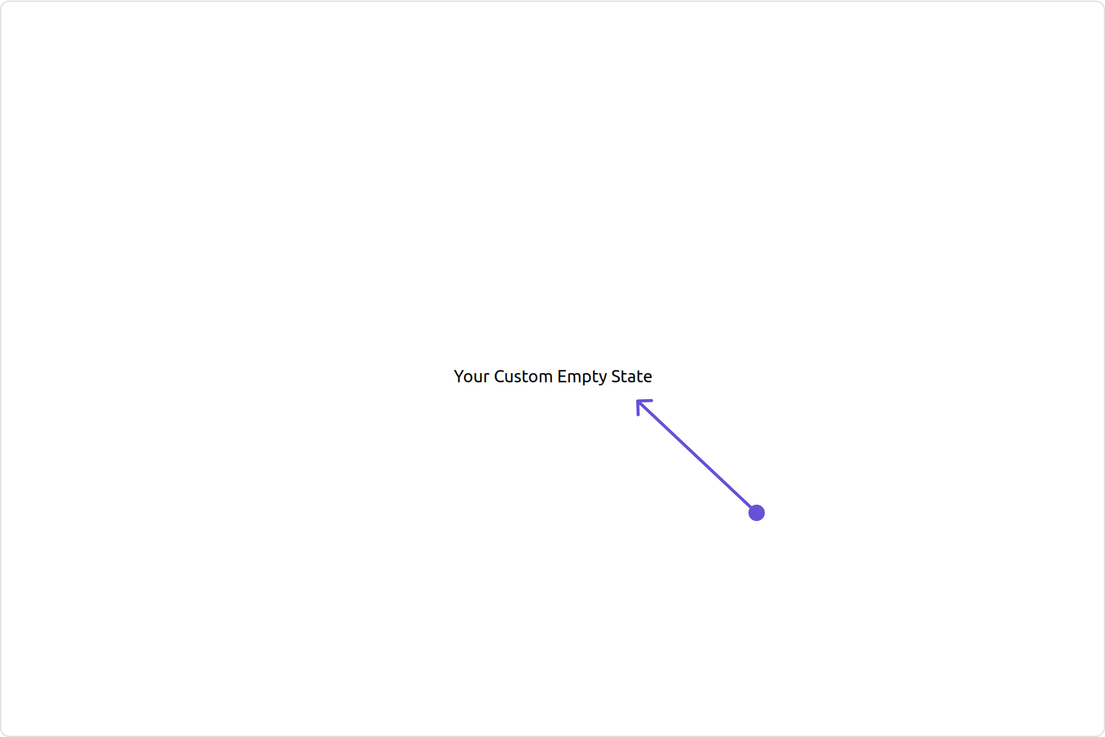
emptyStateText
used to set text which will be visible when no messages are available
emptyStateText="Your Custom Empty State text"
errorStateText
used to set text which will be visible when error in messages retrieval
errorStateText="Your Custom Error State text"
hideError
used to toggle visibility of error in MessageList
[hideError]="true"
disableSoundForMessages
used to enable/disable sound for incoming/outgoing messages , default false
[disableSoundForMessages]="true"
customSoundForMessages
used to set custom sound for outgoing message
customSoundForMessages="your custom sound for messages"
readIcon
used to set custom read icon visible at read receipt
readIcon="your custom read icon"
deliveredIcon
used to set custom delivered icon visible at read receipt
deliveredIcon="your custom delivered icon"
sentIcon
used to set custom sent icon visible at read receipt
sentIcon="your custom sent icon "
waitIcon
used to set custom wait icon visible at read receipt
waitIcon="your custom wait icon"
showAvatar
used to toggle visibility for avatar
[showAvatar]="true"
hideDateSeparator
used to toggle visibility of date separator
[hideDateSeparator]="true"
timestampAlignment
used to set receipt’s time stamp alignment .It can be either top or bottom
timestampAlignment=TimestampAlignment.top
newMessageIndicatorText
used to set new message indicator text
newMessageIndicatorText="Custom Indicator text"
scrollToBottomOnNewMessage
should scroll to bottom on new message? , by default false
[scrollToBottomOnNewMessages]="true"
hideReceipt
Used to control the visibility of read receipts without affecting the functionality of marking messages as read and delivered.
[hideReceipt]="true"
Disable Mentions
Sets whether mentions in text should be disabled. Processes the text formatters If there are text formatters available and the disableMentions flag is set to true, it removes any formatters that are instances of CometChatMentionsFormatter.
[disableMentions]="true"
Disable Reactions
Sets A boolean value indicating whether to disable reactions.Pass true to disable reactions, false to enable them.
For advanced-level customization, you can set custom views to the component. This lets you tailor each aspect of the component to fit your exact needs and application aesthetics. You can create and define your views, layouts, and UI elements and then incorporate those into the component.
CometChatMessageTemplate is a pre-defined structure for creating message views that can be used as a starting point or blueprint for creating message views often known as message bubbles. For more information, you can refer to CometChatMessageTemplate.You can set message Templates to MessageList by using the following code snippet
You can customize the date pattern of the message list separator using the DateSeparatorPattern prop. Choose from predefined options like time, DayDate, DayDateTime, or DateTime.ExampleDefault
You can modify the date pattern to your requirement using DatePattern. Choose from predefined options like time, DayDate, DayDateTime, or DateTime.DatePatterns describes a specific format or arrangement used to represent dates in a human-readable form.
Name
Description
time
Date format displayed in the format hh:mm a
DayDate
Date format displayed in the following format. 1. If timestamp < 24hrs display “Today” 2. If timestamp < 48hrs display “Yesterday” 3. If timestamp < 7days display “EEE” i.e , SUNDAY 4. else display “d MMM, yyyy”
DayDateTime
Date format displayed in the following format. 1. If timestamp < 24hrs display “hh:mm a” 2. If timestamp < 48hrs display “Yesterday” 3. If timestamp < 7days display “EEE” i.e SUNDAY 4. else display “dd MM yyyy”
The emptyStateView method provides the ability to set a custom empty state view in your app. An empty state view is displayed when there are no messages for a particular user.Example
The loadingStateView property allows you to set a custom loading view in your app. This feature enables you to maintain a consistent look and feel throughout your application,ExampleDefault
Assigns the list of text formatters. If the provided list is not null, it sets the list. Otherwise, it assigns the default text formatters retrieved from the data source. To configure the existing Mentions look and feel check out CometChatMentionsFormatter
import { CometChatTextFormatter } from "@cometchat/uikit-shared";class HashTagTextFormatter extends CometChatTextFormatter { constructor() { super(); // Set the tracking character to # this.setTrackingCharacter("#"); // Define regex patterns to find specific text patterns this.setRegexPatterns([ /\B#(\w+)\b/g, // Matches hashtags starting with # ]); // Define regex patterns to replace formatter text with original text this.setRegexToReplaceFormatting([ /#(\w+)/g, // Replace hashtags without formatting ]); // Set callback functions for key up and key down events this.setKeyUpCallBack(this.onKeyUp.bind(this)); this.setKeyDownCallBack(this.onKeyDown.bind(this)); // Set the re-render callback function this.setReRender(() => { // Trigger re-rendering of the message composer component // This could involve updating the UI with the formatted text console.log("Re-rendering message composer to update text content."); }); // Initialize composer tracking this.initializeComposerTracking(); } initializeComposerTracking() { // Get the reference to the input field (composer) const composerInput = document.getElementById("yourComposerInputId"); // Set the reference to the input field this.setInputElementReference(composerInput); } getCaretPosition(): number { if (!this.inputElementReference) return 0; const selection = window.getSelection(); if (!selection || selection.rangeCount === 0) return 0; const range = selection.getRangeAt(0); const clonedRange = range.cloneRange(); clonedRange.selectNodeContents(this.inputElementReference); clonedRange.setEnd(range.endContainer, range.endOffset); return clonedRange.toString().length; } setCaretPosition(position: number) { if (!this.inputElementReference) return; const range = document.createRange(); const selection = window.getSelection(); if (!selection) return; range.setStart( this.inputElementReference.childNodes[0] || this.inputElementReference, position ); range.collapse(true); selection.removeAllRanges(); selection.addRange(range); } override onKeyUp(event: KeyboardEvent) { if (event.key === this.trackCharacter) { this.startTracking = true; } // Custom logic to format hashtags as users type in the composer if (this.startTracking && (event.key === " " || event.key === "Enter")) { const caretPosition = this.getCaretPosition(); this.formatText(); this.setCaretPosition(caretPosition); } // Check if the last character typed was not a space or enter // and if the caret position is at the end, then we need to set start tracking to false if ( this.startTracking && event.key !== " " && event.key !== "Enter" && this.getCaretPosition() === this.inputElementReference?.innerText?.length ) { this.startTracking = false; } } formatText() { const inputValue = this.inputElementReference?.innerText || this.inputElementReference?.textContent || ""; const formattedText = this.getFormattedText(inputValue); // Update the composer with formatted text if (this.inputElementReference) { this.inputElementReference.innerHTML = formattedText || ""; // Trigger re-render of the composer this.reRender(); } } override onKeyDown(event: KeyboardEvent) { // Custom onKeyDown logic can be added here } override getFormattedText(inputText: string) { if (!inputText) { // Edit at cursor position and return void return; } // Perform custom logic to format text (e.g., formatting hashtags) return this.customLogicToFormatText(inputText); } customLogicToFormatText(inputText: string) { // Replace hashtags with HTML span elements to change color to green return inputText.replace( /\B#(\w+)\b/g, '<span style="color: #5dff05;">#$1</span>' ); } override getOriginalText(inputText: string) { // Sample implementation if (!inputText) { return ""; } // Remove formatting and return original text for (let i = 0; i < this.regexToReplaceFormatting.length; i++) { let regexPattern = this.regexToReplaceFormatting[i]; if (inputText) { inputText = inputText.replace(regexPattern, "#$1"); } } return inputText; }}export default HashTagTextFormatter;
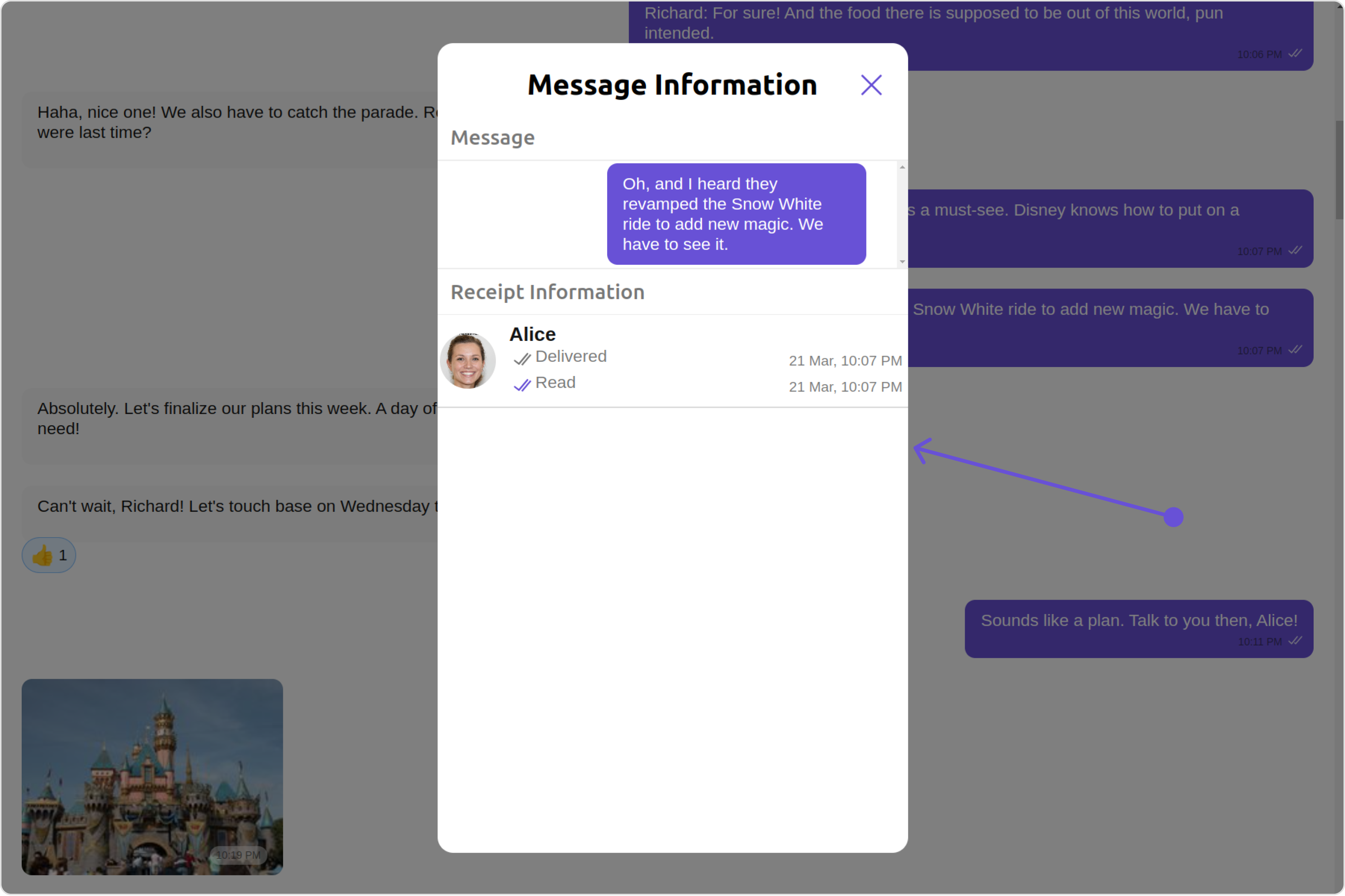
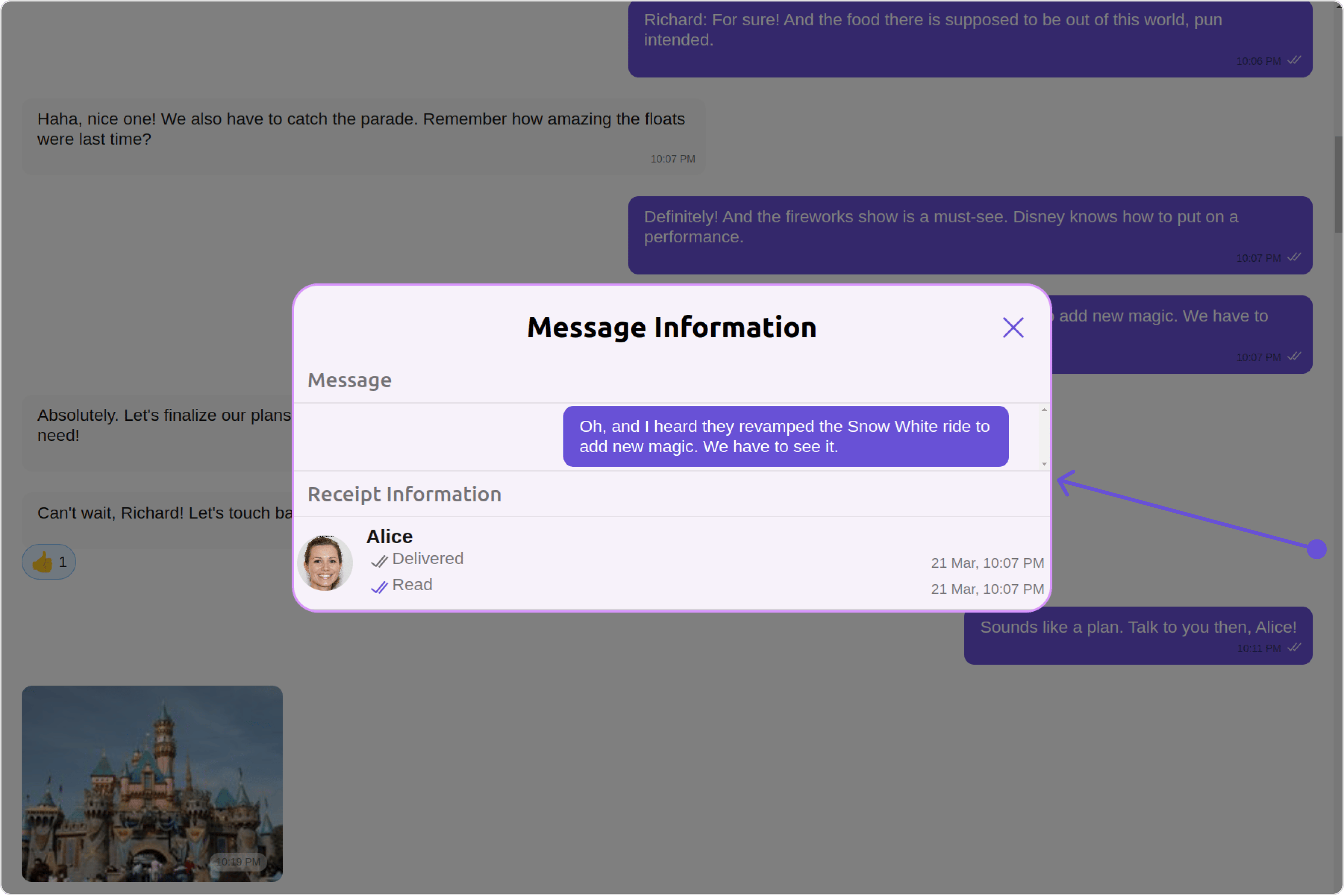
The MessageInformationConfiguration indeed provides access to all the Action, Filters, Styles, Functionality, and Advanced properties of the MesssageInformation component.Please note that the Properties marked with the 🛑 symbol are not accessible within the Configuration Object.ExampleDefault
Custom
In the above example, we are styling a few properties of the MesssageInformation component using MessageInformationConfiguration.
