User Details
Overview
CometChatDetails functions as a standalone widgets designed to establish a screen displaying the details of a specific user or group object. It inherits all properties and methods from the CometChatListBase class, ensuring comprehensive functionality and customization options.
CometChatDetails internally implements the following functionalities:
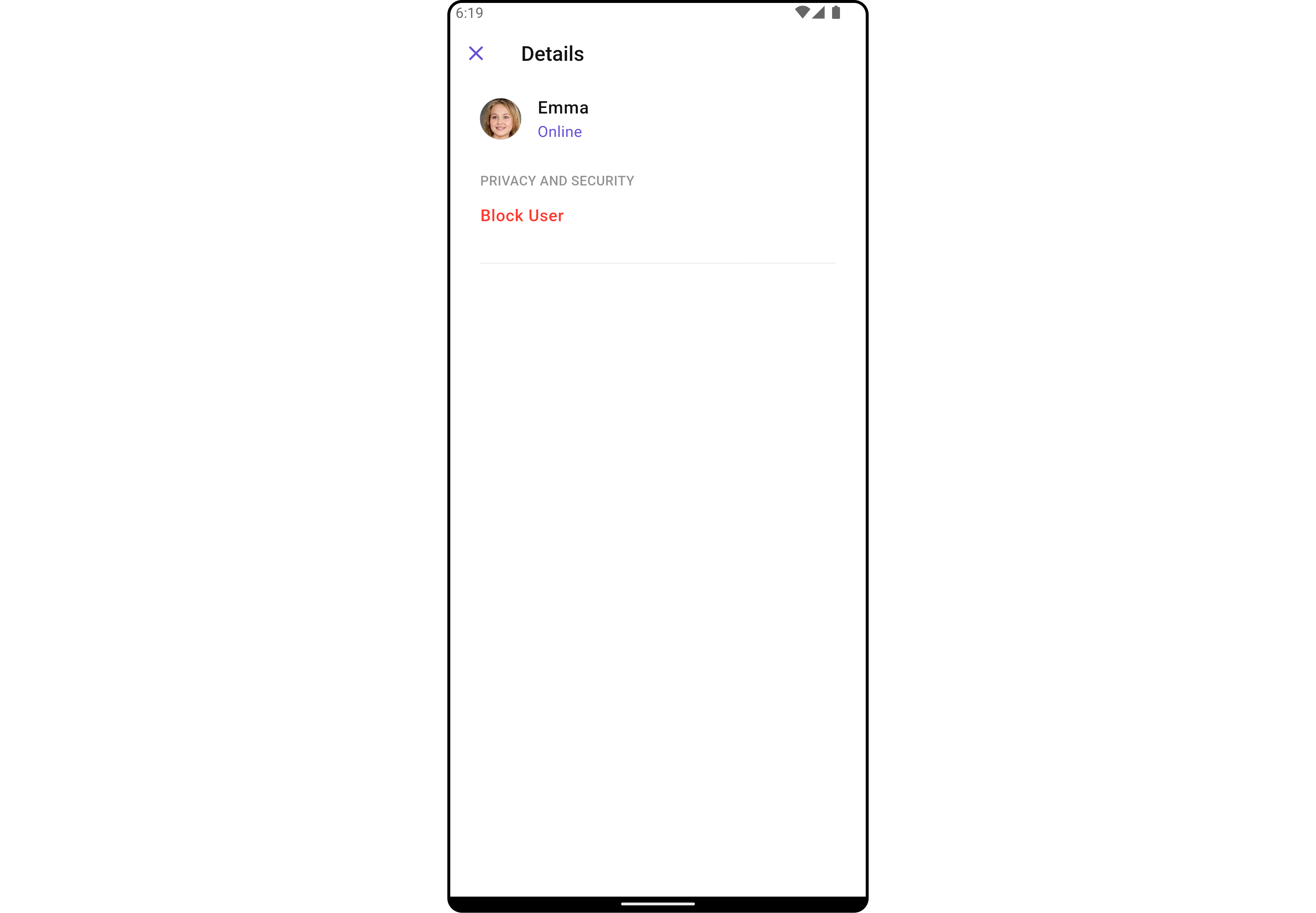
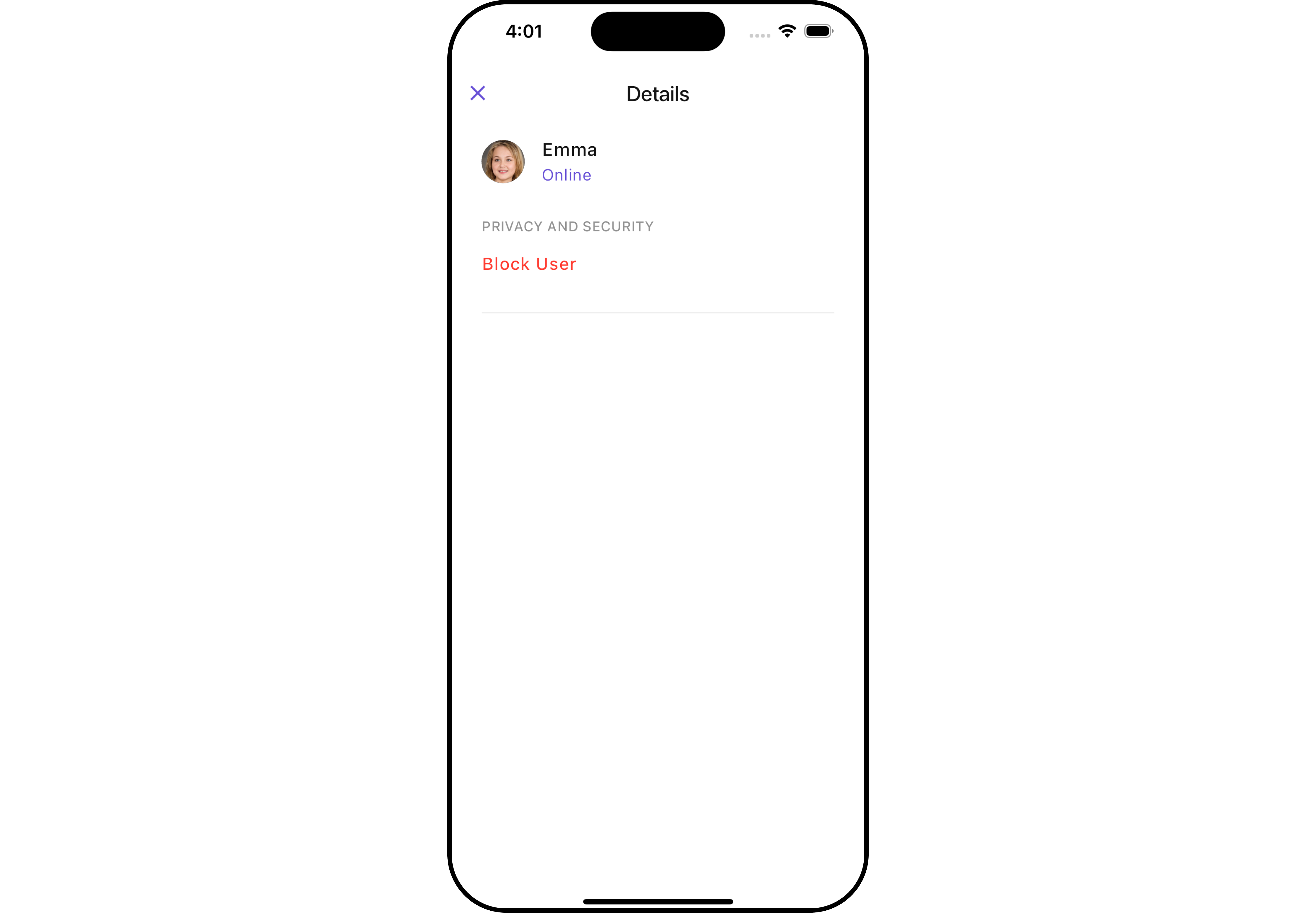
- User Information: It displays details about the user. This includes his/her profile picture, name, status, and other relevant information.
- User Actions: The details screen provides actions to block/unblock the user.
- Android
- iOS
Usage
Integration
As CometChatDetails functions as a widget, it can be directly launched through a button click or any user-initiated action. Additionally, it can be seamlessly integrated into a tab view controller. CometChatDetails offers a range of parameters and methods for customizing its user interface.
You can launch CometChatUsersWithMessages directly using Navigator.push, or you can define it as a widget within the build method of your State class.
1. Using Navigator to Launch CometChatUsersWithMessages
- Dart
Navigator.push(context, MaterialPageRoute(builder: (context) => CometChatDetails(
    user: User(
        uid: "uid",
        name: "name",
    ),
)));
2. Embedding CometChatUsersWithMessages as a Widget in the build Method
- Dart
import 'package:cometchat_chat_uikit/cometchat_chat_uikit.dart';
import 'package:flutter/material.dart';
class UserDetails extends StatefulWidget {
const UserDetails({super.key});
State<UserDetails> createState() => _UserDetailsState();
}
class _UserDetailsState extends State<UserDetails> {
Widget build(BuildContext context) {
return Scaffold(
body: SafeArea(
child: CometChatDetails(
user: User(
uid: "uid",
name: "name",
) // Required User object with name and UID (rest parameters optional)
)
)
);
}
}
Actions
Actions dictate how a widgets functions. They are divided into two types: Predefined and User-defined. You can override either type, allowing you to tailor the behavior of the widgets to fit your specific needs.
1. onBack
The onBack event is typically triggered when the close button is clicked and it carries a default action. However, with the following code snippet, you can effortlessly override this default operation.
This action does not come with any predefined behavior. However, you have the flexibility to override this event and tailor it to suit your needs using the following code snippet.
- Dart
CometChatDetails(
  user: User(
      uid: "uid",
      name: "name"
  ),
  onBack: () {
    // TODO("Not yet implemented")
  },
)
2. onError
This method onError, allows users to override error handling within CometChatDetails, providing greater control over error responses and actions.
- Dart
CometChatDetails(
  user: User(
      uid: "uid",
      name: "name"
  ),
  onError: (e) {
    // TODO("Not yet implemented")
  },
)
Filters
Filters allow you to customize the data displayed in a list within a widget. You can filter the list based on your specific criteria, allowing for a more customized. Filters can be applied using RequestBuilders of Chat SDK.
CometChatDetails widgets does not have available filters.
Events
Events are emitted by a widget. By using event you can extend existing functionality. Being global events, they can be applied in Multiple Locations and are capable of being Added or Removed.
To handle events supported by Users you have to add corresponding listeners by using CometChatUserEvents
| Events | Description |
|---|---|
| ccUserBlocked | This will get triggered when the logged in user blocks another user |
| ccUserUnblocked | This will get triggered when the logged in user unblocks another user |
- Dart
import 'package:cometchat_chat_uikit/cometchat_chat_uikit.dart';
import 'package:flutter/material.dart';
class YourScreen extends StatefulWidget {
const YourScreen({super.key});
State<YourScreen> createState() => _YourScreenState();
}
class _YourScreenState extends State<YourScreen> with CometChatUserEventListener {
void initState() {
super.initState();
CometChatUserEvents.addUsersListener("listenerId", this);
}
void dispose(){
super.dispose();
CometChatUserEvents.removeUsersListener("listenerId");
}
void ccUserBlocked(User user) {
// TODO("Not yet implemented")
}
void ccUserUnblocked(User user) {
// TODO("Not yet implemented")
}
Widget build(BuildContext context) {
return const Placeholder();
}
}
Customization
To fit your app's design requirements, you can customize the appearance of the details widget. We provide exposed methods that allow you to modify the experience and behavior according to your specific needs.
Style
Using Style you can customize the look and feel of the widgets in your app, These parameters typically control elements such as the color, size, shape, and fonts used within the widget.
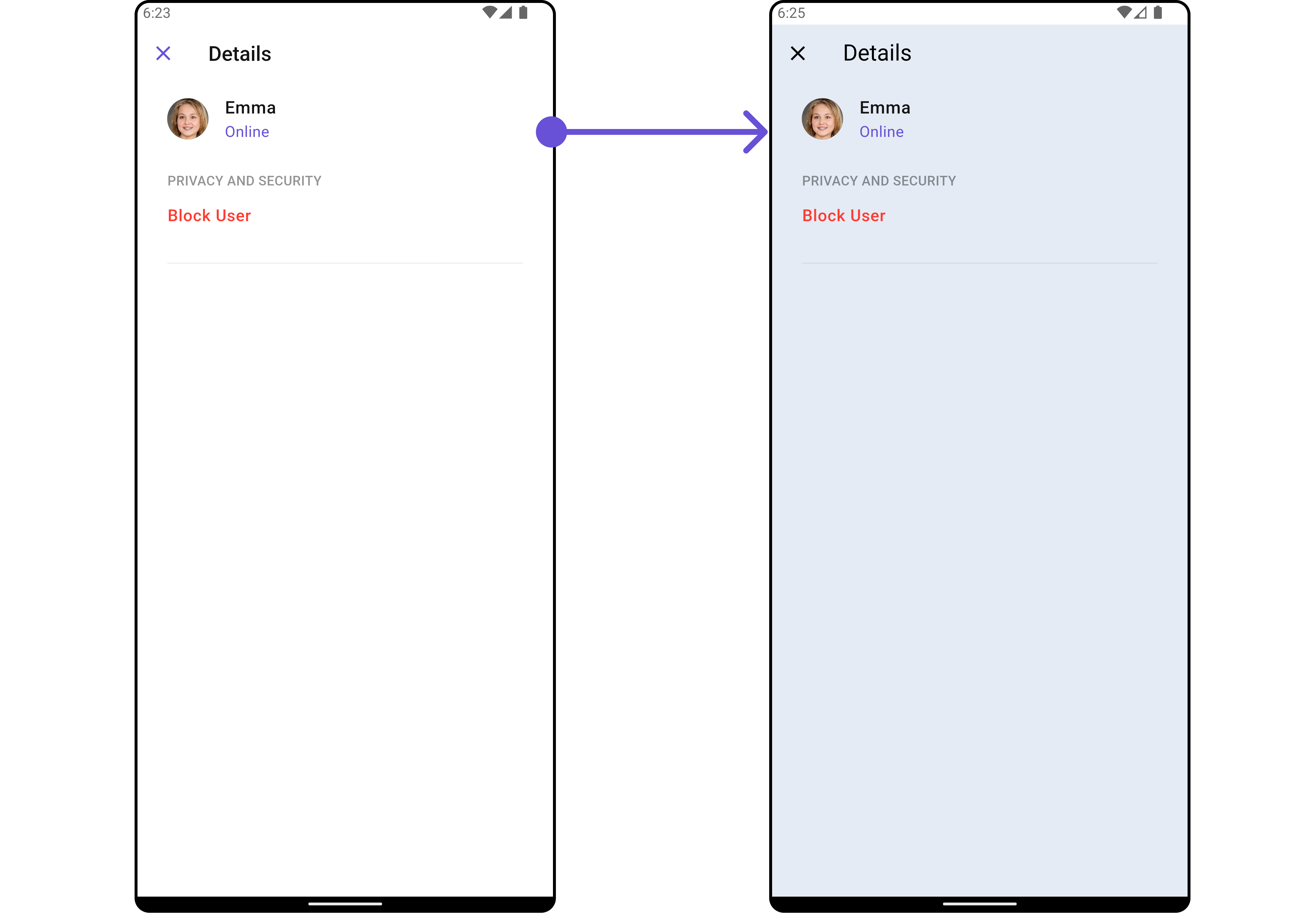
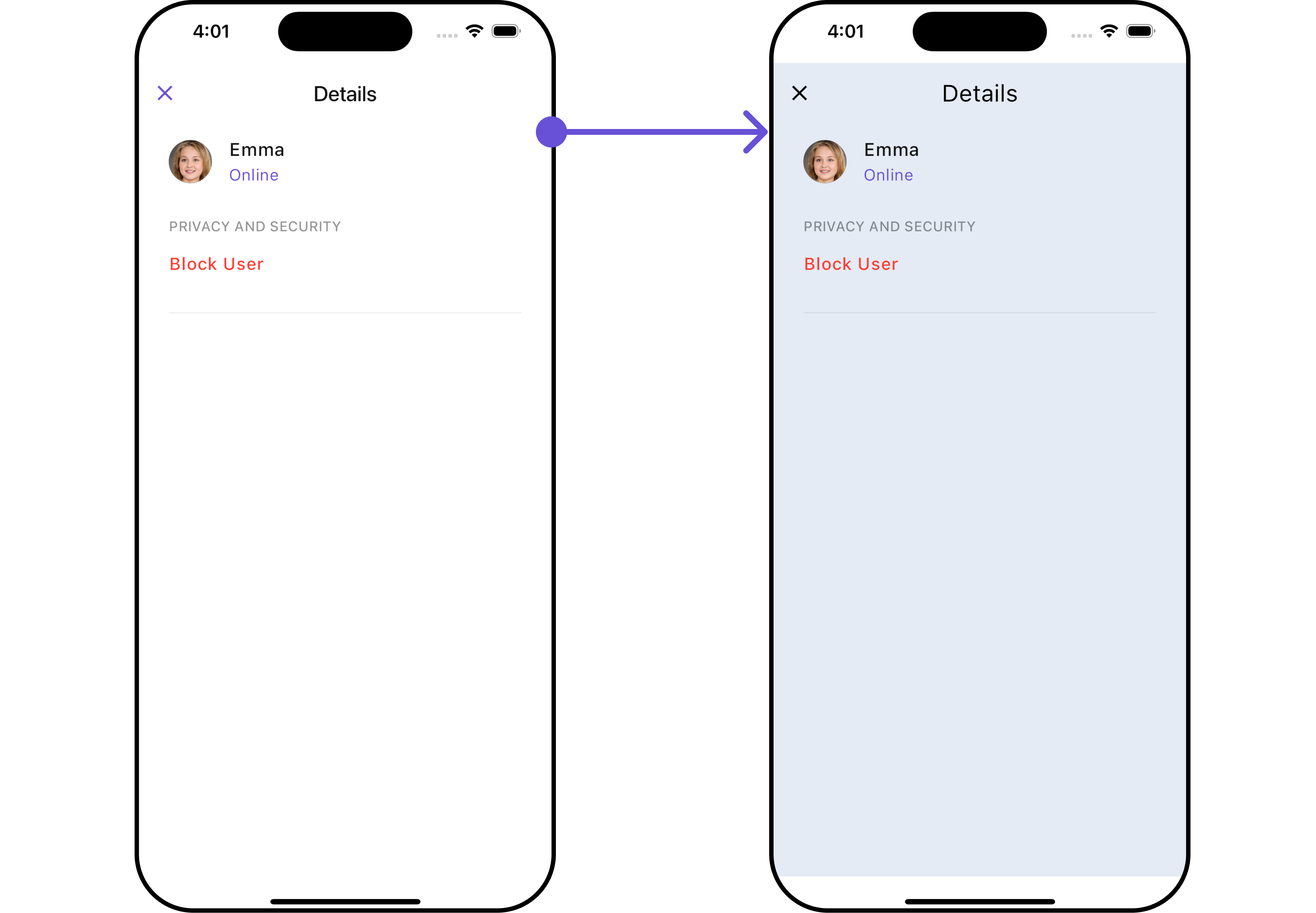
1. Details Style
You can set the DetailsStyle to the User Detail Widget to customize the styling.
- Dart
CometChatDetails(
    user: User(
        uid: "uid",
        name: "name"
    ),
    detailsStyle: DetailsStyle(
        background: Color(0xFFE4EBF5),
        closeIconTint: Colors.black,
        titleStyle: TextStyle(fontFamily: "")
    )
)
- Android
- iOS
List of properties exposed by DetailsStyle
| Property | Data Type | Description |
|---|---|---|
titleStyle | TextStyle? | Provides styling for the title text. |
closeIconTint | Color? | Provides color to the close button. |
privateGroupIconBackground | Color? | Provides background color for the status indicator if the group is private. |
protectedGroupIconBackground | Color? | Provides background color for the status indicator if the group is protected. |
onlineStatusColor | Color? | Sets the color for the online status indicator. |
width | double? | Width of the details widget. |
height | double? | Height of the details widget. |
background | Color? or Gradient? | Background color or gradient of the details widget. |
gradient | Gradient? | Gradient background of the details widget. |
border | Border? | Border of the details widget. |
2. Avatar Style
To apply customized styles to the Avatar widget in the CometChatDetails widget, you can use the following code snippet. For further insights on Avatar Styles refer
- Dart
CometChatDetails(
    user: User(
        uid: "uid",
        name: "name",
    ),
    avatarStyle: AvatarStyle(
        border: Border.all(width: 3),
        borderRadius: 20,
        background: Colors.yellow
    ),
)
3. StatusIndicator Style
To apply customized styles to the StatusIndicator widget in the CometChatDetails widget, You can use the following code snippet. For further insights on Status Indicator Styles refer
- Dart
CometChatDetails(
  user: User(
      uid: "uid",
      name: "name",
      status: "Online"
  ),
  statusIndicatorStyle: const StatusIndicatorStyle(
      borderRadius: 10,
      gradient: LinearGradient(colors: [Colors.red, Colors.orange], begin: Alignment.topLeft, end: Alignment.bottomRight)
  ),
)
4. ListItem Style
To apply customized styles to the List Item widget in the CometChatDetails widget, You can use the following code snippet. For further insights on List Item Styles refer
- Dart
CometChatDetails(
  user: User(
      uid: "uid",
      name: "name",
      status: "Online"
  ),
  listItemStyle: ListItemStyle(
    titleStyle: TextStyle(color: Colors.red),
    separatorColor: Colors.red,
    border: Border.all(width: 2, color: Colors.red),
    padding: EdgeInsets.only(left: 10)
  ),
)
Functionality
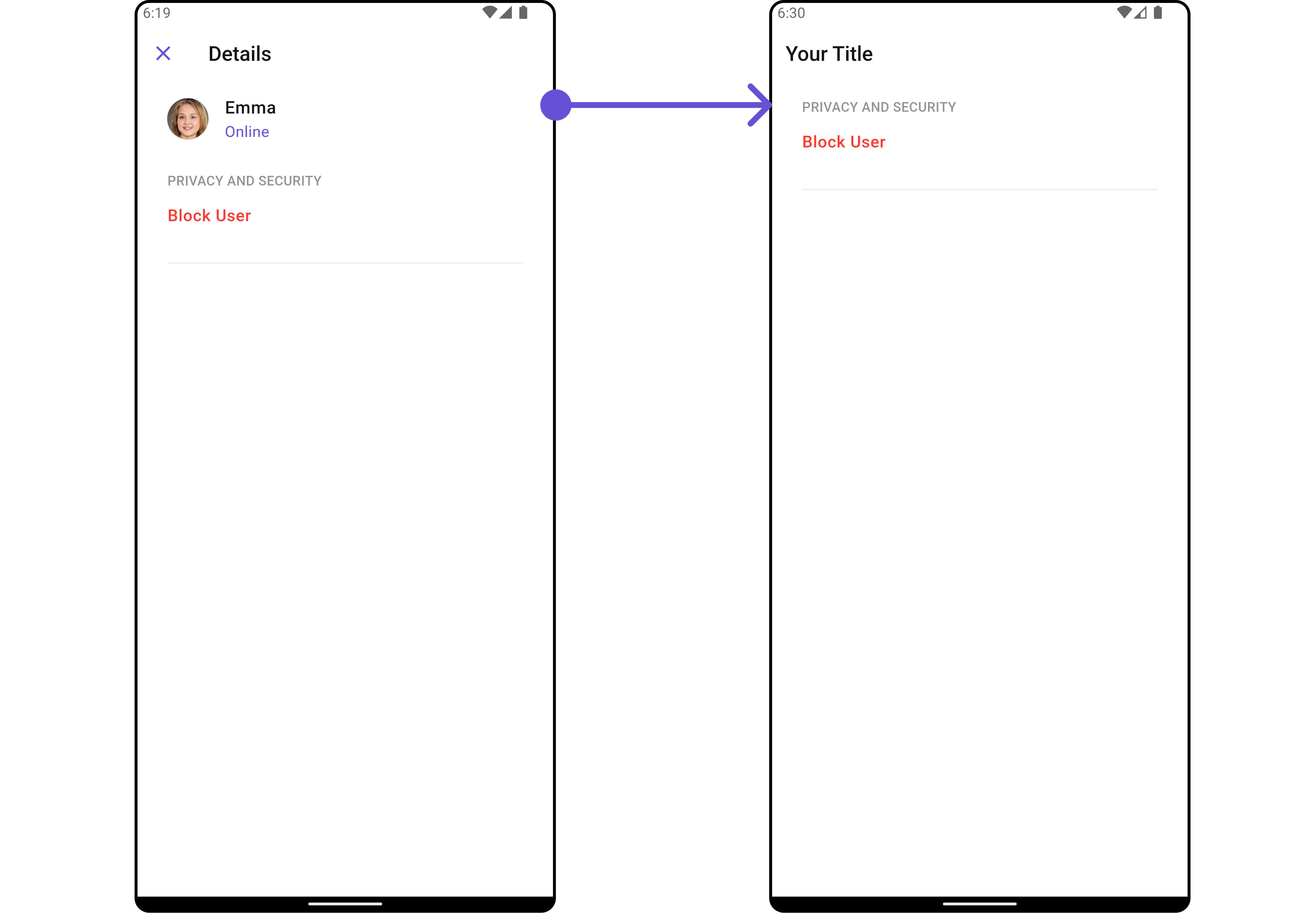
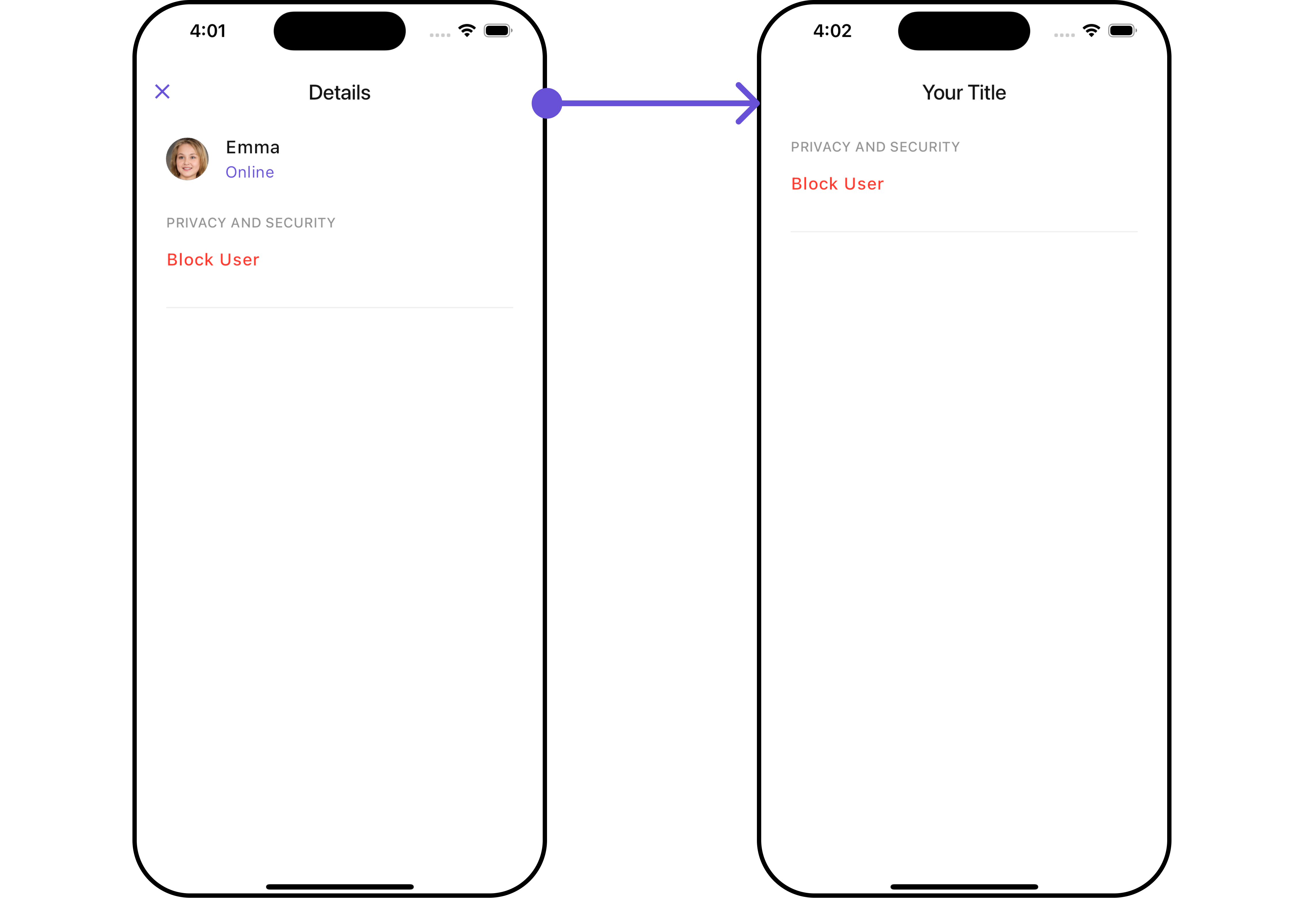
These are a set of small functional customizations that allow you to fine-tune the overall experience of the widget. With these, you can change text, set custom icons, and toggle the visibility of UI elements.
- Dart
CometChatDetails(
  user: User(
      uid: "uid",
      name: "name",
      status: "Online"
  ),
  hideProfile: true,
  showCloseButton: false,
  title: "Your Title",
)
- Android
- iOS
Advance
For advanced-level customization, you can set custom views to the widget. This lets you tailor each aspect of the widgets to fit your exact needs and application aesthetics. You can create and define your own widget and then incorporate those into the widget.
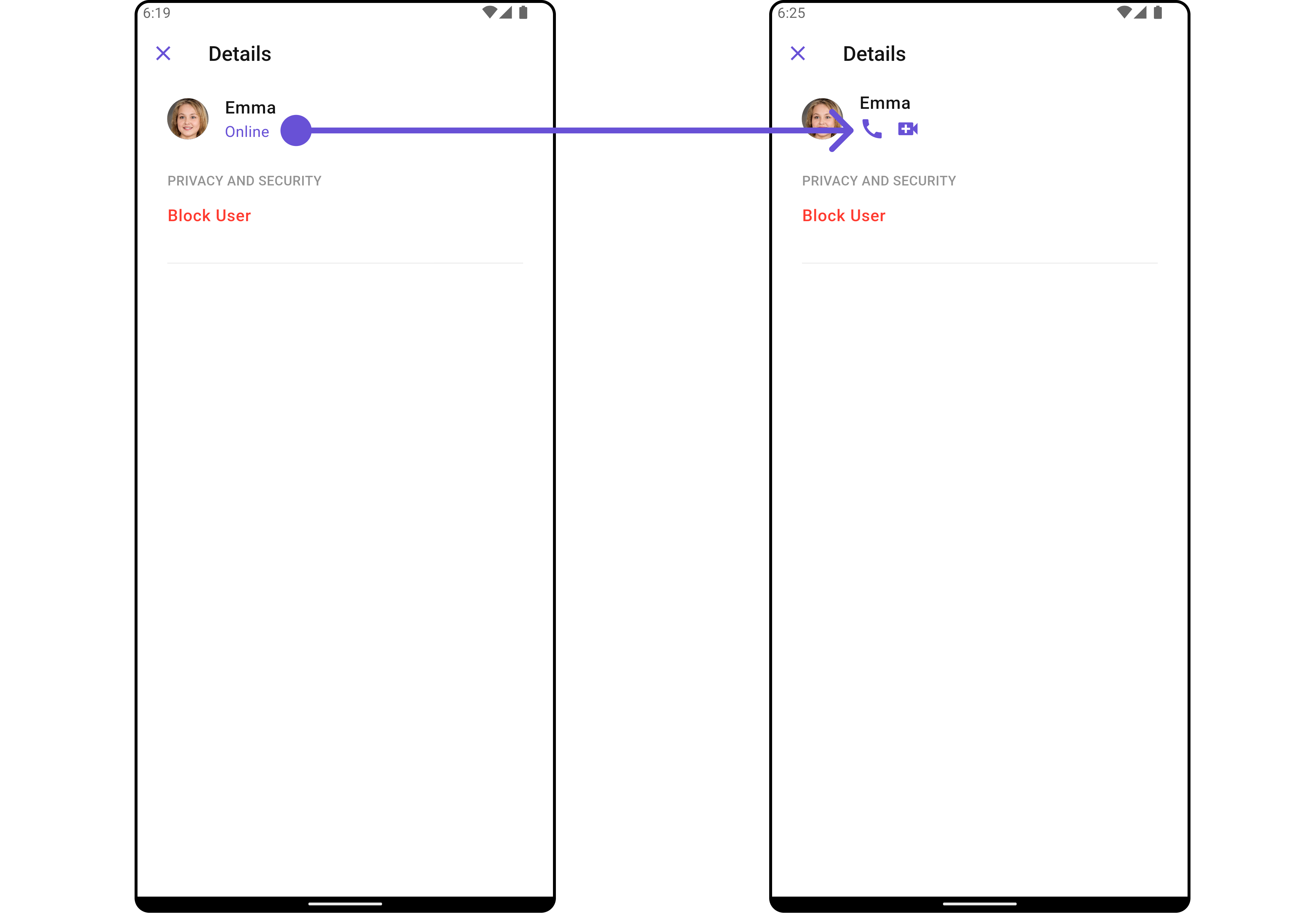
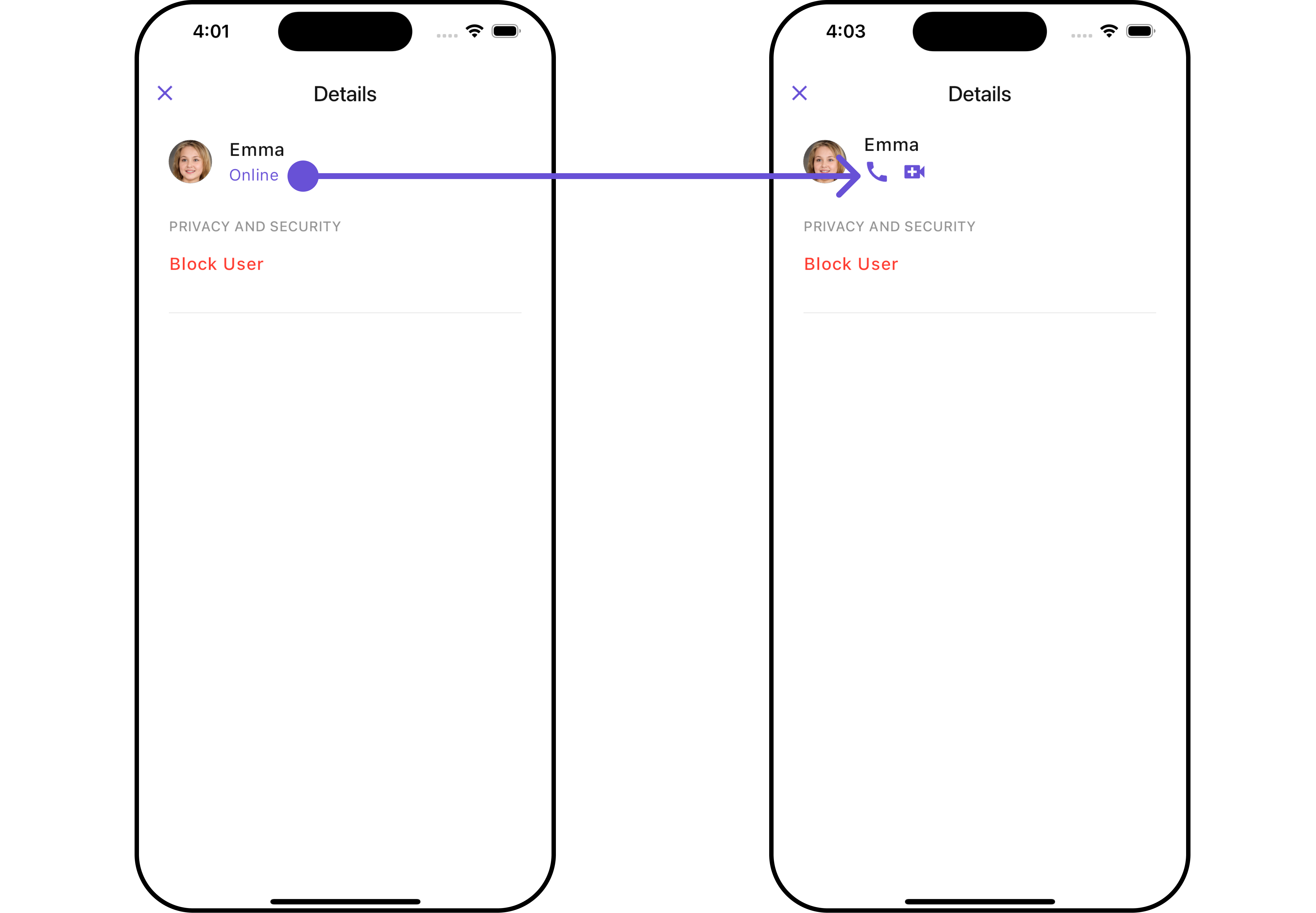
SubTitleView
You can customize the subtitle view for each item to meet your specific preferences and needs.
- Dart
CometChatDetails(
  user: User(
      uid: "uid",
      name: "name",
      status: "Online"
  ),
  subtitleView: ({BuildContext? context, Group? group, User? user}) {
    return const Row(
      children: [
        Icon(Icons.call, color: Color(0xFF6851D6), size: 25,),
        SizedBox(width: 10),
        Icon(Icons.video_call, color: Color(0xFF6851D6), size: 25,),
      ],
    );
  }
)
- Android
- iOS
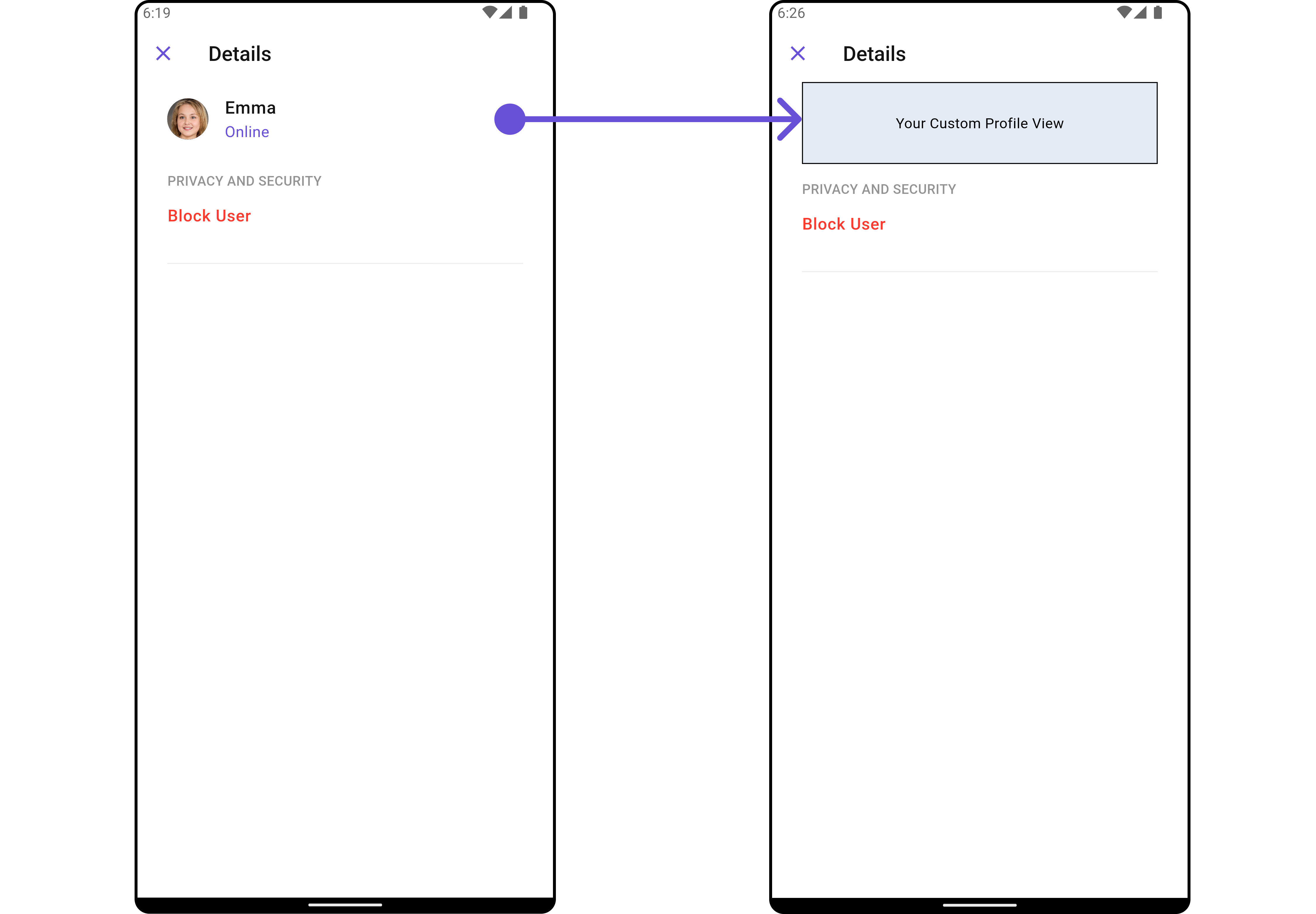
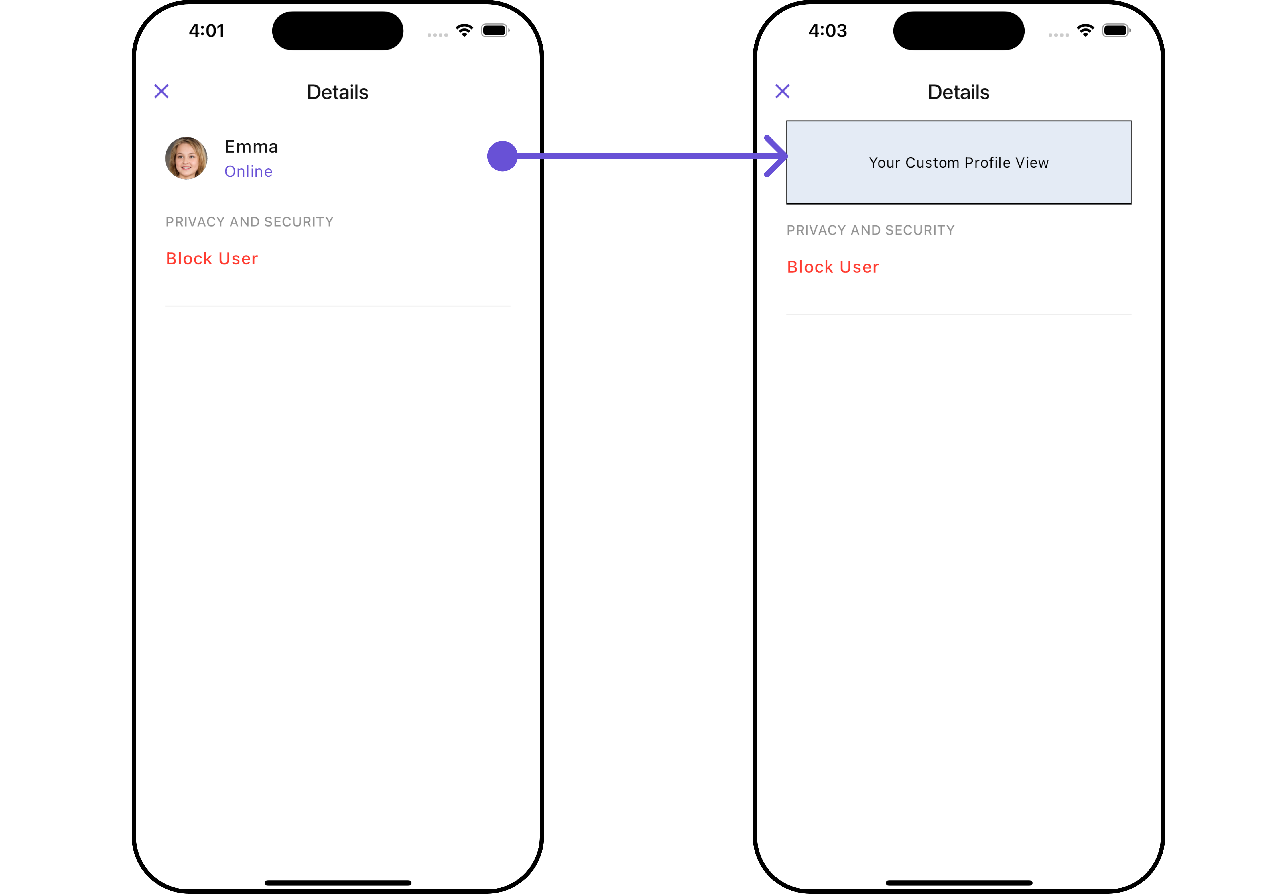
CustomProfileView
Tailor the custom profile view for each user item to suit your specific preferences and needs.
- Dart
CometChatDetails(
  user: User(
      uid: "uid",
      name: "name",
      status: "Online"
  ),
  customProfileView: Container(
    height: 80,
    width: MediaQuery.of(context).size.width,
    decoration: BoxDecoration(
        color: Color(0xFFE4EBF5),
        border: Border.all(width: 1, color: Colors.black)
    ),
    child: Center(
        child: Text("Your Custom Profile View")
    ),
  ),
)
- Android
- iOS
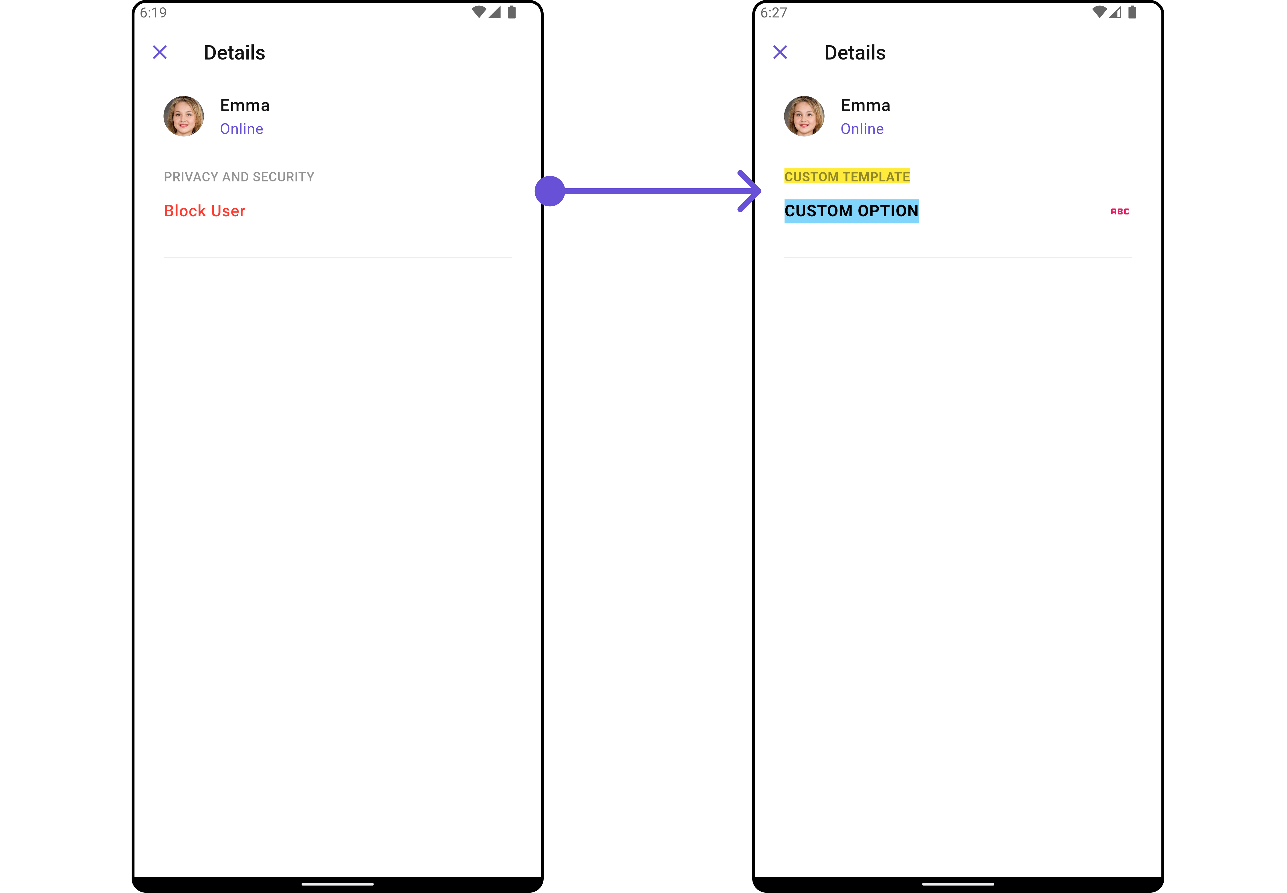
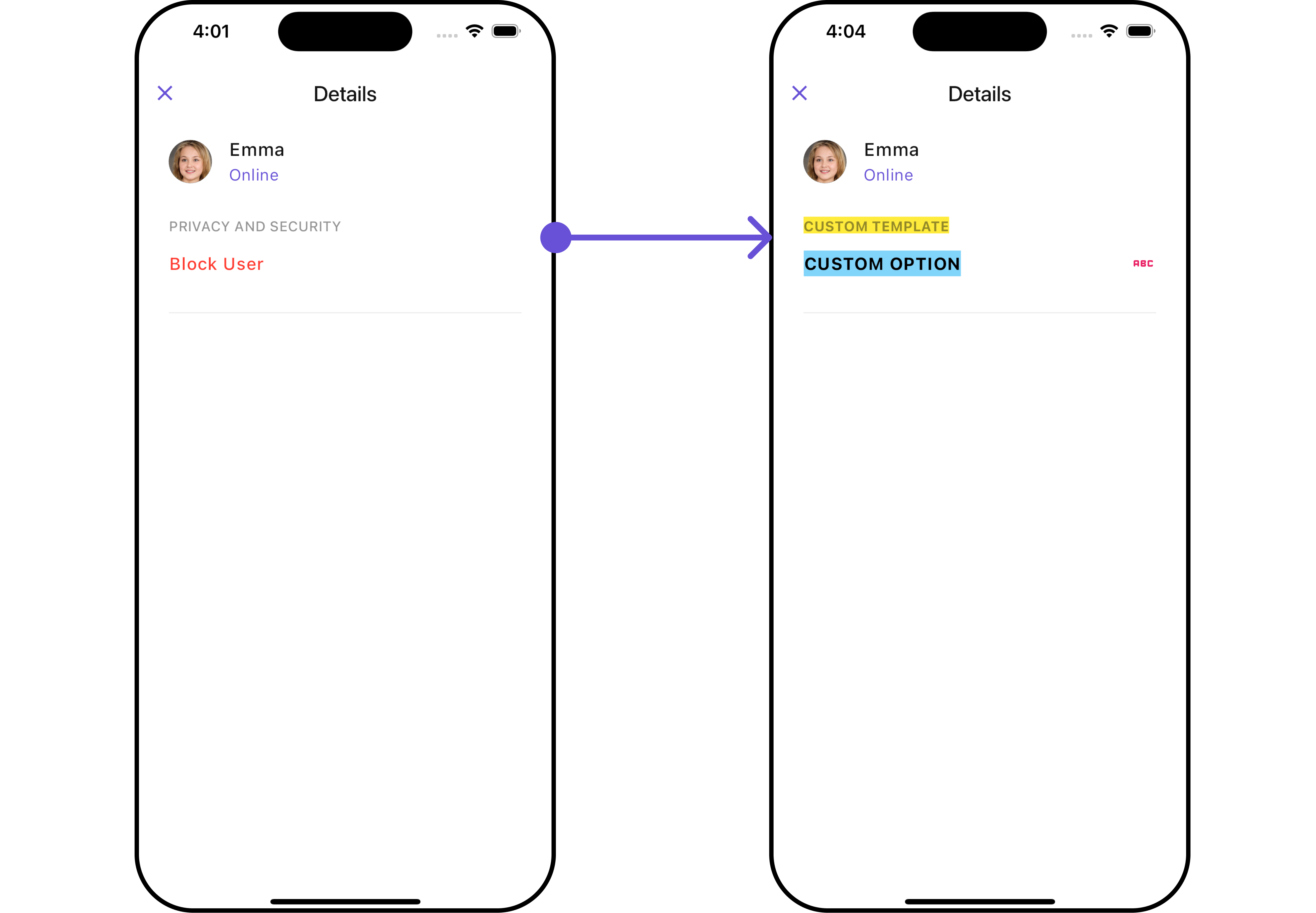
DetailsOption
The CometChatDetailsOption defines the structure for individual options within the CometChat details widget, facilitating customization and functionality for user interactions.
- Dart
CometChatDetailsOption option = CometChatDetailsOption(
    id: "OPTION_ID",
    onClick: (user, group, section, state) {},
    tail: Icon(
        Icons.abc_rounded,
        color: Colors.pink,
    ),
    title: "CUSTOM OPTION",
    titleStyle: TextStyle(
        backgroundColor: Colors.lightBlue.shade200,
        fontWeight: FontWeight.bold
    ),
    icon: AssetConstants.heart,
    packageName: UIConstants.packageName
);
This defines the structure of each option for a template in the details widget.
| Property | Data Type | Description |
|---|---|---|
customView | Widget? | Custom view widget for the details option. |
tail | Widget? | Tail widget for the details option. |
height | double? | Height of the details option. |
onClick | Function(User? user, Group? group, String section, CometChatDetailsControllerProtocol state)? | Callback function triggered when the details option is clicked. |
id | String | Unique identifier for the details option. |
title | String? | Title of the details option. |
icon | String? | URL or asset name for the icon of the details option. |
packageName | String? | Package name associated with the details option. |
titleStyle | TextStyle? | Text style for the title of the details option. |
DetailsTemplate
The CometChatDetailsTemplate offers a structure for organizing information in the CometChat details widget. It serves as a blueprint, defining how user-related details are presented. This structure allows for customization and organization within the CometChat interface.
- Dart
CometChatDetailsTemplate template = CometChatDetailsTemplate(
    id: "TEMPLATE_ID",
    hideItemSeparator: false,
    hideSectionSeparator: false,
    itemSeparatorColor: Colors.deepOrange,
    sectionSeparatorColor: Colors.pink,
    title: "CUSTOM TEMPLATE",
    titleStyle: TextStyle(
        backgroundColor: Colors.yellow,
        fontWeight: FontWeight.bold
    ),
    options: (user, group, context, theme) => [option],
);
Complete Example of Options and Template
- Dart
CometChatDetails(
  user: User(
      uid: "uid",
      name: "name",
      status: "Online"
  ),
  data: (group, user) {
    //Create Options
    CometChatDetailsOption option = CometChatDetailsOption(
        id: "OPTION_ID",
        onClick: (user, group, section, state) {},
        tail: Icon(
          Icons.abc_rounded,
          color: Colors.pink,
        ),
        title: "CUSTOM OPTION",
        titleStyle: TextStyle(
            backgroundColor: Colors.lightBlue.shade200,
            fontWeight: FontWeight.bold
        ),
        icon: AssetConstants.heart,
        packageName: UIConstants.packageName
    );

    //Create Template and add the options in it
    CometChatDetailsTemplate template = CometChatDetailsTemplate(
      id: "TEMPLATE_ID",
      hideItemSeparator: false,
      hideSectionSeparator: false,
      itemSeparatorColor: Colors.deepOrange,
      sectionSeparatorColor: Colors.pink,
      title: "CUSTOM TEMPLATE",
      titleStyle: TextStyle(
          backgroundColor: Colors.yellow,
          fontWeight: FontWeight.bold
      ),
      options: (user, group, context, theme) => [option],
    );

    //Return the template list
    return [template];
  },
)
- Android
- iOS