AI Agent Component Spec
AI Agent Component Spec
| Field | Value |
|---|---|
| Class | CometChatColorPalette |
| Usage | ThemeData(extensions: [CometChatColorPalette(...)]) |
| Categories | Primary, Neutral, Alert, Text, Icon, Border, Background, Button, Shimmer |
| Light mode | Use light color values |
| Dark mode | Use dark color values |
| Source | GitHub |
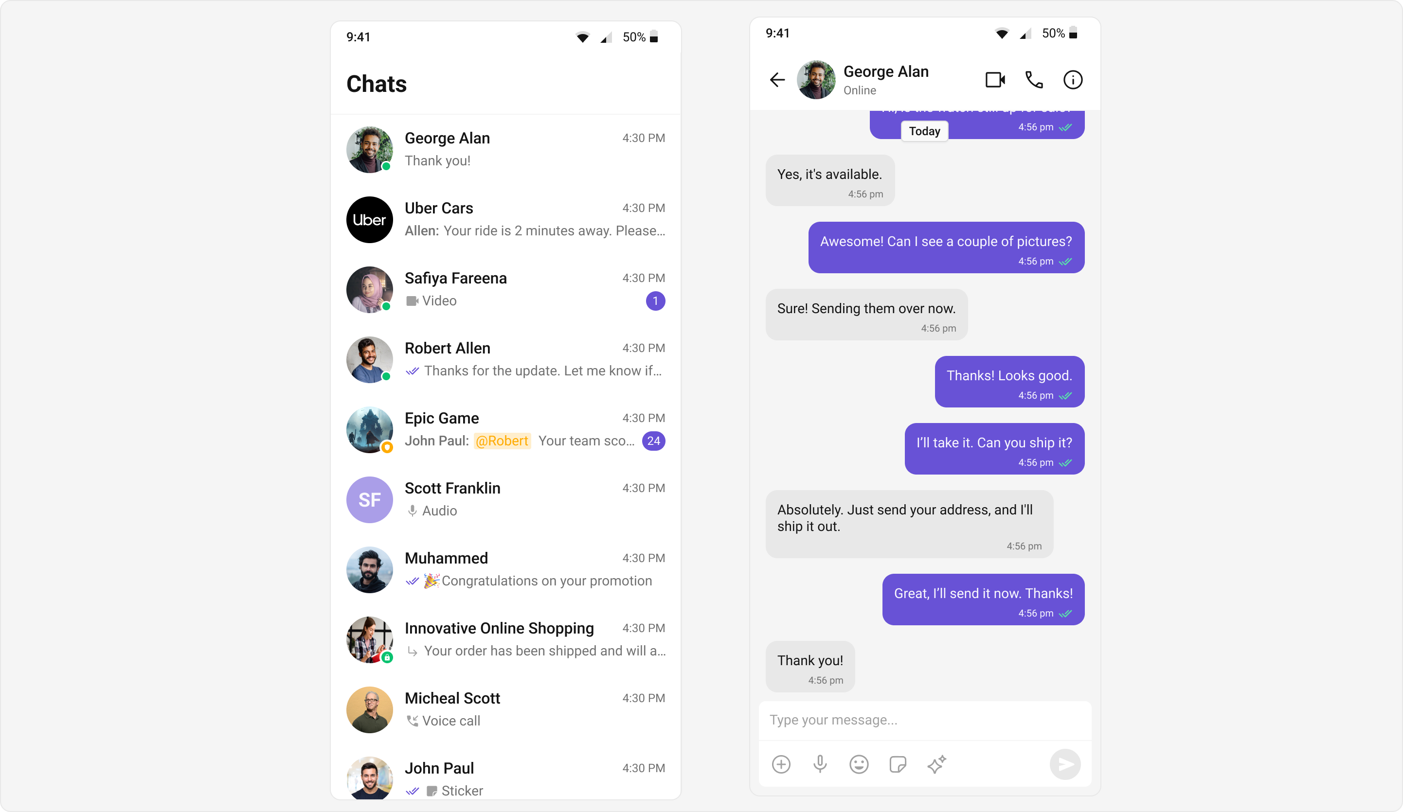
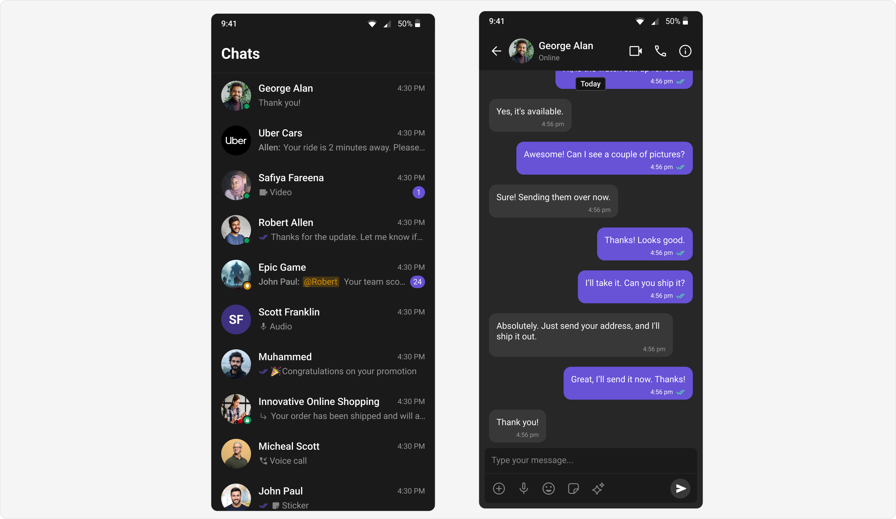
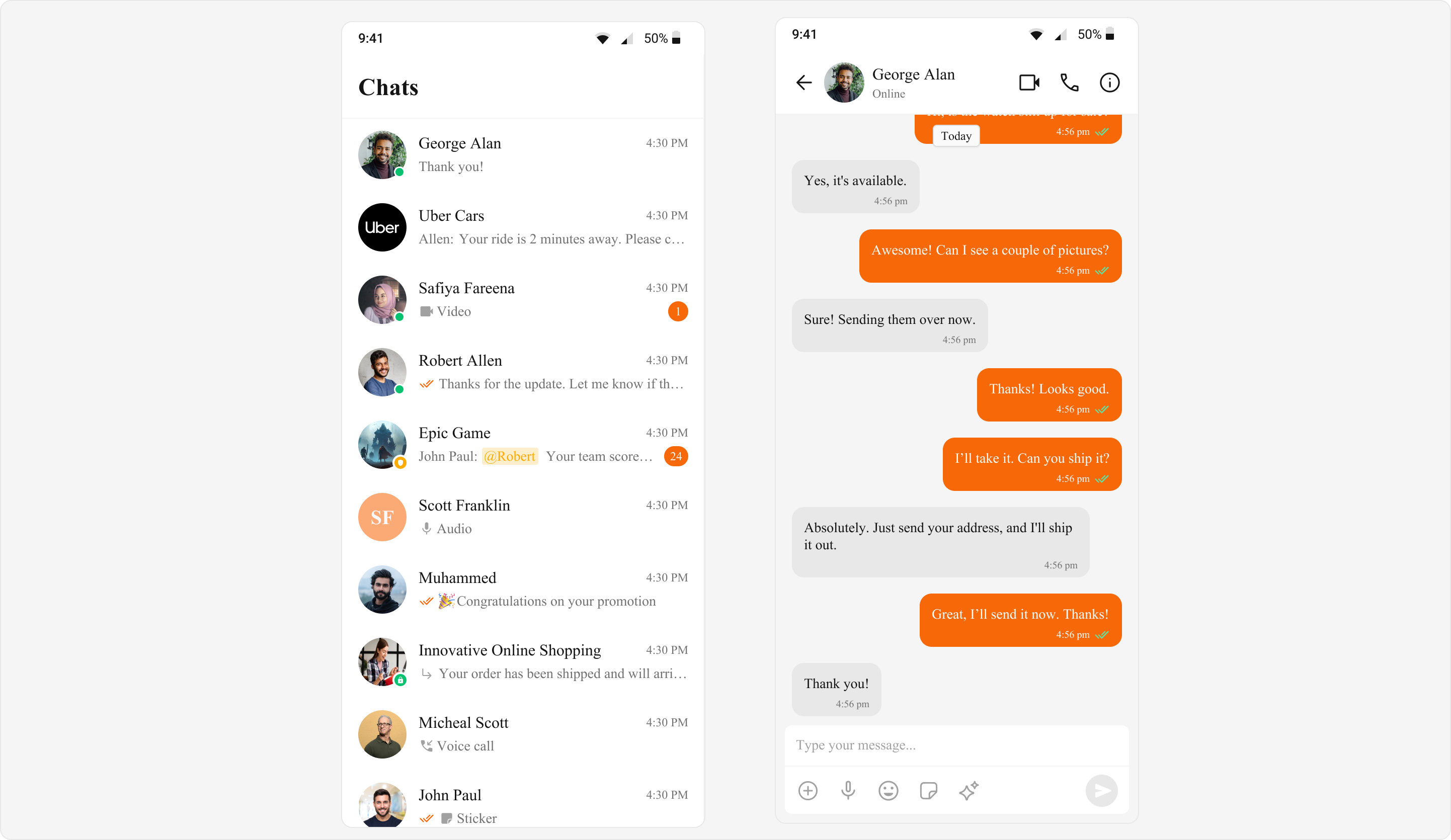
CometChatColorPalette controls all colors in the UI Kit. Apply it via ThemeData.extensions.
Complete Token Reference
Primary Colors
| Token | Description |
|---|---|
primary | Main accent color |
extendedPrimary50 | 96% lighter (light) / 80% darker (dark) |
extendedPrimary100 | 88% lighter (light) / 72% darker (dark) |
extendedPrimary200 | 77% lighter (light) / 64% darker (dark) |
extendedPrimary300 | 66% lighter (light) / 56% darker (dark) |
extendedPrimary400 | 55% lighter (light) / 48% darker (dark) |
extendedPrimary500 | 44% lighter (light) / 40% darker (dark) |
extendedPrimary600 | 33% lighter (light) / 32% darker (dark) |
extendedPrimary700 | 22% lighter (light) / 24% darker (dark) |
extendedPrimary800 | 11% lighter (light) / 16% darker (dark) |
extendedPrimary900 | 11% lighter (light) / 8% darker (dark) |
Neutral Colors
| Token | Description |
|---|---|
neutral50 - neutral900 | Surface and background shades (50, 100, 200, 300, 400, 500, 600, 700, 800, 900) |
Alert Colors
| Token | Description |
|---|---|
info | Information indicator |
warning | Warning indicator |
error | Error indicator |
success | Success indicator |
error100 | Light/dark mode error shade |
Text Colors
| Token | Description |
|---|---|
textPrimary | Primary text |
textSecondary | Secondary text |
textTertiary | Tertiary text |
textDisabled | Disabled text |
textWhite | White text |
textHighlight | Highlighted text |
Icon Colors
| Token | Description |
|---|---|
iconPrimary | Primary icon |
iconSecondary | Secondary icon |
iconTertiary | Tertiary icon |
iconWhite | White icon |
iconHighlight | Highlighted icon |
Border Colors
| Token | Description |
|---|---|
borderLight | Light border |
borderDefault | Default border |
borderDark | Dark border |
borderHighlight | Highlighted border |
Background Colors
| Token | Description |
|---|---|
background1 | Primary background |
background2 | Secondary background |
background3 | Tertiary background |
background4 | Quaternary background |
Button Colors
| Token | Description |
|---|---|
buttonBackground | Primary button background |
secondaryButtonBackground | Secondary button background |
buttonIconColor | Primary button icon |
buttonText | Primary button text |
secondaryButtonIcon | Secondary button icon |
secondaryButtonText | Secondary button text |
Other
| Token | Description |
|---|---|
shimmerBackground | Shimmer effect background |
shimmerGradient | Shimmer effect gradient |
messageSeen | Read receipt indicator |
white | White color |
black | Black color |
transparent | Transparent color |
Light Mode
- Dart
Dark Mode
- Dart
Custom Brand Colors
- Dart