
Building a chat app from scratch requires developing several key components, such as a homepage displaying recent conversations, a chat interface for real-time messaging between users, and a message composer to capture user input. Each of these elements demands considerable effort, including designing message bubbles, conversation lists, and managing real-time interactions effectively.
CometChat streamlines this entire process with its react chat UI kit, which provides a collection of pre-built, customizable chat elements like message bubbles, message composers, conversation lists, user lists, presence indicators, reactions, and more. These components are designed to fit seamlessly into your app’s architecture, saving you time and effort in development.
To start using these components, you’ll need to install the CometChat UI kit, which only takes 5-10 minutes.
In this guide, you’ll find:
01.
A detailed breakdown of each CometChat React component
02.
Clear examples and code snippets for quick integration
03.
Tips on how to customize these components to match your app’s design and functionality.
Installing CometChat’s UI kit for react: Step-by-step guide
To integrate CometChat's pre-built chat components into your React application, follow these simple steps.
Step 1: Register on CometChat
Sign up for a new CometChat account and create an application. Once the app is created, go to the QuickStart or API & Auth Keys section to retrieve your App ID, Auth Key, and Region.
Step 2: Install CometChat UI Kit
Now, install the CometChat react UI kit along with its core chat SDK. Run the following command to install the UI Kit:
Step 3: Initialize CometChat UI Kit
Import the necessary modules in your code.
After completing this step, your react chat UI Kit will be initialized, and you'll be able to use all the pre-built UI components in your application.
Understanding the types of components in CometChat's react UI kit
Components are organized into three main categories: Base Components, Components, and Composite Components. Understanding the distinction between these types is crucial to effectively using and customizing the UI Kit.
1. Base components
Base components are the foundational building blocks of your app’s user interface. They are simple, presentational components that focus solely on rendering visual elements based on input data, without any business logic.
For example, a base component could be a simple message bubble that only displays the message text and formatting but doesn't handle actions like sending or receiving messages.
Example base components:
Message bubbles (basic visual structure of a message)
Avatars (for user profile pictures)
Buttons or icons used in the UI
2. Components
Components in the CometChat UI Kit are more advanced than base components. These elements are composed of base components but come with added business logic, meaning they are designed to both render UI elements and manage interactions, data loading, and events.
For instance, a message composer is a component that not only presents a text input field and a send button (base components) but also manages the logic for sending a message when the user hits "send." These components help you save time by providing ready-made functionality that covers common actions needed in a chat app.
Example components:
Message composer (with built-in logic for sending messages)
Conversation list (auto-updating based on user activity)
Presence indicators (showing user availability)
3. Composite components
Composite components are the most advanced type of component in the CometChat UI Kit. They combine multiple components or other composite components to create complex UI elements with sophisticated functionality. These components are essentially bundles of smaller components working together to deliver more advanced features.
For example, a ConversationWithMessages composite component not only shows a list of conversations but also handles the logic for switching between different chats and displaying the messages within each conversation.
Example composite components:
ConversationWithMessages (a full chat interface)
UserListWithMessages (a user list that integrates seamlessly with a message thread)
Core UI components for building a fully functional react chat app
1. Conversations with messages

As a composite component, it combines several key elements, such as conversations, users, and contacts, into a single, cohesive interface, simplifying the task of managing and presenting user conversations.
Despite its simplicity, the Conversations with Messages component is incredibly powerful. By implementing and configuring this component, you’re already well on your way to building a functional and responsive chat app.
To add this component, check out the below code
For more details on how to implement and customize the Conversations with Messages component , check out the doc given below
2. Contacts, users and groups list
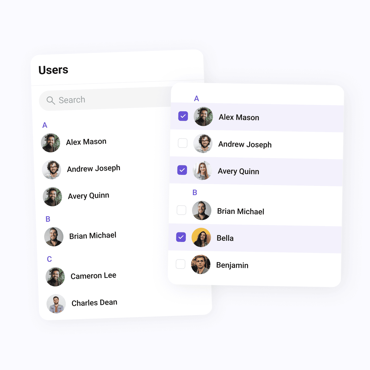
Contacts: This component provides a comprehensive view of all available users and groups within the app. It’s perfect for managing both private and group chats, offering smart search functionality and customizable selection modes. Users can select one or multiple contacts to start new conversations with ease.
To add this component, check out the code below
Users: The Users component focuses on listing all registered users in the application. It includes a search bar for quick navigation and displays each user’s name, avatar, and online/offline status. This component ensures users can quickly locate and initiate a chat with any individual within the app.
To add this component, check out the code below
Groups: The Groups component lists all available chat groups, providing an easy way to browse, join, or create new group conversations. For each group, users can view its name, icon, and the number of participants, giving them valuable insight into group activity levels.
To add this component, check out the code below
Together, these components simplify the process of initiating private or group conversations, giving your app a solid foundation for managing users and groups effectively. Whether you’re implementing one-on-one messaging or building group chat functionality, these components ensure a smooth and user-friendly experience.
For more details on how to implement and customize these components, check out the official documentation given below,
3. Messages
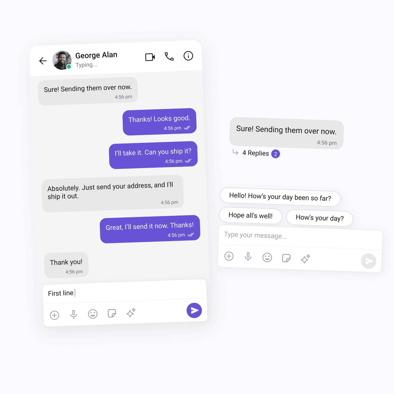
As a composite component, it combines several essential elements to manage both the presentation and functionality of messaging. These include the MessageHeader, MessageList, and MessageComposer components, each working together to create a seamless messaging experience.
Here’s a breakdown of the key components that make up the Messages component:
MessageHeader: This component displays the essential information of the user or group with whom the conversation is taking place. By using CometChat SDK’s user or group object, it retrieves and shows details like the user’s name, profile picture, or group icon. It also includes a real-time typing indicator, which appears when the other participant is typing, enhancing the interactivity of the chat experience.
To integrate this component, check out the code below
MessageList: One of the core UI elements of the Messages component, the MessageList is responsible for displaying the entire history of messages exchanged in the conversation. It not only lists messages but also handles real-time message updates, ensuring that new messages are dynamically displayed as they are sent or received.
To integrate this component, check out the code below
MessageComposer: The MessageComposer is a critical, independent component that allows users to compose and send messages. Supporting various message types—including text, images, videos, and custom messages, it is highly versatile. With built-in support for message input, the composer simplifies the user experience by handling all message creation and submission logic.
To integrate this component, check out the code below
For more detailed guidance on using and customizing the Messages component, visit the official documentation
Messages component documentation
Message composer documentation
4. Message information

Read receipts: Indicates whether the message has been delivered and whether the recipient has viewed it.
Timestamps: Displays the time when each message was sent or received.
To integrate this component, check out the code below
For more detailed guidance on using and customizing the Message information, visit the official documentation
5. Threaded messages

The Threaded messages component enables you to implement a reply feature similar to that found in Slack. This component displays a parent message along with all the replies associated with it, facilitating clearer discussions within a chat.
Key features of the Threaded Messages component include:
Parent message display: The parent message is prominently displayed at the top of the threaded view, providing context for the replies that follow.
Message list for replies: Below the parent message, a message list contains all replies related to that specific message. This organization helps users easily follow the flow of conversation without losing track of the context.
Message composer: Positioned at the bottom of the threaded view, the message composer allows users to compose new replies directly within the thread. This intuitive layout simplifies interaction, making it easy for users to contribute to discussions.
To integrate this component, check out the code below
For more information on how to use the Threaded Messages component, refer to the official documentation:
Threaded messages component documentation
6. Reactions

The Reactions components enhance user engagement by allowing users to express their feelings toward specific messages through emojis. These three interconnected components work together to provide a comprehensive reaction system:
Reactions Component: This component visually represents emoji reactions associated with a particular message. It displays reactions directly in the message bubble.
To integrate this component, check out the code below
Reaction List Component: The Reaction List offers a detailed view of all reactions associated with a message. It showcases the specific emojis used by each individual user. Additionally, users can interact with the list to remove their own reactions.
To integrate this component, check out the code below
Reaction Info Component: This component provides a tooltip that details the emoji reactions on a message.
To integrate this component, check out the code below
For more information on how to use the Reactions component, refer to the official documentation:
7. Group chat components
CreateGroup
This component empowers users to create various types of groups, including public, private, and password-protected ones. By offering customizable group settings, users can tailor the group’s privacy and access level to their preferences, ensuring a personalized chatting experience.
To integrate this component, check out the code below
GroupMembers
This component displays all users who have been added or invited to a group.
To integrate this component, check out the code below
AddMembers
This component enables group owners or administrators to add new members to a group easily. Provides functionality to search for specific users or select from a list of available members.
Once new users are added, they receive notifications to join the group, enhancing participation and collaboration.
To integrate this component, check out the code below
CometChatBannedMembers
This component displays users who have been banned from participating in specific groups.
To integrate this component, check out the code below
CometChatDetails
This component provides additional information and settings related to a specific group.
Group information: Displays vital details about the group, such as the group name, profile picture, and status.
Group chat features: Offers functionalities for managing group members, such as adding or removing participants and assigning roles or permissions.
Group actions: Provides options for administrative actions, including leaving or deleting the group, giving administrators complete control over the group dynamics.
To integrate this component, check out the code below
For more information on how to use the Group chat component, refer to the official documentation:
Groups with messages documentation
Join protected group documentation
8. Chat bubbles

In CometChat's UI Kit, a variety of pre-built message bubbles are provided to display different types of content, such as text, images, files, and more. These message bubbles allow you to easily implement responsive and visually appealing chat bubbles.
All the bubbles are customizable, providing flexibility for developers to align the chat interface with their app’s design while delivering a seamless messaging experience.
Below are the various types of message bubbles available and the corresponding components to use for each:
Text bubble
To display text messages, you can use the CometChatTextBubble component. This bubble cleanly presents text with customizable styling options for readability and appearance.
To integrate this component, check out the below code
Image bubble
For rendering images shared between users, the CometChatImageBubble component is ideal. It supports various image formats and ensures they are displayed attractively within the chat.
To integrate this component, check out the below code
Video bubble
To display video files directly within the chat, the CometChatVideoBubble component offers built-in functionality for playing shared videos without leaving the conversation.
To integrate this component, check out the below code
Form bubble
The CometChatFormBubble component enables the exchange of forms, allowing users to collect information directly within the chat.
Meeting scheduler bubble
With the ScheduleBubble component, users can schedule meetings or appointments within the chat.
Location bubble
The CometChatLocationBubble component provides a map view to display shared locations, showing pinned addresses or coordinates within the chat interface.
Contact bubble
For sharing contact information, such as phone numbers and email addresses, you can use the CometChatContactBubble component.
Card bubble
Lastly, the CometChatCardBubble component offers a structured way to present rich media content, such as product details or event invitations, in a visually organized card format.
To integrate this component, check out the below code
For more information on how to use the chat bubbles component, refer to the official documentation:
Scheduler bubble documentation
9. Read receipts (message status)
Use the CometChatReceipt component to display the status of messages, such as sending, sent, delivered, read, or error states. The icons for each status can be customized to match your app's design.
To integrate this component, check out the below code
For more information on how to use the read receipts component, refer to the official documentation:
10. Message counts
Use the CometChatBadge component to show the unread message count. It visually highlights the number of unread messages, offering users a quick overview of new activity.
To integrate this component, check out the below code
11. Presence Indicators
Use the CometChatStatusIndicator component indicates a user's online or offline status. It offers customization options for the border color, border size, and background color, making it adaptable to your app’s style.
To integrate this component, check out the below code
For more information on how to use the presence indicator component, refer to the official documentation:
Presence indicator documentation
12. Voice recorder
Use the CometChatMediaRecorder component to allow users to record and playback audio. This component is ideal for chat applications where audio messaging is needed
To integrate this component, check out the below code
For more information on how to use the voice recorder component, refer to the official documentation:
About Cometchat
CometChat is a powerful communication infrastructure platform that enables developers to seamlessly integrate real-time chat, voice, and video capabilities into their apps and websites.
Designed to enhance user engagement and in-app communication, CometChat provides a robust set of chat and calling features that cater to various use cases, including marketplaces, telehealth, social networking apps, and enterprise communication solutions.
What We Offer
Real-time chat: Our chat solution supports one-on-one, and group messaging, complete with features like message history, typing indicators, read receipts, and file sharing.
Feature rich UI Kits and SDKs: Our pre-built UI kits help developers get started quickly with beautiful, responsive chat interfaces embedded with business logic.
Voice & video Calling: CometChat offers high-quality voice and video calling features, allowing users to connect instantly.
Chat moderation: We provide advanced moderation tools to automatically filter and block
common violations such as profanity, hate speech, and violence power by contextual AI engines.
Notifications: With CometChat, developers can easily send push, SMS and email notifications to keep users informed about new messages, mentions, or other important events.

Aarathy Sundaresan
Content Marketer , CometChat