AI Integration Quick Reference
AI Integration Quick Reference
| Field | Value |
|---|---|
| Package | @cometchat/chat-uikit-react |
| Framework | React.js |
| Components | CometChatConversations, CometChatMessageHeader, CometChatMessageList, CometChatMessageComposer |
| Layout | Two-panel — conversation list (left) + message view (right) |
| Prerequisite | Complete React.js Integration Steps 1–5 first |
| Pattern | WhatsApp Web, Slack, Microsoft Teams |
Fork the sandbox, insert your CometChat credentials (App ID, Region, Auth Key), and preview the UI in real time.
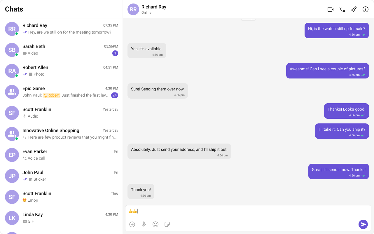
What You’re Building
Three sections working together:- Sidebar (conversation list) — shows all active conversations (users and groups)
- Message view — displays chat messages for the selected conversation in real time
- Message composer — text input with support for media, emojis, and reactions
Step 1 — Create the Sidebar Component
Create aCometChatSelector folder inside src/:
src
CometChatSelector
CometChatSelector.tsx
CometChatSelector.css
- TypeScript
- CSS
CometChatSelector.tsx
CometChatUIKitLoginListener.getLoggedInUser()checks for an active session — the component only renders if a user is logged in.activeConversationhighlights the currently selected conversation in the list.onItemClickfires when a user taps a conversation, passing theConversationobject to the parent.
Step 2 — Update App.tsx and App.css
Wire the sidebar and message components together in your main app file.- TypeScript
- CSS
App.tsx
- When a conversation is tapped,
onSelectorItemClickedextracts theUserorGroupfrom theConversationobject. selectedUser/selectedGroupstate drives which chat is displayed — pass eitheruserorgroupto the message components, never both.- The empty state shows until a conversation is selected.
Step 3 — Run the Project
- Vite
- Create React App
Next Steps
Theming
Customize colors, fonts, and styles to match your brand
Components Overview
Browse all prebuilt UI components
React.js Integration
Back to the main setup guide
Core Features
Chat features included out of the box