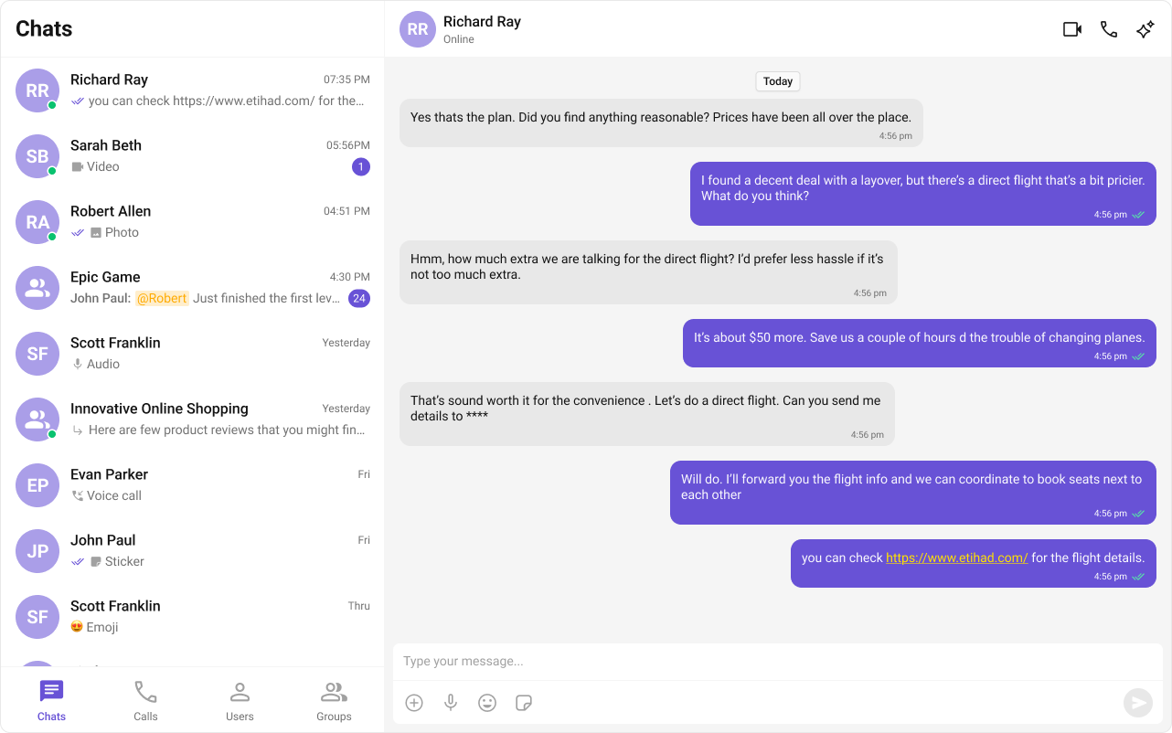
Building a Messaging UI with Tabs, Sidebar, and Message View
This guide walks you through creating a tab-based messaging UI using React and CometChat UIKit. The UI will include different sections for Chats, Calls, Users, and Groups, allowing seamless navigation.
Tip: You can fork the sandbox, insert your CometChat credentials (App ID, Region, Auth Key.) in the code, and immediately preview how the UI and messages respond in real time.
User Interface Preview

This layout consists of:
- Sidebar (Conversation List) – Displays recent conversations with active users and groups.
- Message View – Shows the selected chat with real-time messages.
- Message Input Box – Allows users to send messages seamlessly.
Step-by-Step Guide
Step 1: Create a Tab Component
To manage navigation, let's build a CometChatTabs
component. This component will render different tabs and allow switching between sections dynamically.
Folder Structure
Create a CometChatTabs
folder inside your src
directory and add the following files:
public/
├── assets # These are the images you need to save
│ ├── chats.svg
│ ├── calls.svg
│ ├── users.svg
│ ├── groups.svg
src/
│── CometChatTabs/
│ ├── CometChatTabs.tsx
│ ├── CometChatTabs.css
Download the Icons
These icons are available in the CometChat UI Kit assets folder. You can find them at:
🔗 GitHub Assets Folder
Implementation
- TypeScript
- CSS
import { useState } from "react";
import "./CometChatTabs.css";
// Define icon paths for each tab
const chatsIcon = "/assets/chats.svg";
const callsIcon = "/assets/calls.svg";
const usersIcon = "/assets/users.svg";
const groupsIcon = "/assets/groups.svg";
// CometChatTabs component to display tab options
export const CometChatTabs = (props: {
onTabClicked?: (tabItem: { name: string; icon?: string }) => void; // Callback when a tab is clicked
activeTab?: string; // Name of the currently active tab
}) => {
// Destructure props with default fallback
const {
onTabClicked = () => {}, // Fallback to no-op if not provided
activeTab,
} = props;
// State to track the currently hovered tab
const [hoverTab, setHoverTab] = useState("");
// Array of tab items with their labels and icons
const tabItems = [
{ name: "CHATS", icon: chatsIcon },
{ name: "CALLS", icon: callsIcon },
{ name: "USERS", icon: usersIcon },
{ name: "GROUPS", icon: groupsIcon },
];
return (
<div className="cometchat-tab-component">
{/* Loop through each tab item to render it */}
{tabItems.map((tabItem) => {
const isActive =
activeTab === tabItem.name.toLowerCase() ||
hoverTab === tabItem.name.toLowerCase();
return (
<div
key={tabItem.name}
className="cometchat-tab-component__tab"
onClick={() => onTabClicked(tabItem)} // Invoke callback on click
>
{/* Icon section with mask styling */}
<div
className={
isActive
? "cometchat-tab-component__tab-icon cometchat-tab-component__tab-icon-active"
: "cometchat-tab-component__tab-icon"
}
style={{
WebkitMaskImage: `url(${tabItem.icon})`,
maskImage: `url(${tabItem.icon})`,
}}
onMouseEnter={() => setHoverTab(tabItem.name.toLowerCase())}
onMouseLeave={() => setHoverTab("")}
/>
{/* Tab label */}
<div
className={
isActive
? "cometchat-tab-component__tab-text cometchat-tab-component__tab-text-active"
: "cometchat-tab-component__tab-text"
}
onMouseEnter={() => setHoverTab(tabItem.name.toLowerCase())}
onMouseLeave={() => setHoverTab("")}
>
{tabItem.name}
</div>
</div>
);
})}
</div>
);
};
/* Main container for the CometChat tab bar */
.cometchat-tab-component {
display: flex; /* Align child tabs horizontally */
width: 100%; /* Full-width tab bar */
padding: 0px 8px; /* Horizontal padding */
align-items: flex-start; /* Align tab items to the top */
gap: 8px; /* Space between tab items */
border-top: 1px solid var(--cometchat-border-color-light, #F5F5F5); /* Top border */
border-right: 1px solid var(--cometchat-border-color-light, #F5F5F5); /* Right border */
background: var(--cometchat-background-color-01, #FFF); /* Background color */
}
/* Styles for each individual tab */
.cometchat-tab-component__tab {
display: flex;
flex-direction: column; /* Stack icon and text vertically */
justify-content: center; /* Center vertically */
align-items: center; /* Center horizontally */
padding: 12px 0px 10px 0px; /* Top and bottom spacing */
gap: 4px; /* Space between icon and text */
flex: 1 0 0; /* Equally distribute available space among tabs */
min-height: 48px; /* Minimum height for consistent layout */
}
/* Default tab icon style */
.cometchat-tab-component__tab-icon {
display: flex;
width: 32px;
height: 32px;
justify-content: center;
align-items: center;
background: var(--cometchat-icon-color-secondary); /* Default icon background */
-webkit-mask-size: contain;
-webkit-mask-position: center;
-webkit-mask-repeat: no-repeat;
mask-size: contain;
mask-position: center;
mask-repeat: no-repeat;
cursor: pointer;
}
/* Tab text label style */
.cometchat-tab-component__tab-text {
color: var(--cometchat-text-color-secondary, #727272); /* Default label color */
text-align: center;
font: var(--cometchat-font-caption1-medium, 500 12px Roboto); /* Font style */
cursor: pointer;
}
/* Highlighted icon style for active/hovered tab */
.cometchat-tab-component__tab-icon-active {
background: var(--cometchat-icon-color-highlight); /* Highlight color */
}
/* Highlighted text style for active/hovered tab */
.cometchat-tab-component__tab-text-active {
color: var(--cometchat-text-color-highlight); /* Highlighted text color */
}
Step 2: Create Sidebar
Let's create the Sidebar
component which will render different conversations.
Folder Structure
Create a CometChatSelector
folder inside your src/app
directory and add the following files:
src/
│── CometChatSelector/
│ ├── CometChatSelector.tsx
│ ├── CometChatSelector.css
- TypeScript
- CSS
import { useEffect, useState } from "react";
import {
Call,
Conversation,
Group,
User,
CometChat
} from "@cometchat/chat-sdk-javascript";
import {
CometChatCallLogs,
CometChatConversations,
CometChatGroups,
CometChatUIKit,
CometChatUIKitLoginListener,
CometChatUsers
} from "@cometchat/chat-uikit-react";
import { CometChatTabs } from "../CometChatTabs/CometChatTabs";
// Define props interface for selector
interface SelectorProps {
onSelectorItemClicked?: (input: User | Group | Conversation | Call, type: string) => void;
}
export const CometChatSelector = (props: SelectorProps) => {
const {
onSelectorItemClicked = () => {},
} = props;
// State to manage currently logged in user
const [loggedInUser, setLoggedInUser] = useState<CometChat.User | null>();
// State to track selected conversation, user, group, or call
const [activeItem, setActiveItem] = useState<
Conversation | User | Group | Call | undefined
>();
// State to track currently active tab: "chats", "calls", "users", or "groups"
const [activeTab, setActiveTab] = useState<string>("chats");
// Fetch logged-in user once component mounts
useEffect(() => {
const user = CometChatUIKitLoginListener.getLoggedInUser();
setLoggedInUser(user);
}, [CometChatUIKitLoginListener?.getLoggedInUser()]);
// Logout function to clear user session
const logOut = () => {
CometChatUIKit.logout()
.then(() => {
setLoggedInUser(null);
})
.catch((error) => {
console.log("Logout error:", error);
});
};
return (
<>
{/* Render selector content only if a user is logged in */}
{loggedInUser && (
<>
{activeTab === "chats" && (
<CometChatConversations
activeConversation={activeItem instanceof CometChat.Conversation ? activeItem : undefined}
onItemClick={(item) => {
setActiveItem(item);
onSelectorItemClicked(item, "updateSelectedItem");
}}
/>
)}
{activeTab === "calls" && (
<CometChatCallLogs
activeCall={activeItem as Call}
onItemClick={(item: Call) => {
setActiveItem(item);
onSelectorItemClicked(item, "updateSelectedItemCall");
}}
/>
)}
{activeTab === "users" && (
<CometChatUsers
activeUser={activeItem as User}
onItemClick={(item) => {
setActiveItem(item);
onSelectorItemClicked(item, "updateSelectedItemUser");
}}
/>
)}
{activeTab === "groups" && (
<CometChatGroups
activeGroup={activeItem as Group}
onItemClick={(item) => {
setActiveItem(item);
onSelectorItemClicked(item, "updateSelectedItemGroup");
}}
/>
)}
</>
)}
{/* Render the tab switcher at the bottom */}
<CometChatTabs
activeTab={activeTab}
onTabClicked={(item) => {
setActiveTab(item.name.toLowerCase()); // Update tab on click
}}
/>
</>
);
};
/* Style the icon inside header menu in conversation list */
.selector-wrapper .cometchat-conversations .cometchat-list__header-menu .cometchat-button__icon {
background: var(--cometchat-icon-color-primary); /* Primary icon color */
}
/* Highlight icon on hover */
.cometchat-conversations .cometchat-list__header-menu .cometchat-button__icon:hover {
background: var(--cometchat-icon-color-highlight); /* Highlighted icon color on hover */
}
/* Remove right border from the search bar inside the list */
.cometchat-list__header-search-bar {
border-right: none;
}
/* Align menu list items to the left */
.cometchat .cometchat-menu-list__sub-menu-list-item {
text-align: left;
}
/* Positioning for the submenu inside conversations menu */
.cometchat .cometchat-conversations .cometchat-menu-list__sub-menu-list {
width: 212px;
top: 40px !important;
left: 172px !important;
}
/* Style for the logged-in user section with bottom border */
#logged-in-user {
border-bottom: 2px solid var(--cometchat-border-color-default, #E8E8E8);
}
/* Make submenu items under logged-in user non-clickable */
#logged-in-user .cometchat-menu-list__sub-menu-item-title,
#logged-in-user .cometchat-menu-list__sub-menu-list-item {
cursor: default;
}
/* Logout icon color inside submenu */
.cometchat-menu-list__sub-menu-list-item-icon-log-out {
background-color: var(--cometchat-error-color, #F44649); /* Error color */
}
/* Logout label/text color inside submenu */
.cometchat-menu-list__sub-menu-item-title-log-out {
color: var(--cometchat-error-color, #F44649);
}
/* Enable pointer cursor for chat menu item titles */
.chat-menu .cometchat .cometchat-menu-list__sub-menu-item-title {
cursor: pointer;
}
/* Remove shadow from the chat menu's submenu */
.chat-menu .cometchat .cometchat-menu-list__sub-menu {
box-shadow: none;
}
/* Style the icons inside chat menu items */
.chat-menu .cometchat .cometchat-menu-list__sub-menu-icon {
background-color: var(--cometchat-icon-color-primary, #141414);
width: 24px;
height: 24px;
}
Step 3: Render Experience
Now we will update the CometChatNoSSR.tsx
& CometChatNoSSR.css
files to import these new components as below,
- TypeScript
- CSS
import React, { useEffect, useState } from "react";
import {
CometChatMessageComposer,
CometChatMessageHeader,
CometChatMessageList,
CometChatUIKit,
UIKitSettingsBuilder
} from "@cometchat/chat-uikit-react";
import { CometChat } from "@cometchat/chat-sdk-javascript";
import { CometChatSelector } from "../CometChatSelector/CometChatSelector";
import "./CometChatNoSSR.css";
// Constants for CometChat configuration
const COMETCHAT_CONSTANTS = {
APP_ID: "",
REGION: "",
AUTH_KEY: "",
};
// Functional component for CometChatNoSSR
const CometChatNoSSR: React.FC = () => {
// State to store the logged-in user
const [user, setUser] = useState<CometChat.User | undefined>(undefined);
// State to store selected user or group
const [selectedUser, setSelectedUser] = useState<CometChat.User | undefined>(undefined);
const [selectedGroup, setSelectedGroup] = useState<CometChat.Group | undefined>(undefined);
useEffect(() => {
// Initialize UIKit settings
const UIKitSettings = new UIKitSettingsBuilder()
.setAppId(COMETCHAT_CONSTANTS.APP_ID)
.setRegion(COMETCHAT_CONSTANTS.REGION)
.setAuthKey(COMETCHAT_CONSTANTS.AUTH_KEY)
.subscribePresenceForAllUsers()
.build();
// Initialize CometChat UIKit
CometChatUIKit.init(UIKitSettings)
?.then(() => {
console.log("Initialization completed successfully");
// Check if user is already logged in
CometChatUIKit.getLoggedinUser().then((loggedInUser) => {
if (!loggedInUser) {
// Perform login if no user is logged in
CometChatUIKit.login("cometchat-uid-4")
.then((user) => {
console.log("Login Successful", { user });
setUser(user);
})
.catch((error) => console.error("Login failed", error));
} else {
console.log("Already logged-in", { loggedInUser });
setUser(loggedInUser);
}
});
})
.catch((error) => console.error("Initialization failed", error));
}, []);
return user ? (
<div className="conversations-with-messages">
{/* Sidebar with conversation list */}
<div className="conversations-wrapper">
<CometChatSelector
onSelectorItemClicked={(activeItem) => {
let item = activeItem;
// Extract the conversation participant
if (activeItem instanceof CometChat.Conversation) {
item = activeItem.getConversationWith();
}
// Update states based on the type of selected item
if (item instanceof CometChat.User) {
setSelectedUser(item as CometChat.User);
setSelectedGroup(undefined);
} else if (item instanceof CometChat.Group) {
setSelectedUser(undefined);
setSelectedGroup(item as CometChat.Group);
} else {
setSelectedUser(undefined);
setSelectedGroup(undefined);
}
}}
/>
</div>
{/* Message view section */}
{selectedUser || selectedGroup ? (
<div className="messages-wrapper">
<CometChatMessageHeader user={selectedUser} group={selectedGroup} />
<CometChatMessageList user={selectedUser} group={selectedGroup} />
<CometChatMessageComposer user={selectedUser} group={selectedGroup} />
</div>
) : (
<div className="empty-conversation">Select Conversation to start</div>
)}
</div>
) : undefined;
};
export default CometChatNoSSR;
/* Layout for the main container that holds conversations and messages */
.conversations-with-messages {
display: flex;
height: 100%;
width: 100%;
}
/* Sidebar wrapper for conversation list */
.conversations-wrapper {
height: 100%;
width: 480px; /* Fixed width for conversation list */
overflow: hidden; /* Hide any overflowing content */
display: flex;
flex-direction: column;
height: inherit;
}
/* Hide overflow content inside the conversation component */
.conversations-wrapper > .cometchat {
overflow: hidden;
}
/* Message section layout */
.messages-wrapper {
width: calc(100% - 480px); /* Take remaining space */
height: 100%;
display: flex;
flex-direction: column;
}
/* Styling for when no conversation is selected */
.empty-conversation {
height: 100%;
width: 100%;
display: flex;
justify-content: center;
align-items: center;
background: white;
color: var(--cometchat-text-color-secondary, #727272);
font: var(--cometchat-font-body-regular, 400 14px Roboto);
}
/* Ensure message composer does not have rounded corners */
.cometchat .cometchat-message-composer {
border-radius: 0px;
}
Step 4: Disabling SSR for CometChatNoSSR.tsx
in Next.js
In this update, we will disable Server-Side Rendering (SSR) for CometChatNoSSR.tsx
while keeping the rest of the application’s SSR functionality intact. This ensures that the CometChat UI Kit components load only on the client-side, preventing SSR-related issues.
Disabling SSR in index.tsx
Modify your index.tsx
file to dynamically import the CometChatNoSSR.tsx
component with { ssr: false }
.
import { Inter } from "next/font/google";
import dynamic from "next/dynamic";
import '@cometchat/chat-uikit-react/css-variables.css';
const inter = Inter({ subsets: ["latin"] });
// Dynamically import CometChat component with SSR disabled
const CometChatComponent = dynamic(() => import("../CometChatNoSSR/CometChatNoSSR"), {
ssr: false,
});
export default function Home() {
return <CometChatComponent />;
}
Why disable SSR?
- The CometChat UI Kit depends on browser APIs (window, document, WebSockets).
- Next.js pre-renders components on the server, which can cause errors with browser-specific features.
- By setting
{ ssr: false }
, we ensure that CometChatNoSSR.tsx only loads on the client.
Step 5: Update Global CSS
Next, add the following styles to global.css to ensure CometChat UI Kit is properly styled.
:root {
--background: #ffffff;
--foreground: #171717;
}
@media (prefers-color-scheme: dark) {
:root {
--background: #0a0a0a;
--foreground: #ededed;
}
}
/** Give your App a height of `100%`. Keep other CSS properties in the below selector as it is. */
.root {
height: 100%;
}
#__next {
height: 100%;
}
html,
body {
height: 100%;
}
html,
body {
max-width: 100vw;
overflow-x: hidden;
}
body {
color: var(--foreground);
background: var(--background);
font-family: Arial, Helvetica, sans-serif;
-webkit-font-smoothing: antialiased;
-moz-osx-font-smoothing: grayscale;
}
* {
box-sizing: border-box;
padding: 0;
margin: 0;
}
a {
color: inherit;
text-decoration: none;
}
@media (prefers-color-scheme: dark) {
html {
color-scheme: dark;
}
}
Step 6: Run the project
npm run dev
Next Steps
Enhance the User Experience
- Advanced Customizations – Personalize the chat UI to align with your brand.