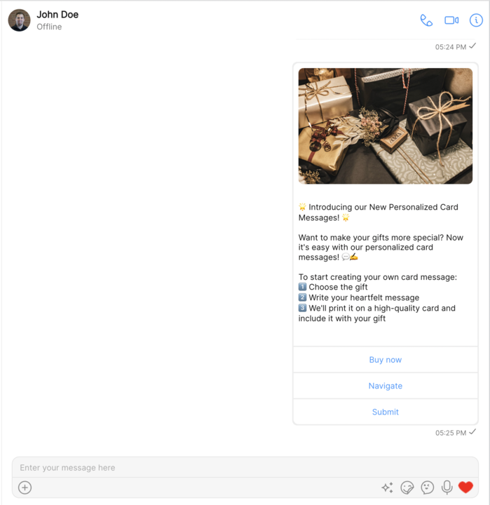
CometChatCardBubble component is used to display a card within a chat bubble. The card includes an image, text, and action buttons. It helps to offer action-oriented chat experiences, like booking a flight, ordering food, scheduling a meeting, etc., directly in the chat.

Properties
| Methods | Parameters | Description |
|---|---|---|
| message | CardMessage | An instance of the CardMessage class which holds information about the card such as image URL, text, and action buttons. |
| cardBubbleStyle ? | CardBubbleStyle | An instance of the CardBubbleStyle class for customizing the appearance of the card bubble. |
CardBubbleStyle
CardBubbleStyle is a class extending BaseStyle containing attributes to customize the appearance of the card in the CometChatCardBubble component.
| Methods | Type | Description |
|---|---|---|
| wrapperBackground | string | Used to set Background of wrapper in card bubble |
| wrapperBorderRadius | string | Used to set borderRadius of wrapper in card bubble |
| descriptionFont | string | Used to set the font style of the description. |
| descriptionFontColor | string | Used to set the color of the description. |
| wrapperPadding | string | Used to set the wrapperPadding of the card bubble. |
| buttonStyle | any | Used to customize the style of buttons. |
| imageHeight | string | Used to customize the height of the image in the card. |
| imageWidth | string | Used to customize the width of the image in the card. |
| imageRadius | string | Used to customize the border radius of the image in the card. |
| imageBackgroundColor | string | Used to customize the background color of the image in the card. |
| dividerTintColor | string | Used to customize the tint of divider in card bubble |
| disabledButtonColor | string | Used to customize the color of button when disabled |
Usage
- TypeScript