- Shape and Style: It is designed to visually encapsulate the content of a message.
- Message Content: The message bubble contains the text or multimedia content of the message, such as plain text, images, emojis, or other media. It displays the actual content of the message sent by the sender.
- Sender Information: Message bubbles includes additional information about the sender of the message, such as their name, profile picture, or timestamp. This information helps to identify who sent the message and when it was sent.
- Layout and Placement: Message bubbles are typically arranged in a chronological order, displaying the messages in the order they were sent beginning from latest to earliest.
- Visual Indicators: Message bubbles also includes visual indicators to convey additional information or status of the message i.e. delivered or read status indicator.
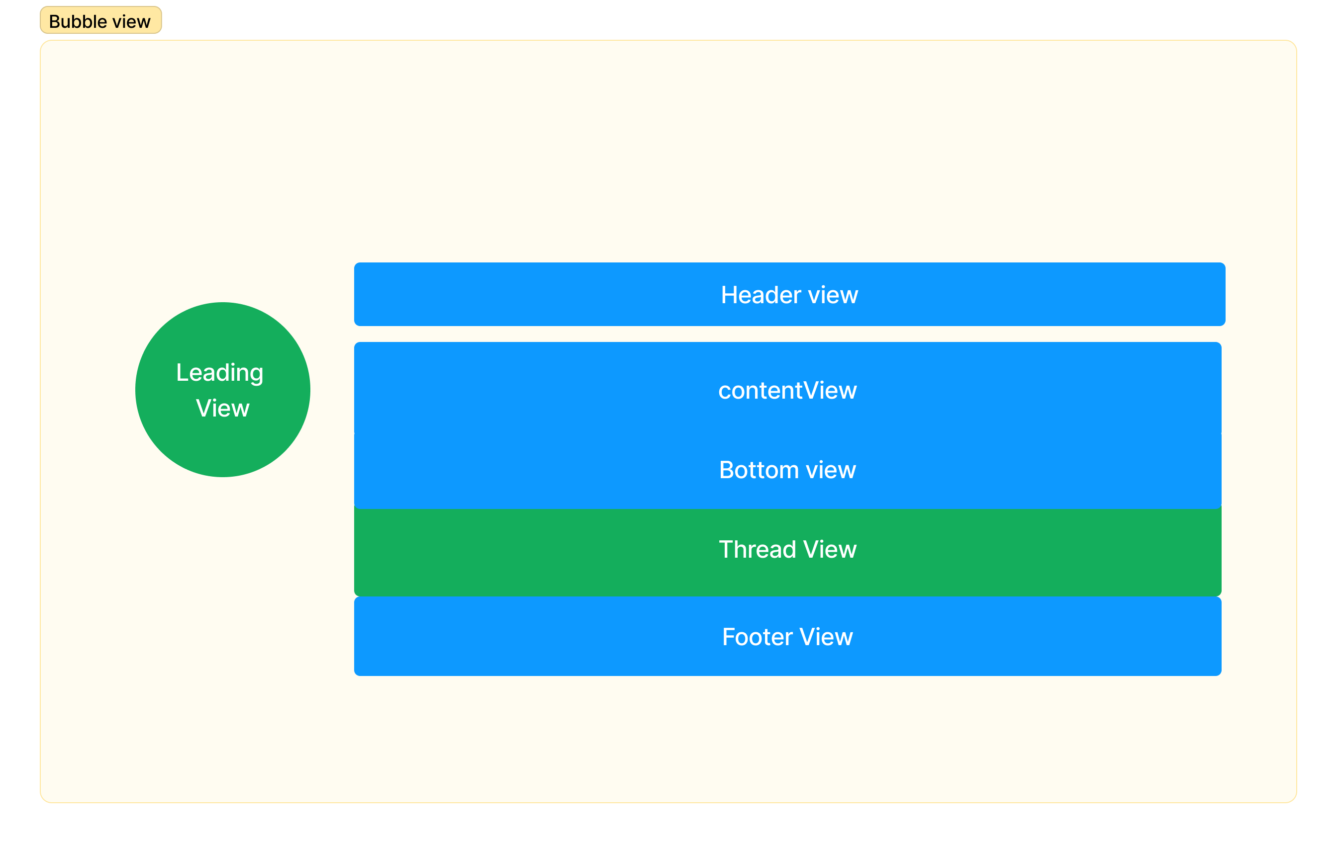
Properties
| Name | Type | Description |
|---|---|---|
| id | string | Unique identifier of each message bubble |
| leadingView | Object as PropType<ViewType> | User-defined component to customise the avatar of the message sender. |
| headerView | Object as PropType<ViewType> | User-defined component to customise the header section of the message bubble. |
| replyView | Object as PropType<ViewType> | User-defined component to customise the header section of the message bubble. |
| BottomView | Object as PropType<ViewType> | User-defined component to customise the quote or reference to the original message view |
| contentView | Object as PropType<ViewType> | User-defined component to customise the actual content of the message bubble |
| threadView | Object as PropType<ViewType> | User-defined component to customise the thread view that displays the no. of replies or responses |
| footerView | Object as PropType<ViewType> | User-defined component to display the footer view that display the timestamp and read-receipt of the message |
| options | Array CometChatActionsIcon | CometChatActionsView | User-defined actions which appears for each message bubble on mouseover. |
| alignment | MessageBubbleAlignment | Group of constants representing the alignment of message bubble |
| moreIconURL | string | Asset URL for the more icon that appears in the context menu |
| topMenuSize | number | List of menu button that appears by default in the context menu |
| messageBubbleStyle | MessageBubbleStyle | Styling properties and values of the component |