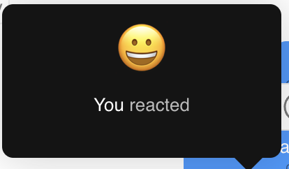
ReactionInfo
The CometChatReactionInfo component is used to display the count and users of a specific reaction to a message.

Properties
| Properties | Type | Description |
|---|---|---|
messageObject | CometChat.BaseMessage | The message to display reactions for. |
reaction | string | The specific reaction to display the info for. |
loadingIconURL | string | The URL for the loading icon. |
errorIconURL | string | The URL for the error icon. |
reactionsRequestBuilder | CometChat.ReactionsRequestBuilder | The request builder for fetching reactions. |
reactionInfoStyle | ReactionInfoStyle | The style for the reaction info component. |
Usage
<cometchat-reaction-info
    messageObject={messageObject}
    reaction={reaction}
    loadingIconURL={loadingIconURL}
    errorIconURL={errorIconURL}
    reactionsRequestBuilder={reactionsRequestBuilder}
    reactionInfoStyle={reactionInfoStyle}
/>
ReactionInfoStyle
ReactionInfoStyle is a class containing attributes to customize the appearance of the CometChatReactionInfo component.
| Attributes | Type | Description |
|---|---|---|
height | string | The height of the reaction info component. |
width | string | The width of the reaction info component. |
borderRadius | string | The border radius of the reaction info component. |
background | string | The background color of the reaction info component. |
border | string | The border of the reaction info component. |
namesFont | string | The font of the user names. |
namesColor | string | The color of the user names. |
reactionFontSize | string | The font size of the reaction emoji. |
reactedTextColor | string | The color of the reacted text. |
reactedTextFont | string | The font of the reacted text. |
errorIconTint | string | The tint color of the error icon. |
loadingIconTint | string | The tint color of the loading icon. |