AI Integration Quick Reference
AI Integration Quick Reference
Where It Fits
CometChatThreadHeader renders the parent message bubble and reply count at the top of a thread panel. Wire it above a CometChatMessageList (with parentMessageId) and CometChatMessageComposer (with parentMessageId) to build a complete thread view.
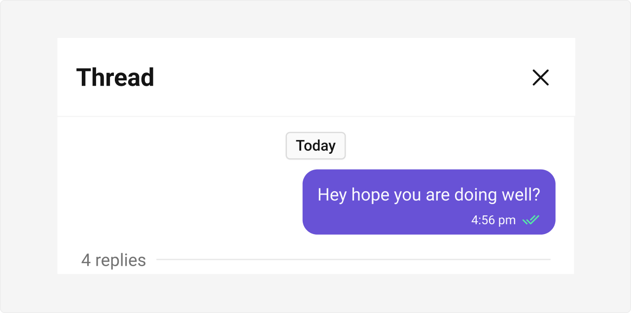
Minimal Render
.cometchat-thread-header
Actions and Events
Callback Props
onClose
Fires when the close button is clicked.onSubtitleClicked
Fires when the subtitle area is clicked.onError
Fires on internal errors.SDK Events (Real-Time, Automatic)
The component listens to SDK events internally for real-time reply count updates. No manual attachment needed.Custom View Slots
| Slot | Type | Replaces |
|---|---|---|
messageBubbleView | JSX.Element | Parent message bubble |
subtitleView | JSX.Element | Subtitle text below the thread title |
messageBubbleView
Replace the parent message bubble with a custom view.Date Time Format Customization
separatorDateTimeFormat
If no property is passed in the CalendarObject, the component checks the global configuration first. If also missing there, the component’s default formatting applies.
Common Patterns
Thread header with hidden chrome
CSS Architecture
The component uses CSS custom properties (design tokens) defined in@cometchat/chat-uikit-react/css-variables.css.
Key Selectors
| Target | Selector |
|---|---|
| Root | .cometchat-thread-header |
| Top bar | .cometchat-thread-header__top-bar |
| Title | .cometchat-thread-header__top-bar-title |
| Subtitle | .cometchat-thread-header__top-bar-subtitle-text |
| Close button | .cometchat-thread-header__top-bar-close |
| Body | .cometchat-thread-header__body |
| Date separator | .cometchat-thread-header__body-timestamp |
| Message bubble area | .cometchat-thread-header__message |
| Incoming message | .cometchat-thread-header__message-incoming |
| Outgoing message | .cometchat-thread-header__message-outgoing |
| Reply bar | .cometchat-thread-header__reply-bar |
| Reply count | .cometchat-thread-header__reply-bar-count |
| Reply divider | .cometchat-thread-header__reply-bar-divider |
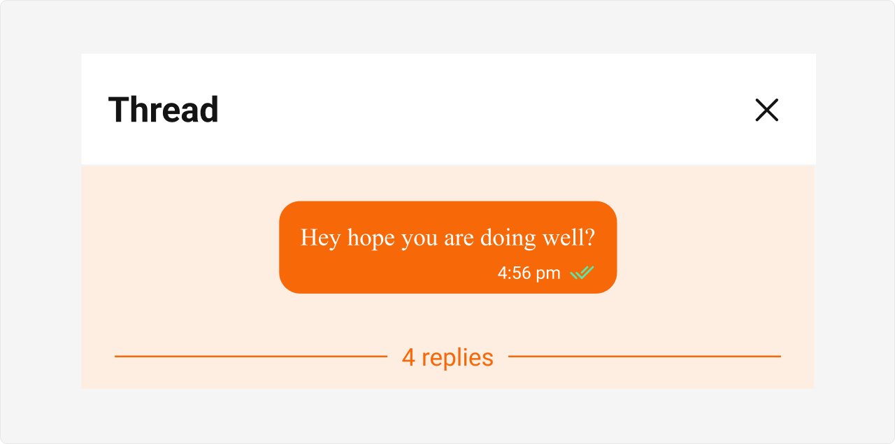
Example: Brand-themed thread header
Props
All props are optional unless noted otherwise.hideDate
Hides the date header.| Type | boolean |
| Default | false |
hideReceipts
Hides the receipt indicator.| Type | boolean |
| Default | false |
hideReplyCount
Hides the reply count.| Type | boolean |
| Default | false |
messageBubbleView
Custom component for the parent message bubble.| Type | JSX.Element |
| Default | undefined |
messageSentAtDateTimeFormat
Format for the message sent-at timestamp.| Type | CalendarObject |
| Default | hh:mm A |
onClose
Callback fired when the close button is clicked.| Type | () => void |
| Default | undefined |
onError
Callback fired when the component encounters an error.| Type | ((error: CometChat.CometChatException) => void) | null |
| Default | undefined |
onSubtitleClicked
Callback fired when the subtitle area is clicked.| Type | () => void |
| Default | undefined |
parentMessage
The parent message displayed in the thread header. Required.| Type | CometChat.BaseMessage |
| Default | — |
separatorDateTimeFormat
Format for the date separator timestamp.| Type | CalendarObject |
| Default | DD MMM, YYYY |
showScrollbar
Shows the scrollbar in the component.| Type | boolean |
| Default | false |
subtitleView
Custom component for the subtitle text.| Type | JSX.Element |
| Default | undefined |
template
Custom template for the parent message bubble rendering.| Type | CometChatMessageTemplate |
| Default | undefined |
textFormatters
Custom text formatters for message text.| Type | CometChatTextFormatter[] |
| Default | undefined |
CSS Selectors
| Target | Selector |
|---|---|
| Root | .cometchat-thread-header |
| Top bar | .cometchat-thread-header__top-bar |
| Title | .cometchat-thread-header__top-bar-title |
| Subtitle | .cometchat-thread-header__top-bar-subtitle-text |
| Close button | .cometchat-thread-header__top-bar-close |
| Body | .cometchat-thread-header__body |
| Date separator | .cometchat-thread-header__body-timestamp |
| Message bubble area | .cometchat-thread-header__message |
| Incoming message | .cometchat-thread-header__message-incoming |
| Outgoing message | .cometchat-thread-header__message-outgoing |
| Reply bar | .cometchat-thread-header__reply-bar |
| Reply count | .cometchat-thread-header__reply-bar-count |
| Reply divider | .cometchat-thread-header__reply-bar-divider |