AI Integration Quick Reference
AI Integration Quick Reference
Where It Fits
CometChatMessageHeader is a header bar component. It sits at the top of a chat screen and displays the avatar, name, and status of the user or group in the conversation. Wire it alongside CometChatMessageList and CometChatMessageComposer to build a complete messaging layout.
- Kotlin
- Java
ChatActivity.kt
Quick Start
Add the component to your layout XML:your_layout.xml

CometChatUIKit.init(), a user logged in, and the cometchat-chat-uikit-android dependency added.
Set a User or Group on the component — this is required for it to display data:
- Kotlin
- Java
YourActivity.kt
- Kotlin
- Java
Actions and Events
Callback Methods
setOnBackButtonPressed
Fires when the user presses the back button in the header. Default: navigates to the previous activity.
- Kotlin
- Java
YourActivity.kt
What this does: Overrides the default back-press navigation. When the user taps the back button, your custom logic runs instead.
setOnBackPress
Alternative setter for the back press callback. Functionally identical to setOnBackButtonPressed.
- Kotlin
- Java
YourActivity.kt
setOnError
Fires on internal errors (network failure, auth issue, SDK exception). This does not change the component’s behavior.
- Kotlin
- Java
YourActivity.kt
What this does: Registers an error listener. If the component encounters an error, your callback receives the CometChatException.
setNewChatButtonClick
Fires when the new chat button is tapped (visible in AI agent conversations).
- Kotlin
- Java
YourActivity.kt
setChatHistoryButtonClick
Fires when the chat history button is tapped (visible in AI agent conversations).
- Kotlin
- Java
YourActivity.kt
- Verify: After setting an action callback, trigger the corresponding user interaction (back-press) and confirm your custom logic executes instead of the default behavior.
Global UI Events
TheCometChatMessageHeader component does not emit any global UI events.
SDK Events (Real-Time, Automatic)
The component listens to these SDK events internally. No manual attachment needed unless additional side effects are required.| SDK Listener | Internal behavior |
|---|---|
onUserOnline | Updates online status indicator for the user |
onUserOffline | Updates offline status indicator for the user |
onTypingStarted | Shows typing indicator in the subtitle area |
onTypingEnded | Hides typing indicator and restores subtitle |
onGroupMemberJoined | Updates group member count |
onGroupMemberLeft | Updates group member count |
onGroupMemberKicked | Updates group member count |
onGroupMemberBanned | Updates group member count |
Automatic: user presence, typing indicators, and group member count changes update in real time.
Functionality
Small functional customizations such as toggling visibility of UI elements and setting the user or group object.| Methods | Description | Code |
|---|---|---|
setUser | Passes a user object to display that user’s header details. Required for the component to function. | .setUser(user) |
setGroup | Passes a group object to display that group’s header details. Required for the component to function. | .setGroup(group) |
setBackIconVisibility | Toggles visibility for the back button | .setBackIconVisibility(View.VISIBLE) |
setUserStatusVisibility | Toggles visibility for the user’s online/offline status indicator | .setUserStatusVisibility(View.GONE) |
setGroupStatusVisibility | Toggles visibility for the group status indicator | .setGroupStatusVisibility(View.GONE) |
setVideoCallButtonVisibility | Toggles visibility for the video call button | .setVideoCallButtonVisibility(View.GONE) |
setVoiceCallButtonVisibility | Toggles visibility for the voice call button | .setVoiceCallButtonVisibility(View.GONE) |
setMenuIconVisibility | Toggles visibility for the overflow menu icon | .setMenuIconVisibility(View.GONE) |
setNewChatButtonVisibility | Toggles visibility for the new chat button (AI agent conversations) | .setNewChatButtonVisibility(View.GONE) |
setChatHistoryButtonVisibility | Toggles visibility for the AI chat history button | .setChatHistoryButtonVisibility(View.GONE) |
- Verify: After calling a visibility method, confirm the corresponding UI element is shown or hidden. After calling
setUser(user), confirm the header displays that user’s name and avatar.
Custom View Slots
Each slot replaces a section of the default header UI. Slots accept aFunction3<Context, User, Group, View> callback that receives the current context, user, and group objects.
| Slot | Method | Replaces |
|---|---|---|
| Item view | setItemView(Function3) | Entire header layout |
| Leading view | setLeadingView(Function3) | Avatar / left section |
| Title view | setTitleView(Function3) | Name / title text |
| Subtitle view | setSubtitleView(Function3) | Subtitle text below name |
| Trailing view | setTrailingView(Function3) | Right section (action buttons) |
| Auxiliary button | setAuxiliaryButtonView(Function3) | Additional action button next to trailing view |
| Options | setOptions(List<MenuItem>) | Overflow popup menu items |
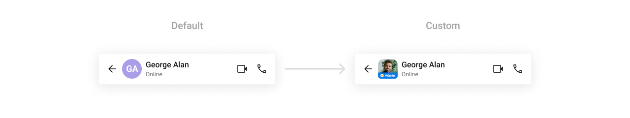
setLeadingView
Replace the avatar / left section.
- Kotlin
- Java
What this does: Registers a callback that returns a customViewfor the leading (left) area of the header. The callback receives the currentContext,User, andGroupobjects.
header_leading_view.xml layout file:
header_leading_view.xml
- Kotlin
- Java
What this does: Inflates the header_leading_view.xml layout and sets the avatar image from the user or group. If the user has an “admin” role, or if the logged-in user is the group owner, the admin badge view becomes visible. The view is sized to 45dp × 45dp.
setTitleView
Replace the default title view with a custom layout.
- Kotlin
- Java
What this does: Replaces the default title with a custom TextView that displays the user’s or group’s name.
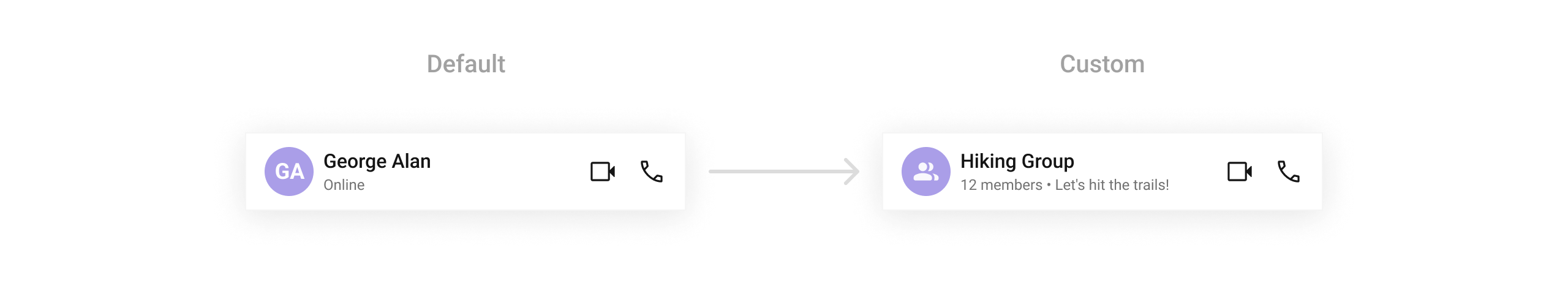
setSubtitleView
Replace the subtitle text below the user’s or group’s name.
- Kotlin
- Java
What this does: Registers a callback that returns a customViewfor the subtitle area of the header. The callback receives the currentContext,User, andGroupobjects so you can customize the subtitle based on the conversation.
- Kotlin
- Java
What this does: Creates a TextView and sets its text to the user’s status (for user conversations) or the group’s member count and description (for group conversations). If the group has more than 1 member, it shows “X members”; otherwise it shows “1 member • [description]”.
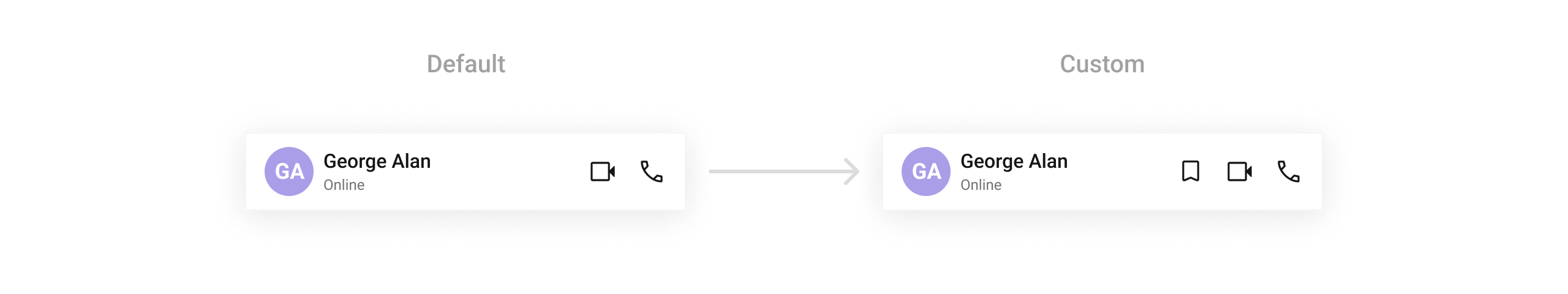
setTrailingView
Replace the trailing (right) section of the header, used for action buttons or indicators.
- Kotlin
- Java
What this does: Registers a callback that returns a customViewfor the trailing (right) area of the header. The callback receives the currentContext,User, andGroupobjects.
- Kotlin
- Java
What this does: Creates an ImageView with a save icon drawable, sizes it to 24dp × 24dp with a 16dp left margin, and returns it as the trailing view in the header.
setItemView
Replace the entire default header with a fully customized layout.
- Kotlin
- Java
What this does: Registers a callback that returns a customViewto replace the entire default message header layout. The callback receives the currentContext,User, andGroupobjects.
custom_message_header.xml layout file:
custom_message_header.xml
What this does: Defines a custom message header layout with a back button, avatar, title and subtitle text views, and call buttons. This layout replaces the entire default header when inflated in setItemView.
Inflate the XML and initialize the views:
- Kotlin
- Java
What this does: Inflates the custom_message_header.xml layout and populates it with the user’s or group’s avatar, name, and status/member count. If the conversation is with a user, it sets the user’s status as the subtitle and configures call buttons for that user. If the conversation is with a group, it sets the member count as the subtitle and configures call buttons for that group.
setAuxiliaryButtonView
Add a custom button or additional action next to the title or trailing section.
- Kotlin
- Java
What this does: Registers a callback that returns a customViewto display as an auxiliary button in the header. The callback receives the currentContext,User, andGroupobjects so you can customize the view based on the conversation.
setOptions
Sets the list of popup menu items displayed when the overflow menu icon is tapped.
- Kotlin
- Java
What this does: Sets custom popup menu items for the header’s overflow menu. Each item has an ID, label, and click action. Setting options automatically makes the menu icon visible.
- Verify: After setting any custom view slot, confirm the custom view renders in the correct position within the message header, and the data binding populates correctly for the user or group.
Common Patterns
Hide call buttons — text-only chat
- Kotlin
- Java
Show back button for navigation
- Kotlin
- Java
Minimal header — hide status and menu
- Kotlin
- Java
Advanced Methods
setDateTimeFormatter
Provides a custom implementation of DateTimeFormatterCallback to configure how time and date values are displayed. Each method corresponds to a specific case:
time(long timestamp)— Custom full timestamp formattoday(long timestamp)— Called when a message is from todayyesterday(long timestamp)— Called for yesterday’s messageslastWeek(long timestamp)— Messages from the past weekotherDays(long timestamp)— Older messagesminute(long timestamp)/hour(long timestamp)— Exact time unitminutes(long diffInMinutesFromNow, long timestamp)— e.g., “5 minutes ago”hours(long diffInHourFromNow, long timestamp)— e.g., “2 hours ago”
- Kotlin
- Java
What this does: Overrides the default date/time formatting for the message header. Today’s messages show “Today”, yesterday’s show “Yesterday”, recent messages show “X mins ago” or “X hrs ago”, last week’s show “Last Week”, and older messages show the full date in “dd MMM yyyy” format.
setLastSeenText
Provides a custom implementation for the “last seen” text displayed below the user’s name. Only applies to user conversations.
- Kotlin
- Java
What this does: Replaces the default last seen text with custom logic. Returns “Active now” for online users and “Last seen recently” for offline users.
setBackIcon
Replaces the default back icon with a completely custom View.
- Kotlin
- Java
setPopupMenuStyle
Sets a custom style for the overflow popup menu.
- Kotlin
- Java
AI Agent Button Customization
For AI agent conversations, the header shows new chat and chat history buttons. Customize their icons and tints:| Method | Type | Description |
|---|---|---|
setNewChatIcon | Drawable | Custom icon for the new chat button |
setNewChatIconTint | @ColorInt int | Tint color for the new chat icon |
setChatHistoryIcon | Drawable | Custom icon for the chat history button |
setChatHistoryIconTint | @ColorInt int | Tint color for the chat history icon |
Internal Access
These methods provide direct access to internal components for advanced use cases.| Method | Returns | Description |
|---|---|---|
getMessageHeaderViewModel() | MessageHeaderViewModel | The ViewModel managing header data and state |
getAdditionParameter() | AdditionParameter | Data source addition parameter for configurators |
getUser() | User | The currently set User object |
getGroup() | Group | The currently set Group object |
Use these only when the standard API is insufficient. Directly manipulating the ViewModel may conflict with the component’s internal state management.
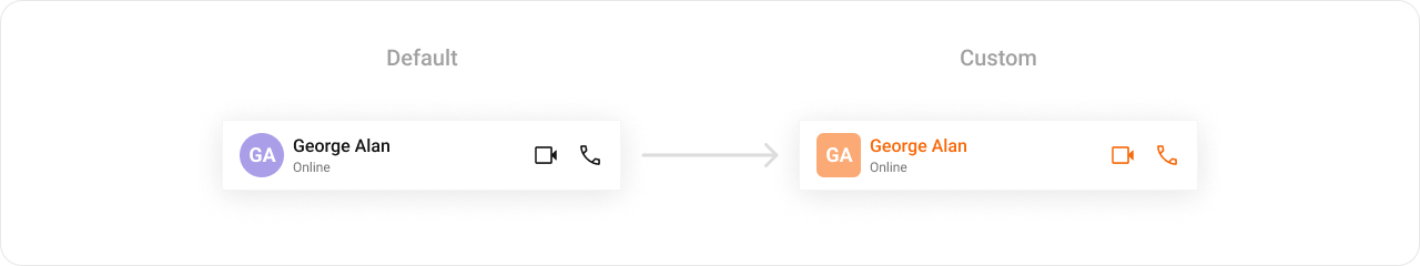
Style
The component uses XML theme styles. Define a custom style with parentCometChatMessageHeaderStyle in themes.xml, then apply with setStyle().
themes.xml
- Kotlin
- Java
What this does: Applies theTo know more such attributes, visit the attributes file.CustomMessageHeaderStyletheme to theCometChatMessageHeadercomponent, changing the title text color, avatar style, and call button icon tints.
- Verify: The header title text displays in orange (
#F76808), and the voice and video call icons display with orange tint (#F76808).
Programmatic Style Properties
In addition to XML theme styles, the component exposes programmatic setters for fine-grained control:| Method | Type | Description |
|---|---|---|
setBackgroundColor | @ColorInt int | Background color of the component |
setTitleTextColor | @ColorInt int | Title text color |
setTitleTextAppearance | @StyleRes int | Title text appearance |
setSubtitleTextColor | @ColorInt int | Subtitle text color |
setSubtitleTextAppearance | @StyleRes int | Subtitle text appearance |
setBackIconTint | @ColorInt int | Tint color for the back icon |
setMenuIconTint | @ColorInt int | Tint color for the menu icon |
setCornerRadius | @Dimension int | Corner radius of the component |
setAvatarStyle | @StyleRes int | Style for the avatar |
setStatusIndicatorStyle | @StyleRes int | Style for the online/offline status indicator |
setTypingIndicatorStyle | @StyleRes int | Style for the typing indicator |
setCallButtonsStyle | @StyleRes int | Style for the call buttons |
Customization Matrix
| What to change | Where | Property/API | Example |
|---|---|---|---|
| User object | Activity/Fragment | setUser(User) | .setUser(user) |
| Group object | Activity/Fragment | setGroup(Group) | .setGroup(group) |
| Override back-press behavior | Activity/Fragment | setOnBackButtonPressed(OnBackPress) | setOnBackButtonPressed { ... } |
| Handle errors | Activity/Fragment | setOnError(OnError) | setOnError { e -> ... } |
| Title text color | themes.xml | CometChatMessageHeaderStyle with cometchatMessageHeaderTitleTextColor | <item name="cometchatMessageHeaderTitleTextColor">#F76808</item> |
| Avatar style | themes.xml | CometChatMessageHeaderStyle with cometchatMessageHeaderAvatarStyle | <item name="cometchatMessageHeaderAvatarStyle">@style/CustomAvatarStyle</item> |
| Call button icon tints | themes.xml | CometChatCallButtonsStyle with cometchatCallButtonsVideoCallIconTint / cometchatCallButtonsVoiceCallIconTint | <item name="cometchatCallButtonsVideoCallIconTint">#F76808</item> |
| Apply a custom style | Activity/Fragment | setStyle(int styleRes) | cometchatMessageHeader.setStyle(R.style.CustomMessageHeaderStyle); |
| Back button visibility | Activity/Fragment | setBackIconVisibility(int) | .setBackIconVisibility(View.VISIBLE) |
| User status visibility | Activity/Fragment | setUserStatusVisibility(int) | .setUserStatusVisibility(View.GONE) |
| Group status visibility | Activity/Fragment | setGroupStatusVisibility(int) | .setGroupStatusVisibility(View.GONE) |
| Video call button visibility | Activity/Fragment | setVideoCallButtonVisibility(int) | .setVideoCallButtonVisibility(View.GONE) |
| Voice call button visibility | Activity/Fragment | setVoiceCallButtonVisibility(int) | .setVoiceCallButtonVisibility(View.GONE) |
| Menu icon visibility | Activity/Fragment | setMenuIconVisibility(int) | .setMenuIconVisibility(View.GONE) |
| New chat button visibility | Activity/Fragment | setNewChatButtonVisibility(int) | .setNewChatButtonVisibility(View.GONE) |
| Chat history button visibility | Activity/Fragment | setChatHistoryButtonVisibility(int) | .setChatHistoryButtonVisibility(View.GONE) |
| Date/time formatting | Activity/Fragment | setDateTimeFormatter(DateTimeFormatterCallback) | See setDateTimeFormatter code above |
| Custom last seen text | Activity/Fragment | setLastSeenText(Function2<Context, User, String>) | See setLastSeenText code above |
| Entire header layout | Activity/Fragment | setItemView(Function3) | See setItemView code above |
| Subtitle view | Activity/Fragment | setSubtitleView(Function3) | See setSubtitleView code above |
| Leading view (avatar area) | Activity/Fragment | setLeadingView(Function3) | See setLeadingView code above |
| Trailing view | Activity/Fragment | setTrailingView(Function3) | See setTrailingView code above |
| Title view | Activity/Fragment | setTitleView(Function3) | See setTitleView code above |
| Auxiliary button view | Activity/Fragment | setAuxiliaryButtonView(Function3) | See setAuxiliaryButtonView code above |
| Header popup menu options | Activity/Fragment | setOptions(List<MenuItem>) | cometchatMessageHeader.setOptions(menuItems); |
| Popup menu style | Activity/Fragment | setPopupMenuStyle(int) | .setPopupMenuStyle(R.style.CustomPopupMenuStyle) |
Next Steps
Message List
Display messages in a conversation
Message Composer
Rich input for sending messages
Conversations
Browse recent conversations
Theming
Customize colors, fonts, and styles